color choices ... pls help
-
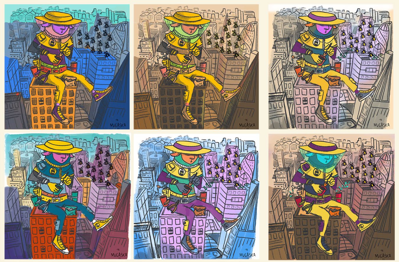
Hi, here is a draft of an illustration, which I am planning to paint on wood with acrylics.... As I am not great with color choices, I needed to see how it looks like in photoshop first. However I am not sure if any of these is good to proceed.. Any advise will be highly appreciated!
")
-
I like the first one, it fits the energy of the piece? But I am not great at color choices either!
-
I like the bottom left and the bottom middle ones
Deviantart: https://www.deviantart.com/jacy13
Instagram: https://www.instagram.com/jacy13draws/?hl=en
Portfolio: https://jacy13.artstation.com/ -
@HeatherBouteneff it's soo dificult right? colours are a mystery to me lol
-
@Jacy13 thank you! I kind off lean towards this one too...
-
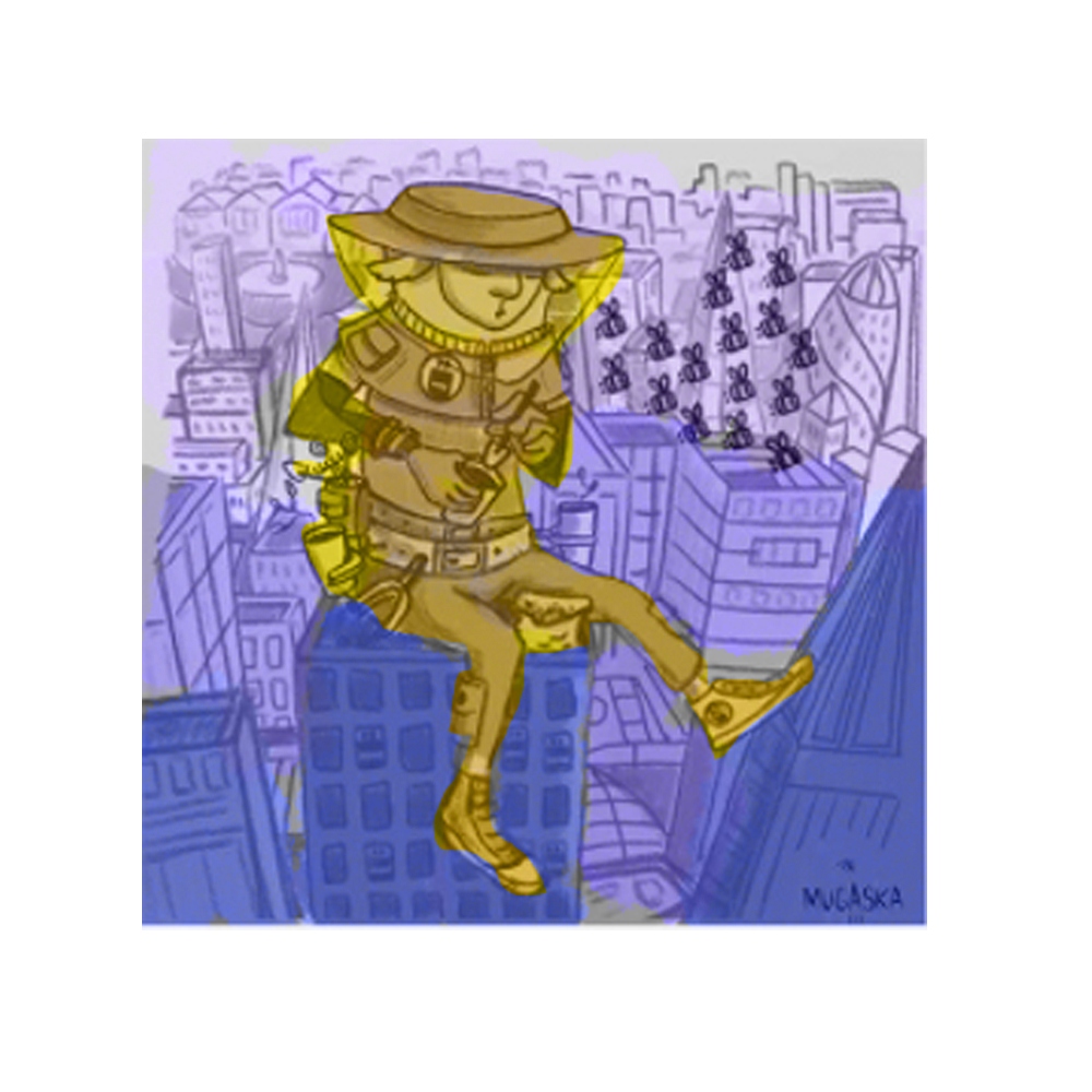
@aska You might want to really simplify your palette and go for a triad. Pick a complementary set of colors and one of the colors next to it on the color wheel. This should allow you to pop what needs to pop and simplify the rest. For example, if you did your lamb in yellows (like the one up top), do all your background in muted blues and purples. It would be easier on the eye, especially with all the lines and details you have in the illustration.
Here's a really bad drawover to show what I mean:
-
@chrisaakins thank you! this is very useful.
I didn't mean to draw a lamb but yeah he kind off looks like one lol -
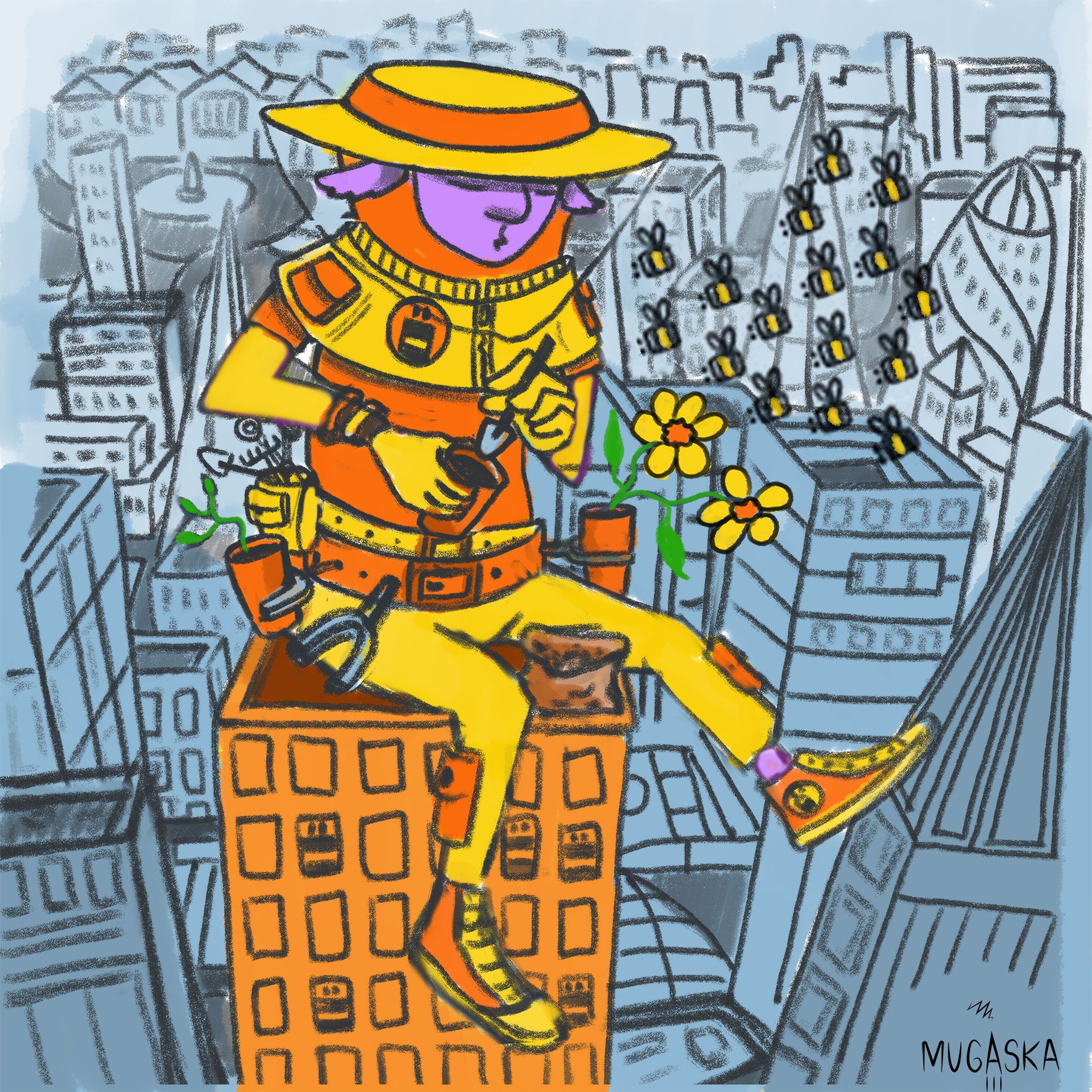
I think I am going for this one....
-
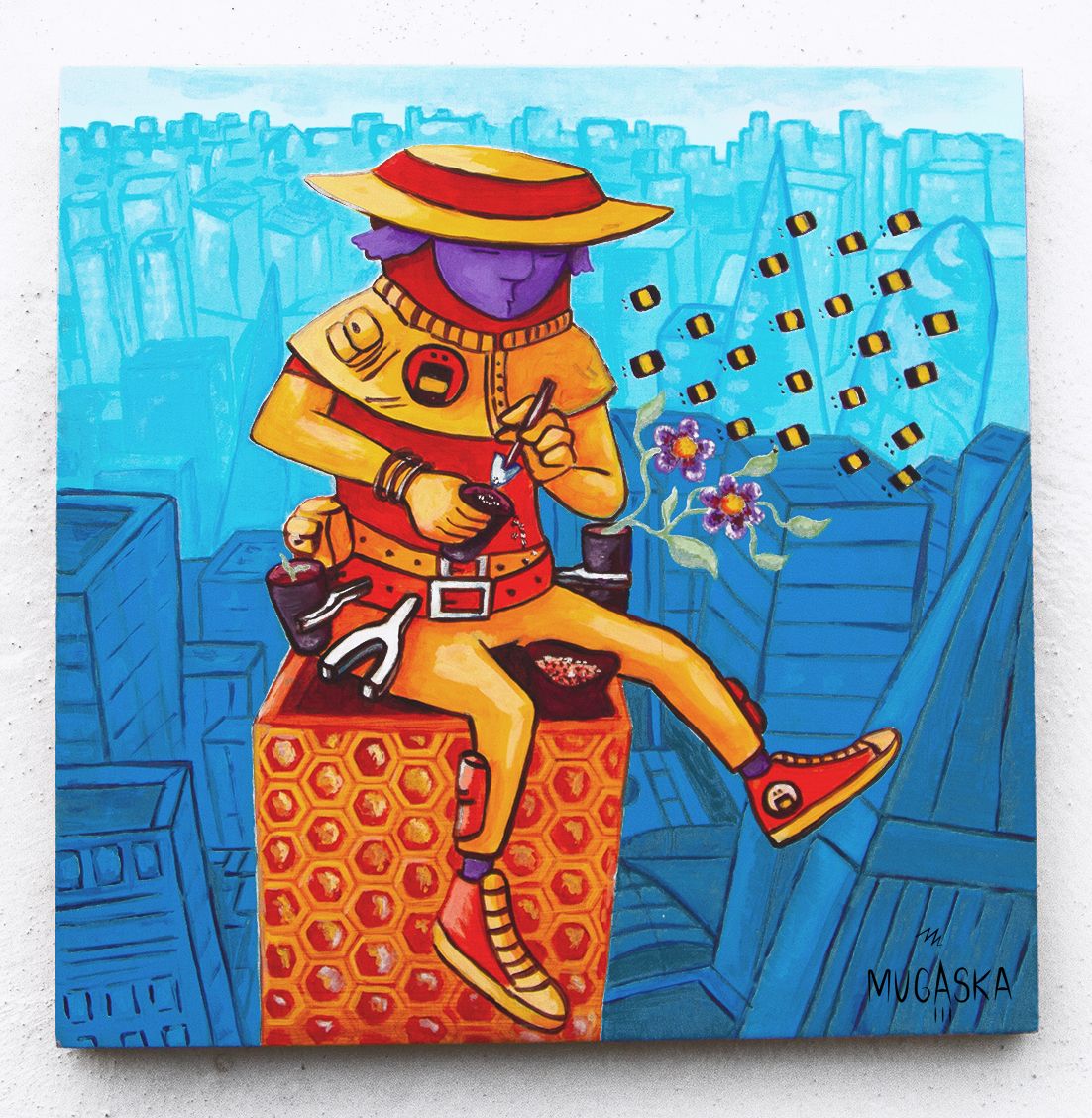
Hi guys, so here is how it turned out! I am still going to add a few tiny details like bee wings etc, so if you have any critiques let me know!:)