Tony santigo master study
-
If you want my brutally honest opinion, the most glaring problem I see is... Luke's anatomy. His eyes don't look like they're facing the same direction, and they're really different shapes, they're also pretty big, like his lips. His nose looks like it's squished to his face. For some reason, it looks like you gave him a hair clip on his right side, but I think that's just an unintentional error.
Finis Coronat Opus
Instagram: www.instagram.com/madgcartoons/
Behance: www.behance.net/madgcartoons
Website: https://michaelangelodgo.wixsite.com/madgcartoons -
Out of curiosity, have you tried flipping the canvas? I’m just curious as to why you seemed so dismissive of it in your original post?
I know you say you needed different advice but doing something like that will greatly help trick your brain into not trying to see Luke Skywalker but instead see it as shapes and form.
Website: laurenpetiti.myportfolio.com
Instagram: @laurenpetiti"So the man who really loves God could...paint his pictures, even if no man ever saw them. He knows God looks upon them." - Francis Shaffer.
-
Personally I don’t abide by the rule that master copies should look exactly like the original. However, I do believe that they should look as if they were done by the original artists. They don’t need to be identical, yours should just be so good to the point that if someone were to look at both without knowing which one is the original then they should not be able to pick yours out as the copy.
That aside I think there is a bigger problem here. The artist who you are copying is not a master and not someone you should be copying. Their proportions are often incorrect and they’re not applying the rules of light and shadow correctly in many of their pieces. I don’t mean to sound harsh but I do want to make sure you don’t make the mistake of copying from the wrong people. I would suggest looking for artists who are known masters, people who are commonly regarded as masters in the art world. I hope this helps
-
Of course I do but I want new advice
-
@Griffin
Teacher told me to draw him. It was his recommendation to me.
-
@Michael-Angelo-Go wdym unintentional error. Im confused.
-
@Ari-Sorokin
I do have a couple things, but I am also wondering why your mentor chose Tony Santigo? Lee teaches a class on finding your style and he talks about putting together a dream portfolio and then doing master studies based off of that. Basically it’s professional work that you wish you had done - the stuff you are aiming at. I agree with the person who said it’s not the best thing to try and do a copy of work that is problematic. Tony has some cool pieces, but he doesn’t look to be master level.
That aside, Do you have a subscription to the svs classes? There are a few things Jake teaches in the “how to draw everything” class that I found really helpful. One of them was to draw the picture upside down. It helps your brain to focus on the shapes you were making and stop thinking about trying to draw “Luke Skywalker” or whatever else. Another trick is to draw the negative spaces. And you can use your pencil or a stick to make sure you are getting the angles right. That’s the one that actually helps me the most. It really helps with placement of objects inside a picture. Jake has us draw a folding chair for that particular exercise and I was amazed that I could pull off drawing something by only drawing the negative space. It helps with portraits too! A lot. If you don’t have a subscription, I would look up both of those things on YouTube. I’m sure there are some tutorials. I could show you in a quick draw over what the negative space looks like too. Hope that’s helpful! -
@Ari-Sorokin I'm glad you tried it! I know it's frustrating as you're learning, but trust me, these are fundamentals because they work. It could be that new advice isn't going to help you as much as the old standbys (the same advice I give my own students).
-
@Pamela-Fraley we both have similar styles. Another reason is because i didnt really know who to do. Im trying to exposes myself to other artists now so I didn’t have to worry about who to draw.
-
@Ari-Sorokin that makes sense. It’s just a matter of “filling the creative bank account”, as Jake would say. And, its great that you are trying this stuff. I just did my first master study and it was not easy!
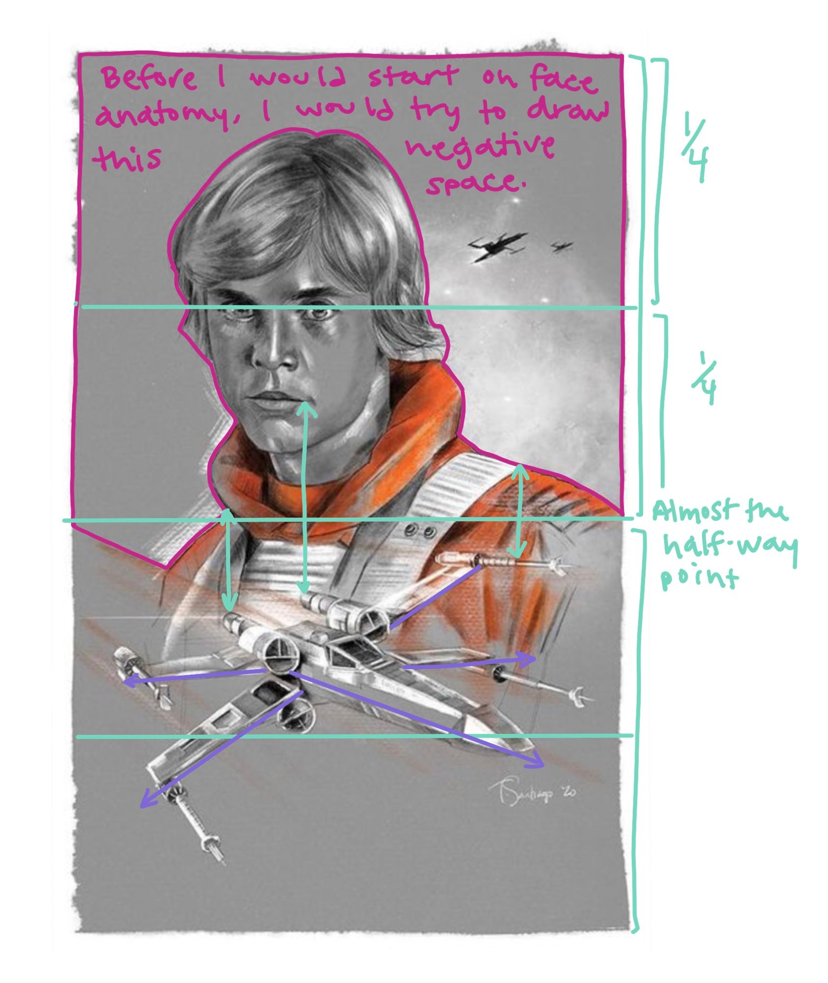
I did a little drawing on top of Tony’s piece to show you how I would try try to approach it. I hope it helps. The pink lines outline the negative space around his head. When you look at that instead of him, you can see more accurately how much of the space he’s taking up. The green lines are about relationships. His eyes are about 1/4 of the way down the page, the right shoulder goes off at about the halfway point. Also, the corner of his mouth should be in line with the right back thruster and where his collar meets his other shoulder should line up with the other thruster... I didn’t mark them all. You can also see that his hair part is just left of center at the top of the page...
Also, the purple lines are angles. I just hold a pencil up to these and then to my paper to see if they match. Usually when I focus on all three of these (negative space, relationships and angles) I can get things put in mostly the right place. And then you can apply what you know about anatomy, color and light and all that.