Progress on my painting - Help on colour please
-
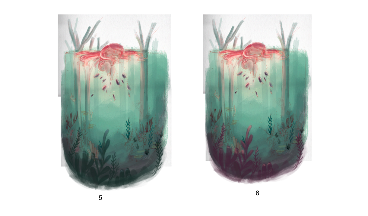
Now seeing the variations as small thumbnails on here, i'm thinking perhaps the smaller plant life needs to stay how it was in the original version, so it stands out far less?
What do we think about this instead?
Sorry for all the variations guys...you know what it's like when you keep staring at something for ages and can't make the right decision!
-
I really love this image in all it's variations, there's a depth and sense of wonder to all of them that really pulls me in. I can see why you are having trouble deciding, they are all interesting in their own way, I can't really say any one of them is necessarily more successful than the other, they all just lead your eye a little differently.
I think my personal preference, if I'm just going off my gut, is in the top three grouping, far right (#3). I like it because the sea life has a strong, but not overpowering presence. The colorful plant life offers the most depth in that space and though it slightly pulls the eye from the main character I think it opens up so much more room for the viewer eye/imagination to wander through. I do not think there is too much at all.
It's really lovely and I'm enjoying seeing you progress on this piece.
-
@Tiffany-Thomas Thank you! Yes I see what you mean - seeing it with fresh eyes now I see how the colours in #3 pull the eye downwards, which could be quite nice...and makes me wonder if I could get away with adding the octopus back into the painting (if you haven't seen my other post, not sure how these forum chats work yet lol, there was a debate about the presence of an octopus!)
I might have a play around with that idea...Thanks again!
-
@Abigail-Hookham I did see your other post, I liked the octopus and it & would be interesting to see him back in there, I guess the only way to know is to try, lol. Maybe try a couple variations, one where he is more silhouetted in the background or something? I'll keep an eye out for your next post ;).
-
@Abigail-Hookham 3 would be my vote.
It adds visual interest to the bottom without distracting the eye from the focal point of the character at the top of the composition.
It also mirrors some of the warm tones from the figure, again, without distracting. Overall, it creates a harmonious composition.
Really, really well done! Can't wait to see the finished illustration!
-
@Abigail-Hookham oh, and I really like the addition of the foreground plant life -- it adds depth to the piece.
Darker fish vs. lighter fish? The darker fish read better, but I wonder if they're a smidge too dark... With the source of light seeming to come from the character or whatever she's holding, it feels like the fish, being that close, would be lit a little more than they are and would not be silhouetted to that extent, especially compared with how you've lit the figure.
Hope this feedback helps!
")
 ️
️illustrator - author - smiley person
mbaileyart.com
instagram.com/mbaileyart/ -
@Melissa-Bailey-0 Yes that is a very good point, and why I originally had them as light fish. But I think what you're suggesting would help balance it better. I'll be sure to amend before I paint the 'final' thing!
Thanks!
-
This is lovely! I think I like the first one the most because the visual interest is really focused on the girl.
-
@Abigail-Hookham
I like the light color of your original painting. Soft tones and dreamy. -
I like the purple #3, the darker plant life helps define the glass shape...