colour comp critique most appreciated
-
@Braden-Hallett Is great, I love it!
-
@Nyrryl-Cadiz Awesome! Thanks

-
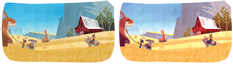
I feel kinda hesitant to post this, since what you have here is good, and from your body of work you seem to have a very established color palette, and this illustration does play nicely with your other stuff.
However, if you wanted to explore something a little different to hit the "warmth and idylic" aspect, you could try to make this image a bit warmer?
This might just be my stylistic opinion, but here is a side by side comparison to show what I mean
Check out my art and tutorials :)
Instagram: www.instagram.com/carliannecreates/
Youtube:
https://youtube.com/c/CarlianneCreatesShop: www.carliannecreates.com
-
@carlianne @Braden-Hallett I was going to mention the sky feels saturated...it's where my attention went first. Overall great design. The giant bunnies crack me up.
-
@carlianne @Braden-Hallett --just my personal preference, but I love how Carlianne has warmed up the palette. The purpler (is that a word?) mountain really plays off the yellow, the characters pop, and you have that nice contrast when playing with complimentary colors. (The rabbits might be a smidge too red, but again, this is all personal preference.)
Both palettes work beautifully. Warming it up does change the feel slightly and adds some background depth. But Braden, do your thing! This piece is going to be amazing no matter what you decide to do.
-
@Braden-Hallett -- love this comp, and hesitate to pick on it, but I will!
 Just wanted to mention one thing, and it's really nitpicky, but ... where are the shadows?
You've set the barn basically on the base of the mountain. If a mountain that big were that close, with a strong light source coming from the right, where is the shadow it's casting? Wouldn't the midground field, which is currently the lightest yellow and which seems to be sitting slightly behind the mountain, be mostly in shadow? If so, that would really change your values on the left side of the comp.
Guess if you're going to address it, now would be the time to do so, which is why I'm bringing it up. Honestly, though, love your work!
illustrator - author - smiley person
mbaileyart.com
instagram.com/mbaileyart/ -
@Braden-Hallett Wow! This is amazing! I don’t have any suggestions about what to change or add. I think carlianne’s input was fantastic and that warmer palette would make for a great sunset feel.
-
@carlianne said in colour comp critique most appreciated:
I feel kinda hesitant to post this, since what you have here is good, and from your body of work you seem to have a very established color palette, and this illustration does play nicely with your other stuff.
However, if you wanted to explore something a little different to hit the "warmth and idylic" aspect, you could try to make this image a bit warmer?
This might just be my stylistic opinion, but here is a side by side comparison to show what I mean
Interesting! Thanks for the feedback. I'll definitely play around with some color overlays
")
-
@Melissa-Bailey-0 said in colour comp critique most appreciated:
@Braden-Hallett -- love this comp, and hesitate to pick on it, but I will!
Just wanted to mention one thing, and it's really nitpicky, but ... where are the shadows?You've set the barn basically on the base of the mountain. If a mountain that big were that close, with a strong light source coming from the right, where is the shadow it's casting? Wouldn't the midground field, which is currently the lightest yellow and which seems to be sitting slightly behind the mountain, be mostly in shadow? If so, that would really change your values on the left side of the comp.
Guess if you're going to address it, now would be the time to do so, which is why I'm bringing it up. Honestly, though, love your work!
The light, she is coming mostly from above. Think just past noon
Though I'll definitely be sure to accentuate the shadows that are there (such as one side of the barn). Thanks for the feedback! -
Thank you everyone for the feedback
It's greatly appreciated and made this one a whole lot easier to finish. Thought I'd post the final 