Kelly’s cookin’ yeti WIP
-
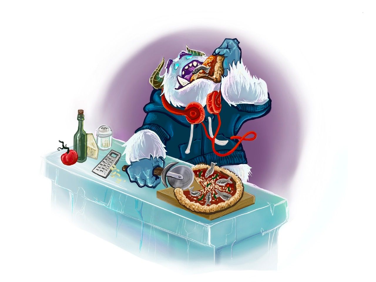
Hahaha, This is a funny illustration Kelly. The personality really comes through. I love your approach to values and the color palette you've chosen. This feels like an average teenager/college freshman to me. I think the splashes of red are really strategic!
The thing that jumps out at me most is the anchovy on the pizza slice the Yeti is eating - for a second it looked like a tusk stuck through the pizza slice. It became clear when I enlarged the image. The anchovy is very similar to the hue and tone in that general area and carries an implied line with the horn. Perhaps relocate the anchovy?
I love the glowy eyes and the purple eyebrows! Very clever to have the counter top be a block of ice.
I think there's suppose to be a yeti gut happenin'? I could be wrong, but I think that's the curve the belly is going with. If so, I think that has good character and humor to it, and I wish it stood out more from the background, also so that the yeti doesn't look like a sweatshirt floating in space. Maybe move the draw strings a bit to either a) show motion or b) show the curve of the yeti's belly.
Okay! That's my feedback for now! In all, I think this is a clear, enjoyable piece with a lot of personality and relatability! And noooow I'm craving pizza. So thanks for that Kelly.
Happy drawing!Shani
-
@TheArtBard thanks so much for all of your wonderful feedback! I agree that those areas could use some clarification. I didn't notice the fish looking kind of like a tooth when the image appears so small. That is super important because during the critique arena they are all small and don't show at full screen. I wanted the background to be that bright blue to make it cohesive with the other yeti images but as a spot illustration maybe that is less important

-
Is it a bit more clear with the purple background?

-
@K-Flagg I’ve been loving the ice crystal/pointy snowflakes in your last two entries. I wonder if that back drop colour could reflect that ice crystal shape - some implied jagged edges and points instead of the round circle.
Maybe the pizza could lay a little flatter on the cutting board?
The only other thought I have is that the hair coming out of his pizza eating arm sleeve should have some tufts pointing down for gravity sake.
Yeah, nothing big to add, honestly. Love your yeti, and I think this is a great illustration!
-
This post is deleted! -
Heyhey @K-Flagg
Yeeeeees, love the changes you've made. The purple background really emphasizes the blue glow on the horns (I didn't even notice that the first time around!)
The anchovy is in a much better location! I would say maybe the furthest parts of the mouth should be a darker value purple than the purple lips? This would help create depth, and distinguish the anchovy as in front of the mouth, going into the mouth (difference in value for depth will put the anchovy in front of the mouth).
Mmmmm, I didn't notice it before, but I see it now and maybe you're in the same boat? The hand and jacket have a dark outline. The fur has no (or a white) outline. It might help to base your outlines on the glowing eyes? That would make the planes of the hand facing the eyes have a light blue outline where the back of the hand makes sense to have a darker outline. And on that note, I'm having a hard time figuring out the light source. It looks like it's both under the chin, above the raised arm, and to the left of the arm holding the pizza cutter. I think if this is figured out, it'll help the raised arm read as raised. Of course I can tell it's raised, but I feel it could read cleared with a few adjustments.
You do a great job with the various textures on the countertop - the cheese-grater, the glass bottle, the tom, the cheese, the shaker, the cutting board - all of that is so good! I'm really excited to see how this piece turns out!Happy drawing Kelly!
Shani -
@Cayleen thanks for the feedback
 that is a great point about which way the fur is laying on his arm, I will see if I can add some of these great suggestions.
 -
@TheArtBard great great points! I think I tried the blue outline on the fur originally and it didn’t work with the blue background but maybe it will work now with the purple! Thank you so much for the feedback

-
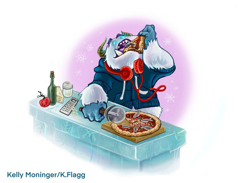
I flattened the pizza a bit, lightened the background and added snowflakes. I also added a bit mor outline and made the fur point down on his arm a bit. I think I would call it done unless there is something obvious that I’m missing. Thanks for all the help! I like this piece much better than when I started.

-
Heyhey @K-Flagg - thanks for your patience

I LOOOOVE the changes! And the little snowflakes in the background, very good choice! Nice touch.
There's very few things I would change in this piece, it would be rather nitpicky, so take it or leave it, hahaha. Typically, you're almost done when you start nitpicking, so there ya have it.
One thing I notice is that the anchovy on the mouth pizza has the white belly touching the white tooth. I know it's separated by an outline. It would be my... "vision" to see the anchovy laying differently. Maybe a "U" shape rather than an "n" shape. I understand it's an "n" shape to curve with the pizza slice. I think with a "u" shape, it'll be bent away from the tooth, eliminating the white on white readability issue, and allowing for the tail to flair out and add an interesting anchovy silhouette. Again, nitpicky. UP TO YOU.
I also notice the sweatshirt drawstrings and wish the outline on the "L" curved one were a bit... cleaner? Thinner? Less of a sweep of white and more of a drawstring? It's an optional area of improvement of course, it still reads as a draw string, so up to you.
The cheese on the cheese grater it a little hard to read against the highlight on the ice counter.
The outline on the thumb wrapped around the pizza cutter could probably be thinner/weighted since it's exposed to whatever light source is shining on the belly and underarm (and perhaps eyes? Doubtful though). It really grabs my attention because it's such a bold outline. I understand why you did it though - the hand and the ice block are very similar in hues. Perhaps adding a tinge of pink to the knuckles and fingers (where blood flow would usually make these areas warmer) would help separate the hues in lieu of the outline.
The different values and subtle hues on the under-forearm of the lifted arm is just... chef's kiss on that, really nicely done! I truly do love this piece! So much personality and clever techniques. There's really a lot here that can be praised! I think you should be proud of your work! All of my above feedback is nitpicky because the big, obvious stuff is done - you nailed it!
I look forward to seeing what you end up doing with this and how the judges react! Happy drawing Kelly!
Shani -
I love this! The only thing that stands out to me is that it doesn't necessarily emphasize the "wafting scent", and I don't know how judges will be about that, but it's a lovely illustration!