Society of Visual Storytelling

    SVSLearn Forums

    • Register
    • Login
    • Search
    • Recent
    • Tags
    • Popular
    • Users
    • Groups
    • Search

    Vignetti Yeti - looking for feedback in progress

    Contest
    17
    40
    2562
    Loading More Posts
    • Oldest to Newest
    • Newest to Oldest
    • Most Votes
    Reply
    • Reply as topic
    Log in to reply
    This topic has been deleted. Only users with topic management privileges can see it.
    • Valerie Light
      Valerie Light last edited by

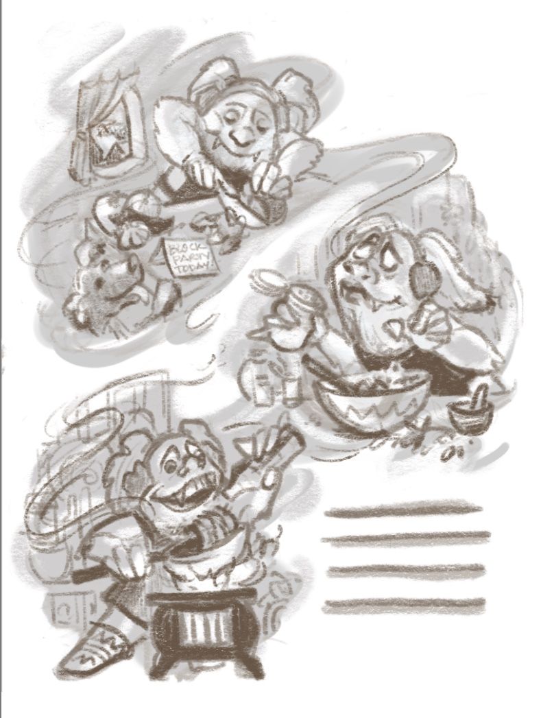
      Hello all! I'd love to hear some reactions on this rough sketch for the Yeti Cooking prompt. Is it readable? Is the yeti likeable, and can we tell that she's really enjoying herself?
      And most importantly, should I ditch this '3 moments floating in clouds of aroma' idea? The main feedback I got from Jake and Will in last night's Critique Arena is that I had way too much going on. I sort of think I can pull this together so it doesn't look crazy busy, but generally I do have a tendency to think more is more.
      2.12.21 yeti cooking rough.jpeg

      www.valerielightillustration.com
      www.instagram.com/valerie_light_illustration

      braden H 1 Reply Last reply Reply Quote 3
      • braden H
        braden H @Valerie Light last edited by

        @Valerie-Light I think if you pick one of those moments (my fav's the third one) it will read more as a spot illustration, especially if you have the yeti's silhouette breaking away from the background.

        Valerie Light 1 Reply Last reply Reply Quote 1
        • Valerie Light
          Valerie Light @braden H last edited by

          @Braden-Hallett Thanks for the advice! I'll sketch a bit on that idea.

          www.valerielightillustration.com
          www.instagram.com/valerie_light_illustration

          1 Reply Last reply Reply Quote 0
          • Niels
            Niels last edited by

            I do think you have too much going on with the three pictures. Initially I looked at the picture and thought you fleshed out three ‘rough’ versions to see which worked the best. The aroma-floating idea was lost on me (which might say more about me though).

            If I haveto pick one I’d go with the first. In all three the Yeti is clearly having fun, but I like the touch of the dog looking up and the picture of the cutting of veg evokes all kinds of smell sensations for me.

            Instagram: www.instagram.com/novanbergen/

            Valerie Light 1 Reply Last reply Reply Quote 0
            • Valerie Light
              Valerie Light @Niels last edited by

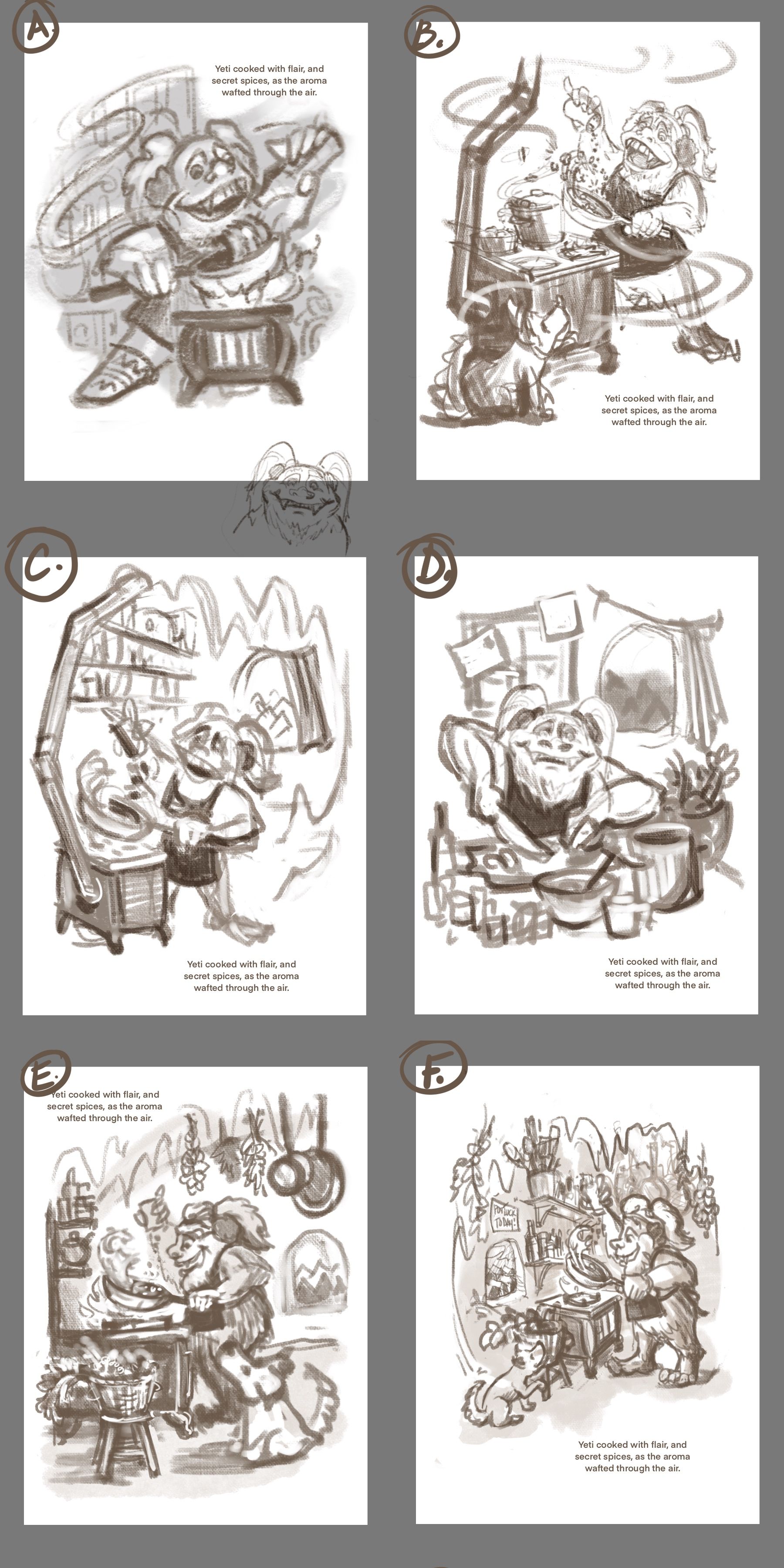
              @Niels Thanks! I took another look at trying to get all the feeling I wanted into one picture, instead of 3. I think and Braden are right that it's too much going on.

              I really want to emphasize Cooking with Flair in mine, and i feel like that wants a sense of motion and pizazz in the yeti's pose. I did 6 more thumbs to work out some of that. I have my favorite one, but I wonder what you all think?
              2.13.21_Six_Thumbs.jpg.jpeg

              www.valerielightillustration.com
              www.instagram.com/valerie_light_illustration

              lizardillo Nyrryl  Cadiz 2 Replies Last reply Reply Quote 1
              • Niels
                Niels last edited by

                B. Definitely B! The angle gives it a feeling of energy combined with the waves of scent.

                Instagram: www.instagram.com/novanbergen/

                1 Reply Last reply Reply Quote 1
                • lizardillo
                  lizardillo @Valerie Light last edited by

                  @Valerie-Light I really like B too. I like the movement it has.

                  Website: lizardillo.co.uk
                  IG: instagram.com/lizardillo

                  1 Reply Last reply Reply Quote 1
                  • Nyrryl  Cadiz
                    Nyrryl Cadiz SVS OG @Valerie Light last edited by

                    @Valerie-Light A, B, or C. I can’t decide.

                    Portfolio: nyrrylcadiz.com
                    Instagram: https://www.instagram.com/nyrryl_cadiz/
                    YouTube: https://www.youtube.com/channel/UCbJCF1Im8ZO7hpGWTKOJMuA

                    1 Reply Last reply Reply Quote 1
                    • KayPotter
                      KayPotter last edited by

                      I think B! I think part of the reason I feel it’s successful for this prompt is because it doesn’t have background information, so the edges of the illustration are really interesting with the white negative spaces coming in.
                      Either way, these are all so good 😊.

                      1 Reply Last reply Reply Quote 1
                      • shereen said
                        shereen said last edited by

                        I like B!

                        1 Reply Last reply Reply Quote 1
                        • Valerie Light
                          Valerie Light last edited by Valerie Light

                          Yay, thanks for weighing in, everyone! I am also voting for B, maybe adding in some elements from C. Thanks for the validation! Onward! 🙂

                          www.valerielightillustration.com
                          www.instagram.com/valerie_light_illustration

                          1 Reply Last reply Reply Quote 0
                          • Valerie Light
                            Valerie Light last edited by

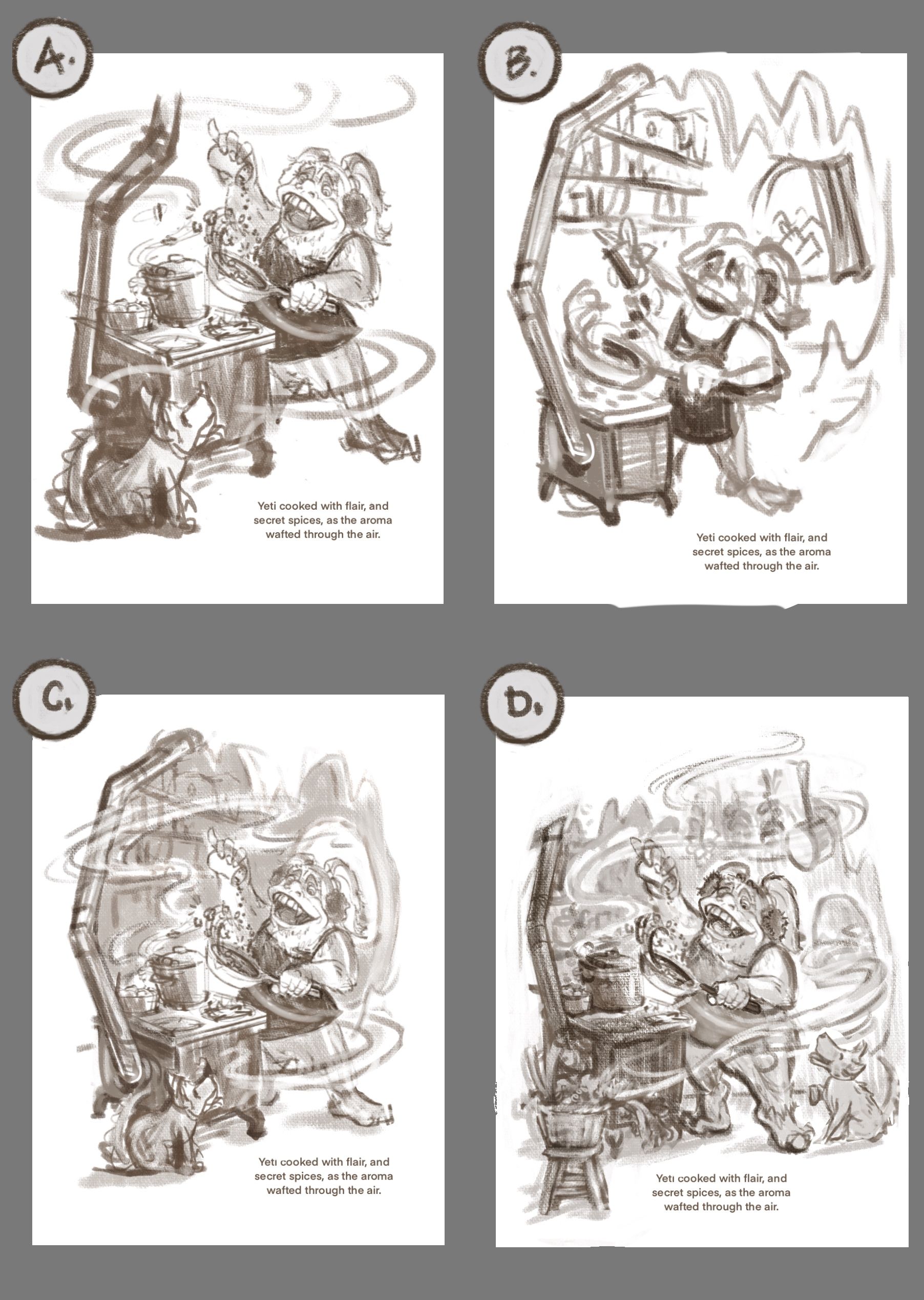
                            I'm narrowing down a composition! Here's another page of roughs. I think that A is the clearest one, but if can use value to control the focus in D, I think it would be great to show as much as I can about who the yeti is and what her world is like. What do you vote?

                            (side note: this past week or two is the first time I've used a forum like this to share advice on a WIP. I am LOVING all the constructive feedback and advice from this group. Thank you all for being so welcoming 🙂 ).
                            2.14.21_FourThumbs.jpg.jpeg

                            www.valerielightillustration.com
                            www.instagram.com/valerie_light_illustration

                            Kevin Longueil Lindsey Pittenger Nyrryl  Cadiz Jacy13 4 Replies Last reply Reply Quote 2
                            • Kevin Longueil
                              Kevin Longueil SVS OG @Valerie Light last edited by

                              @Valerie-Light I think they would all work well - I do like B the most for some reason...maybe the cleaner silhouette? - if you are going to have the puppy i think i like the position in A and B best

                              Portfolio: kevinlongueil.com
                              https://www.instagram.com/kevinlongueil/

                              1 Reply Last reply Reply Quote 1
                              • Lindsey Pittenger
                                Lindsey Pittenger @Valerie Light last edited by

                                @Valerie-Light I really like both C and D. I gravitate towards D because the puppy is so happy. I also really like the pots and herbs hanging in the background

                                1 Reply Last reply Reply Quote 1
                                • Nyrryl  Cadiz
                                  Nyrryl Cadiz SVS OG @Valerie Light last edited by

                                  @Valerie-Light my vote is on A. I love how simple and bare the background is. The Yeti’s silhouette is very clear and just pops right off the page.

                                  Portfolio: nyrrylcadiz.com
                                  Instagram: https://www.instagram.com/nyrryl_cadiz/
                                  YouTube: https://www.youtube.com/channel/UCbJCF1Im8ZO7hpGWTKOJMuA

                                  1 Reply Last reply Reply Quote 2
                                  • Jeremiahbrown
                                    Jeremiahbrown last edited by Jeremiahbrown

                                    I vote A. It feels more like a typical spot illustration and keeps the focus on the characters.

                                    Jeremiah Brown
                                    www.jeremiahbrownillustration.com
                                    https://www.instagram.com/jeremiah.brownillustration/

                                    1 Reply Last reply Reply Quote 1
                                    • KaraDaniel
                                      KaraDaniel last edited by

                                      I vote A 🙂

                                      instagram.com/sha_kara
                                      karadaniel.net

                                      1 Reply Last reply Reply Quote 1
                                      • Jacy13
                                        Jacy13 @Valerie Light last edited by

                                        @Valerie-Light I vote A as well 😃

                                        Deviantart: https://www.deviantart.com/jacy13
                                        Instagram: https://www.instagram.com/jacy13draws/?hl=en
                                        Portfolio: https://jacy13.artstation.com/

                                        1 Reply Last reply Reply Quote 1
                                        • Niels
                                          Niels last edited by

                                          I like D the most because of the different values in the picture. However I like how the chimney of the stove makes a natural border in image C. Maybe a mix of C and D would be an option? A stove-border like in C would probably mean that composition wise you’d have to ditch the stool with veg om the lower left though. The moving of the dog towards the right lower corner works quite well and makes more of a connection with the yeti this way.

                                          Instagram: www.instagram.com/novanbergen/

                                          1 Reply Last reply Reply Quote 1
                                          • KayPotter
                                            KayPotter last edited by

                                            I’m sticking with A because I think it’s the most ‘spot illustration-y’ :).

                                            1 Reply Last reply Reply Quote 1
                                            • First post
                                              Last post