I'd love some feedback on this cover design :)
-
@Braden-Hallett Great improvement with the cover! I also have some suggestions based on all the wonderful feedback you've already received.
I really like adding the other hand reaching for the skull. It seems more interactive. But if you're going for that, I'd also suggest trying to switch the legs so that you can see both the legs clearly and also the torso.I think you need a sharp font to match all the sharp lines of the supercomputer. Maybe more in the lines of the first font you used but something with more width and kerning so that it's easier to read.
Also, try playing around with the scale of "THE" and see if it looks any better?
-
@Neha-Rawat thank you for the feedback! I'll try and open up the pose. At the very least make it so that the silhouette reads better!
and that some awesome advice on the font. I had to look up what Kerning was, lol.
-
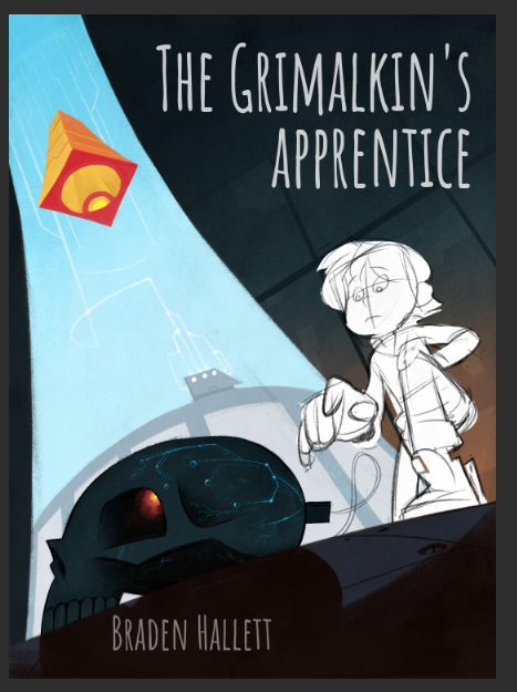
MAJOR SURGERY TIME!
I HATE making these kinds of changes once a piece is at this stage, but in this case the feedback was so good I kinda have to try
")
First step is the pose. Next step is the colour alterations. last step is the font fiddlin'.
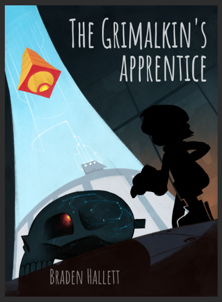
I think this pose is more open and the silhouette reads clearer at the very least. And story telling-wise reaching for the skull is so much better than lookin' at the cord!
Let me know what you think! I'll be implementing the colour suggestions next
and just the silhouette.
-
@Braden-Hallett super nice! just quick thoughts plus a draw over - was wondering how it might look if his body language and face were opposing each other...was wondering if you showed that he was pulling away...head tilted away and his body kind of braced against the direction he is reaching? A little heroic resolve in his expression? also was thinking that he would really have to be reaching across his own center line for the plug thing so he would have a bunch of twist in his torso which really adds to the pose I think - lifted the toe of the boot to show bracing and tried (and failed)to give his left hand that sort of apprehensive protective pose a hand makes whenever reaching for a skull/supercomputer ....is there any way you could make the plug glow? would make for a nice warm against cool options - just thinking out loud ...and drawing instead working
-
@Kevin-Longueil I like how he looks hesitant here!