Idea Sketch: feedback appreciated
-
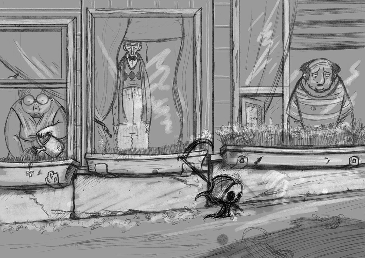
Thank you @phoenix-yip The intention was that he is walking from left to right and cutting down the flowers on the boxes under the window. That is why I positioned him on the right. The color scheme is going to be a bit gray or blue to make it feel a sad. The flowers will be yellow, so they will stand out from the ground and on the box (the ones that are still left) to draw attention to them. Trying to combine sadness with a bit of a joke (accidentally cutting down the flowers). The theme for this piece is "April is the cruelest month". I wanted to draw the reaper cute to make him less menacing since I want the piece it self to feel a bit depressing and sad. There is the element of dread, since he is death so he has come for someone. I have an idea in my head about how I would like the image to feel when you look at it. Cute, sad, funny and macabre at the same time... never tried something like this before... no idea how this will turn out
")
Illustrator & Visual Artist
https://hakepe.myportfolio.com/ -
@hakepe oh that's sick, I did not catch that he was cutting the flowers down. I like that idea though.
-
Nice idea! Really like the concept!
I'm curious about the focal point. Is it the reaper or the flowers? The people are looking down, as if they don't see the reaper, so I'm assuming it's the flowers (otherwise I know I'd sure be looking at the reaper instead
).Just taking a bit more on what @phoenix-yip said, I think I'd try to either back the reaper up slightly so that the 3rd person had not yet had his flowers cut down, and maybe that final third of the design would be a bit brighter/more colorful to really bring home what's happening (maybe hes more neutral and not as sad as the others). Or extend the scene and put the reaper after that 3rd person to bring home the point that all the flowers are gone.
-
I really love the concept and I think that the message comes across beautifully. I like the lay out and the design. I think (but this is just me) it would be nice having the character in the first window watering the flower pot, or something like that, to communicate the hope that things will be nice and beautiful again.
Sorry if this comments is not appropriate Just love the artwork!
 -
Thank you @jdubz @phoenix-yip @Simonpeterpaul for your feedback, it was really good and helpful. Since everyone seems to agree that moving the reaper a bit to the left might be a good idea, I will try that and see what it looks like. I will look into the expressions and the watering can idea. It might be fun if the last person was still happily looking at his flowers unaware that they will be cut down shortly. The people in the picture cannot see the reaper (he is invisible unless you are dead or dying). They are looking at the flowers like "hey.... where are my flowers...."
-
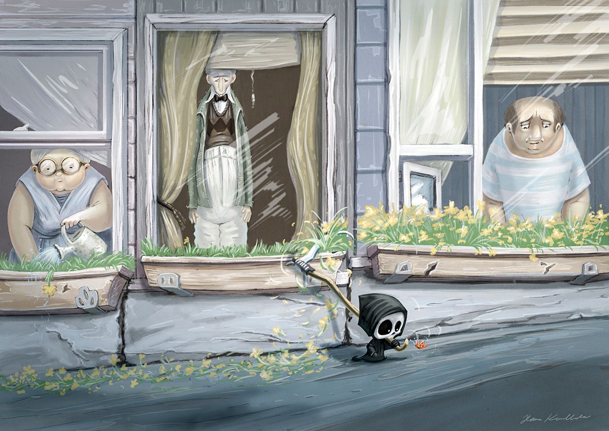
Made a few alterations to the sketch.
Illustrator & Visual Artist
https://hakepe.myportfolio.com/ -
What a super neat idea!
I love the addition of the woman with the watering can. And opening the window on the right. It makes me want the middle guy to have something too... a cat? A book? A pipe? A spilling cup of tea?
I love the size of the reaper. -
@hakepe I really love this illustration already! Such an awesome concept. The only thing I notice is that the characters in the windows all blend into the background value wise. I'm thinking that is intentional; as not to bring too much focus on them, but I thought I would put that out there just in case you wanted them to pop out slightly from the background. I love your grim reaper character!

-
@hakepe Ohh yeah I really like where that took it. I think the only thing I wish I could see more was the expression of the middle guy. I don't know if I'd sacrifice his shape though - the tapered mouth is really dynamic. Maybe its just the line weight that could be thinned out so we could see it better?
I agree with @Jacy13 - I wasn't sure if this was the final values version. Since the reaper is the only dark thing on the entire piece, I'd say if you darkened the areas behind the characters on the inside that would really pop everyone off the page and create a lot more dynamic range.
-
I would add way more drooping flowers to hit us over the head with the trail of death idea.
-
@hakepe I really love it, so so much.
-
Thank you everyone for your feedback and advice. This is what I ended up with.
-
This a great piece! I love the death design and the colors are really good.
-
Ohhh I really love that you made that little one distracting with that butterfly, something like he didn't even notice that he is cutting all the flowers, that makes his so Innocent and cute, also I love that you end up changing the position of the old woman cause the 3 in the first sketch looks like statues, really a lovely work x3
-
Thank you @K-Flagg . I am glad that adding the butterfly gave the effect that I wanted @Mari1-9Munive This character is starting to have a life of it's own in my head, I think I am going to make some more paintings with him, maybe even a story or a comic. I have a couple of ideas in mind.