Critique my recent Illustration
-
I think for me it's a little distracting that the windows are matching the character in terms of value. The brightest thing on that piece are the white windows, so it kinda pulls your eyes into the city without any payoff. You could easily lower those down by half and still easily read to the viewer that it's a city and keep your characters popping out in front.
-
Thanks for responding. What do you mean by cleaning up the lines exactly? Clean up lines to me means editing or removing construction lines so I might not get what you mean by it
-
@jdubz Oh Excellent! Thank you for that!
-
Shakey/messy lines can be taste. I see plenty of people have looser lines. If it wasn't intentional, you could clean them up more.
The thing that throws me off are the buildings, they are really poor.. Also the windows on the left have some hard lines, so the blurry in the background feel is gone. I would look up some reference and make the buildings a bit nicer, or get rid of them. They can be simple, but still need to be designed.
All my links: https://APHOTICMOTH.carrd.co/
-
@CLCanadyArts I should note, it's the purple hands up front, that the lines are lacking on. When I look closer, I see your other lines are pretty clean. So I would refine the hand lines if I were you.
")
All my links: https://APHOTICMOTH.carrd.co/
-
@CLCanadyArts I see your points. Thanks
To Thy Self be True
-
@jthomas I wasn't saying they have to be complex, or anything, just a little more designed. It's a cool piece.
All my links: https://APHOTICMOTH.carrd.co/
-
@CLCanadyArts I agree! I was intending to design the buildings better and fix the windows but didnt want to spend a lot of time while I work on other projects. Thanks for the push to not be mediocre!
To Thy Self be True
-
@jthomas Hi JThomas, I want to be more clear about my feedback. I'm sorry that I was vague at the beginning because I do have a lot of advice for you but I was worried that it might come across as harsh, but here I go.
One of the issues that I was having with your piece was:
- The final lineart looks like construction lines.
- Figure-ground issues (like with the buildings).
- The color harmony could be slightly better.
- Soft shading vs hard shading.
So #1. the one thing that stood out to me the most was the lineart. It looks like construction lines and that makes the piece look sloppy and incomplete. There are open gaps in the lineart, some lines are really squiggly that I think might be rather distracting, some of the fill color is slightly is going beyond the lineart, and I think you could really benefit if you smoothen your lines and work with lineweights better.
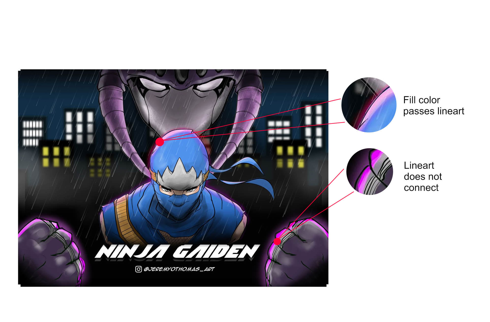
The ninja character and the fists look especially sloppy, when compared to the villain in the back, whose lineweight looks really smooth and clean, not to mention the shading too. Ma,y I ask why you put a little bit more effort in designing him versus designing the ninja?
2# the figure-ground is really weak. Just like what @jdubz the values of the ninja character in front and the windows of the towers in the back are pretty similar and it balances the picture way too much. You could improve this by changing the values so that the buildings in the back "blend-away" almost get lost but not too much (does that make sense?) as to not take away our full attention from the ninja to the background.
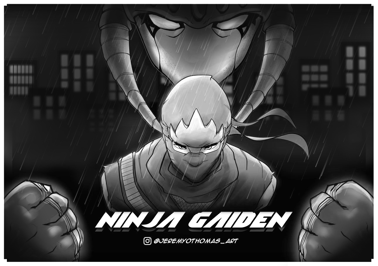
3# Regarding color harmony, I think the color scheme is just a little too... colorful? What I mean is I think there are certain colors here that are sort of displacing the harmony of this image. Like the orange and the yellow? If you could use the same type of color for both the windows and his gear, it would make the image feel a lot more cohesive.
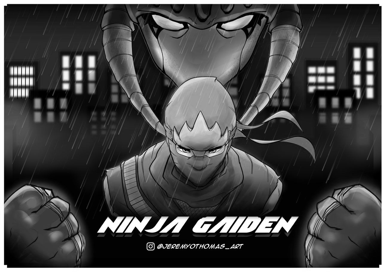
When I combine the stronger figure-ground with the more cohesive palette, you get something around the likes of this.
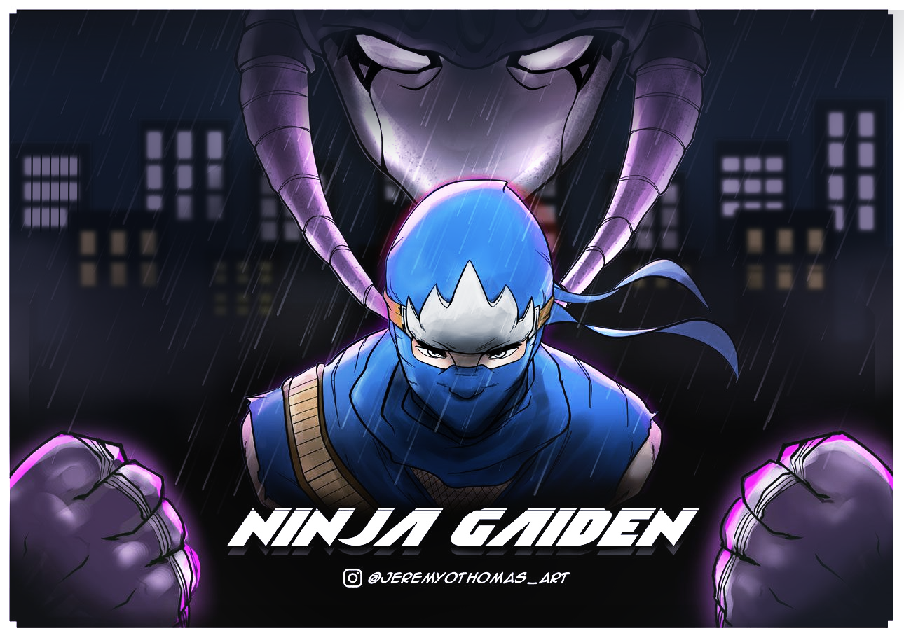
See how the ninja gaiden just sort of illuminates the scene? How the lighting makes the villain a lot more terrifying and a force not to be reckon with? I feel like this now sort of sets the mood you were going for.
My last issue was with 4# the shading. I think the shading is just way too soft and you should be going for shadows and lighting that are a lot more harder. You know what I'm talking about?
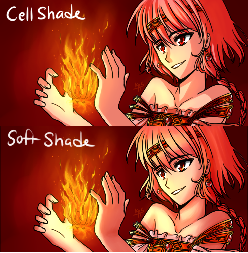
Cel or Hard shading is what the fists and the ninja need more. When I draw with lineart, I like to mix the use of hard and soft shading, which creates a natural 3D effect, if used wisely. What I like about the villain again in the original version is that he's well drawn, the shading makes the head look 3D and the lineart looks clean and smooth. It has a good balance between soft and hard shading that I am not seeing in the rest of the image.
Here's how I personally mix Cel and Soft shading.
I generally go with hard-shading for the entire image, and use soft-shading sort of sparingly. I use soft shading in addition to cel shading when I want to convey things like diffused lighting bouncing off a character, which is something you have done well in the original drawing. I also use soft shading in addition to cel shading to convey reflected light within the shading and shadows of objects or characters, because usually shadows aren't really one solid color, there's actually a subtle gradiency where shadows sort of oddly go from the darkest color to the least darkest color due to reflected light. I used a lot of soft shading on these characters to convey how shiny they are so that's another use for soft shading ^_^
I hope this critique was a lot more informed. Please follow @CLCanadyArts advice about the buildings and then integrate what I said about the figure-ground, color harmony, lineart and using soft or cel shading. Hope I helped you!
Finis Coronat Opus
Instagram: www.instagram.com/madgcartoons/
Behance: www.behance.net/madgcartoons
Website: https://michaelangelodgo.wixsite.com/madgcartoons -
@Michael-Angelo-Go Wow great breakdowns. You hit every struggle point I had with it that I could'nt articulate.
Funny because the buildings, windows and hands where points I really got lazy on and I KNEW it!The hands I did as a quick after-thought and the original drawing was the Ninja First then I mirrored the villian from side to side so thats why that looks cleaner versus the freehanded ninjas Lineart. So I get what you mean by it not looking as clean on the Ninja.
The shading was me practicing some Shading/lighting style from Dave Rapozza so thats why it looks off. My usual work has more single focused shading with one or two light sources.
Thanks for the tips on the buildings and contrasting more foreground background consistency. I tried a lot of new things for me on this one and it helps to get insights like this. Cheers!