The market
-
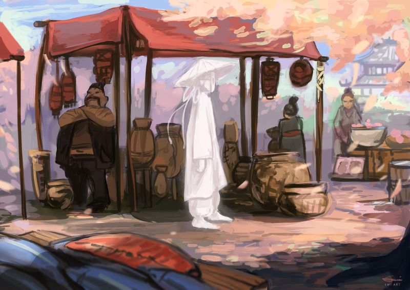
"Spirit market" - Digital illustration -
The colors used and their position on this piece are simply beautiful! The lighting is also gorgeous as the objects feel like they actually have different textures because of how you painted the highlights and shadows.
Honestly, I love mostly everything about this piece, except for the composition/placement of the ghost character. I feel like there's a story here, but the piece sort of seems static to me as the subject of focus is in the middle of the page. I'm also drawn to the character on the left of the screen instead of the ghost character, because of the dark tonal values/colors used in the left area of the image compared to about half of the ghost character's light colors/values contrasting against similar values/colors, creating a lack of value contrast for the main character.
Perhaps if the canvas orientation was portrait/vertical rather than landscape/horizontal, with the main character still in the bottom center of the image, it would create a more airy/otherworldly feel for me? Or if the spirit character was more to the left or right of the center, there would be more of a suggestion/feeling of what's ahead or what's behind/being left behind? I'm simply speculating of course, though.
Overall, it's a phenomenal piece! Keep up the good work!
-
@Jonathan-Malski
Thank you so much! I really appreciate your comment. With this piece my goal was to practice colors and light. I also think that the composition needs more work.
 -
I agree with @Jonathan-Malski about the contrast on the left side of the image drawing attention first, but I absolutely love the gentle contrast of the ghost's top half with the soft lilac/pink/blue background. If anything, the contrast at the ghost's bottom half makes the figure feel too solid to me.
The ghost does seem static when placed in the center. I wonder if the ghost were placed further to the right, so that the viewer gets that great payout of seeing the ghost after one's eyes travel over the market.
It may run contrary to the story you are telling, but I also wonder if the ghost could be more actively turned towards the viewer. Silhouettes don't draw the viewer in as much as a turned head (which may be what you're going for, as it makes the ghost seem more isolated.).
Placing the ghost figure on the right, looking and facing out of the picture plane, might make the composition feel unbalanced. But if the figure is on the left side, it may seem the ghost is interacting with the market in an un-ghostly manner.
This is such a lovely piece and makes me think about the characters. Engaging.