May contest entry WIP
-
@Asyas_illos @chrisaakins Thank you guys

@dantter Cool, I just learned a new word
")
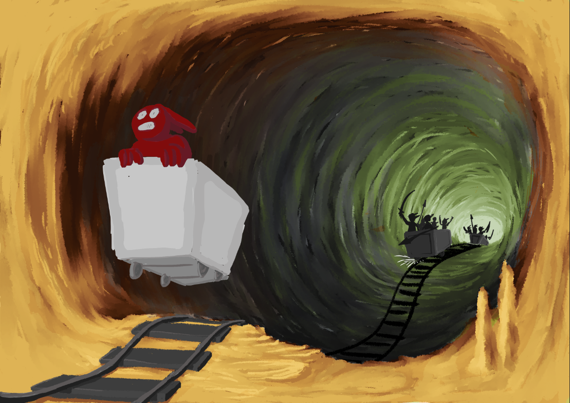
To be honest I've kept postponing the next part of this drawing a bit, since I was afraid I couldn't realize the feel of the initial sketch. The combination of lighting and texture work has been daunting since I have to capture a specific mood. Now that I've begun I think its not looking too bad. Currently I'm playing around with gradiant maps in photoshop, which allows me to map the grey-scale range to specific colors for the foreground, middle ground and background in isolation. In this example I'm testing a sort of evil looking green light for the background and a desert lighting for the foreground. I'm undecided if I like the idea that the foreground is the mouth of the cave, exposing the scene to daylight. The middle ground ties the two color schemes together with a subtle blue lighting. What do you think?
Instagram: https://www.instagram.com/mortenchristiansenart/
DeviantArt: https://www.deviantart.com/mortenchristiansen -
Nailed it!
-
@Morten-Christiansen this is wonderful
-
@Morten-Christiansen this is beautiful so far.!
-
I like this color combo but curious what other color palettes you play with too!
-
@Asyas_illos Here are a few other interesting color combinations. Option C was mostly just for fun though
 Of these I think I like A and B the best, although I still prefer the original one. Since its so easy I think I'll just alternate between them while working on the details for a bit to get a feel for each of them.
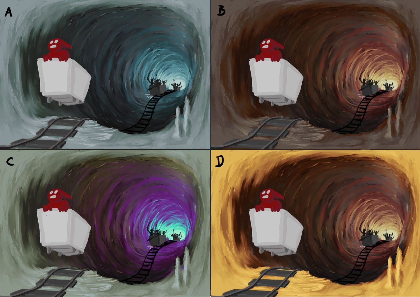
Instagram: https://www.instagram.com/mortenchristiansenart/
DeviantArt: https://www.deviantart.com/mortenchristiansen -
@Morten-Christiansen I think I like B the most, but if A is set in an ice tunnel, that would be a really exciting illustration too.
-
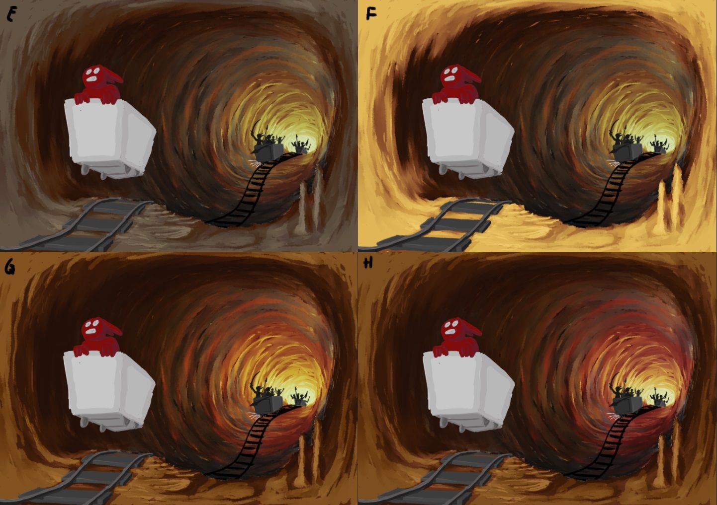
Hmm, an interesting development. By accident I turned on two different color schemes at the same time and it turns out that they combine in interesting and quite dramatic ways. Here are a some examples of how the original can be mixed with option B and D. I think it will become quite difficult to choose
Instagram: https://www.instagram.com/mortenchristiansenart/
DeviantArt: https://www.deviantart.com/mortenchristiansen -
@Morten-Christiansen oooh I like G!
-
Really interesting color combinations! Love the storytelling, too.
But for me, one thing is unclear: where is your focal point? Do you want the viewer to first see the pursuers? The foreground character? The cart?
When I squint or look from a distance, the first thing I see is the cart -- it's so light and has the most contrast. The second thing I see are the characters in the background giving chase. Even though he's red, the character being chased (your main character?) gets lost in the warm background, maybe because the values are so similar and because of the high contrast of the cart he's in.
If this isn't supporting the story you want to tell, one small change that might help with your values is to lighten the dark values right behind the character, which naturally would happen at the entrance of a cave. You could also put some rim lighting behind the character, as there would be some cast light from that strong secondary light source in the background. This might help him stand out more.
Found a reference image that might help communicate what I'm trying to say:
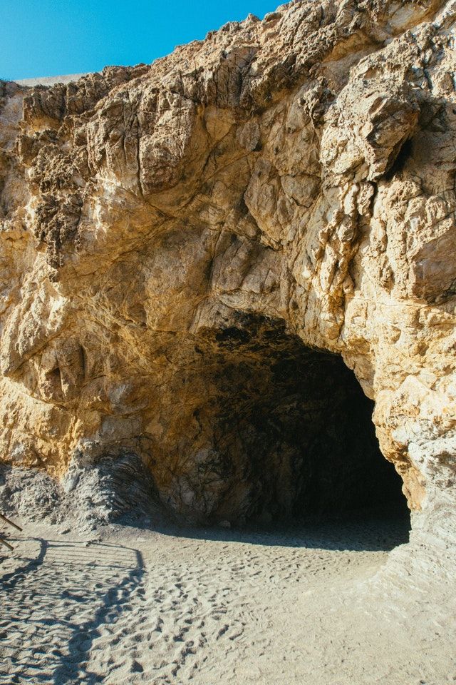
Just wanted to share what I'm seeing. Looking forward to seeing where you go with this piece! pexels-athena-3010021.jpg
-
Great color combos! I personally like G and H (although c was really fun) and I also agree with @Melissa-Bailey-0 that the character to cart contrast should maybe be switched, I realized you’re not finished maybe you are already doing this, but yes he does get a bit lost in the background.
-
@Melissa-Bailey-0 The front cart is supposed to be the main focus, with the pursuers the secondary focus. I had deliberately held the front cart in neutral colors so far because I wanted to get the background colors down first. I'm closer now to its final look, but there is still some tweaking to be done to isolate it from the background.
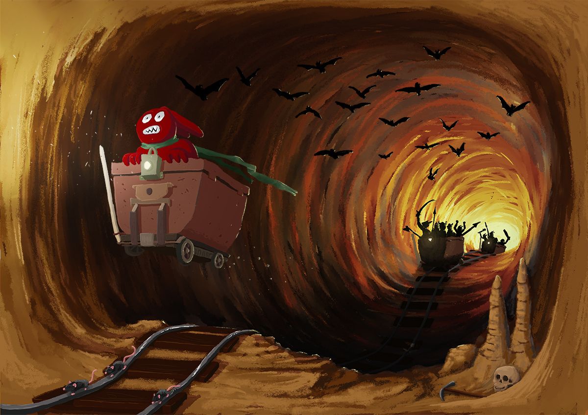
When I added the lamp to the cart it naturally drove the mood to better fit without daylight in the foreground.
-
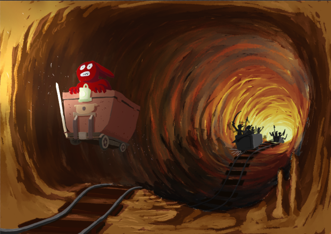
I thought the drawing was a bit empty in many places, so I added in some details. With most of them I try to reinforce the sense of forward motion. Is it too much or do you think it works well? Do the rats read as running? When I look at them closely, I kinda think they look stationary, but I'm unsure how to fix them at that small scale.
@ajillustrates @Janette You may find the design of the carts a bit familiar

Instagram: https://www.instagram.com/mortenchristiansenart/
DeviantArt: https://www.deviantart.com/mortenchristiansen -
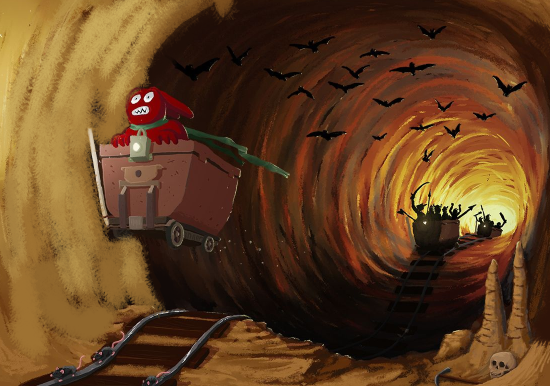
I think a little cropping could help the composition a lot. If you look at the round dark mass of the tunnel, it really reads as a centered bullseye that goes very close to the edges of the paper all the way around.
-
Another idea would be to make your character breaking through the edge of the tunnel. I think overlapping the elements this way would really separate the foreground and help it read just a tiny bit faster. I hope you don't mind me drawing over, it's just the easiest way to communicate this idea:
-
This post is deleted! -
@Janette Cool, I like him
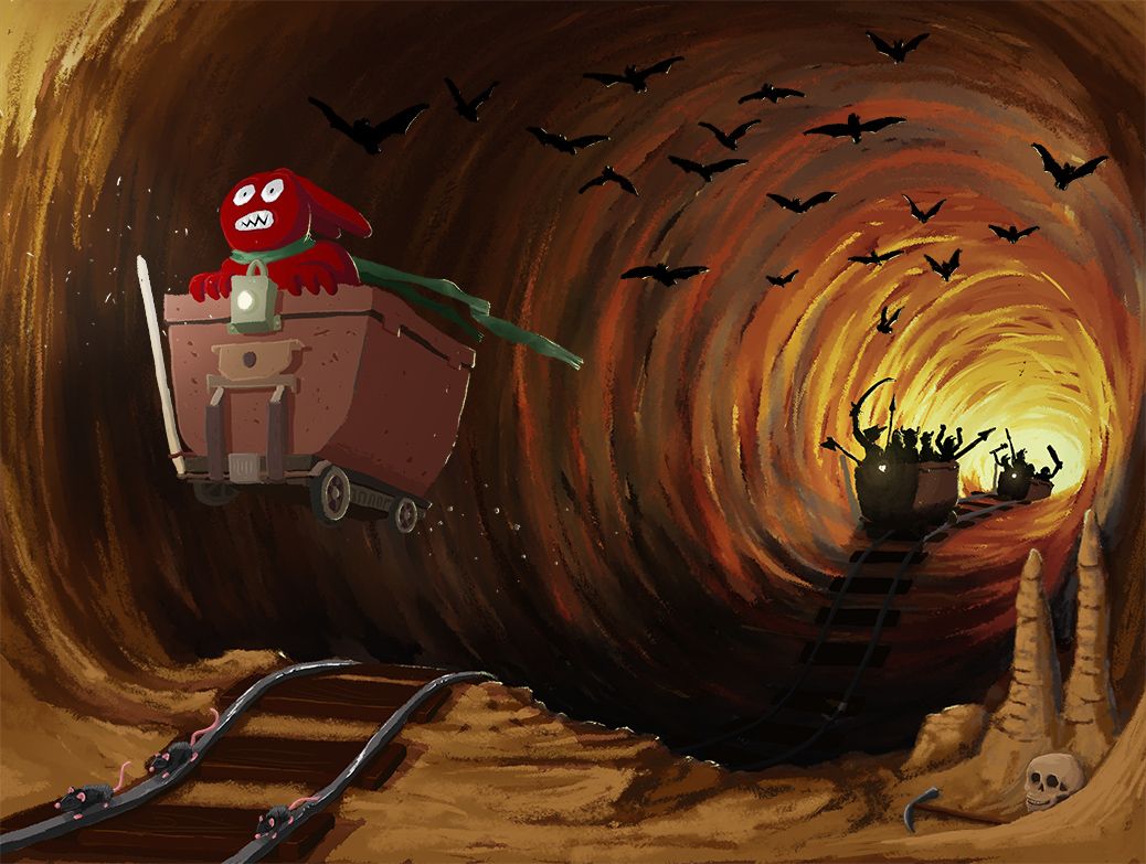
@Matthew-Oberdier I think you might be on to something. The cave is certainly too evenly round now that you bring my attention to it. I like the following cropping - it brings the viewer closer to the action which I think strengthens the tension. Thanks for the suggestion
Instagram: https://www.instagram.com/mortenchristiansenart/
DeviantArt: https://www.deviantart.com/mortenchristiansen -
@Morten-Christiansen Yeah it's looking very nice! I think maybe the background creatures might be competing a little bit with the main focal point because there's so much contrast back there. Maybe if you slightly darkened the brights in the back of the tunnel it would help us focus more on the main character. I think if you did that, and really tightened the detail on the main character, it could bring this piece to the next level.
-
@Matthew-Oberdier I actually didn't plan on doing much more with the main character - mostly due to my lack of experience with character design - but your comment prompted me to try and go for a more detailed and well defined character.
@Sabrina-Gosselin It seems that your hat suggestion might make it into the drawing after all
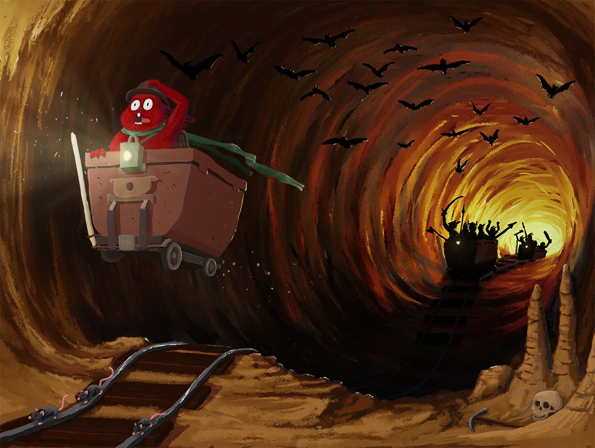
Instagram: https://www.instagram.com/mortenchristiansenart/
DeviantArt: https://www.deviantart.com/mortenchristiansen -
@Morten-Christiansen haha that's awesome! I really like him with the hat
