Beach scene feedback please
-
@Asyas_illos yes, the image has more depth, and your seagulls are so cute! (The reason they got blurry is because of how Procreate works. You can move elements around but once you change their size in any way, they get blurry. When I'm working in Procreate, I either make all the changes to the composition at the rough sketch phase, which doesn't matter if it gets blurry cuz it's going to be drawn over anyway, or export it as a PSD and make changes to more finished elements in Photoshop, which allows you to resize without losing clarity, then if there's still more work to do I export it back to Procreate and keep working. LONG explanation! Anyway, that's the way I get around the blurriness issue.)

Adjusting the water did help, but it's still drawing the eye more than it should. It feels like it's trying to be a character but it's a background element. It's the only cool blue in your composition--all your other blues are warm blues. Even though aqua is your favorite color, does it belong in this particular illustration?
Water reflects the colors of whatever's around it -- your lovely sky is so soft, almost periwinkle and the water would reflect that in real life. Here are some examples:
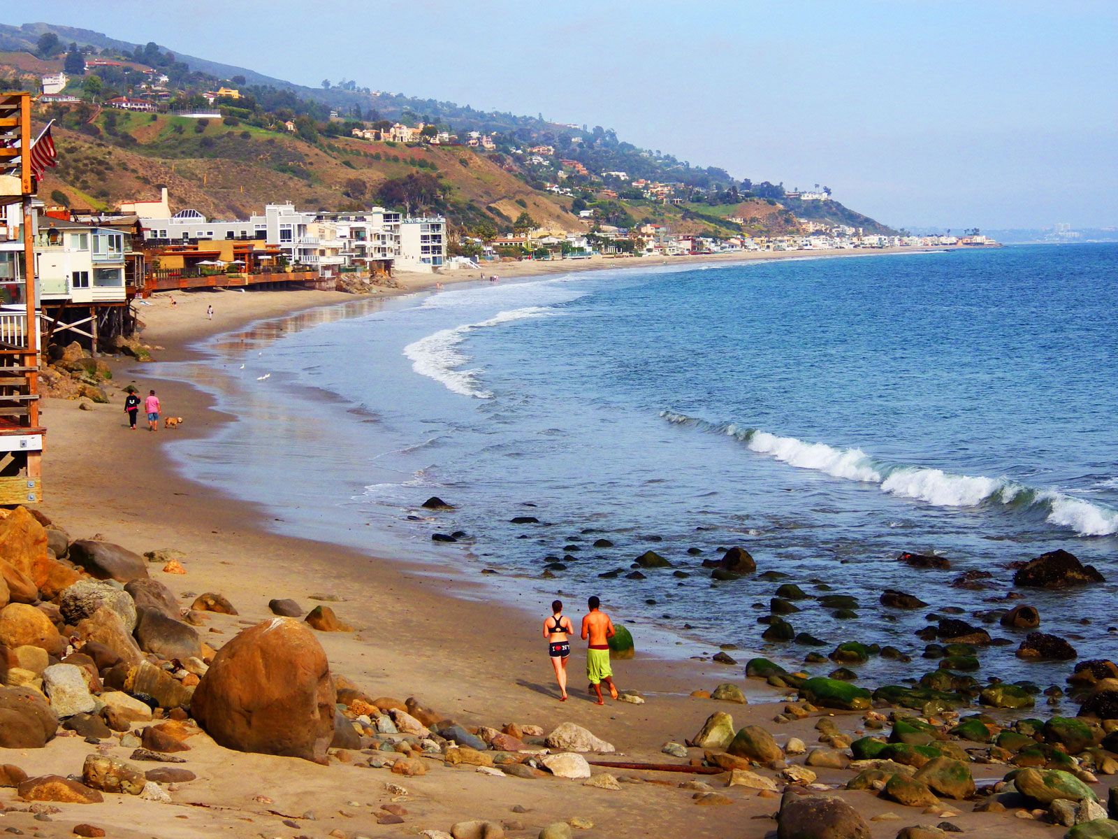 Example 1
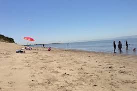 Example 2
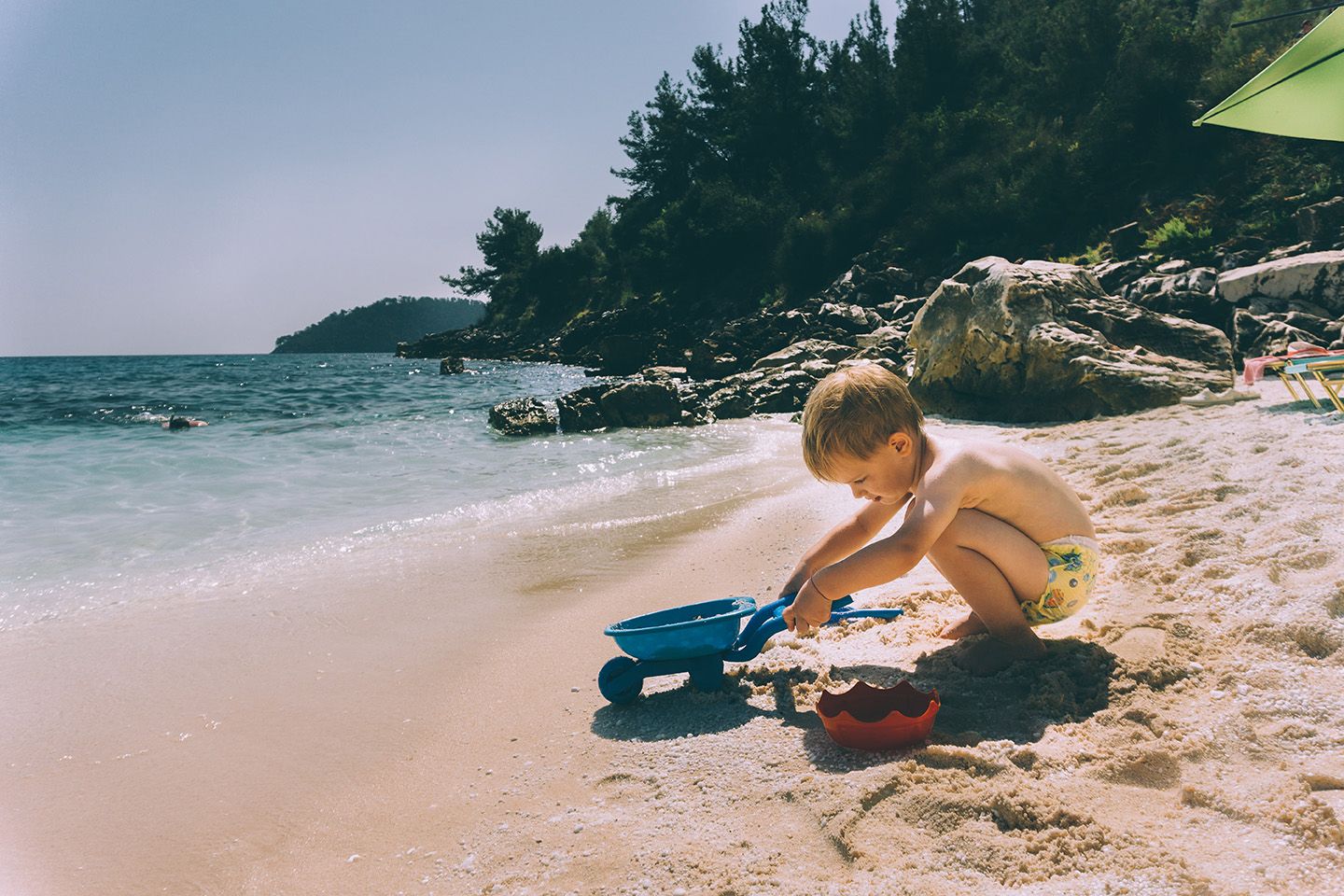 Example 3
Why not try coloring the water again on a separate layer? That way it's easy to delete if you don't like the change.
Really loving this piece, Asya! Love how you rendered the sand with all those painterly strokes and subtle hues. And there's definitely some Beekle inspiration in the clouds, which are great! Looking forward to seeing it all done.