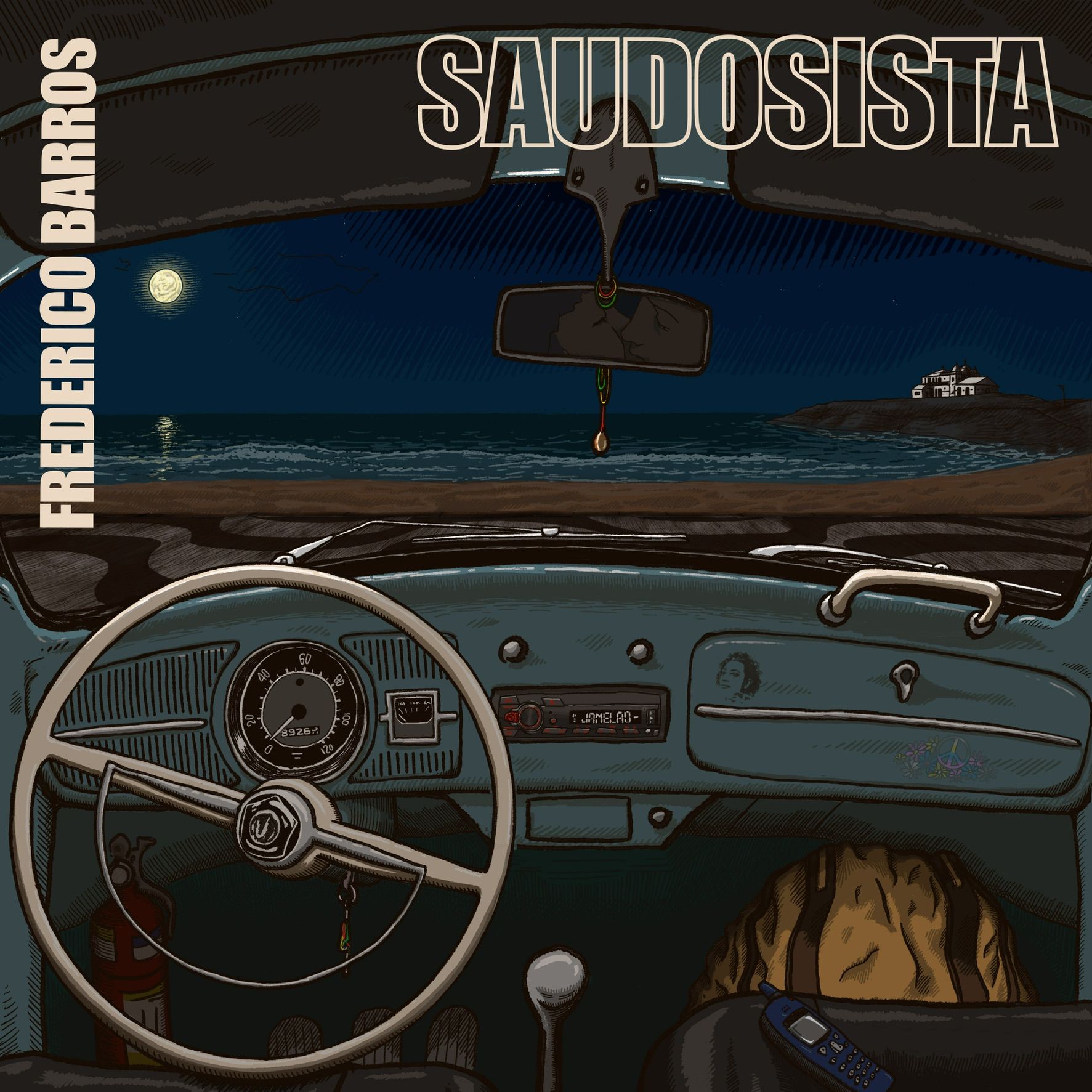
Need some feedback/help solving style problems
-
@fmb I think this is a great improvement! it indicates what time of day it is and sets a mood with the "story" still very clearly centered on the inside of the vehicle. I would still like to see just a few little stars to break up that solid dark sky and a tiny bit of moon reflection....nothing distracting or too contrasty. Nice work.
-
@Larue thank you! I’m still on the fence about making it dark like you see in this last image, or portraying a daybreak. In the latter case I am also going through the trouble of figuring out how to do this consistently with the overall style (which brings us back to the initial question, I guess…). I’m learning a lot in this process, but I’m starting to feel it’s starting to take too long…
-
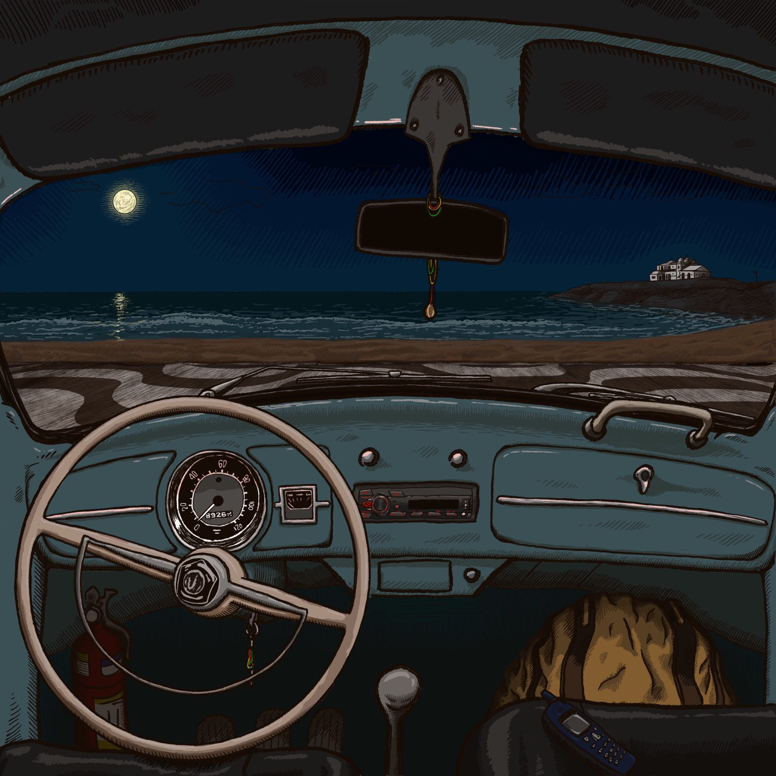
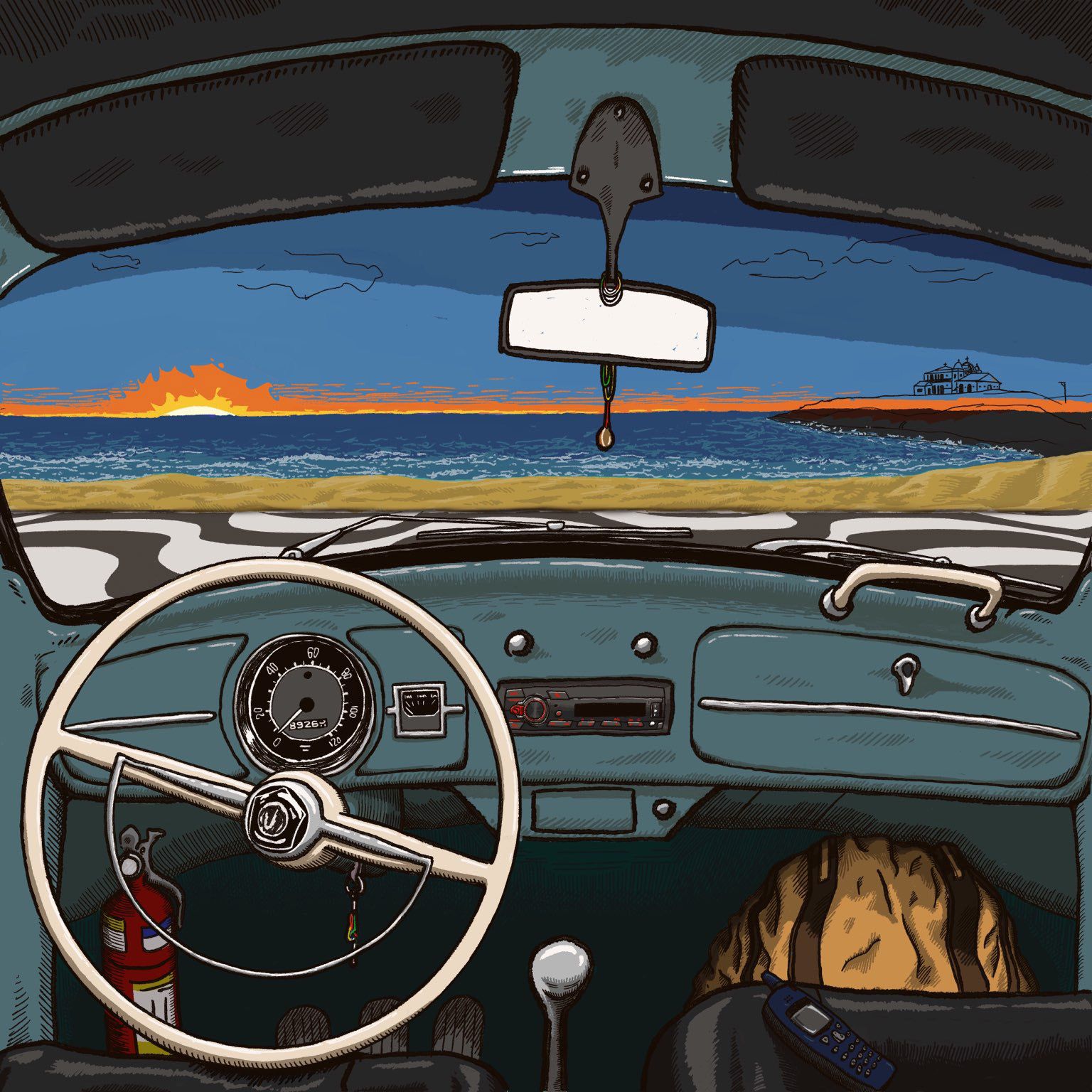
Here are the two unfinished options I have now:
-
@fmb oh wow! Both are so nice. Guess it all depends on what feeling you want the album art to convey -- each gives off slightly different vibes.
One other thing to consider: this is for an album cover, correct? So is there going to be any text or typography on the cover? Where is it going to go and have you left adequate room for it?
Nice work with the lighting and achieving that consistent style throughout that you were aiming for!
-
I like the first of the two options best. The fire extinguisher draws the eye in the second one - maybe you need to tone that down a bit? It is in the footwell so a darker shade would work and then it wouldn't stand out so much.
-
@Melissa-Bailey-0 Indeed, they are different vibes. I currently am thinking that the darker one solved the problems I'm facing a bit better, but I sort of prefer the lighter version because it's less cold in terms of colors. That said, I'm leaning towards the darker one precisely because I know how to deal with its problems.
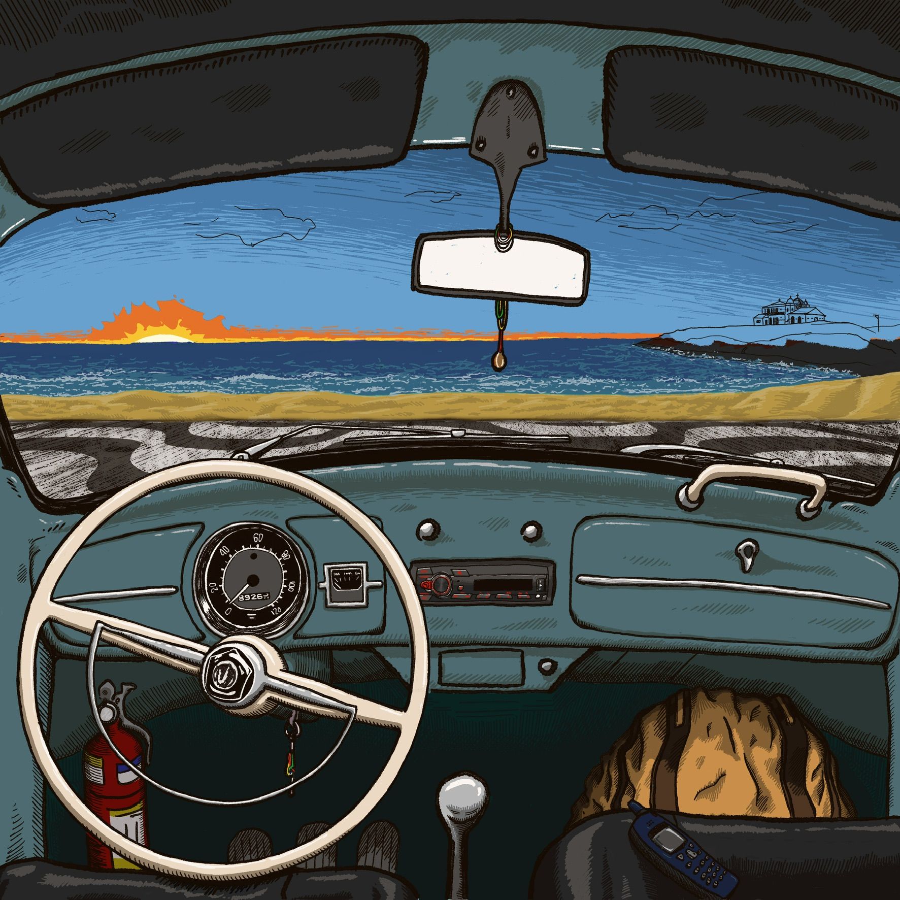
I really wish I found out how to solve the ones for the lighter version. I did two new now, one employing stippling, the other lines, and the stippling looks slightly better, but at the same time all my stippling images look like they'er somewhat dirty or something like this. The sun is indeed looking like an explosion. As a matter of fact, I'm not entirely convinced of either one and I'm starting to get tired of working on this image--luckly I won't have a client or an art director yelling at me, since I am also the client
 )
)Yes, the letters were an afterthought to me--I have zero experience doing these things. I tried putting them on the top, over the shaders (is this how they're called in English? Should I call them sun-breakers? I don't know, but it's the top on the image. In the days of Spotify and similar things, I guess the letters have to be a bit larger so that one can see them from the small screen of a phone, but I'm now considering the top left corner with part of the name turned 90 degrees to go at the y axis and the rest plain horizontal on top. I really don't know and I am totally open to suggestions.
Thank you for your comments!
Thank you for your vote on the first on and for your other remarks as well, @geekinm. Yes, I toned the fire extinguisher down.
-
Here they are:
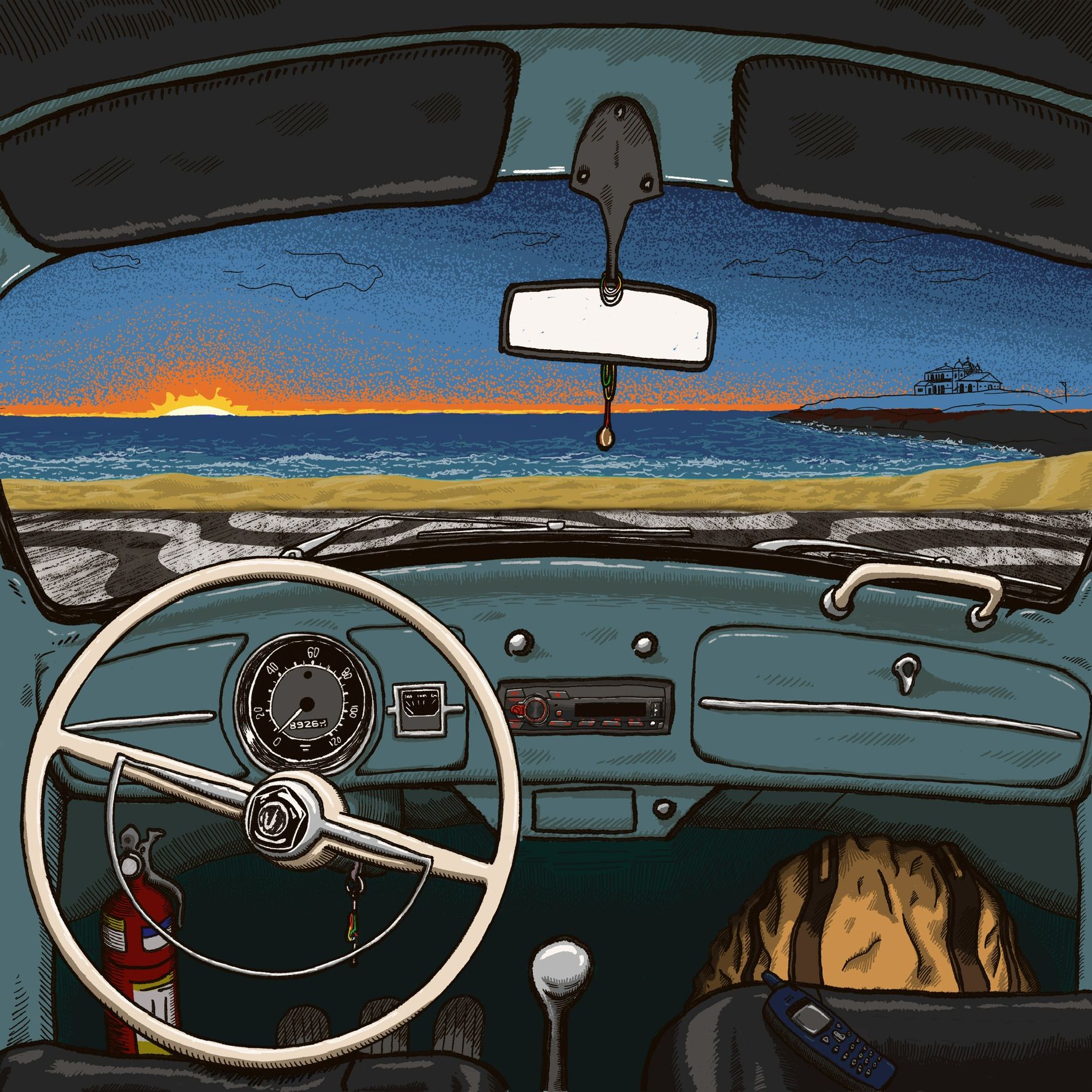
-
@fmb I'm really liking the night one, great work on the white caps. Keeps my eye on the car not the sky that is secondary.
-
@fmb thanks for the explanation. I agree that the stippling version is better. However, that hot orange is drawing the eye. Is it meant to be the focal point? Perhaps not having much going on in the sky is the way to go, giving the eye a chance to rest and not bounce around quite so much.
And remember: there is also going to be text, which is a huge design element, will compete for attention, and/or cover up things in the illustration that you might have poured time, sweat, and tears into. It would be a shame to have spent so much time agonizing over something that might get covered over with text.
Just sharing a tip that I've found helpful in designing covers: the client should provide the text at the outset and it should be integrated into the design at the sketch/thumbnailing stage. This has saved me so much hassle and frustration. Text is such a huge piece of the puzzle, and trying to design a cover without it is like trying to complete a puzzle with a bunch of missing pieces.
Hope I'm not stepping on toes and hope you find this helpful.
 ️
️ -
@Melissa-Bailey-0, you didn’t step on any toes at all. Your advice has been great and I’ll definitely heed it next time. Thank you!
Well, since you all helped me so much, I figured I should post here the final version. I still can change it if any of you have any suggestions, though.
Thank you everybody for all the comments, suggestions and, in a sense, lessons, I should say!
