Society of Visual Storytelling

    SVSLearn Forums

    • Register
    • Login
    • Search
    • Recent
    • Tags
    • Popular
    • Users
    • Groups
    • Search

    Digital Sketching Series WIP

    Artwork
    22
    38
    1909
    Loading More Posts
    • Oldest to Newest
    • Newest to Oldest
    • Most Votes
    Reply
    • Reply as topic
    Log in to reply
    This topic has been deleted. Only users with topic management privileges can see it.
    • Meekipink
      Meekipink last edited by

      Ok, wow this is GORGEOUS! The cross-hatching is absolutely doing it for me, your values are clear (but could probably be pushed even more to separate the background from the foreground), and your character design is {chef's kiss} spot on!

      Haha, I didn't notice it at first, but I agree with the people pointing out that the boy sitting on top of the (presumably warmish) stove over an open HOT oven probably isn't the best idea for an illustration that could appear in a children's book. Assuming that the oven was just used, that is. The light-haired boy would be wearing oven mitts if it was, so... I guess it wasn't. But then... why is it open...? Gah! SO many questions!!

      instagram.com/meekipink

      1 Reply Last reply Reply Quote 1
      • Gary Wilkinson
        Gary Wilkinson last edited by

        Thank you for all the comments. I can see what you mean about sitting on the stove. However this story is about a boy who said he baked a cake but actually didn't. He made a mess on the floor in preparation to make it, but then bought one. The 2 other characters arrived later and figure out what he did. I can still understand about the bad implication of saying to kids it's ok to sit on a stove so i'll think about what to do with that.

        Also good point about adding a bit more contrast, that should be an easy fix and i'll see how I get push those values a bit more.

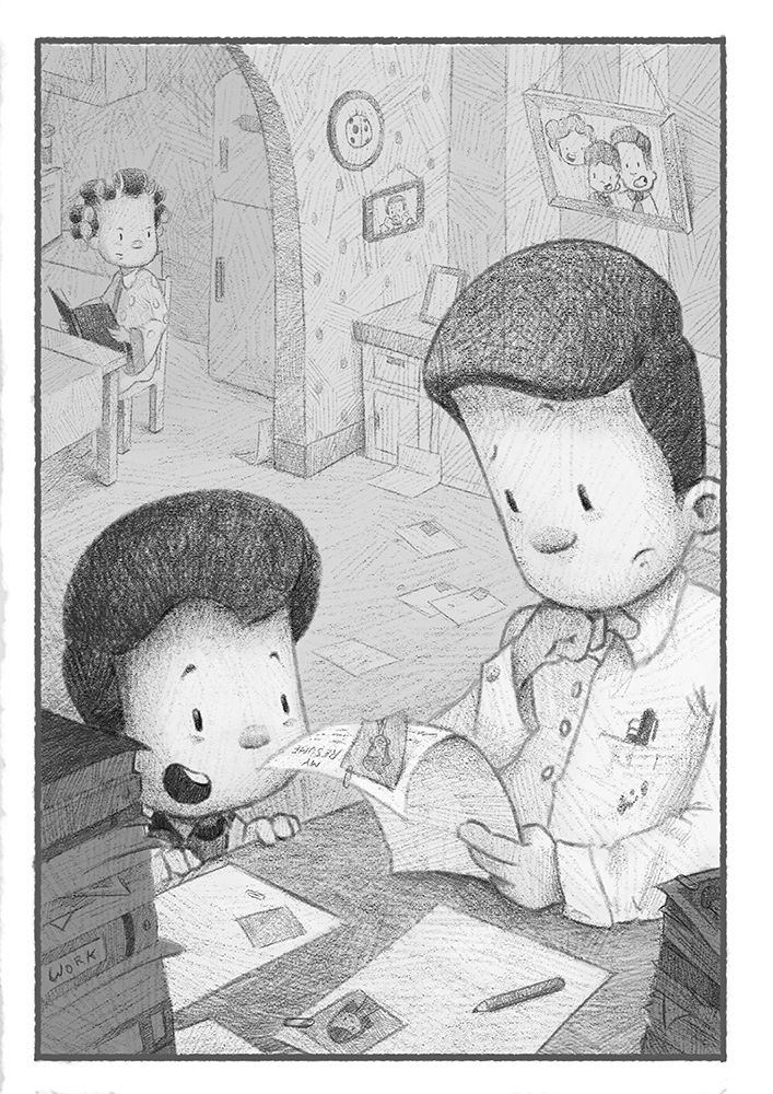
        The next picture in the series is about the boy's dad who is looking at hiring a new person for his store, but is unsure about who to hire. I feel it's almost there but might need a little more work on it before it's fully done.

        5 jobsm.jpg

        www.garywilkinsonart.com
        www.instagram.com/gwillustration/
        www.twitter.com/GWillustration

        1 Reply Last reply Reply Quote 1
        • Gary Wilkinson
          Gary Wilkinson last edited by

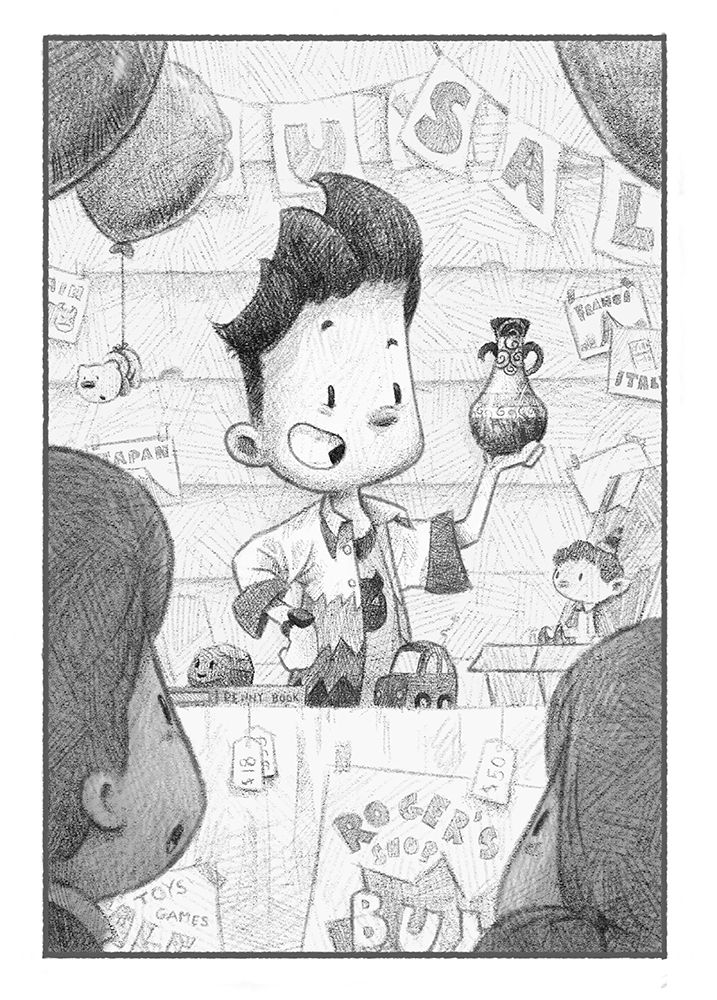
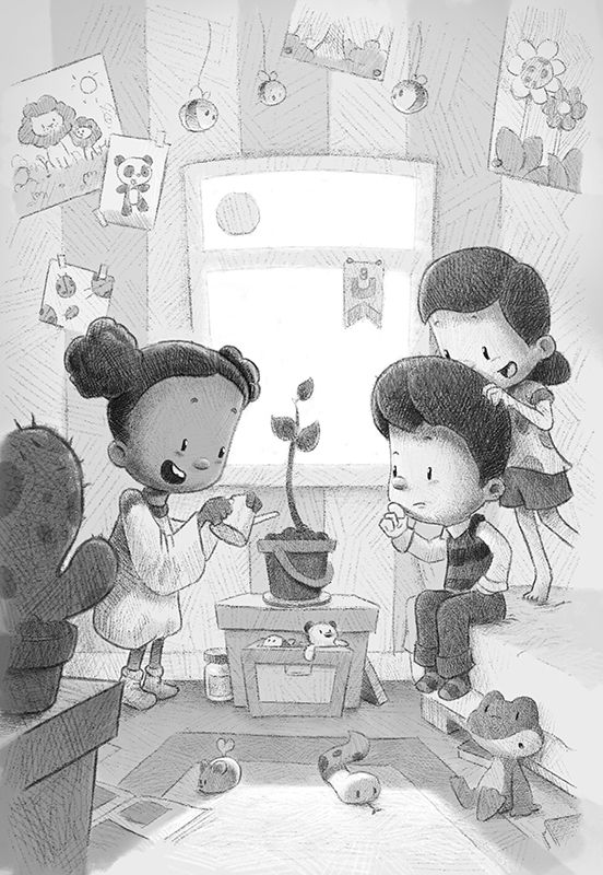
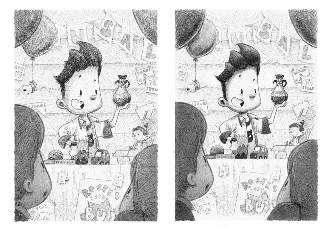
          This story is about a boy who is having a garage sale and boasting about an old artifact he found in Brazil. He's quite a showoff and is the "bad boy" of this and another story.

          4 artifact sm.jpg

          www.garywilkinsonart.com
          www.instagram.com/gwillustration/
          www.twitter.com/GWillustration

          1 Reply Last reply Reply Quote 2
          • Kori Jensen
            Kori Jensen last edited by

            I can't express how amazing your work is. Keep up the good work sir! There are so many elements to these drawings that I wish I could incorporate into my drawings. The first one is my favourite of all of them. I love the pencil cross hatching and how it works into showing your values. your environments are also amazing.

            https://daddydudeler.wixsite.com/portfolio

            Gary Wilkinson 1 Reply Last reply Reply Quote 2
            • Gary Wilkinson
              Gary Wilkinson @Kori Jensen last edited by

              @Kori-Jensen Thank you I really appreciate it πŸ˜ƒ The baking one is also still my favorite one too!

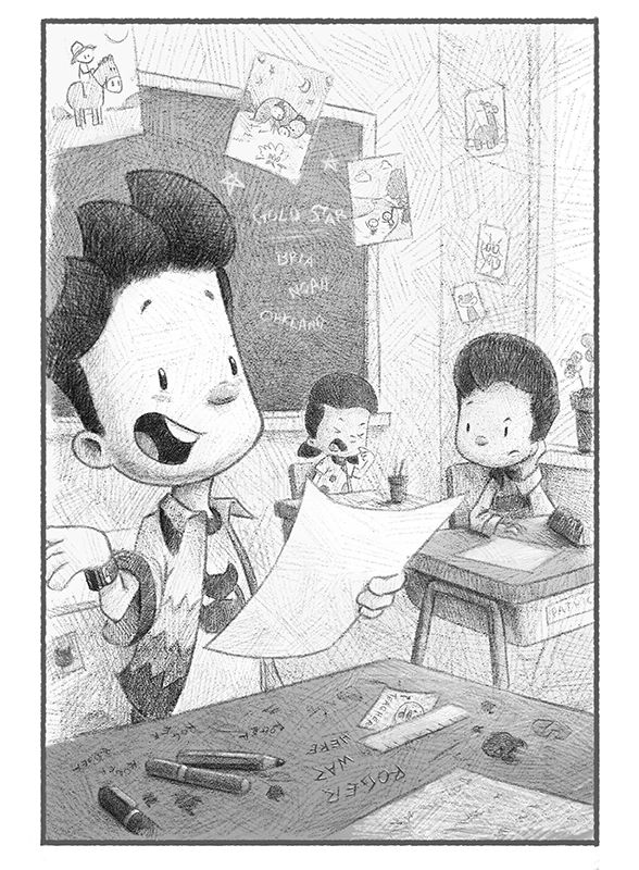
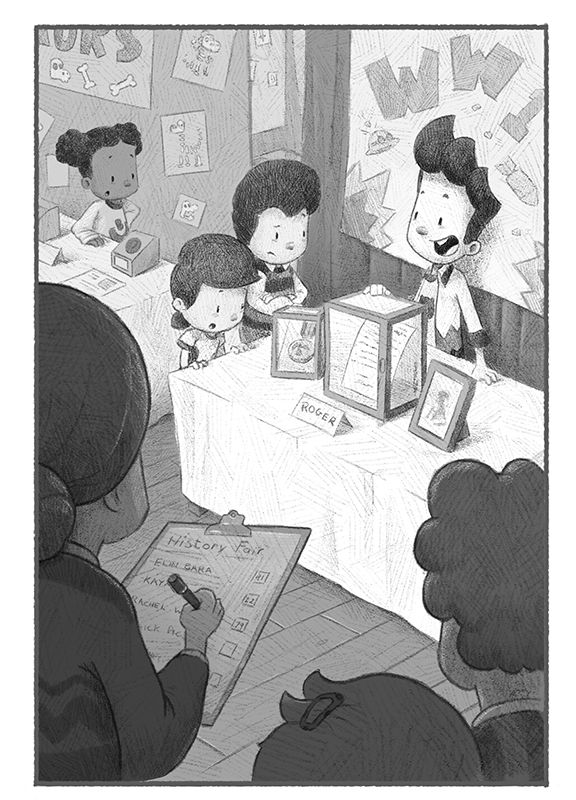
              This next one was a fun one to do. This story focuses around the previous "bad boy" telling a story to the class that he made it, but tries to come off as a hero. Had fun adding a few hidden easter eggs in this one.

              6 classroom.jpg

              www.garywilkinsonart.com
              www.instagram.com/gwillustration/
              www.twitter.com/GWillustration

              Kori Jensen 2 Replies Last reply Reply Quote 4
              • Kori Jensen
                Kori Jensen @Gary Wilkinson last edited by

                @Gary-Wilkinson is this traditional or digital?. I mean it does not matter much to be honest. It's still stunning. Easter eggs from your previous work? That is amazing I just love the detail. I can't wait to get this good my friend lol.

                https://daddydudeler.wixsite.com/portfolio

                Gary Wilkinson 1 Reply Last reply Reply Quote 1
                • Kori Jensen
                  Kori Jensen @Gary Wilkinson last edited by

                  @Gary-Wilkinson I wish I could pick your brain sir. You are so much the type of artist I want to be. If you don't mind me being too forward. It's just that your work makes me happy πŸ™‚

                  https://daddydudeler.wixsite.com/portfolio

                  1 Reply Last reply Reply Quote 1
                  • Larue
                    Larue last edited by

                    I think they are all very good. So much detail but no doubt where you should be looking. Stuff my favorite memeories my looking at books as a child was. I always loved to look all over the page to find all the other goodies the artist put in the back ground. Keep up the good work, it's obvious you love what you do:)

                    1 Reply Last reply Reply Quote 1
                    • Gary Wilkinson
                      Gary Wilkinson @Kori Jensen last edited by Gary Wilkinson

                      @Kori-Jensen thank you! It's all digital. I usually sketch out some thumbnails traditionally but move to the digital side later. Will has some great bids about digital sketching. I made my own brush to get the effect that suited me and although I'm still trying to improve it's been a fun process.

                      I'll be posting up some step by step shots of how I do each one later, so hopefully you might find that useful.

                      www.garywilkinsonart.com
                      www.instagram.com/gwillustration/
                      www.twitter.com/GWillustration

                      Kori Jensen 1 Reply Last reply Reply Quote 1
                      • Kori Jensen
                        Kori Jensen @Gary Wilkinson last edited by

                        @Gary-Wilkinson seriously? That would be awesome I'd love to see it my friend! You made your own pencil brush? Wow that must have been very specific the brush you had in mind. Either way the result is amazing.

                        https://daddydudeler.wixsite.com/portfolio

                        1 Reply Last reply Reply Quote 0
                        • chrisaakins
                          chrisaakins last edited by

                          @Gary-Wilkinson I don't know how you would do this in Photoshop but in Procreate I use the smudge tool a little bit when I use my graphite brush and I want it to look like traditional. This is because no matter how much you are careful with pencil you always end up smudging it a little bit and if you want it to look really like pencil that little detail helps a whole lot in convincing the viewer that you did it all traditionally.

                          Chris Akins
                          www.chrisakinsart.com
                          www.instagram.com/chrisakinsart/

                          NicolaSchofield 1 Reply Last reply Reply Quote 2
                          • NicolaSchofield
                            NicolaSchofield @chrisaakins last edited by

                            @chrisaakins this is so true! Even when I know a drawing is digital, if it has pencil smudges my brain won't quite accept it πŸ˜„

                            Nicola Schofield

                            Twitter: twitter.com/NSchofieldArt
                            Instagram: instagram.com/NicolaSchofieldArt/

                            1 Reply Last reply Reply Quote 1
                            • Gary Wilkinson
                              Gary Wilkinson last edited by

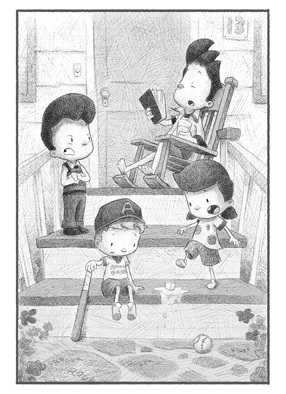
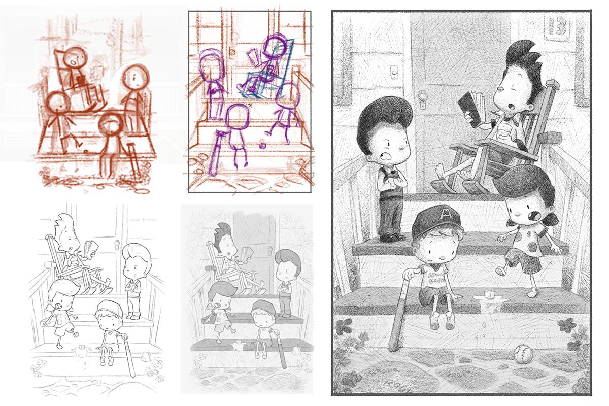
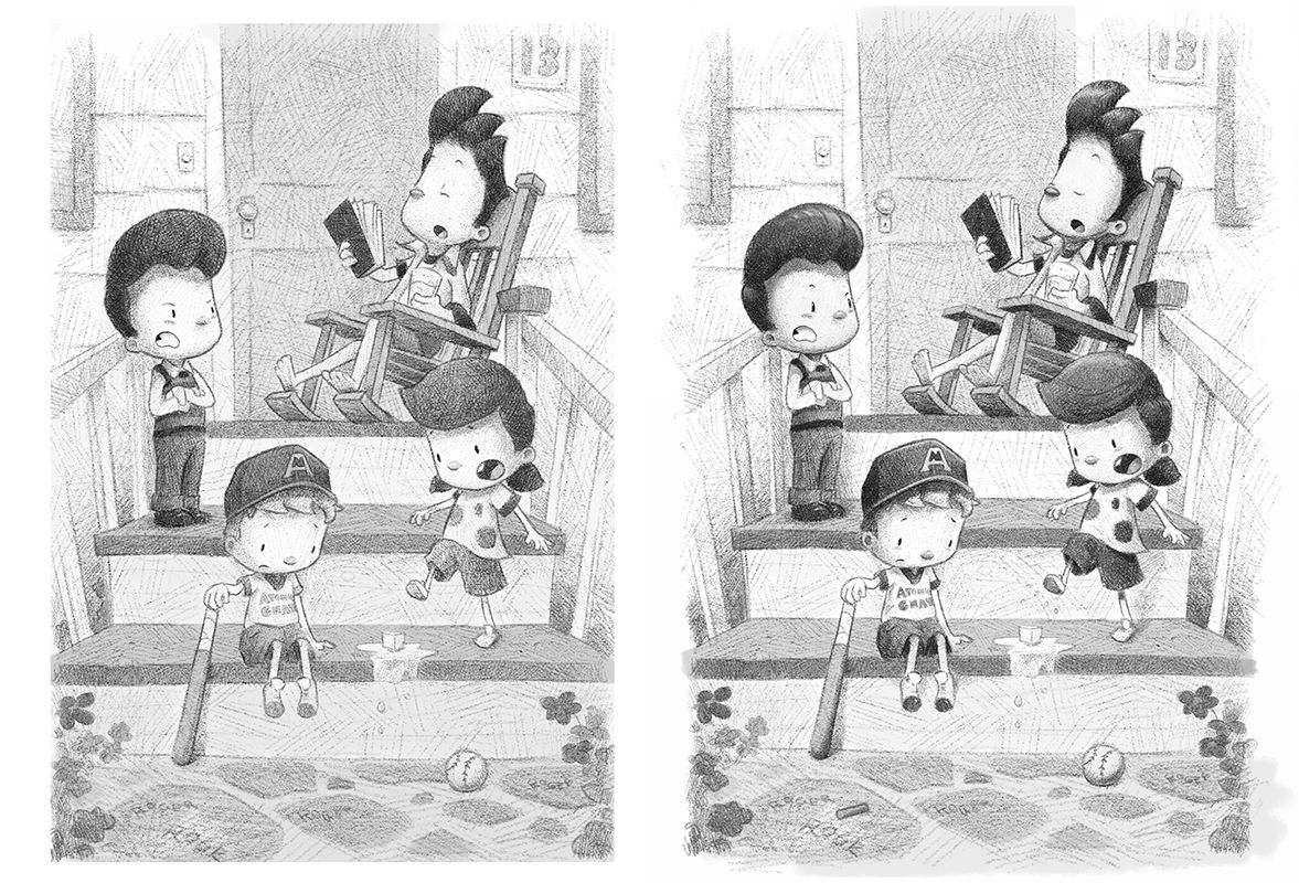
                              This one was a bit more tricky to get it done at it needed 4 characters in a small space (on the porch). I wanted the composition to look nice so it seem like a good idea to put them all on different steps.

                              I've added a quick step by step of my process for how it was done. The most important step was to get the sketch right and from that I would put some flat shades down before cross hatching with the brush. Another important step was to choose where to place the focus through composition and value, to bring the viewers eye to the character in the chair.

                              6 baseball sm.jpg

                              Untitled-1.jpg

                              www.garywilkinsonart.com
                              www.instagram.com/gwillustration/
                              www.twitter.com/GWillustration

                              1 Reply Last reply Reply Quote 5
                              • Gary Wilkinson
                                Gary Wilkinson last edited by

                                Had to do this picture twice as I was unhappy with how it first turn out. Took a while, but much happier with it now

                                RD OAK 6 sm.jpg

                                www.garywilkinsonart.com
                                www.instagram.com/gwillustration/
                                www.twitter.com/GWillustration

                                1 Reply Last reply Reply Quote 1
                                • Gary Wilkinson
                                  Gary Wilkinson last edited by

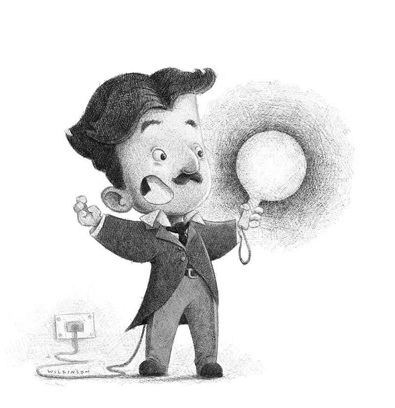
                                  Not part of this series, but to save making a new topic I'll add it here. Wanted to try mix up caricaturing with this pencil style. Went into more detail with the crosshatching, though Ithink it can work well both ways. Might be hard to guess but this is Nikola Tesla done for facebook contest

                                  tesla 4sm.jpg

                                  www.garywilkinsonart.com
                                  www.instagram.com/gwillustration/
                                  www.twitter.com/GWillustration

                                  1 Reply Last reply Reply Quote 3
                                  • Gary Wilkinson
                                    Gary Wilkinson last edited by

                                    Back to the series. Took a while to find a composition I was happy with as I needed to fit in a bunch of characters in a portrait frame as well as showing the 3 items on the table clearly enough.

                                    9 history fair sm.jpg

                                    www.garywilkinsonart.com
                                    www.instagram.com/gwillustration/
                                    www.twitter.com/GWillustration

                                    Melissa_Bailey 1 Reply Last reply Reply Quote 3
                                    • Melissa_Bailey
                                      Melissa_Bailey @Gary Wilkinson last edited by

                                      @Gary-Wilkinson nice composition! You did a great job solving the problem of multiple characters in a vertical format. The overhead POV works.

                                      illustrator - author - smiley person
                                      mbaileyart.com
                                      instagram.com/mbaileyart/

                                      1 Reply Last reply Reply Quote 0
                                      • Gary Wilkinson
                                        Gary Wilkinson last edited by

                                        After practicing more of my digital sketching skills and after taking a second look at theses sketches I'm started to add more detail and refine/ push the contrast in them, especially in the areas that stand out.

                                        I hope this heads the image overall. What do you think of the adjustments?

                                        7 artifact update.jpg

                                        6 baseballsm.jpg

                                        www.garywilkinsonart.com
                                        www.instagram.com/gwillustration/
                                        www.twitter.com/GWillustration

                                        Melissa_Bailey Iain Davidson Matthew Oberdier 3 Replies Last reply Reply Quote 2
                                        • Melissa_Bailey
                                          Melissa_Bailey @Gary Wilkinson last edited by

                                          Love your work, Gary! The pencil style is really working -- looks traditional and love the loose scribbles/hatching.

                                          Pushing the contrast really makes these illustrations read better, especially the one where the girl is directly in front of the rocking chair. The values are so similar there that adding some highlights and shadow helps differentiate the two.

                                          illustrator - author - smiley person
                                          mbaileyart.com
                                          instagram.com/mbaileyart/

                                          1 Reply Last reply Reply Quote 1
                                          • Iain Davidson
                                            Iain Davidson @Gary Wilkinson last edited by

                                            Thanks for sharing these @Gary-Wilkinson it’s really great watching the series progress, and it’s stunning work.

                                            I agree with @Melissa-Bailey-0 that the contrast boost helps. Looking forward to the next one!

                                            Born again artist/illustrator.
                                            IG: http://instagram.com/iain.draws
                                            IG: http://instagram.com/iain.designs

                                            1 Reply Last reply Reply Quote 2
                                            • First post
                                              Last post