HELP NEEDED CHOOSING BEST PORTFOLIO LAYOUT
-
Hi everyone! How’s everybody doing?
So i’ve been revamping my portfolio. I’m stuck between 2 layouts. Please help me decide which is best. Please vote which layout u like and why. Thank you. ️️️
️️️Here’s a link to my portfolio https://nyrrylcadiz.com/home
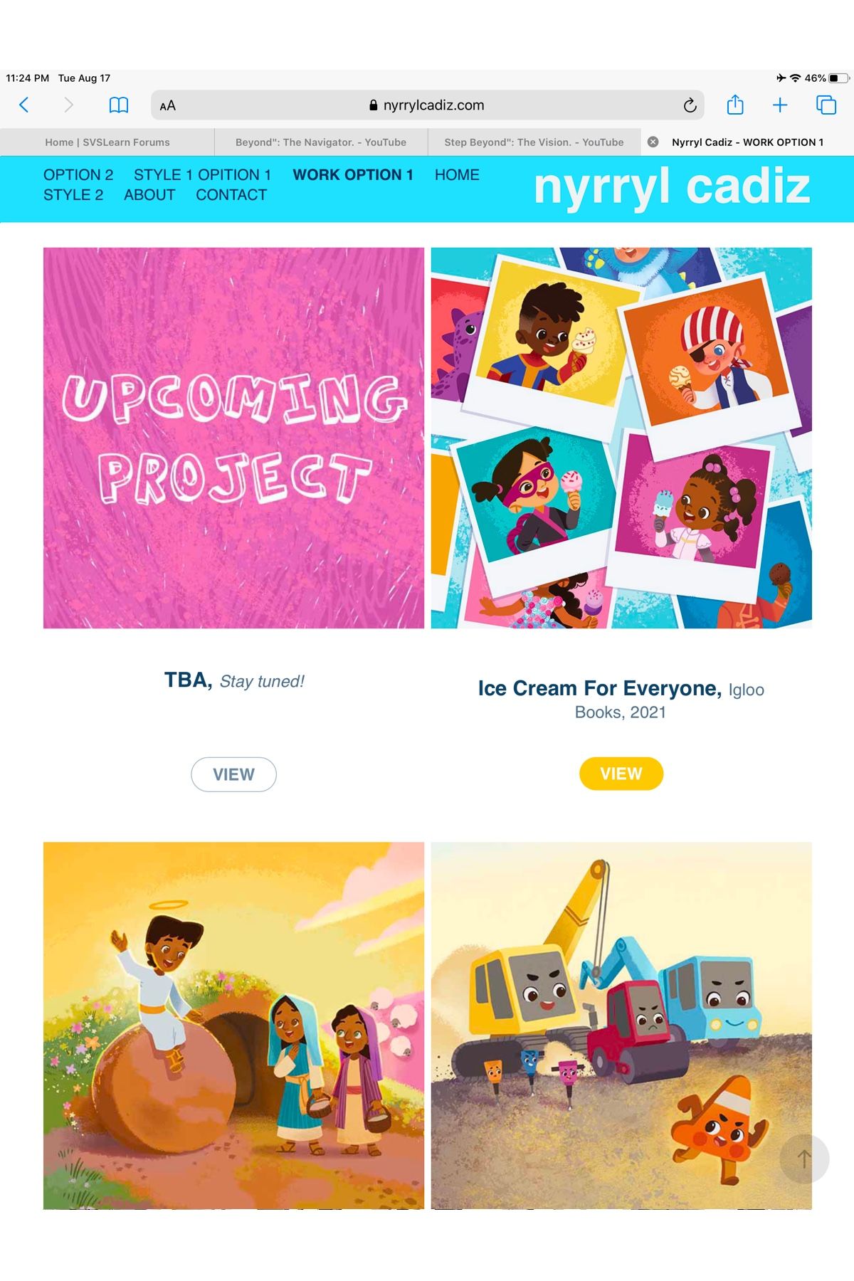
NOTE: All the ‘VIEW’ buttons are not working. I’m still building my site. It will be functional soon.
————
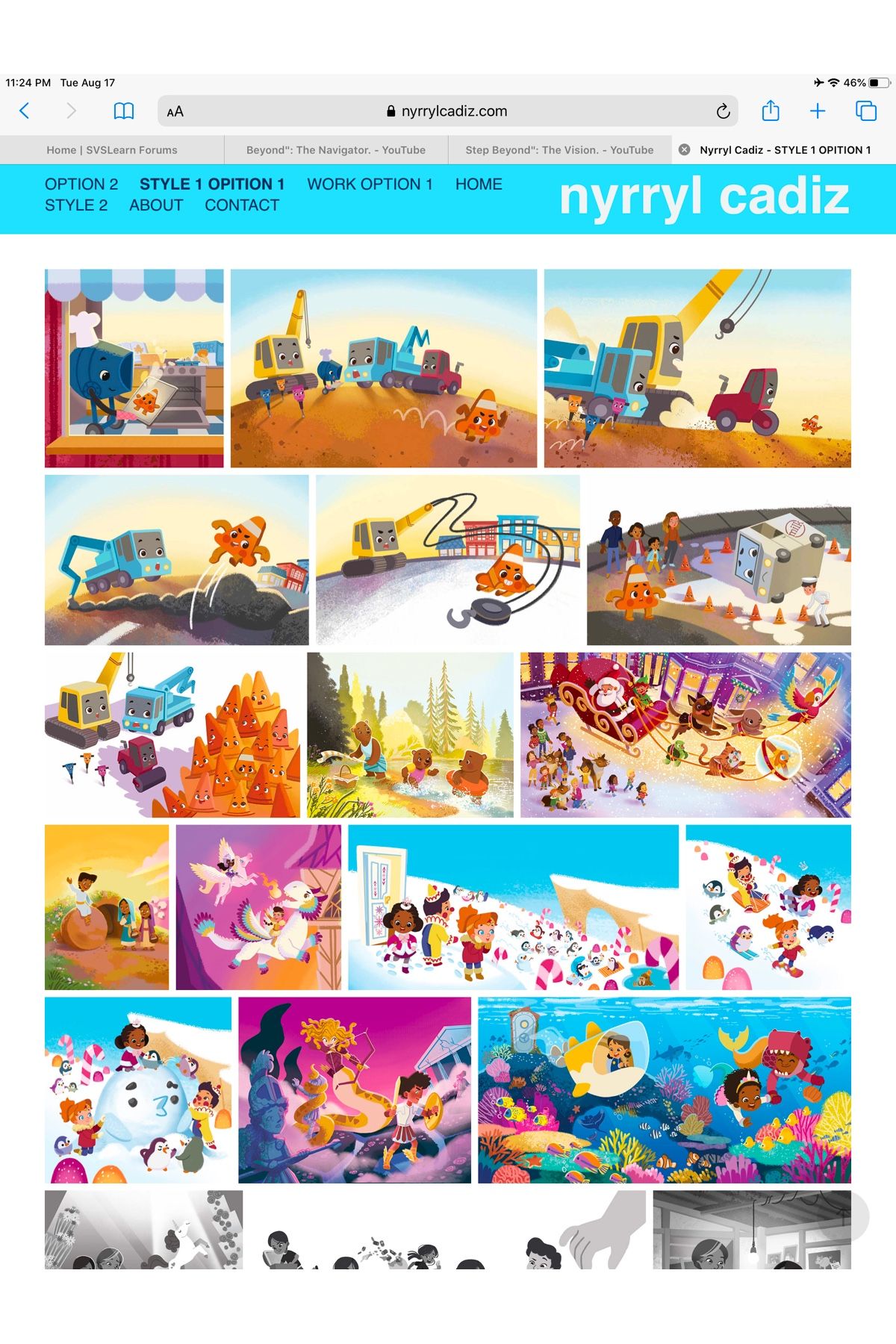
Option 1
Pros
- You can see all my pieces at once.
- Uninterrupted viewing
.
Cons
- It has to have a separate ‘WORK’ tab to show which pieces belong to which project. And which project is paid.
- Redundant
.
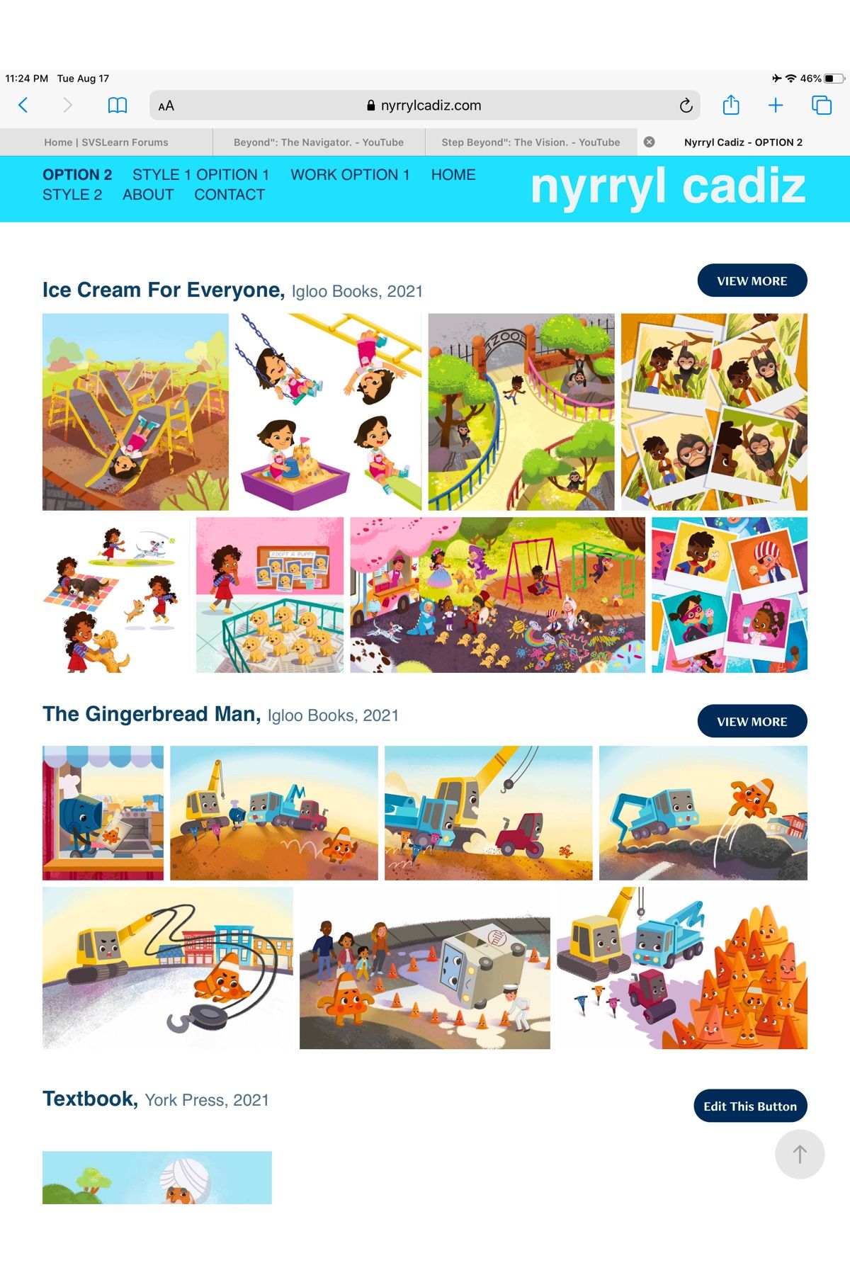
———-Option 2
Pros
- all my art works are on 1 page
- no more separate ‘Work’ page
- images already grouped into respective projects
- organized, efficient
.
Cons
- Interrupted viewing
- projects with only 1 image look empty and lonely
- unconventional
.
Portfolio: nyrrylcadiz.com
Instagram: https://www.instagram.com/nyrryl_cadiz/
YouTube: https://www.youtube.com/channel/UCbJCF1Im8ZO7hpGWTKOJMuA -
I like Option 1. I can dive right into your work and see/scroll through it all.
I also believe that's how agents and such prefer it. During SCBWI (web) conferences that I attend, they always talk about the home page just being a wall of art they can just look through.
For those that want to go into more depth about each project, they can then go your Work or Projects or Books page. But I think most will prefer the ability to just dive right into your portfolio.
I would add that you might have the option to add Lightbox caption to the illustrations on Option 1 where you can add the name of the project as well as who it was for and when.
So as they scroll through the Ice Cream for Everyone pictures in Option 1, you caption the pictures with the Ice Cream for Everyone, Igloo Books, 2021 you have in Option 2.
-
@Nyrryl-Cadiz I'm personally a big fan of layout 1. Layout 2 creates a lot of clicking in and out, and I find that people give up after 2-3 projects. You can include different pages from the same project in your gallery and projects page. For instance, page 1-2 in your gallery, page 3-4 in your projects page. Also, you can remove text in your gallery and keep it in your projects page. This way, the pages still offer something different!
-
My vote is for option 1, too.
Why? It's easy to navigate and we get to see who you are as an illustrator right away without extra clicks.
Will the thumbnails in the gallery be able to be enlarged? If so, that allows the viewer to choose which image they want to look more closely at. That would be something busy art directors would appreciate.
-
@Nyrryl-Cadiz I prefer Option 2 because for me, Option 1 is a bit too cluttered and overwhelming. Option 2 is more organized and put together. It does take more clicking, but I think overall, it's a better look. Great job on your website!
Ambria (Bri) :D
-
Option 2 , really impressive to see your work grouped into books.
-
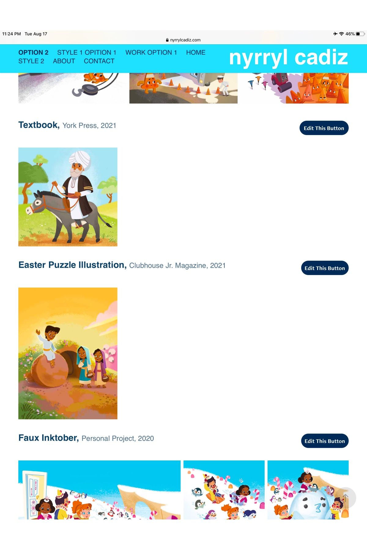
I like option 2, and for each project, if there are illustrations that look a bit like each other in appearance, such as the second the third image of the Gingerbread Man project, maybe you only need to show one of them. Having three-five images for each project would be a good number.
-
@Nyrryl-Cadiz I'd pick Option 1.
As a client, my priority would like to see the variety and quality of work. Not how many paid/unpaid projects you've completed. If I like your work, I wouldn't mind clicking on the "Work" tab to check who you've worked with.
But in option 1, your first 7 images are all of the same project. Maybe just pick best 2 for each project so that the content doesn't seem repetitive on the home page and shuffle them up. Even with this gallery view, the viewer would probably just see the top 6 images and then have to scroll down. Pick these top images wisely to show your work. Good luck! -
Hi @Nyrryl-Cadiz, I’m in the Option 1 camp!
Make it easier for the busy art director.
-
@Neha-Rawat oh great point Neha! It makes the portfolio feel less rounded as well seeing so many similar images right at the top
-
@Kevin-Treaccar @NessIllustration @Melissa-Bailey-0 @ambria @Matthew-Oberdier @idid @Neha-Rawat @Jeremy-Ross @Jeremy-Ross @carlianne Thank you so much for the input everyone. You've sold me with Option 1. It's an oldie but definitely a goodie. Again, thank you!
Here's my portfolio https://nyrrylcadiz.com/
it's not finished. there's still a lot of this to arrange and buttons to link. Maybe it will be ready by next week.
-
@idid @Neha-Rawat @carlianne Oh no, my current gallery is no where final or intentional. the only reason the Gingerbread illustrations are on top is because I uploaded them first completely by chance.
 I prefer showing my strongest piece first (which is my mermaid and other personal work imo). The gingerbread pieces will probably be placed in the center as filler. Tho I agree that limiting the number of illustrations per project will lessen the redundancy. I'll keep that in mind. Thank you!
Portfolio: nyrrylcadiz.com
Instagram: https://www.instagram.com/nyrryl_cadiz/
YouTube: https://www.youtube.com/channel/UCbJCF1Im8ZO7hpGWTKOJMuA -
@Nyrryl-Cadiz I am also a fan of option 1 . The first layout where you get a quick view of all of your beautiful would be more impactful to art directors I think.
K.Flagg
-
@K-Flagg @christaelrod thank you!
-
@ambria personally I agree, #2 feels more clean. If you could change option 1 up a bit, bigger pictures, more spacing, and maybe having project title separations as you scroll down you could convince me.
another option. what if your second and third pictures for option 2 were the home page. I think it would be the best solution. you show a lot of your work from the start, but it is still clearly organized, and interested people could learn more about the projects they like without having to scroll through everything... good luck
")
-
I'm late to the party. I like version 1 as well. I agree with the statement to choose the best pieces from a project and only show those in the initial page since you have a projects page where the rest could be seen.
-
hello, everyone! so I've finalized my website.
Here's the link https://nyrrylcadiz.com/home
@R-Fey-Realme @burvantill Thank you so much for the input guys!!!!
Portfolio: nyrrylcadiz.com
Instagram: https://www.instagram.com/nyrryl_cadiz/
YouTube: https://www.youtube.com/channel/UCbJCF1Im8ZO7hpGWTKOJMuA -
@Nyrryl-Cadiz Not sure if it's just me, but the art styles don't seem that different. If you were going to break it up I would do "comics" and "illustration" at most, but I don't know that you have to
Check out my art and tutorials :)
Instagram: www.instagram.com/carliannecreates/
Youtube:
https://youtube.com/c/CarlianneCreatesShop: www.carliannecreates.com
-
@carlianne @Nyrryl-Cadiz I agree.
-
@carlianne oh i totally agree.
 the only difference between Style 1 and 2 is the outline in my opinion. But in my experience, ADs are so specific that they can drop you in the running if you don’t have the specific look they’re going for. I want to get into MG so I need to mimic that mainstream look a bit which means adding linework despite practically drawing the same still.
I had a potential Publisher client before who showed me one of my old pieces with outlines. I didn’t know that they wanted the drawing style but not necessarily the line work. I should’ve asked more questions but I just went with the piece they showed me. I gave them a sample with line work and needless to say, I did not get the job.
If I had separated the 2 styles then they could’ve easily said “We want the Style 1” or “We want style 2.” We could’ve avoided a huge misunderstanding. I don’t want to repeat that again.
Portfolio: nyrrylcadiz.com
Instagram: https://www.instagram.com/nyrryl_cadiz/
YouTube: https://www.youtube.com/channel/UCbJCF1Im8ZO7hpGWTKOJMuA