September Critique Arena — Feedback on Rough Sketch Requested
-
@Katherine she's great, I love her slippers so much!

Nicola Schofield
Twitter: twitter.com/NSchofieldArt
Instagram: instagram.com/NicolaSchofieldArt/ -
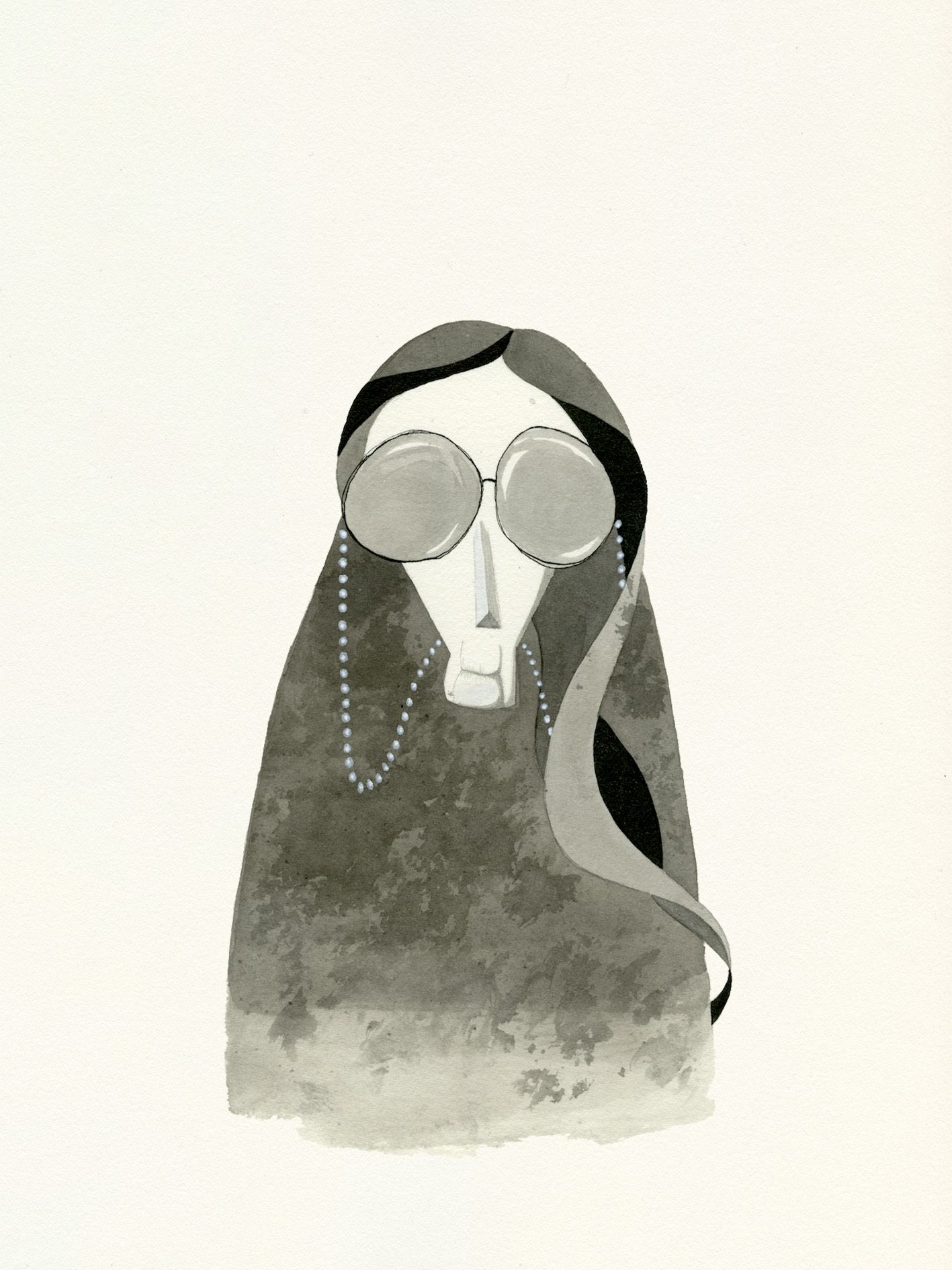
Great silhouette! My one suggestion would be the “Must be ink or look like ink” not really reading that on this character. Can’t wait to see more!

-
@Katherine I see you incorporated some moth wing texture at the tips of the cloak, but I think you can dial it up 120%. Instead of flat black, how would the character look if their attire is entirely moth inspired patterns? Could her bunny slippers look a bit more DIY?... And a bit morbid? But maybe that's not your thing

-
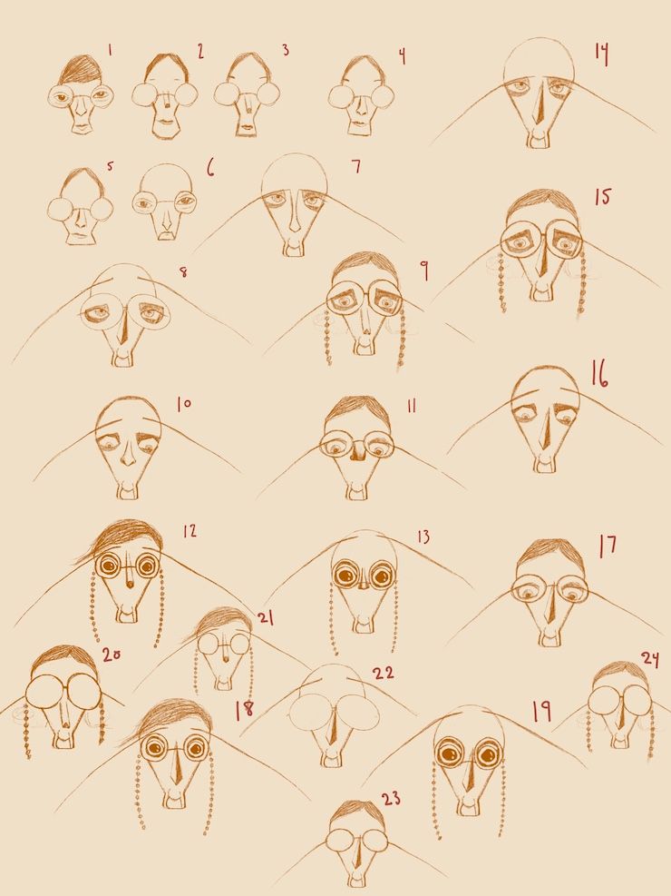
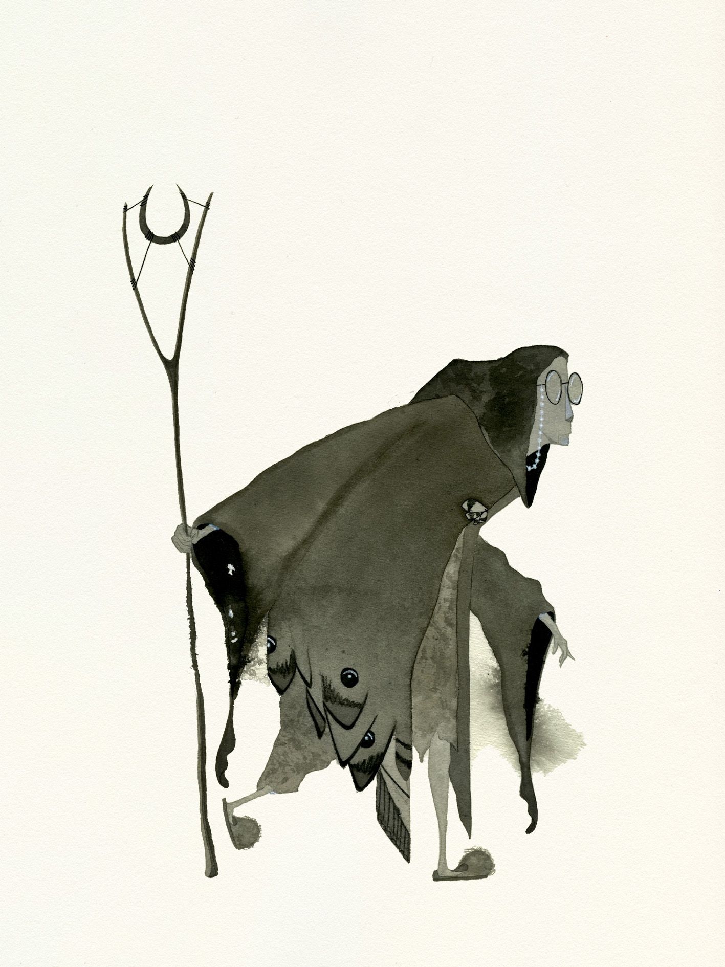
@Katherine Like the character a lot but I'm having difficulty reading the face.
-
@NicolaSchofield Thanks Nicola!
-
@Nico-Ecenarro Thanks Nico — this is just in the sketch phase so haven't taken it to final rending with ink yet
")
-
@Larue Thanks for the feedback Larue! I tried making the face a bit more readable but because I wasn't sure why it wasn't reading easily I'm not sure if I fixed it at all
 I was wondering if maybe the difficulty was the negative shape around the face so I mostly just changed that up — has that helped at all?
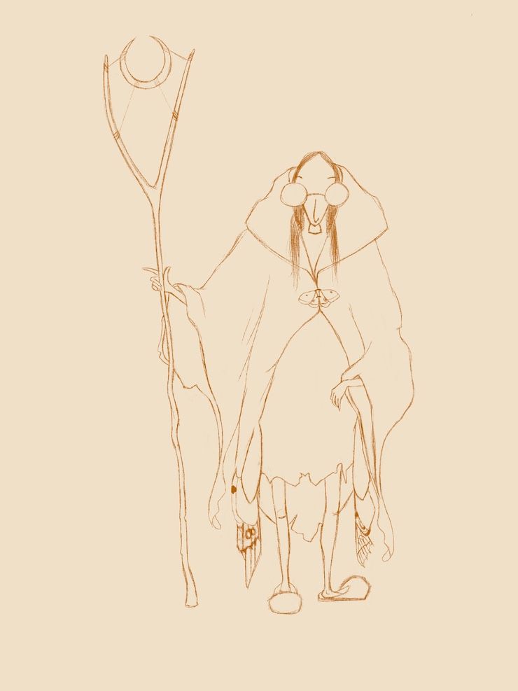
the site: katherinetyson.com
instagram: instagram.com/katherinetysonart -
@willicreate Thank you — I love the suggestion of dialling up the mothiness 120% but apparently my drawing chops only allowed roughly 22%. And yep I do intend to attempt some moth-inspired patterns when I take this to final rendering
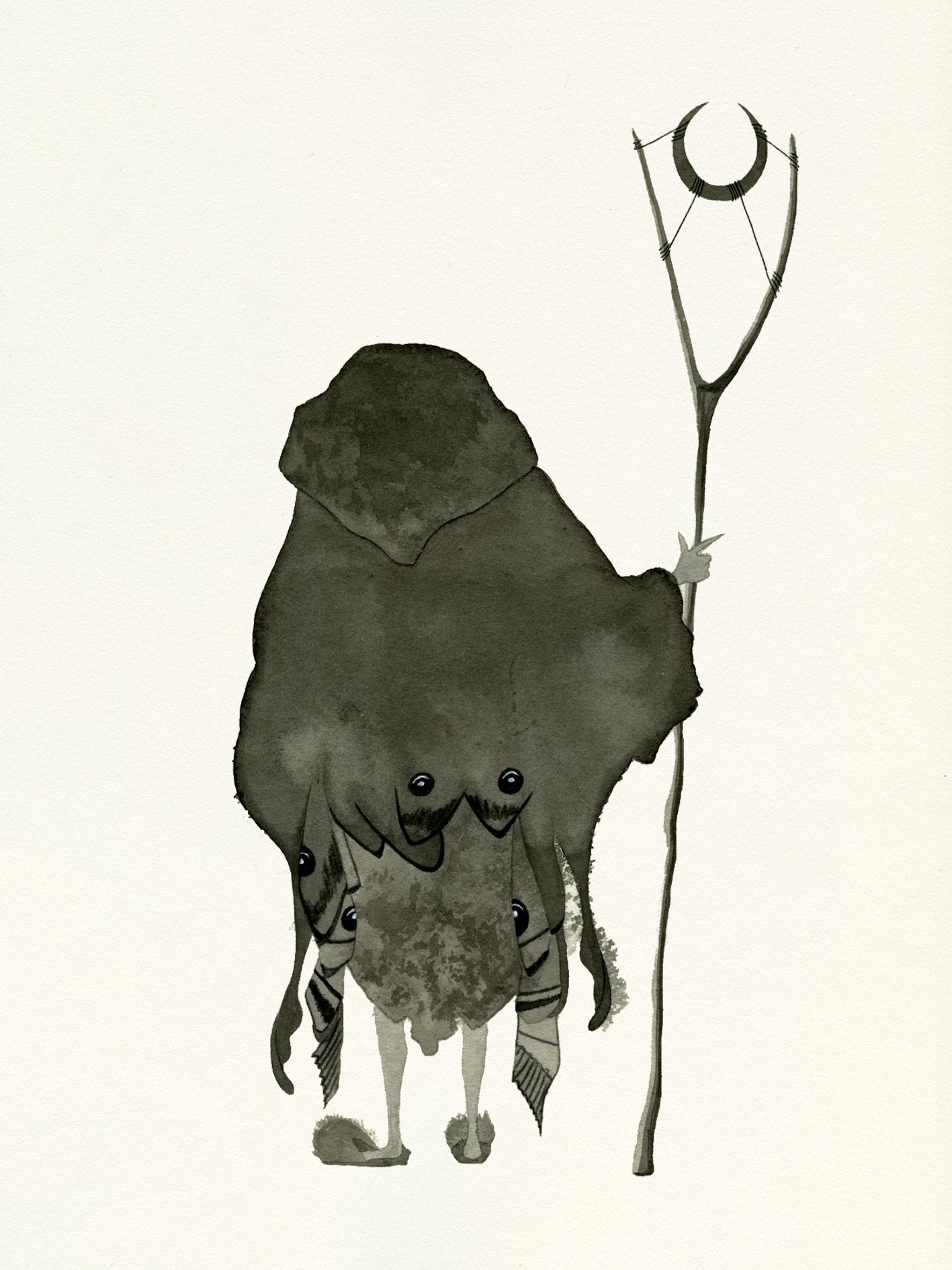
I also attempted to incorporate the moth wings into the back design...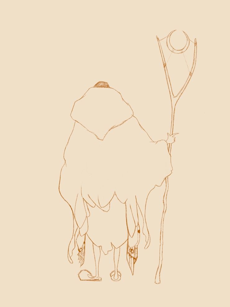

the site: katherinetyson.com
instagram: instagram.com/katherinetysonart -
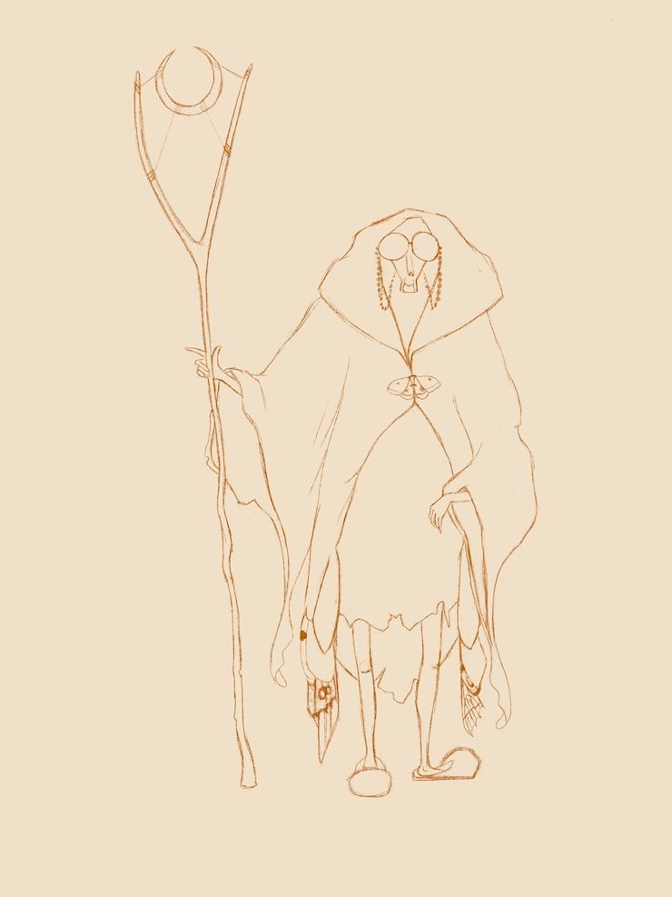
@Katherine Cool, and creepy! I think you're hitting your keywords of Dotty, and Alert, but i don't think I'm getting Hungry from her pose and expression.
What kind of inking are you planning to do? -
@Katherine I think she is really interesting! For me the biggest issue was finding her mouth. I finally got it when I zoomed in. Maybe try adding a TINY bit more space on the face around the mouth to connect the top of the face with chin. I kept seeing the chin as something separate from the face. Just an idea.
-
@Katherine Definitely better, the neck still throws me a bit, looks like a large tooth. I think it would still read if you remove that all together or add a shoulder line/shape on either side.
-
@Larue said in September Critique Arena — Feedback on Rough Sketch Requested:
@Katherine Definitely better, the neck still throws me a bit, looks like a large tooth. I think it would still read if you remove that all together or add a shoulder line/shape on either side.
Am I seeing it wrong? I thought that was the chin, not the neck. The hair definitely did help!
-
Thank you so much everybody. This has been so incredibly helpful. I did a whole heap of face re-designs today and settled on one which hopefully fixes the chin-looking-like-a-neck issue
@Frogpunzel you are right the "neck" is the chin. Actually hilarious how much work I did and ended up going with the design that basically added a line to either side of the mouth 
-
@Valerie-Light Thanks Valerie! I was hoping hungry would come through with how thin she is but I guess she could be thin for other reasons. I'll be inking her in traditional media with ink washes. I'm going to watch that experimental inking video (that I think maybe Lee did) on SVS.
the site: katherinetyson.com
instagram: instagram.com/katherinetysonart -
@Katherine Cool, I should check out that video too!
-
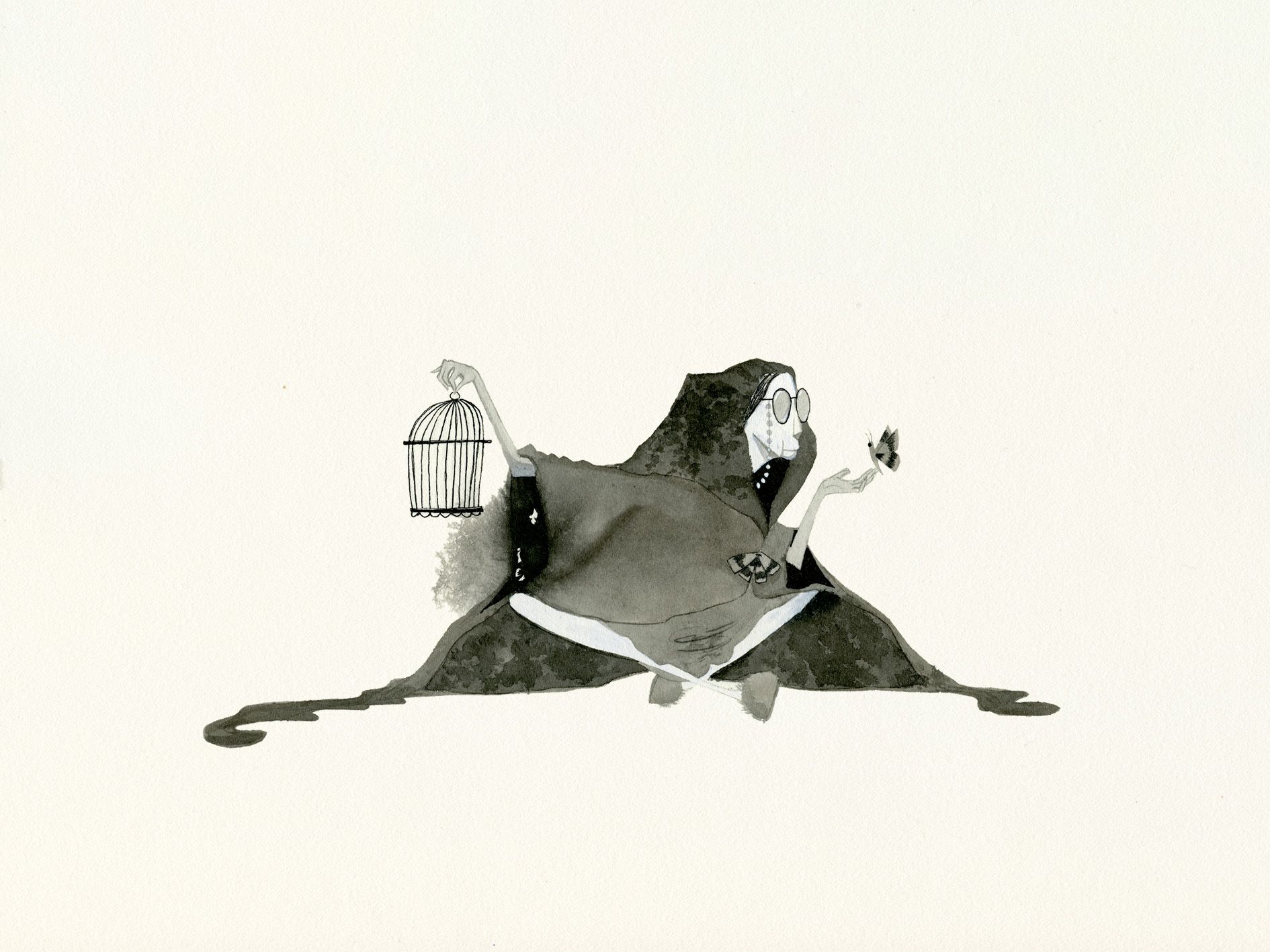
Hi folks, just wanted to share the final illustrations and thank everyone profusely for your feedback! Having to draw this from various angles was the hardest thing I've ever done
There are a couple of things I need to fix before uploading it to my portfolio but I need some time away from it!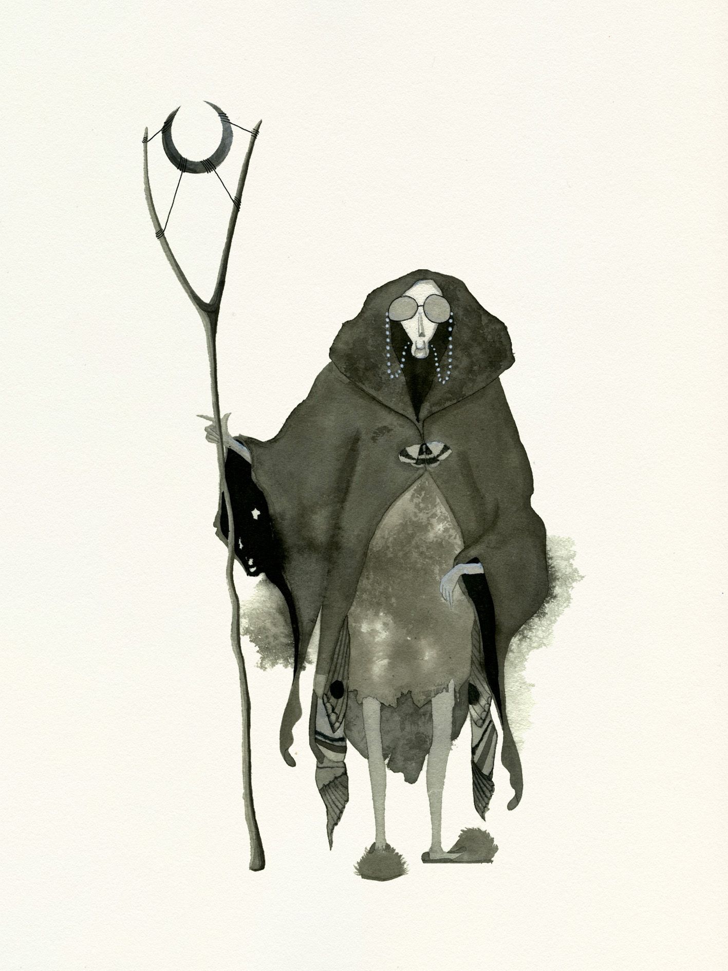
-
@Katherine Really really amazing. I love her design, you get the moth vibe right away. Well done!
-
@Katie-Carling Thank you Katie!
