Critique for map
-
@Judy-Elizabeth-Wilson said in Critique for map:
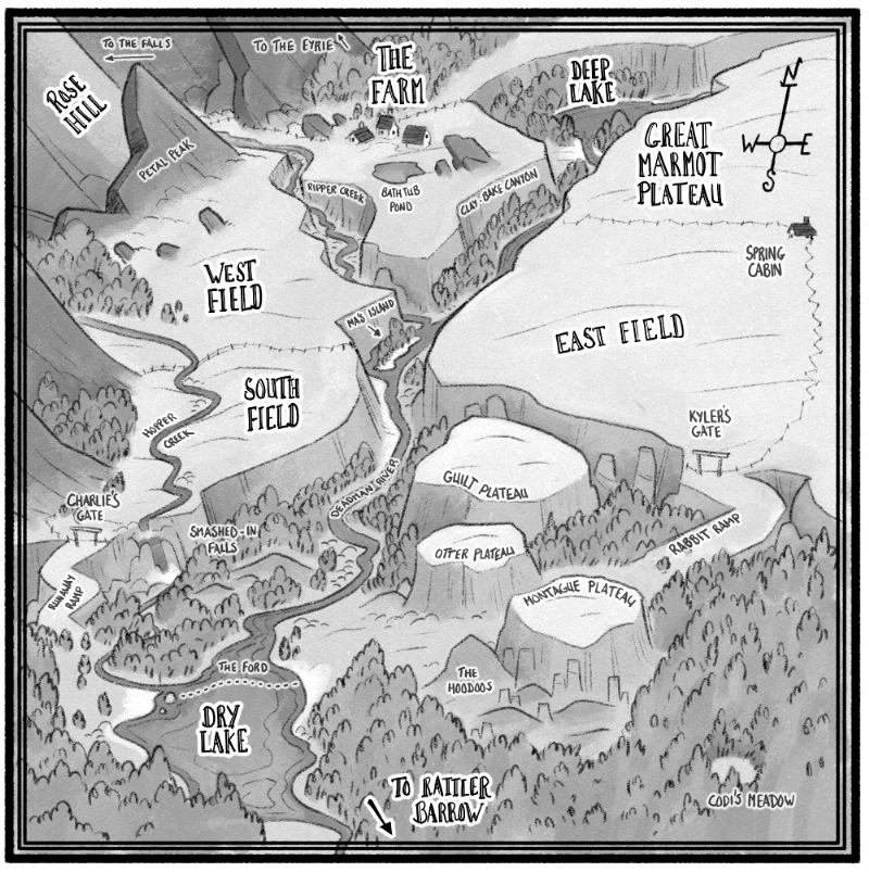
Catch me at Rabbit Ramp!
Ah yes, the worst of the ramps, lol
Good to know it looks good
")
-
@RachelArmington said in Critique for map:
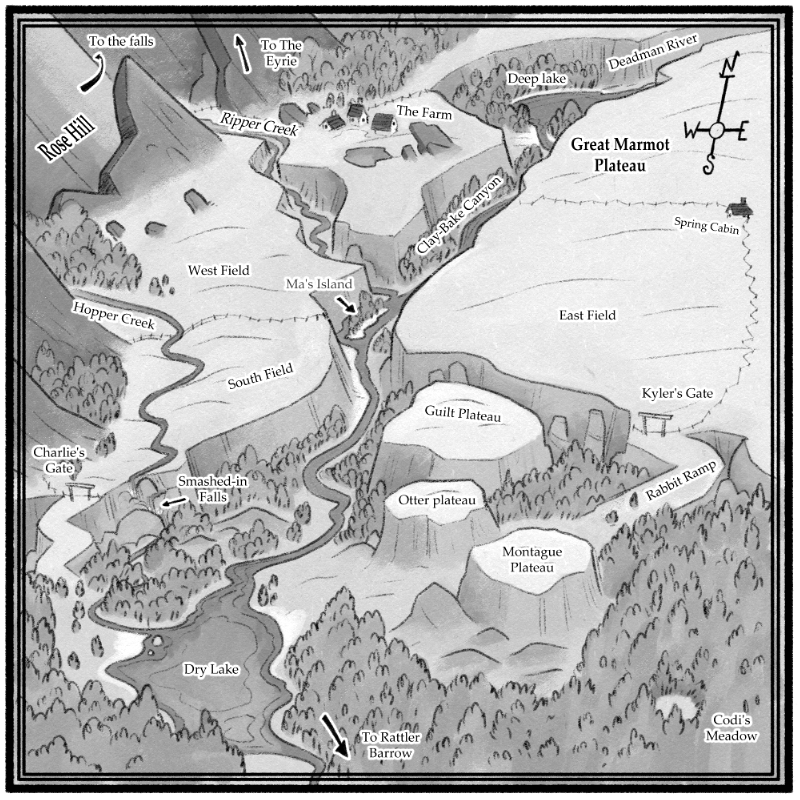
The only thing that doesn't work as well for me is the white highlights
They are indeed a little jarring! Thanks for the feedback
-
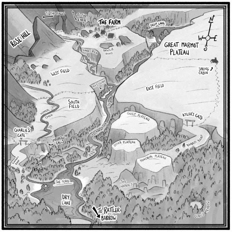
@Braden-Hallett I love the way this looks, it's a beautiful and stylized map. However I wonder if it's capable to incorporate themes into the typography per each landmark. for example, wavy letters to lakes, or stylized titles to mountains. or perhaps making the landmarks enlarged to stand out more.
I only suggest this because nothing really stands out here. If you enlarged them then the important locations would be highlighted.
I hope you find that as a good enough critique. Good luck! -
easy fix
-
@Kori-Jensen said in Critique for map:
However I wonder if it's capable to incorporate themes into the typography per each landmark. for example, wavy letters to lakes, or stylized titles to mountains. or perhaps making the landmarks enlarged to stand out more.
Good call! I like that idea
Thanks! -
I don't know much about map making, but i really like this one! I love the feeling of depth. a lot of maps look really flat, which can be a cool look too i guess. Anyways, Great job!
-
I think this looks amazing.
Maps are a really great fit with your style! Maybe the waterfall could look more waterfally? -
@Braden-Hallett Firstly let me say I love a good fantasy map, and this one is great! The only thing I would add is consistency in the labelling of place names. Almost all of them have capital letters for both names, but some don't, and those caught my eye.
'Otter Plateau', 'Deep Lake', and maybe 'to The Falls' -
I think with everyone's feedback this turned out pretty awesome! Thanks for the feedback thus far everyone
-
And with some attention paid to the hand lettering and some heirarchy I think it's done