Critique for Market Illustration
-
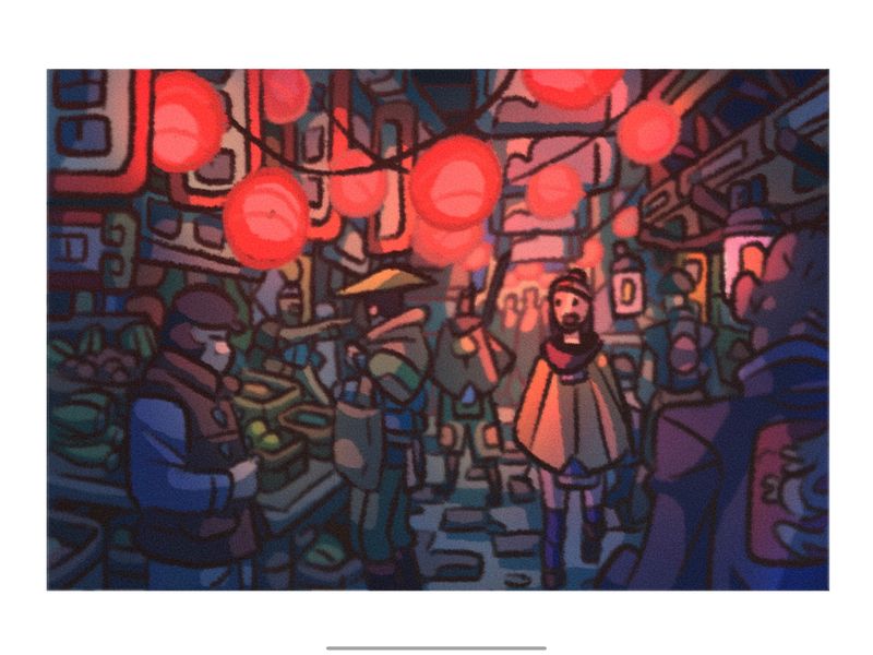
Hello everyone! This is an update on the illustration I've been working on for the past week. It's been super fun and I think I'm starting to come out of my art block just taking it slow and allowing myself to have more satisfaction regarding my work. Anyways, what do you think? Where do I need to improve? Thank you again! I really appreciate it.
-
@phoenix-yip ooh, nice work! Cool texture use, and I LOVE this color palette. It's one I gravitate toward, too. So glowy, and it reminds me of some of the lantern spreads in Aaron Becker's 'Return'.
My only critique is about the intensity of red in the lanterns. I think they demand a lot of attention, and I wonder what would happen if you experimented with cropping the top of the image, or dialing the chroma of the red way down to bring focus to the yellow-caped girl.
-
@phoenix-yip Hi and nice to see you post for feedback again. First thing that came to my mind was line weight -I feel it's all reasonably the same which distracts me as I am looking everywhere, however the no line on the lights help bring some focus but do you want us to focus there (the change of no line and the red colour draws me there first). I agree with @Valerie-Light on the dull but red red lighting it's pretty intense and takes you away from the people and bustling. And there's a tangent with the dude whose buying something; his jacket is touching the man's coat whose walking away from us. lols aaa tangents.
Anyways always cool seeing your work and progression.
")