Any impressions and criticisms will be greatly appreciated
-
This is a piece that I think is pretty close to finished but I would love any feedback on what I could do better in the future and what I did effectively. Also of course if there is anything I could add such as darker value and whatnot, I'm very open to that as well. Thanks!
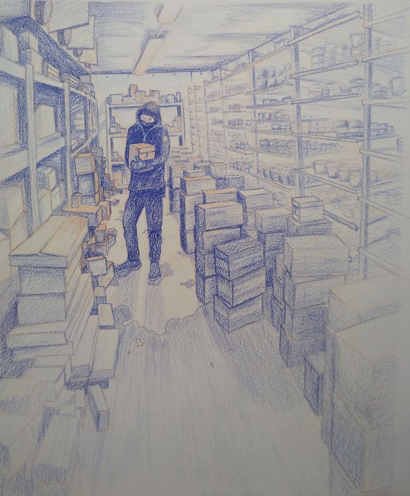
Some context: I'm working towards becoming an illustrator as I love telling stories through visual medium. I recently got my first commission and it was a rather open-ended prompt but I thought it would help me practice storytelling. The prompt was, "a daily life moment of someone," and I searched my world for these kinds of stories. It was an awesome exercise in seeing the world through the eyes of a storyteller and I'd recommend it to anyone! The style she wanted was a sort of more finished journaled sketch vibe. I thought the rough paper and chunky prismacolor strokes contributed to that but again, any feedback would be warmly appreciated.
Thanks for stopping by!
Happy creating,
Tristan -
@Tristan-Lapetz Great start! Try working on tonal contrast between the darks and lights; maybe some variation in the linework *unless you like keeping the linework consistent.
I hope that helps.
-
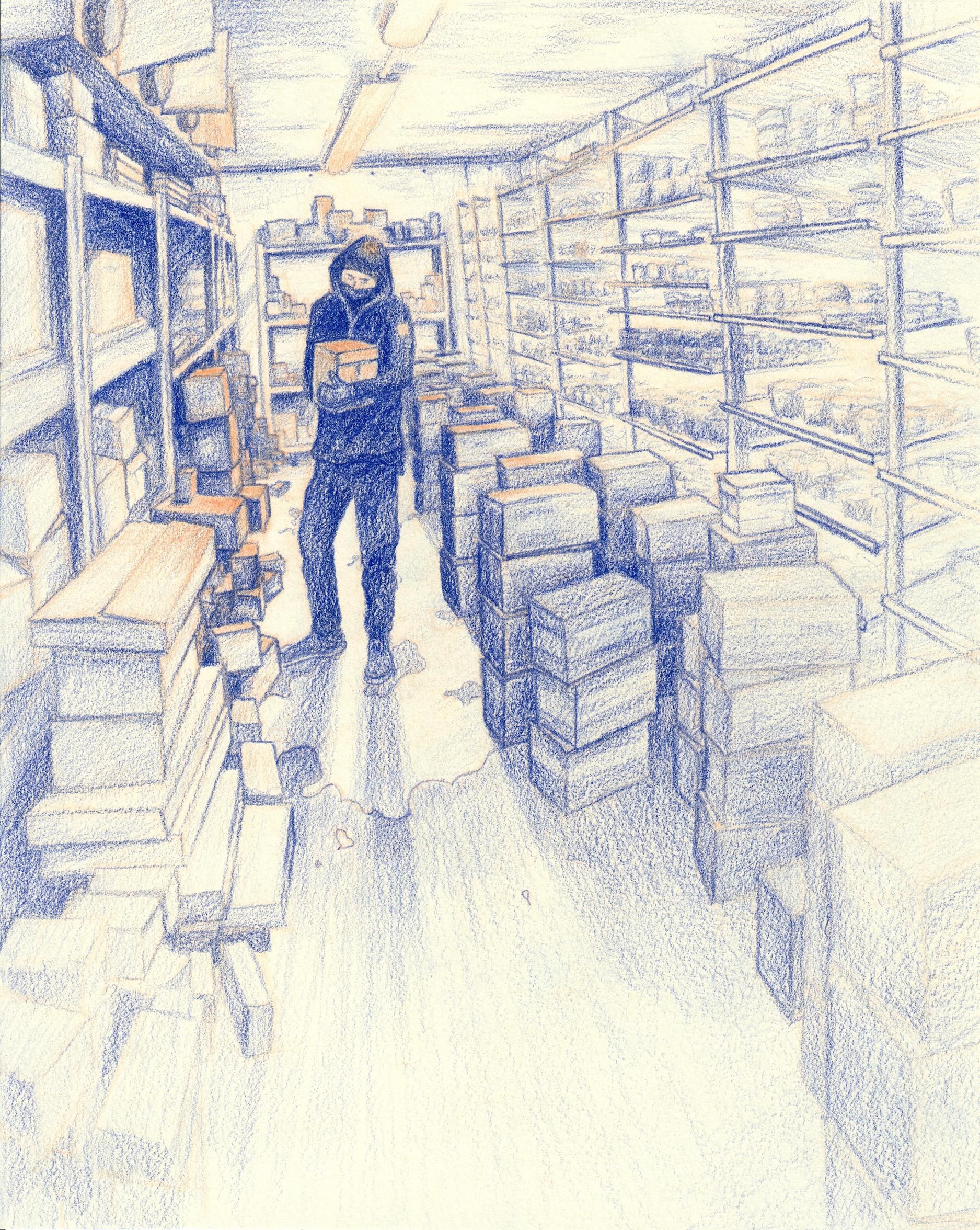
@Tony-Barber Thanks for the feedback, that's really helpful! After uploading I realized it looked pretty washed out too. I'll definitely push contrast and strengthen some of the lines.
-
@Tristan-Lapetz This is actually really great! No comments from me
-
The updated version after of few recommended tweaks. Thanks again for stopping by!
-
This looks so good! The contrast looks better in the recent photo and the colors seem more vibrant, too. I also like that you chose to use only two colors. Well done! My two cents would be to add a little more story to it. Why is this moment important/interesting/special? Ex: Are they realizing that the package they're delivering is actually for them?
Looking forward to seeing more of your work!
-
Normally I'd say more contrast would be good. BUT if this is in a freezer, and you purposefully wanted this to feel really cold and lonesome, then you did a great job!
My Drawing Show: https://www.youtube.com/ArtParlor
Instagram: https://www.instagram.com/frostdrive/ -
Hey! Looks great. I find the version with higher contrast between warm and cool colors packs a much greater punch.
I suppose this isn't what you're going for, but the ground looks to me as if he's standing on clouds. Is it meant to be a puddle? I'm not sure if I'm the only one who reads it this way, but with the blue color, the way the shadow seems to radiate from a central point behind the figure, and the large white organic shape on the ground, it really looks a lot like the sky. You could lean into the surrealist aspect of it, but that might not fit the prompt you're working from.
A bit more contrast in the size of the boxes could also make the composition a bit more interesting!
I really love the color scheme, it's very simple, but the contrast between one cool and one warm color creates a nice effect.
Please take everything I say with a grain of salt, I'm a complete beginner at this!
-
@Frost-Drive Cold and lonesome is certainly what I was going for, thanks a bunch for the feedback!
-
@sam-draws I never saw it that way and I very much appreciate the intriguing direction you've offered! I need to figure out why exactly it is but that's the way our dairy cooler floor has eroded over time I believe. It is kind of a worn off layer of paint or protection of some sort. I love the clouds idea though, I really do. That could do great in bringing in an aspect of daydreaming at work!
-
@aprilshin What wonderful guidance, thank you so much! I will absolutely sketch up some ideas to see how I could've added more story. This one has to get sent out soon but I'll certainly keep your advice in mind moving forward and looking backwards. Thank again, this is fantastic input.