Draw 50 things challenge - Santa's factory
-
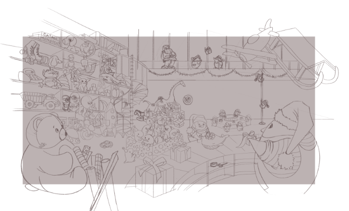
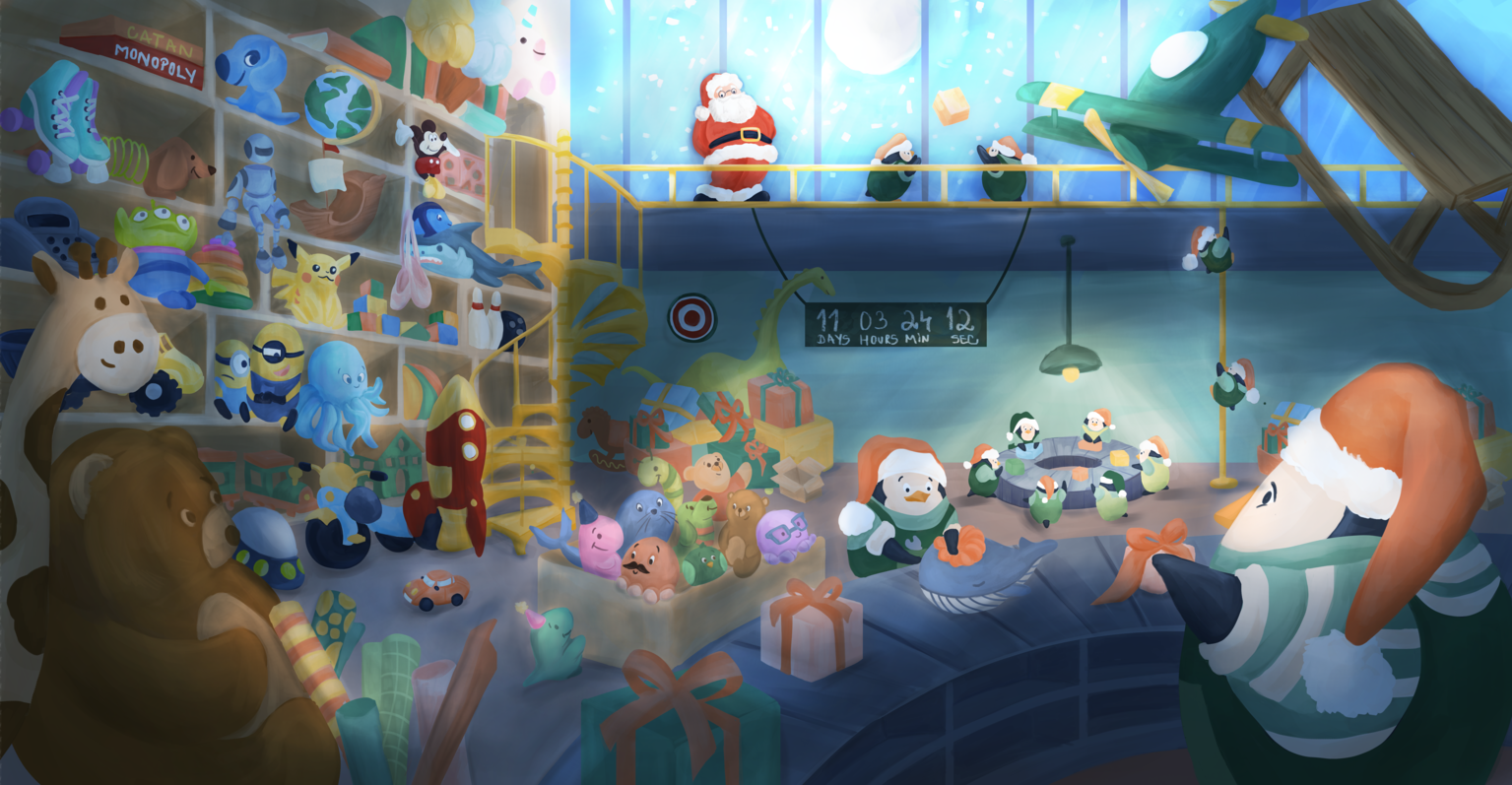
Hello, guys! I want to draw a more complex Christmas illustration and to use the "draw 50 things" challenge for that. Here is my clean sketch after choosing the room layout and after creating multiple thumbnails for a Santa's factory theme. I would really love to find out your opinion. What do you think about:
- the composition and camera angle
- the overlapping of the objects
- the focal point
- the storytelling
The gray area is where I want to crop.
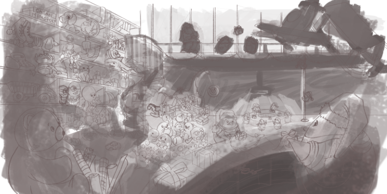
I added a veeeery rough values sketch to show you how I'm planning to render it. On the top of the scene there is a big window, the main light source. I was thinking to have Santa in there, dark on light, looking down at his factory full of toys and penguin elves. The near plan is dark, the middle one is lighter because of the light coming from this window, and dark again behind the staircase.
Can't wait to see your thoughts!
-
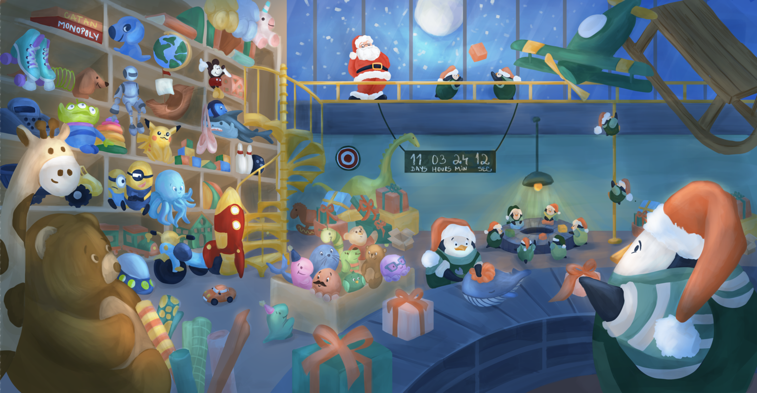
Hello, guys! I've just finished rendering this piece, but I'm not very happy with the light and the atmosphere. What do you think about the result? Any suggestions will help me a lot! I still wanna invest a little bit more time in this and make it better, but I'm not sure what is missing.
-
@simonaburlacu This is beautiful. I’m afraid I don’t have any advice as I’m just a beginner. It looks great to me!
-
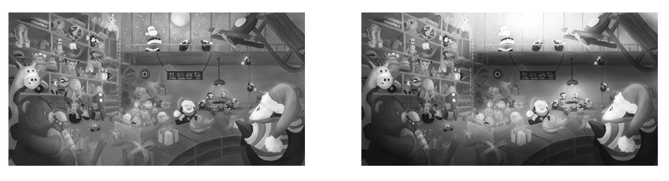
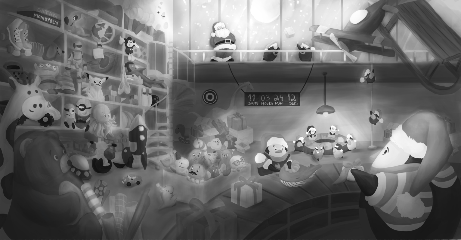
@simonaburlacu I think the main reason you're not happy with it is the value range. If you take this into black and white, it's sort of a massive amount of mid-tones from left to right with small deviations of high and low contrast. So it's just making it kind of muddy across the board. Especially in the middle area a lot of the values are kind of indistinguishable.
The value range also helps define a foreground, middle ground and background. So you're eye is kind of not sure what to do.
What I'd do is take it into grayscale and start messing with what area you want to be light/dark. Below I kinda messed with a real quick value shift to let the shadows and light tell the eye where to look. But you can go any way you want. Then tighten up those sections. So for example all the stuff on the left you can keep pretty tight to whatever value range you're using to define the midground.
I think that can go a long way to help fix what isn't looking right instinctively.
-
Thank you so much @caseysmom! This feedback also means a lot to me!
-
@jdubz You are so right! My eye didn't know where to look and I felt like losing the main focal point in the image (which I wanted to be the Santa Claus watching his factory). I have pushed the values more and I feel like it's much better now. If I squint my eyes, the scene is more clear to me now. What do you think especially of the midground? That part seems to me the most difficult part to define for me.
Thank you soo much for your valuable feedback and the effort you put in adjusting my initial image! This was really helpful!
-
@simonaburlacu Hi Simon,
Thanks for sharing this. Great piece! I'm in the middle of doing a Santa's factory piece too, although it's quite different.I was going to say what jdubz said, about the values. However, that still leaves you with two focal points on two different horizontal planes - the higher one with Father Christmas and the lower one on the factory floor.
I thought your rough values sketch was actually good. Don't be afraid to make Father Christmas and the figures up on the mezzanine a lot darker - silhouetted against the moon-lit sky. If you get your colours and values right, that would look really good.
Then, with the main focal point on right of the factory floor, ensure the contrasts between the different objects and their backgrounds are worked well, to make them pop. Do this by using harder edges and value contrast.
What do you think?
It'll be a nice portfolio piece. -
Hi, @adam-thornton-0 ! Thanks a lot for your feedback and ideas. I will try to paint Santa dark on light. I like your idea with hard edges. I really feel like the objects are being lost on the background. I do need to push this more. I would love to see your Santa's factory illustration too!