Society of Visual Storytelling

    SVSLearn Forums

    • Register
    • Login
    • Search
    • Recent
    • Tags
    • Popular
    • Users
    • Groups
    • Search

    Star Critique Arena Edit

    Artwork
    6
    6
    377
    Loading More Posts
    • Oldest to Newest
    • Newest to Oldest
    • Most Votes
    Reply
    • Reply as topic
    Log in to reply
    This topic has been deleted. Only users with topic management privileges can see it.
    • andreazupcsan
      andreazupcsan last edited by

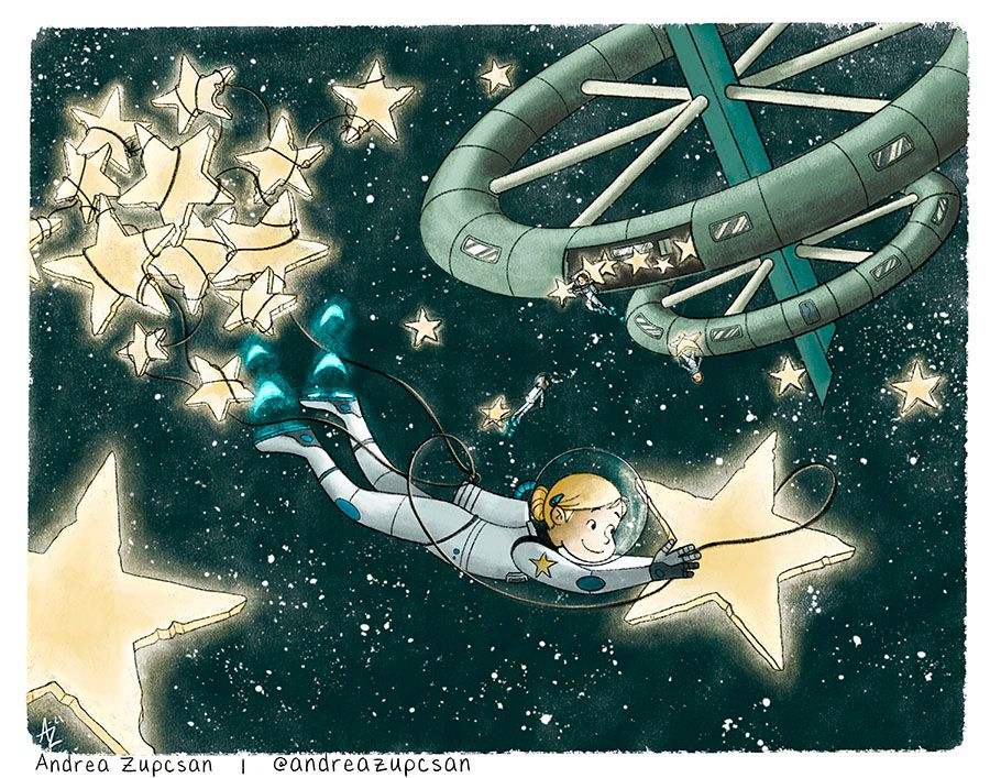
      Hi everyone! During the critique arena @Jake-Parker and @Lee-White said I needed to crank up my colors.

      Personally, I think they were 100% right. Lol

      I turned up the saturation on one. I think it gives it that extra pop. Thought I’d post both images here to see what everyone else thinks! Thanks for the critique Jake and Lee! On to the next one!

      Original:
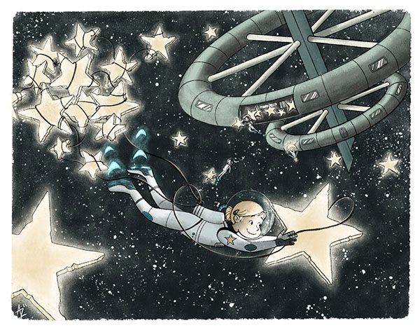
      8584BAE6-2D6F-4C31-9F99-E14B06545AAA.jpeg

      New:
      26C91F15-3CE2-4E97-93F4-5B286F77225F.jpeg

      Andrea Zupcsan
      instagram: www.instagram.com/andreazupcsan
      facebook: https://www.facebook.com/andreazupcsan

      Lee White Jeremiahbrown Nyrryl  Cadiz 3 Replies Last reply Reply Quote 14
      • Lee White
        Lee White SVS Team SVS Instructor Pro SVS OG @andreazupcsan last edited by

        @andreazupcsan much better! : )

        SVS Faculty Instructor
        www.leewhiteillustration.com

        1 Reply Last reply Reply Quote 2
        • Jeremiahbrown
          Jeremiahbrown @andreazupcsan last edited by

          @andreazupcsan I'm probably in the minority (perhaps the only one, haha) but I like the first one better. I'd like to see what happens if you suck (desaturate) the green out of the spaceship (while keeping the values the same) so that only the girl has the accent green color.

          Jeremiah Brown
          www.jeremiahbrownillustration.com
          https://www.instagram.com/jeremiah.brownillustration/

          1 Reply Last reply Reply Quote 2
          • Asyas_illos
            Asyas_illos last edited by

            It does look good but I liked the dark sky better maybe try a version where the sky background stays dark and then keep the saturation revisions you did to the character and stars and station? Otherwise it’s a great image!

            Asyasewardillos@gmail.com
            www.Instagram.com/asyas_illos/
            https://asyasewardillos.wixsite.com/mysite

            1 Reply Last reply Reply Quote 1
            • Nyrryl  Cadiz
              Nyrryl Cadiz SVS OG @andreazupcsan last edited by

              @andreazupcsan Beautiful!

              Portfolio: nyrrylcadiz.com
              Instagram: https://www.instagram.com/nyrryl_cadiz/
              YouTube: https://www.youtube.com/channel/UCbJCF1Im8ZO7hpGWTKOJMuA

              1 Reply Last reply Reply Quote 1
              • J
                jdubz last edited by jdubz

                @Lee-White I figured I'd post in here since it was on topic rather than add another topic to the forum. I re-ran the colors away from blue/teal to blue/yellow and I knocked down the moon a bit so it wasn't stealing the show against the star.
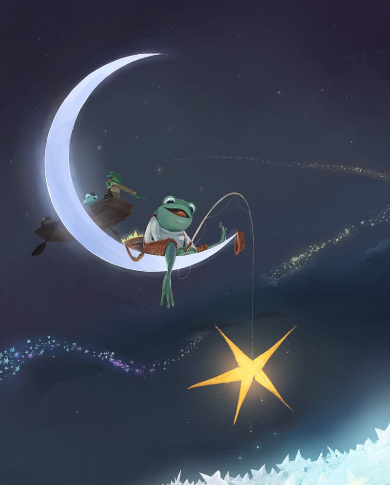
                Starfrog 2.jpg

                What does everyone think? Does the color contrast help much or is it kind of a lateral shift?? I kinda thought the teal color made it more "ethereal" but maybe that was just me lol.

                Josh White
                https://www.instagram.com/joshwhiteillustration/

                1 Reply Last reply Reply Quote 3
                • First post
                  Last post