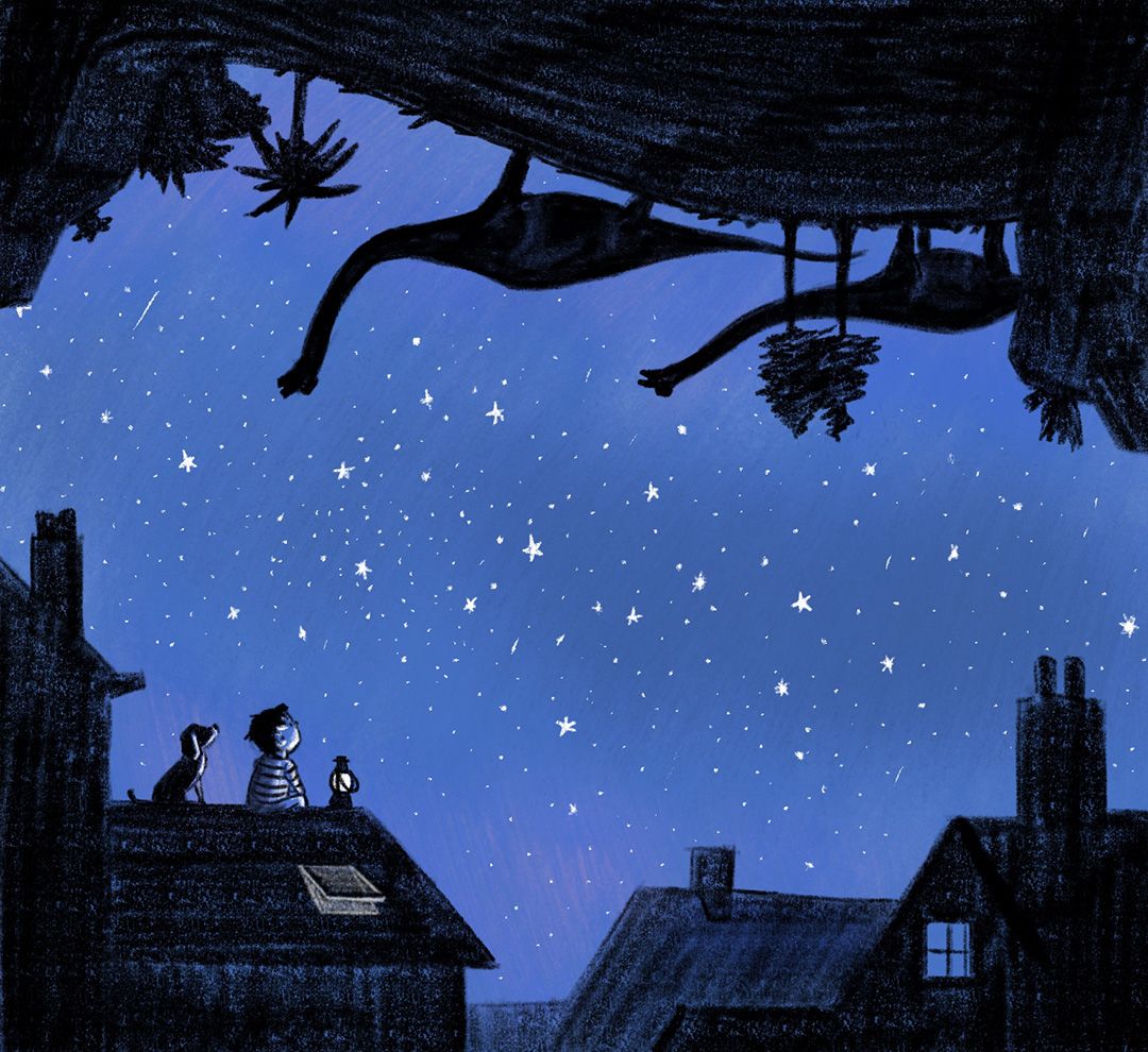
Anyone wants to critique my STAR entry?
-
Hi everybody. Congratulations to Miranda and Josh and everybody else that made the sweet 16, amazing work guys!
When you don’t make it to the 16, you know your work is not good enough but what it is what is lacking is sometimes difficult to point out, especially when you don’t have formal training or other professionals looking at your art.
So can anybody help me to point out what I need to improve? I don’t want this one to get lost in the pile of "not good enough" because well… I kind of like it.- Is the concept too weird/complex?
- Is the drawing style too rough?
- I went for an almost monochromatic color scheme (instead the classic warm-cool one) Is that too boring?
All help is welcome, Thanks!
-
@joosterwijk I would be really interested in hearing the judges' opinions on this one, because I really liked it! I don't think it's too rough. The only thing I can think of is that maybe the concept was unclear. Maybe the boy is thinking about the ancient beginnings of the universe? Or is he reading constellations and seeing dinosaurs? If it's the latter, maybe the dinosaurs could form constellations. But it must be concept, because I can't tell you for sure what the story is. (And I can really, really relate to this problem!!)
But the artwork itself is really lovely! I mean, maybe you could make the stars yellow, but I like it just fine as it is. Plenty of books are very effectively illustrated in two colors.
-
I love the concept in this image. I do hope you keep working on this idea. It feels there is a bigger story behind it and I want to know what the story is about.
That being said, the image as it is now felt a bit unfinished to me. It is really hard to pinpoint what makes an image feel unfinished (I have that issue all the time myself). Here is a list of things I could think of. They might be interesting for you to try...
-
work on the silhouette design for the boy and the dog. I would also consider removing the lamp, and replacing it with a dinosaur toy or something (connecting the concept more). If you do want to have the lamp on, consider a yellowish glow for the lamp and maybe some yellow light on the boy´s face.
-
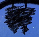
I will also try out different shape designs for the houses, trying to make them less generic somehow. They do not have to have a lot of details, but what shapes you chose and the few details you included are quite important to make this image stand out.
-
I really like the ancient world in the sky upside-down. But I want to know what makes that dark shape that made the boy imagine the ancient world. I am wondering what the image would look like if the shapes on the sky feel more like formed by dark-blueish clouds. Again you do not need a lot of details, but the silhouette design is really important here.
Hope this makes sense.
-
-
@joosterwijk Hi! First of all beautiful Piece. I love the color, texture, and felling it's giving off. My biggest issue is that I don't see a strong center of attention. If it's the kid, I suggest making the lamp brighter. Maybe making its light yellow. I hope this helps
Portfolio: nyrrylcadiz.com
Instagram: https://www.instagram.com/nyrryl_cadiz/
YouTube: https://www.youtube.com/channel/UCbJCF1Im8ZO7hpGWTKOJMuA -
@joosterwijk I really like your piece, I think the concept is really interesting! I think a monochrome color scheme can totally work, and I don't think you should put this in a "not good pile" at all.
I do agree with some of the other comments that it feels a little bit unfinished, more like a sketch than the final image, and I know that's tricky to understand between "unfinished" and "painterly" sort of style.
I'll try and show an example of someone in a similar medium as you
This is an image by @nadyart on instagram:
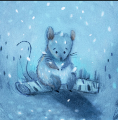
So first of all there are a lot of sketchy lines here, but you can also see the thoughtfulness and control of the glow between the two blue colors how it gently gradates outwards or the cast shadow. There is also a variety in the texture of some areas being soft and some areas being sharp.
I remember when I was first learning to draw a rough style and although it FEELS messy the line work is actually very thoughtful and even down to the direction and thickness of the lines. I would encourage you to explore that thoughtful control even in a loose piece.
Secondly, there are some design areas that could be improved. The stars for example (are actually pretty evenly spaced out like a pattern
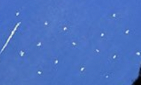
It's really hard to avoid! But try to make some stars bigger, some smaller, some brighter, some more dull and some in clusters example:

Which I'm also seeing a bit in your trees, the spacing between the bits that stick out or the cluster of branches is evenly spaced
These are pretty subtle adjustments but I think would elevate you to the next level as an artist
")
The hardest part is having GOOD IDEAS though and you have that!! This next part is just adding some finesse
I'm excited to see more of your work!
Check out my art and tutorials :)
Instagram: www.instagram.com/carliannecreates/
Youtube:
https://youtube.com/c/CarlianneCreatesShop: www.carliannecreates.com
-
@lauraa Thanks Laura! Yes the concept is probably not completly clear. I kind of knew that but I liked that it provoked wonder and questions. Probably more questions than answers... not a good idea
I think you can go in a picturebook a lot further, because you have the context and words. When I was making this I had in my mind: "The boy looked at the stars and thought about the dinausors who looked at the same stars millions of years ago". Thanks again for the kind words, it gives me energy! -
@xin-li Thanks Xin, I definitely going to use your tips. In general I probably need to give it more time, I think I tend to rush when I "see" the picture in my mind. About point 3, It will make the concept clearer for sure and I need more studies for that. Thanks again!
-
@nyrryl-cadiz A different color will solve that for sure. Worth trying it out. Thanks!
-
@carlianne Thank you Carlianne, your answer is as good as always! I really like your example of nadyart and the relation between thoughtful control and looseness. I really have to practice this more, now it is often stiff or rushed. Thanks!
-
@joosterwijk I instantly liked this at first glance. I agree with the previous points and the lamp colour would help. I think this would be hard to get your concept across without accompanying text. At least, I don't know how I would do it
-
I really like this style, I don’t think it’s too rough. The issue I see is just clarity if the idea. Not really sure what’s going on and it just becomes a bit of a distraction. I also don’t think of "star" when I look at this. So I’d say focus on the main idea and build around that and make sure the message you’re trying to deliver is clear.
-
I really loved your illustration and I like that you have to think about it and can put your own interpretation on what is happening. It would be interesting to know why it didn't make the top 16 from the judges perspective, and my only guess would be concept and how it relates to the star prompt. Some good points in this thread as well, as always. I would love to see the rest of the story.
Maybe you could try making it part of a short sequence of images for your portfolio, so that the story becomes really clear without having to change this one too much?