Critique requested: Yeti continuation illo
-
I might be taking the easy way out, but what about combining the two color approaches so that it's a night time scene, but the lamp is also on. This will give you a pretty dynamic color scheme, while using the lamp light to highlight the soccer ball, the girl, and the yet (sorry for the messiness of the draw over).
-
@larue Thank you for the positive feedback!
-
@asyas_illos Thanks, that is very helpful. I will try to tone down the moonlight. Throwing the glow effect around was too tempting. I almost knew that it was getting to be too much, and it was good to have someone confirm it.
-
@ajillustrates Thank you for taking time to do the draw-over, and I don't think it is the easy way out at all. I think you are on to something. It was starting to look too dark and I wasn't sure how to resolve that without putting moonlight everywhere, which would also reduce the impact of the focal points of the composition. The draw over helps a lot!
-
@jenn I'm just going to jump in here and say I like version one, because I like what you've got going on with the Dega-esque color. If you want to make it more dramatic and emphasize the figures more, you can tone down the overhead light.
-
@lauraa OK thank you. It was getting so I was tired of looking at my colors and wasn't sure whether it was the colors that were tired. I very much appreciate the fresh perspective.
studiojcd.com
she/her/hers
Insta/Twitter: @chengdesautels -
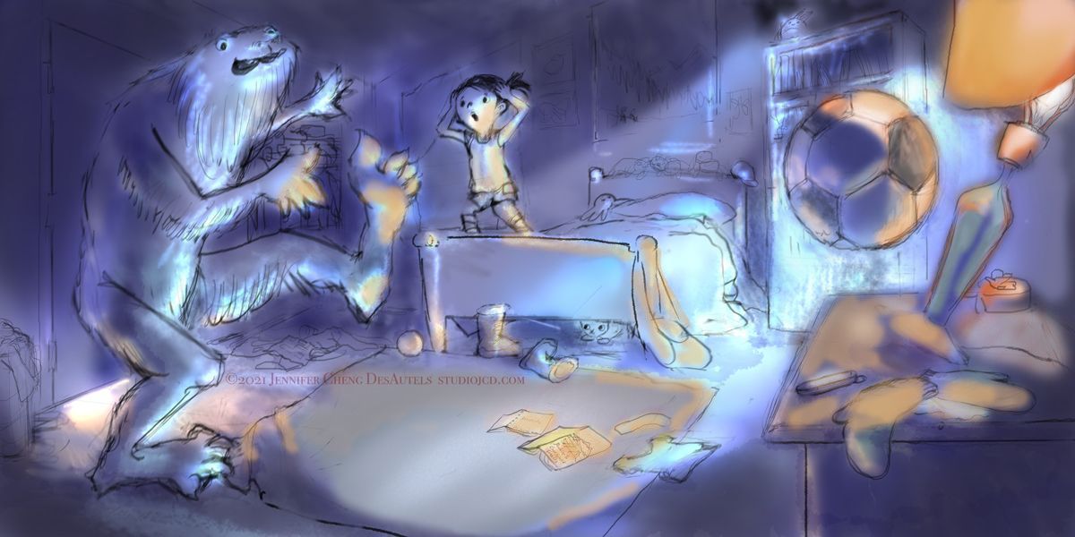
@jenn I am a little torn on the color pallets. I guess it depends on what the story is. I get a more "Shh! Be quiet!" vibe from the blue pallet, which has a more interesting story in my mind, but the first version is a little easier to navigate and tell what all is in the room.
I also think I like the perspective change in the second (blue) version a little more. Makes me feel a bit lower in the space, giving the Yeti and even bigger stance. It's crazy how that one small change made that much of a difference to me.
Wonderful work! Can't wait to see where you go with this.
@madebyduh
www.madebyduh.com -
@jenn Looking at this piece again this morning, I do think you could use the value more effectively to emphasize color. I realize that, depending on the optimum saturation value of a given color, darkening it can ruin the nice vibrant color effects. This often gives me fits because, well, Impressionists didn't always let value ruin a good color effect! And you have nice Impressionistic color. Still, I think it might be helpful in your case to look at value. Your dark areas in the first version are the window behind the girl and the book shelf behind the ball, which is a good start, but as much as I love that buttery yellow, I think a darker wall is worth considering.
If you darken the walls behind the figures, you emphasize them plus the lamp and ball, which are you focal points. This is in effect what you do in the second image. But there it looks a little muddy. I think this may just be a technical matter, and if you defined your light and dark areas more economically it would work. But I still like the version with the lamp as light source better than the moon one, because it allows for color and puts a literal spotlight on the desk area.
This is all to say that sometimes I don't like making a quick response on the forums like I did yesterday, because I haven't had time to look at the piece carefully yet, but once I look a second time I understand my reasons better and can explain them to the other person. Anyway, still love your color and I hope I don't ruin it with my suggestions!
-
@lauraa thank you (again) for your thoughtful comments. I think your analysis is spot on. I started as a plein air landscape painter where it's all about the moments of color. But I agree that in illustration the colors need to serve the narrative. I'm not against redoing etc - yay for digital media, it's so forgiving!!
-
@duh Thanks for the feedback about the perspective. I agree, I need to make a choice about the story. I agree the blue one makes for a better story, so I think I will go with something along those lines. Thanks again.