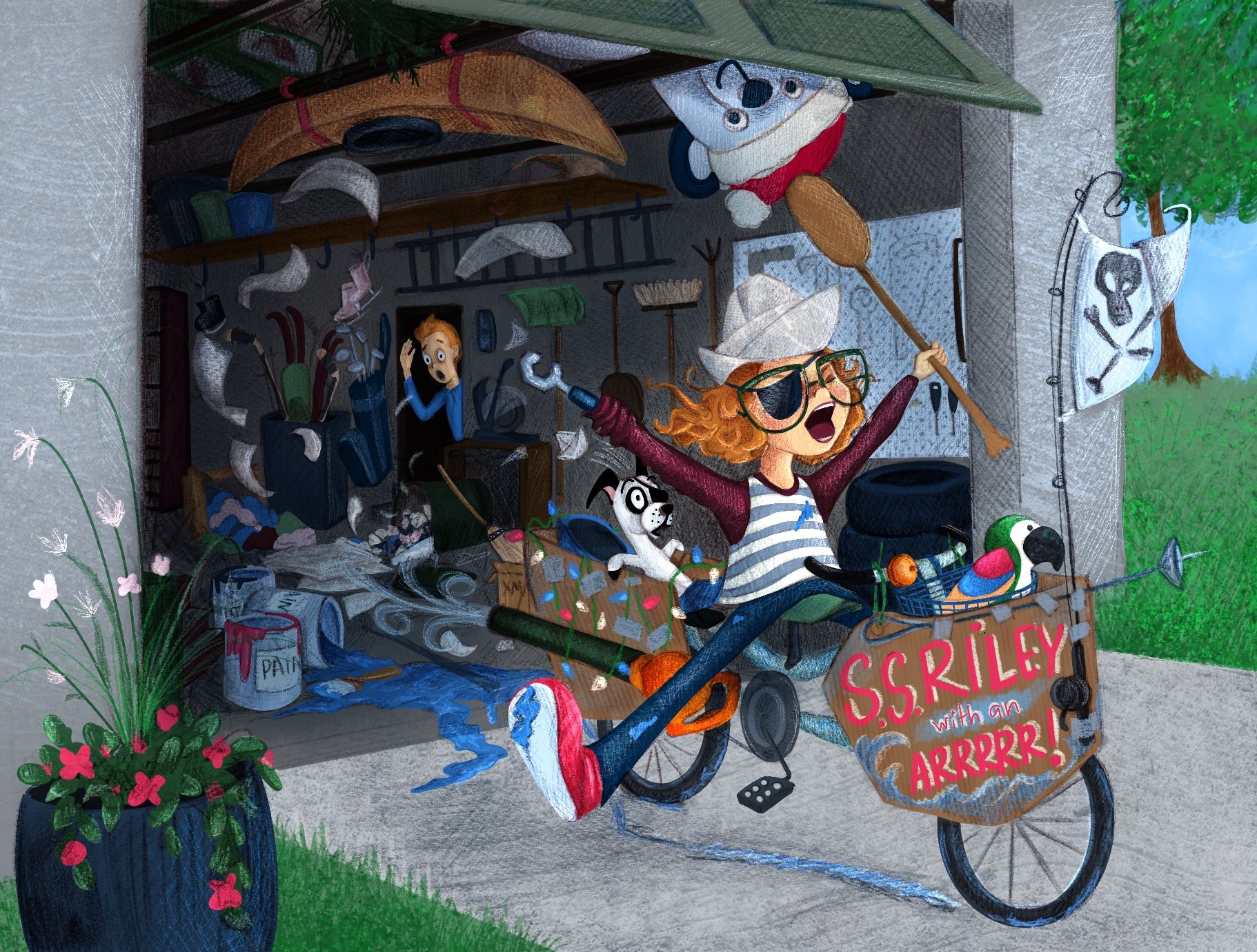
Feb contest prompt WIP
-
@asyas_illos Found it. Didn’t find the link anywhere on the SVS site, so I had to Google it.
Thank You -
@doodlemick no problem!
-
I’ll probably spend the next 28 days staring at it and tweaking it, but I’d love feedback!

-
@angelinakizz really nice! I'm still getting over the fact that you did this all with your non-dominant hand!
Some feedback:
-
What is the bear doing hovering above the garage door? It's one of the highest areas of contrast, so my eye keeps going there. Is he part of the story? If he's part of the background clutter and has nothing to do with the story, you may want to darken him more so he recedes and doesn't compete for attention.
-
It might be the brightness level on my monitor, but the garage reads as very dark (I had to bump up the brightness to clearly see the illustration). With it being that dark, the clutter is harder to read. With Riley's dark sleeves and jeans, she doesn't stand out as well as she could. Adjusting some of the values could help you define your focal point and make the illustration read more clearly.
Love your creativity with Riley's invention! Her expression is great! Two thumbs way up!
-
-
Oooh that’s great feedback, thankyou, I’ll get on that right now!
We have a ton of stuff hanging from the rafters in our garage, and one of them is a giant inflatable Christmas Moose. Lol.
I will work in the contrast, and darken the bear! Thanks a bunch!
-
@asyas_illos thankyou! I changed it back, I totally agree with you, her previous expression was better than the open eye.
-
This is great! I was thinking of what angle to draw my garage and how to tell my story in one go. This pic does the trick. Awesome!
-
I think having the bear face the viewer puts too much focus on the bear rather than Riley and the mess. Maybe have the bear looking towards or somewhat facing Riley instead of the viewer?
-
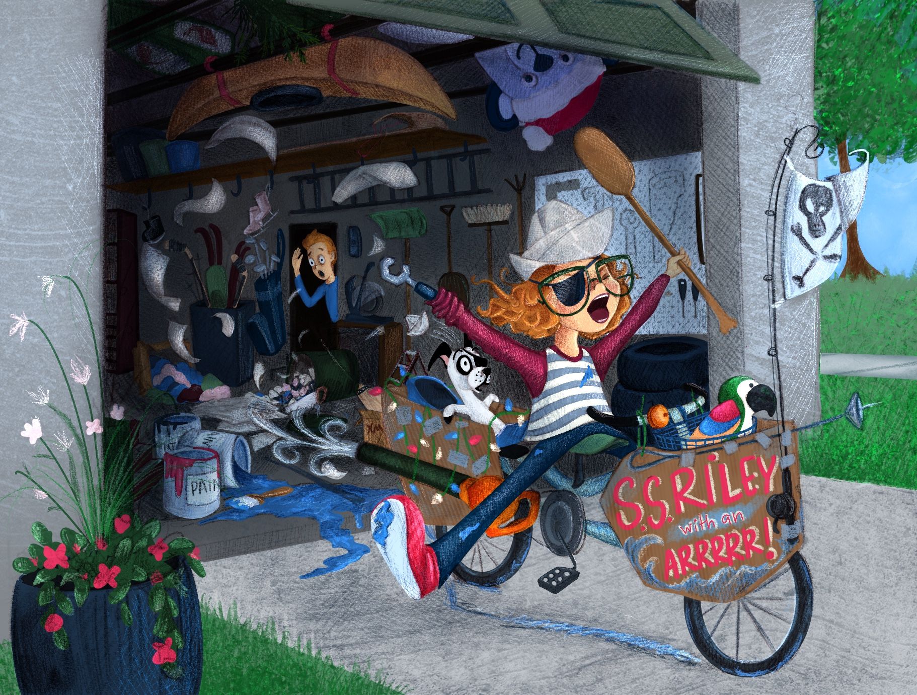
@allevolz thankyou, I’ll play with the bear some more. I’ve shaded him darker in shadow so that he’s not so promenant, but I do agree that he’s still too heavily prominent.
-
@angelinakizz this looks awesome! One thing that does stand out to me though is that bear in the Christmas hat. It’s so unusual in this setting that I think it becomes too much of a focal point and feels like it’s a bigger part of the story that it should be
-
@griffin thanks so much Griffin. I agree that the bear had too much prominence. I spent the last few days making adjustments on the piece, and last night I reduced the size of the bear and put him deeper into shadow. I’m still working on tweaks, and figure the next 2 weeks, I’ll keep looking for things to improve on it.
Here’s where I’m at now.
