Portfolio piece feedback wanted
-
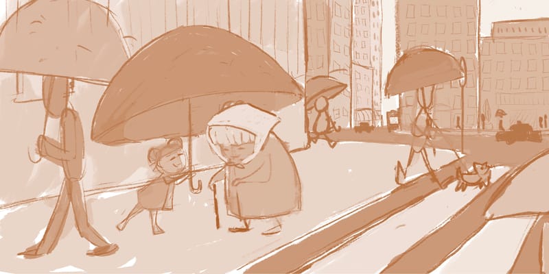
I think I would add some cars in the street, and a stop sign on the corner where the crosswalk is. More people in the backgrounds as silhouettes. I would even Google cities like New York, or Chicago to get a good idea of what’s missing. Looks good so far. Nice work
Wannabe Caricature Artist and Illustrator.
https://www.flickr.com/photos/doodlemick/
https://www.instagram.com/doodlemick619/ -
@doodlemick yes I am dreading adding the cars!
-
@kayleenartlover yes it’s just a sketch I laid some tones down but I’m still thinking Of color palettes and adding some more details. Thank you for the feedback!
-
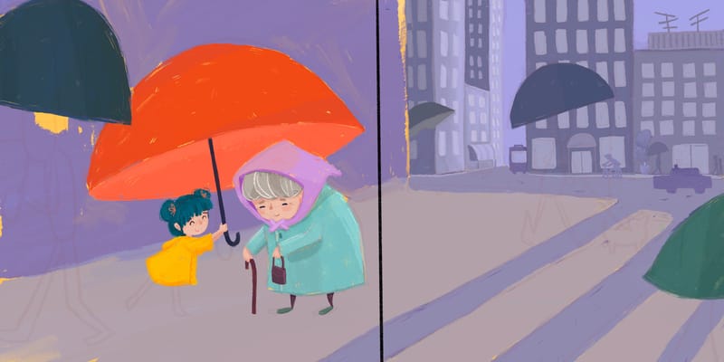
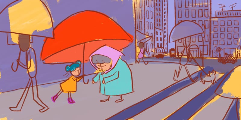
Ok I added a few more things but I think that’s it for now after I add color and rain I may add more details I just don’t want to over complicate the image
-
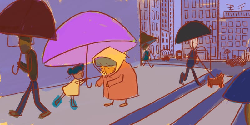
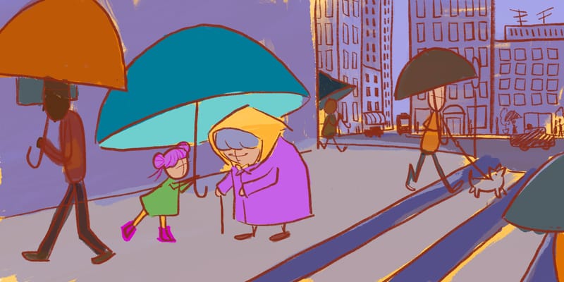
Got some color comps here I definitely want the girl and granny to b the focal point and for the buildings and most of the background to be somewhat monochromatic . The by standers will roughly be the same colors so I didn’t bother with their color in the third…
-
@asyas_illos really like the red umbrella! Because red is such a hot color, your eye immediately goes there first. I also like the last color comp because you've got versions of the 3 primary colors centered around the umbrella. I'd bump up the yellow on the girl's dress and mute all the other yellows/hot colors in the rest of the piece. (I really like the pops of yellow peeking through the background purples, even if it's unintentional. Really cool!)
Is the story that the girl is offering an umbrella to the little old lady? Or holding it over her to protect her from the rain? Such a sweet scene! Have you read The Big Umbrella by Amy June Bates and Juniper Bates? I think you'd love it! (Could give you some inspiration too.)
As far as feedback, gonna draw your attention back to what @NessIllustration said: if this is a portfolio piece for the children's book market, the illustration should clearly communicate that you know the market and that you know how to illustrate a picture book, even if you haven't illustrated one yet. There are a few composition issues that could lead an art director to question that.
To help communicate, I did a few quick little draw-overs. This first one is focusing on composition:
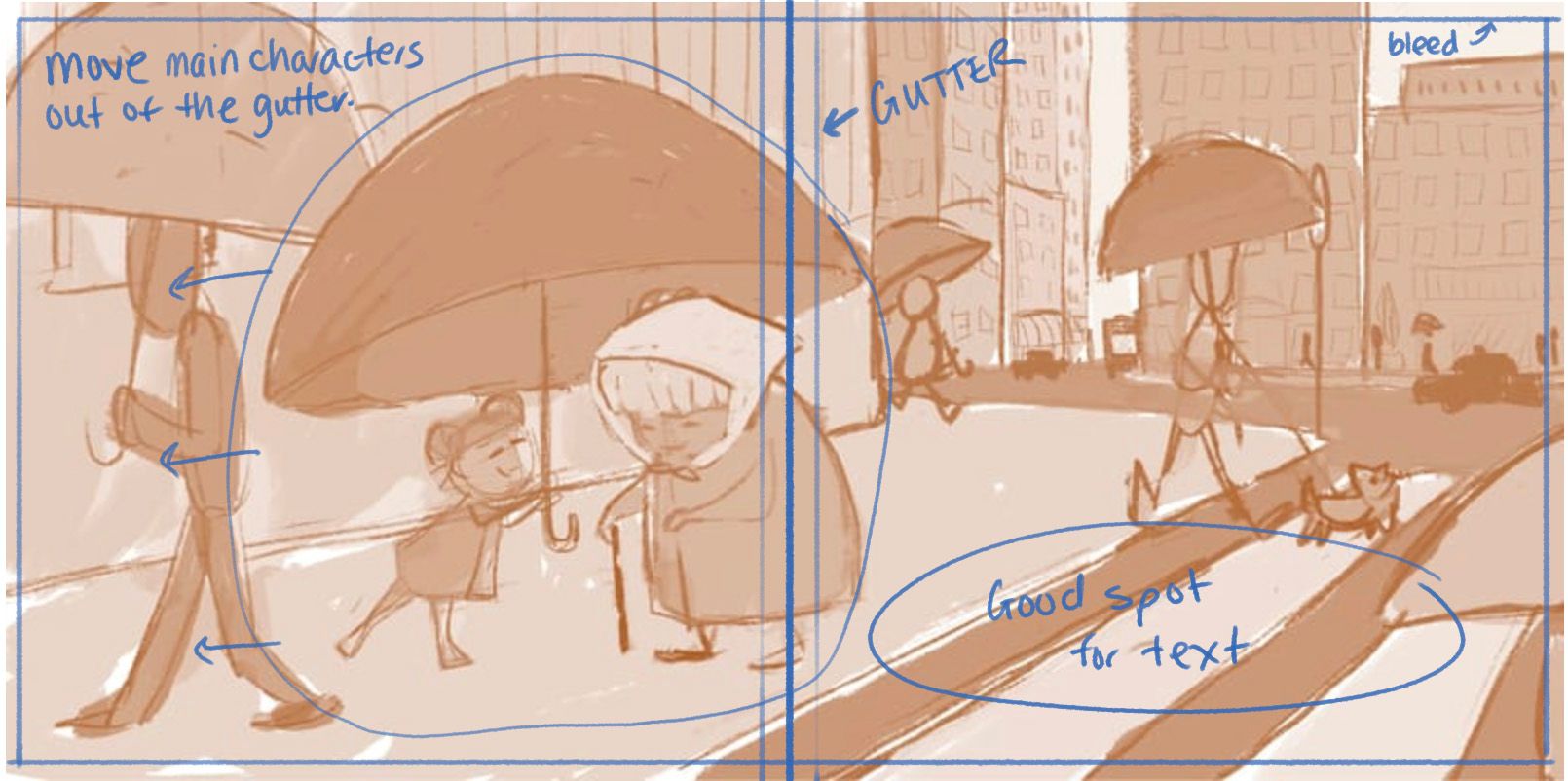
There are 2 big no-no's here: 1) a main character is in the gutter and 2) there is no room for text. You have a spot where text could go, but that is also the area of highest contrast -- it would be difficult to read text over those alternating dark and light stripes. Tone down those stripes, and you will have left room for text that an AD will be happy to see. The second fix? Crop or adjust your composition to move Granny out of the gutter.Second draw-over focuses on optimizing the composition for picture book layout and to keep the focus on the main characters:
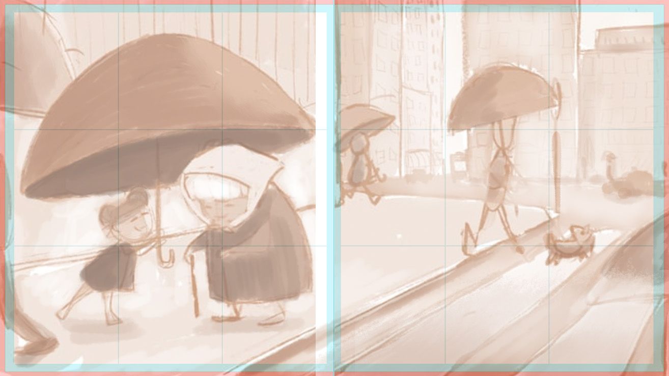
I used one of my templates for a 9x10 trim size (that's the guide lines you see over the image). Also played with value to put the highest area of contrast on the focal point--the characters under the umbrella. The high contrast of the crosswalk lines was reduced -- they're hinted at, but they're no longer vying for attention and there is now a clear space where text could be placed.Hope this helps. This is such a cute comp! Looking forward to seeing where you go with it. Please keep us updated, as you always do!
illustrator - author - smiley person
mbaileyart.com
instagram.com/mbaileyart/ -
@melissa_bailey yes! Thank you for the drawovers! I hadn’t thought of the text so I’ll keep that in mind, though I have since, scooted them all over a tad more. I am totally having fun, while learning a lot at the same time in doing some things I have had yet to explore. Yes I intend to leave bits of the wash showing through I love how it gives a sort of sense of looseness. Thank you for the excellent feedback! I will post more progress soon
-
@melissa_bailey and no I haven’t read that but I will check it out!
-
@asyas_illos you're welcome! Glad you found it helpful.
-
Making progress… ooh I just noticed she’s wearing coralline’s clothes… oh well