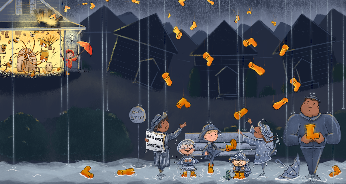
Lotsaboots? Or just a littlebitofboots?
-
@braydin-hawlette Umbrellas is a cute idea! And honestly, for a kid, I was wondering about changing the story and just having it rain cookies...
-
This gave me the feeling of the Willy Wonka Everlasting Gobstopper Machine. Good Idea
Wannabe Caricature Artist and Illustrator.
https://www.flickr.com/photos/doodlemick/
https://www.instagram.com/doodlemick619/ -
@griffin said in Lotsaboots? Or just a littlebitofboots?:
I love this idea so far but I do think Riley and the garage could have some more attention. Just increasing the size of the garage and moving the composition around a bit could do the trick.
I like the idea of her solving a problem with her machine. The abundance of rain gear to help with historic rain is a very cute kids book idea
") I was suggesting umbrellas instead because they're a much more interesting shape and can have a lot more in the way of character (all kinda of colours/patterns as well as being open or closed).
I was suggesting umbrellas instead because they're a much more interesting shape and can have a lot more in the way of character (all kinda of colours/patterns as well as being open or closed).Cookies is nice, but the umbrellas or rain boots are an easier story read I think
-
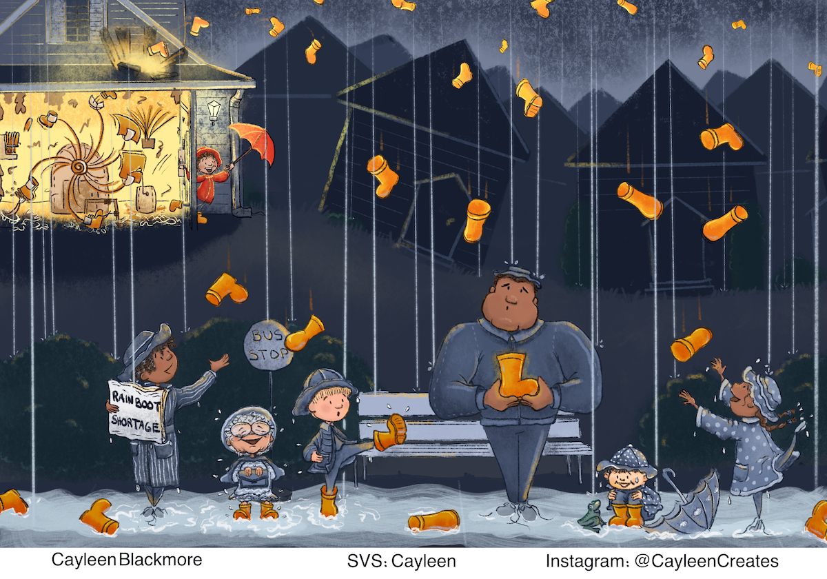
@cayleen I like the second one better! For me the problem in the first image isn't necessarily the amount, but how even the distribution. It seems too organized! Very fun concept!
-
@braydin-hawlette Awesome, thanks!
-
@doodlemick Oh fun! Thank you!
-
I like the second one, the boot distribution is more appealing to me.
This idea is super cute, however it took me a while to find Riley. Maybe it’s just that it’s line art still, but I feel like there needs to be more focus on Riley. Could you put the character on the far right in the yard catching a boot, and move the far left further forward so that they aren’t such a straight line (think reverse C shape to you characters) ? I feel like this would draw your eyes to the back of the image.
-
This is a great idea! Really fun! I love the boots, and the second one works better for me with less boots and more randomness.
I agree that there needs to be a bit more emphasis on the garage and I think the other characters should be more to the right, in line with the projection of the wellies, and not in such a straight line. Just some thoughts.
-
Thank you for your feedback!!! I tried using a bit of colour and contrast to bring attention to Riley and the garage. Might need to tweak it some more though?
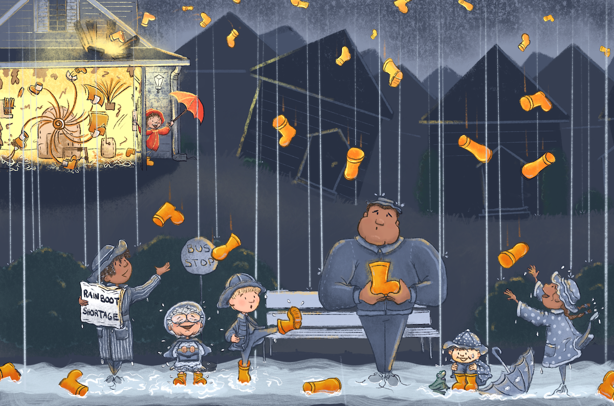
Next question... Do you prefer the darker picture or the lightened one? I kind of like the darker one, but that might just be on my bright iPad screen. (Top is darker, bottom is lighter. I might be over thinking this too....lol).
-
And, since I can't stop poking...What about this one with the people scootched over?