Society of Visual Storytelling

    SVSLearn Forums

    • Register
    • Login
    • Search
    • Recent
    • Tags
    • Popular
    • Users
    • Groups
    • Search

    Feedback needed - irish dance logo project

    Projects
    13
    31
    1738
    Loading More Posts
    • Oldest to Newest
    • Newest to Oldest
    • Most Votes
    Reply
    • Reply as topic
    Log in to reply
    This topic has been deleted. Only users with topic management privileges can see it.
    • Oana
      Oana last edited by

      After one more day of moving things around I got to this version:F59C67C7-4F17-47DA-8A10-891E98F2B7A3.jpeg
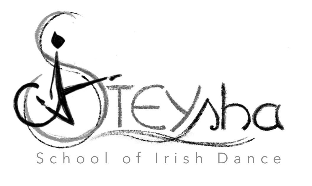
      The large/small caps will stay , though it does unbalance the composition a bit to the right and I don’t know what to do about it. but I unified the fonts more and got the “school of Irish Dance” in one line wich is definetely much better. I showed it to the teacher and she likes it very much, but she had an unexpected observation - to her the cat looks naked and she wants me to add some detail so it is clothed 🤭 I think I might add a separation at the waistline, that might suggest pants?
      The suggestions here really helped, thank you! I will return after vectorising

      J 1 Reply Last reply Reply Quote 1
      • J
        jdubz @Oana last edited by

        @oana Aren't cats normally naked?

        Josh White
        https://www.instagram.com/joshwhiteillustration/

        Oana 1 Reply Last reply Reply Quote 0
        • Oana
          Oana @jdubz last edited by

          @jdubz lol I thought so but maybe not when they start dancing 😼
          Until I figure out how to dress the cat I tried a little something to balance the right side. I would appreciate an opinion on this, especially from not-into-irish-dance people!
          1FF13491-6B84-4665-95D0-0E2E26CF266F.jpeg

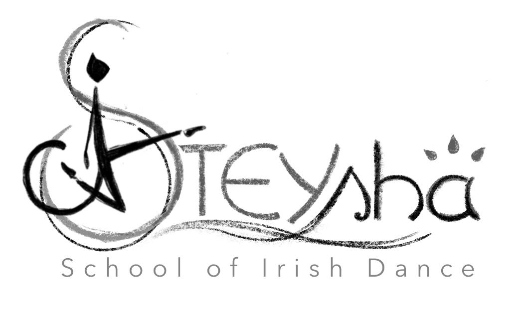
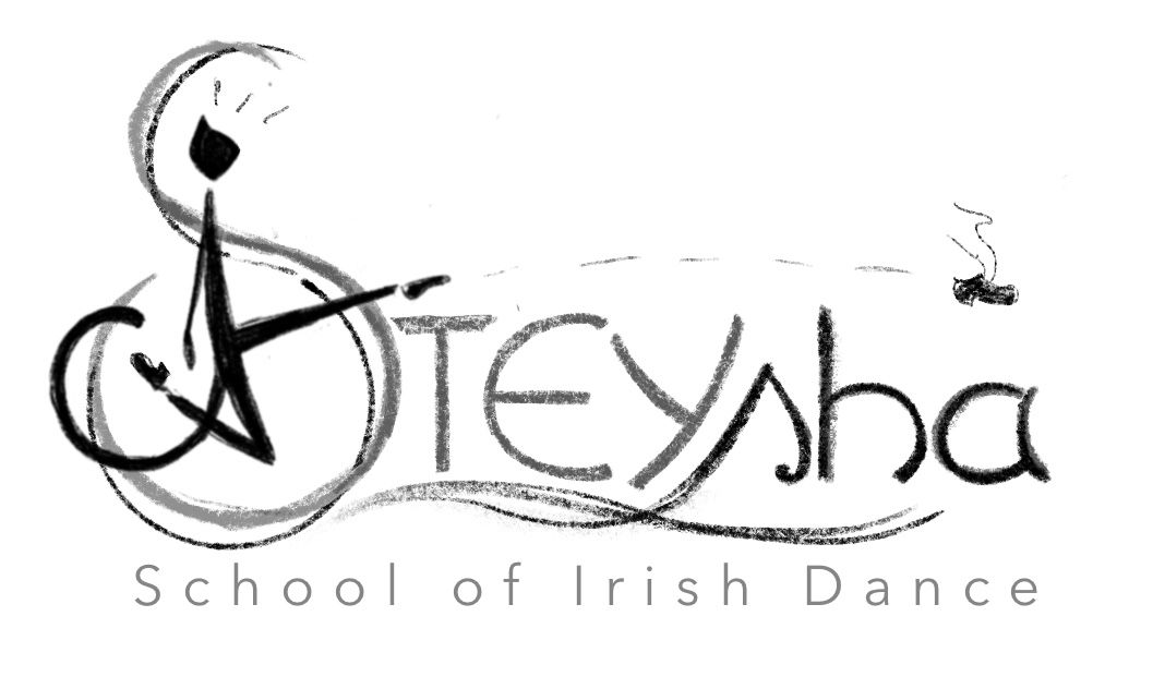
          Or I could always go this way 😹
          9FF27C63-F2FF-4DC0-9CE5-10CFD0912A79.jpeg

          Kim Hunter jenn 2 Replies Last reply Reply Quote 1
          • Kim Hunter
            Kim Hunter @Oana last edited by

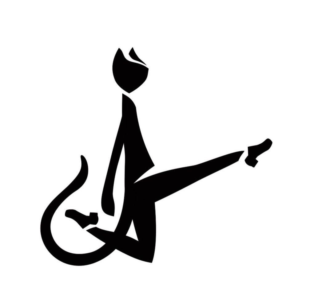
            @oana I like it but I'd like to see it without the curl coming off the dancer's back/bottom. It's kind of cool but it also looks like a monkey's tail. I find myself staring at it, even from across the room. You can also slide it up higher on the dancer so it looks like a skirt instead of a tail. Just try it and see how it looks.

            Oana 1 Reply Last reply Reply Quote 0
            • Oana
              Oana @Kim Hunter last edited by

              @kim-hunter That's an interesting observation I didn't get before, thanks. I will consider it when working on the final shilouette, the dancer is a cat so the tail stays but I will try to shift it higher. Actually I noticed it looked like the tail of a monkey but the circled shape looked better in the design to me.

              1 Reply Last reply Reply Quote 0
              • jenn
                jenn @Oana last edited by

                @oana I don't think you need to balance it on the right side with extra objects. The shoe is funny though.

                studiojcd.com
                she/her/hers
                Insta/Twitter: @chengdesautels

                Kim Hunter 1 Reply Last reply Reply Quote 0
                • Kim Hunter
                  Kim Hunter @jenn last edited by

                  @jenn After I read that it's a cat I wondered if you added a second ear then maybe it would read as a cat better. Maybe try a more paw-like hand?

                  Oana 1 Reply Last reply Reply Quote 1
                  • Oana
                    Oana last edited by

                    Update on the cat after some time spent in vector land:IMG_3499.JPG
                    What do you think?
                    Still working on the letters, painfull process.... 😰

                    jenn 1 Reply Last reply Reply Quote 3
                    • Oana
                      Oana @Kim Hunter last edited by

                      @kim-hunter You were right, a second ear seems to work and it's not cartoonish as I feared!

                      1 Reply Last reply Reply Quote 0
                      • jenn
                        jenn @Oana last edited by

                        @oana agreed, the 2nd ear makes it much more recognizable as a cat

                        studiojcd.com
                        she/her/hers
                        Insta/Twitter: @chengdesautels

                        1 Reply Last reply Reply Quote 1
                        • Oana
                          Oana last edited by Oana

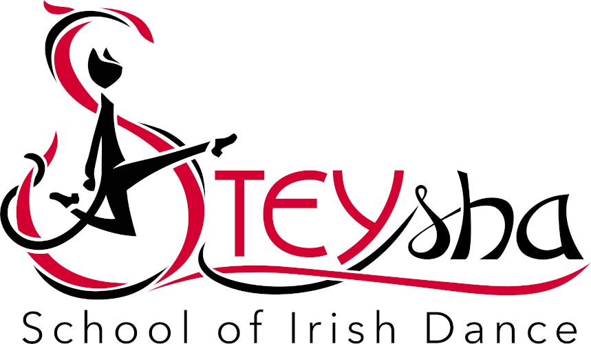
                          One more step... It's a vector now! I just still feel like readjusting every point a 100 times... and I still need tomake some color variants, this is the red scheme the school already had, I'm not sure which other way to go... Opinions welcome, your previous input was very helpfull!
                          E90CF0BB-36FE-4E84-9DE8-8C88B10D49FF.jpeg

                          DoodleMick jenn crispalomino 3 Replies Last reply Reply Quote 4
                          • DoodleMick
                            DoodleMick @Oana last edited by

                            @oana This is very nice and professional looking… Great Job

                            Wannabe Caricature Artist and Illustrator.

                            https://www.flickr.com/photos/doodlemick/
                            https://www.instagram.com/doodlemick619/

                            1 Reply Last reply Reply Quote 1
                            • jenn
                              jenn @Oana last edited by

                              @oana I agree with @DoodleMick very pro! I really like the twisty ribbon effect, it adds drama and flair

                              studiojcd.com
                              she/her/hers
                              Insta/Twitter: @chengdesautels

                              Oana 1 Reply Last reply Reply Quote 0
                              • Larue
                                Larue last edited by

                                Hi there, Late comment coming in. I've been watching the progress and I think it's coming together well. My one issue is that I think you're losing the readability of the "s" in shay. If I hadn't known it was an "s " I could have read it as an r,n, or s.

                                Oana 1 Reply Last reply Reply Quote 1
                                • Oana
                                  Oana @Larue last edited by

                                  @larue Good point and you are right, I'll have to go over that once more! Ugh letters are so difficult! 🙂

                                  1 Reply Last reply Reply Quote 0
                                  • Oana
                                    Oana @jenn last edited by

                                    @jenn Thank you! I tried to incorporate the twisty effect as a celtic element, it's much used in dance dress designs

                                    1 Reply Last reply Reply Quote 0
                                    • T
                                      tonydupreart last edited by

                                      Sorry for the late comment - the latest version looks amazing. My comment - and only because reading it as a cat was discussed so much - is on the legs of the cat. They are human-like at the moment, and it might be worth trying to do an indication of feline leg anatomy, even if very subtle. If you have completely straight legs, it's fine due to simplification, but once you add a bend (especially the knee, like you have) or anatomical curve/muscle, then you're kind of committing to a species at that point. May be worth sketching out quick. (If I didn't catch that it's supposed to be this way, I'm sorry)

                                      Oana 1 Reply Last reply Reply Quote 1
                                      • crispalomino
                                        crispalomino @Oana last edited by

                                        @oana I think it looks great, especially with the two colors.

                                        https://www.instagram.com/crispalominoartist/
                                        https://www.instagram.com/explore/tags/themisadventuresofwinston/

                                        1 Reply Last reply Reply Quote 1
                                        • Oana
                                          Oana last edited by Oana

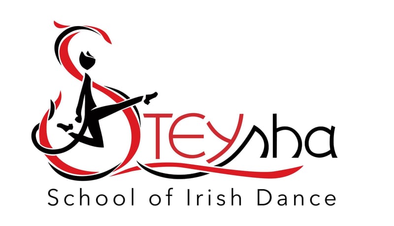
                                          Looks like the project is ready, here is how the final version turned out:

                                          Steysha-catlogo-small.jpg

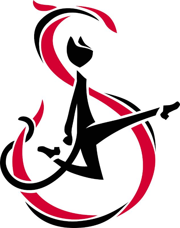
                                          I also isolated the S with the cat, might be used on its own:

                                          Steysha-catlogo-doarS-small.jpg

                                          At present all looks good and we're happy, we still have to see the logo "in action".

                                          All comments and suggestions received here were very helpful to me, thanks!!!! 👍 😁

                                          Jeremy Ross F Tannie Smith 3 Replies Last reply Reply Quote 2
                                          • Oana
                                            Oana @tonydupreart last edited by

                                            @tonydupreart I get what you were saying. I smoothed out the leg shapes and though I am not sure it indicates "more feline" it does look better more stilised!

                                            1 Reply Last reply Reply Quote 0
                                            • First post
                                              Last post