WIP feedback
-
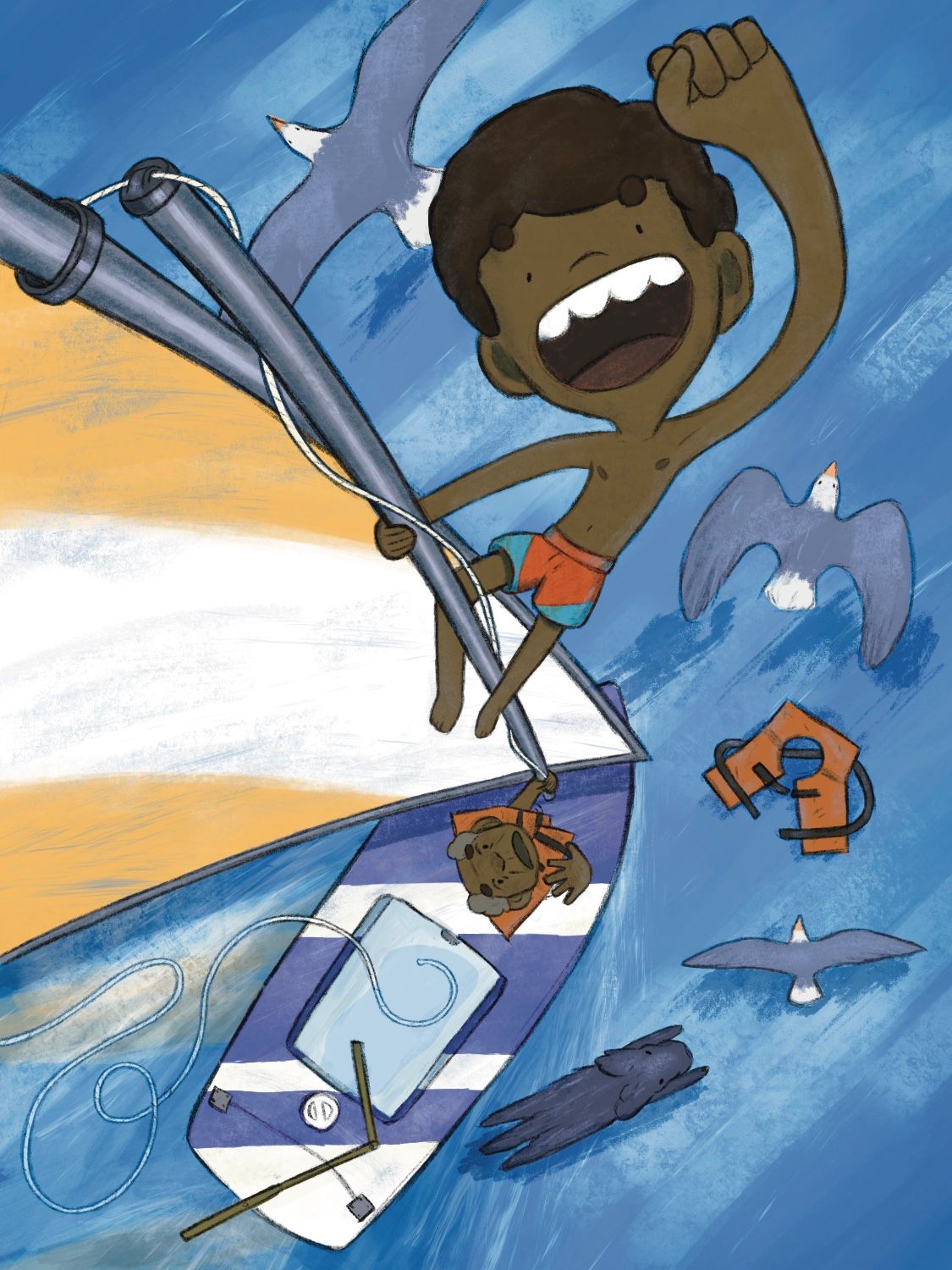
@Kristen-Lango thanks for the feedback! The broad white strokes are meant to be reflected clouds and the ones around the boat are crashing water from the wake. I think you may be right about the grey undertone of the water. I made it a cooler, lower saturation to contrast the brightness of everything else but since it’s a reflection of the sky which is a bright sunny day then I should probably make the water more saturated.
-
I think I’m about done here. Added a bunch of blue highlights to unify the image and make things pop a bit more, hopefully they’re not distracting. I also added the reflection of the sale to give the water some more variety. Let me know if you see any issues please!
-
That is a really neat but difficult perspective! Something I’d do to push the appearance of a sunny day in addition to saturating the blues would be warming up the parts that are receiving direct sunlight, especially where they are closer to the viewer. Right now the figures still have sort of a grey/green cast to me, and I think a soft orange overlay in some places would do the trick. James Gurney’s book Color and Light does an amazing job of explaining how you can capture atmospheric lighting in scenes with different weather!
-
@Griffin I like what you did by adding that yellow reflection of the sail

-
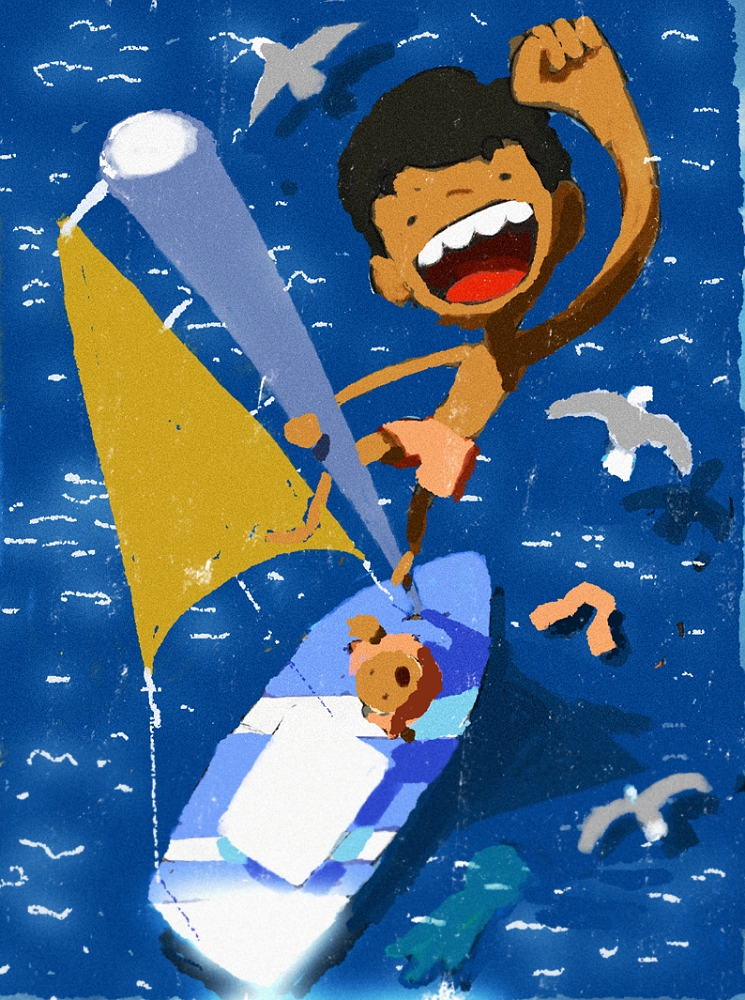
@Griffin i think, if you want to make it look like bright sunny day, you need more value separation between planes, that are hit by strong direct sun, and planes, that are in not hit by sun light. There have to be hard cast shadows as well.
In the scenario of POV in your picture and sun light coming from top, the water is hit by sun, but because it is more translucent and deep, it wont get really bright in value, if will just get more saturated in color. There might be strong spot reflections from small waves though. There shouldnt be any reflecrion from clouds in this set up. If clouds are above the water, they would just block the sun and create cast shadows.
I think, it is always helpful to use some photo reference, if you want to achieve certain light scenario.
In your POV, the perspective is not easy, so you might be carefull with sizing of objects (for instance the livejacket looks a bit big, if floating on water).For the birds, their cast shadows, can help to imply their size.Maybe something like that? (sorrry for messing up with your drawing)
-
@marek-halko nice @Griffin i was going to mention this also, that there should probably be more highlights or brighter saturation on certain surfaces.
-
@marek-halko thanks so much! Your version captures the brightness and colors I’ve been trying to get. I really tried to find reference to help me with this but I couldn’t find many images that were just looking down at the ocean like this to give me an idea of how light and reflection work at this angle. Your advice and re-paint are super helpful, can’t thank you enough!
-
@marek-halko After seeing your re-paint of it I’m wondering now if I should change my composition a bit to have more of the sail in the image like yours does. It might make the the illustration read more clearly I think
-
@Griffin What he said ^
 the he being @marek-halko
 -
I've been out of town so sorry for the late feedback. Love the perspective and I won't tag onto stuff already mentioned but to me I'm confused by the person down below on how it looks like he's holding the end of the pole with his hand, almost like he's waving a flag in the air. I think you want it to read as a pole connecting solidly into the boats hull down by his feet. I think if you could show the tips of his toes and maybe a washer with bolts attaching the "pole" to the boat there wouldn't be any confusion.
-
@Griffin the perspective is quite challenging, but i think, it fits perfectly for the story moment. i think my paint over would need a lot of adjustment and i dont know, if the sail size is necesarilly helping the composition, i just though, it might be smaller. But the composition in the end depends on value contrast, so playing with light and local color can help a lot to get composition, you like. Good luck!