Critiques Wanted on New Storm Concept
-
Hi there! Right after the deadline in May, I had another idea for the storm concept that I really wish I had thought of/finished earlier because I feel it was stronger than my other two entries.
I would still be quite grateful for your feedback and critiques are very welcome!
After hours spent on a piece I always feel way too close to it and have troubles seeing what is wrong or doesn't read correctly.
Thanks in advance!!
")
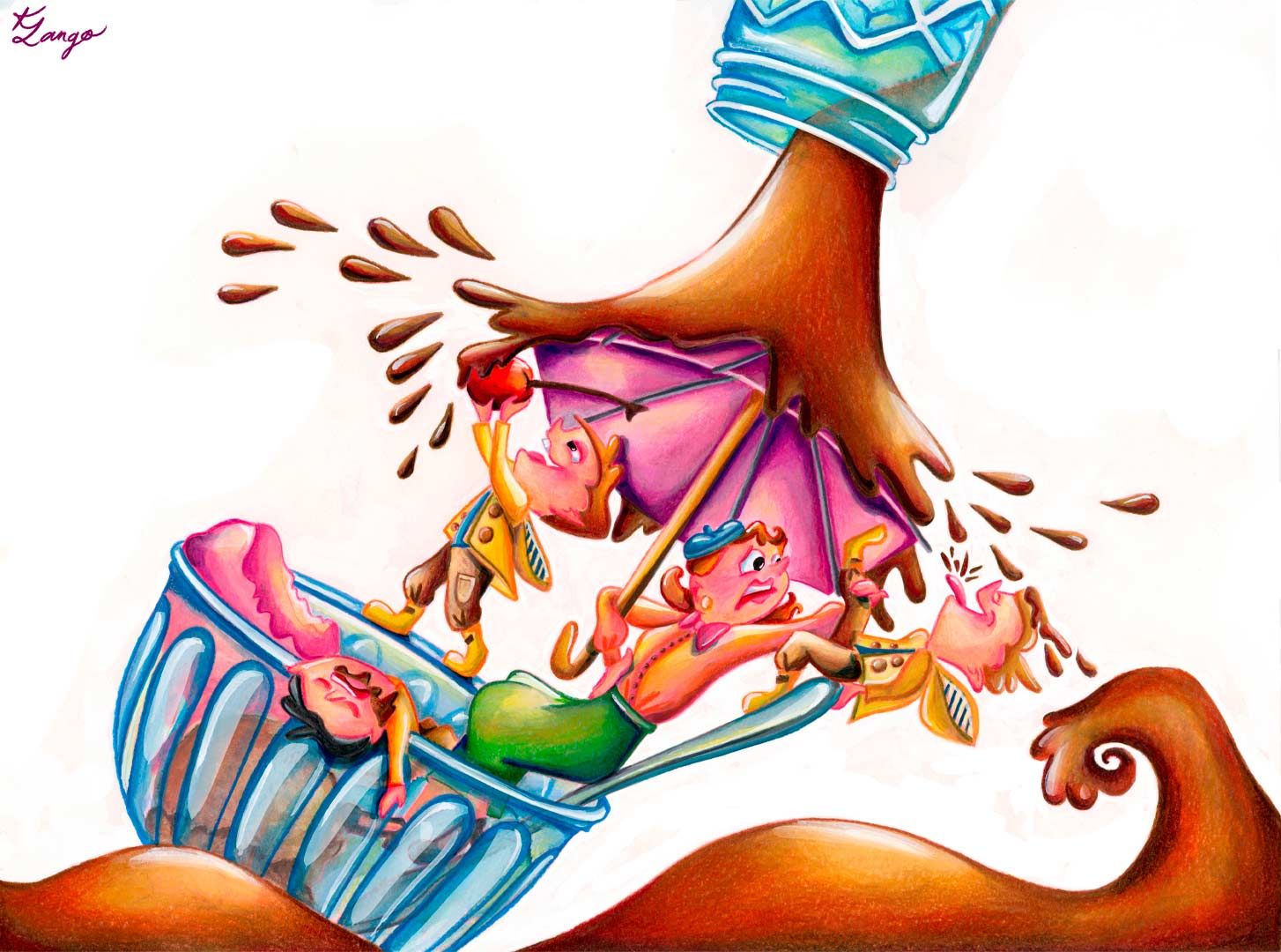
Sorry to repeat this photo (it's in the storm thread also) but I wanted to provide it here so you can see a bit of the process and how I work traditionally.
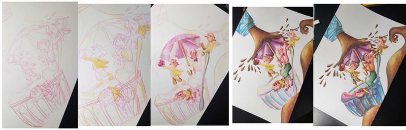
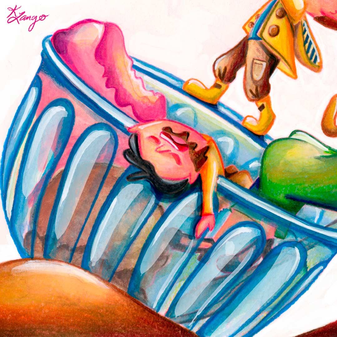
PS one thing that jumps out at me more on the computer screen than in the actual physical copy is the color of the woman's face... on the computer it's looking way too pink
 I'm wondering if others feel the same.
 -
@Kristen-Lango Oh, I love this fun piece! So much energy. Some observations:
- I agree with you that the faces look too pink here and almost blend into the umbrella
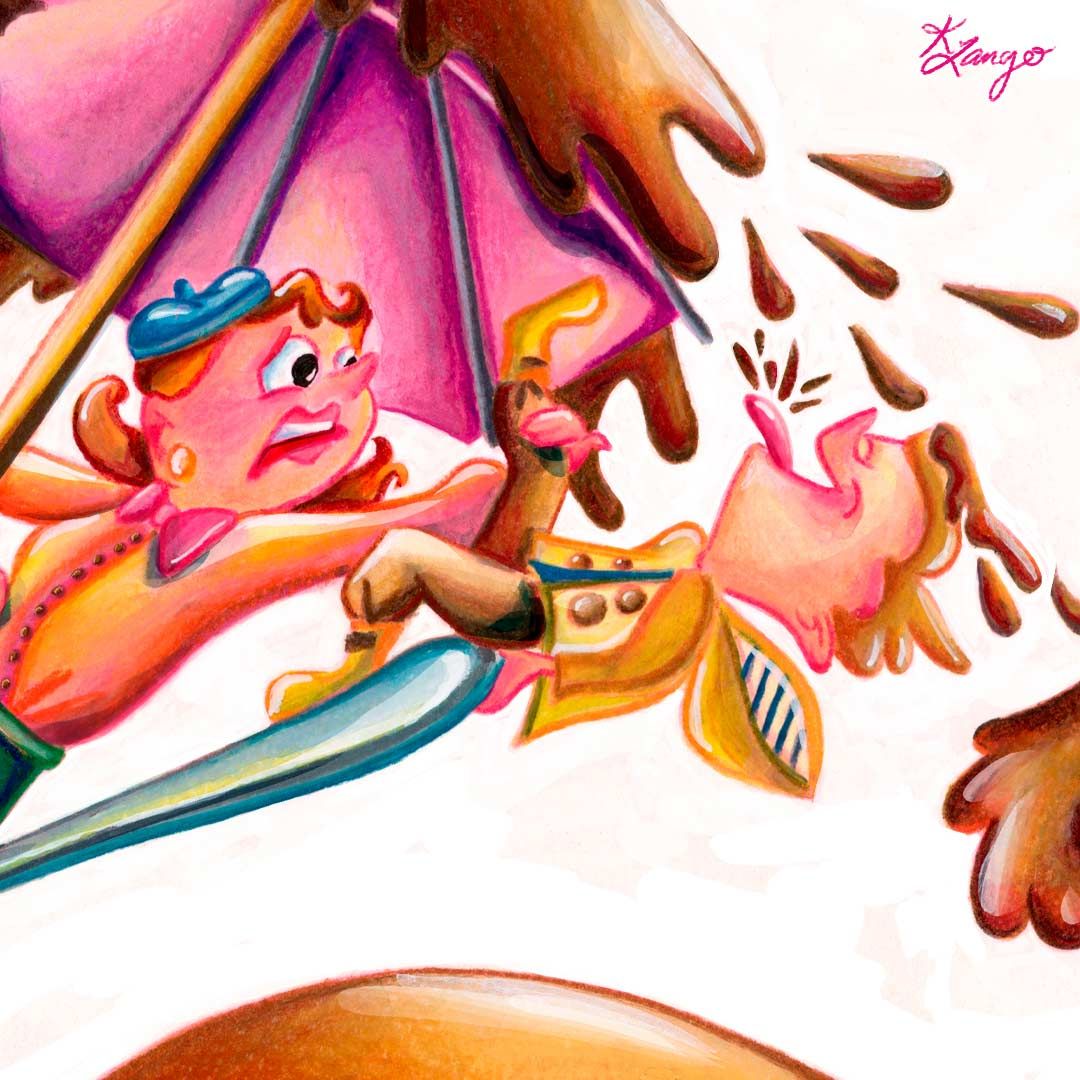
- The perspective of the umbrella looks a little off. I think we should be seeing more of the sides and a little less of the underside? Unless it is tilted but then we need to see that it is visibly tilted
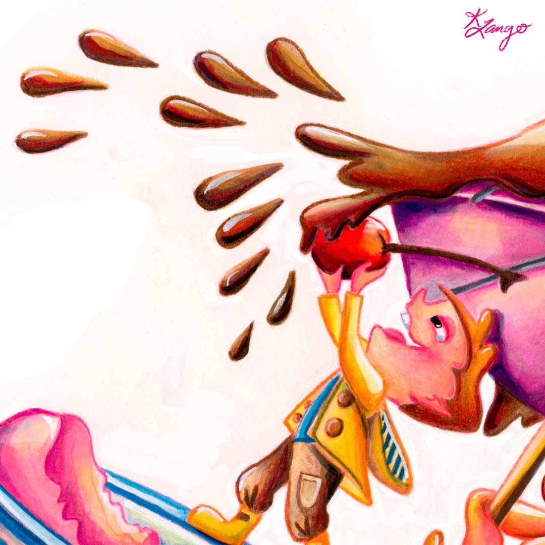
- The chocolate liquid thing, is that chocolate syrup? Yumm! I would like to see a bit more thickness if so... currently with the way it splashes around it looks more like coke...which is yummy too I guess
Overall I love the concept and the colours. Go for it!
www.instagram.com/art.melc.illo/
www.artmelc.com
I write weekly on mondayblues.substack.com -
@Melissa-Candrasaputra Thank you so much Melissa! These are all such helpful comments
Totally - the umbrella's perspective is a little wonky (shhh don't tell but I didn't plan out the perspective on this one haha)And ugh yes I struggled with the attempt to make it look like a thick chocolate syrup, I thought it might have a lot of yellows and orange and red tones but now I see that that is giving it a bit of a soda vibe. Maybe throwing some bluish purple tones in there might help?
Thanks again!
-
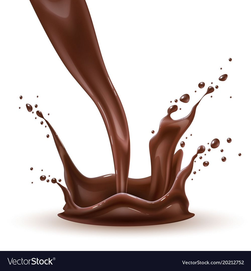
@Kristen-Lango I suspect it might be the teardrop shapes that is throwing me off. Thick liquids like chocolate syrup doesn't really splash that way. Maybee changing them to round blobs might work? Here's a quick reference on chocolatey behaviour...
www.instagram.com/art.melc.illo/
www.artmelc.com
I write weekly on mondayblues.substack.com -
@Melissa-Candrasaputra Ah yesss this is so super helpful! Really, I don't know what I'd do without these forums and you guys

-
@Kristen-Lango I would also add that it may look more interesting if you add more contrast to the drops. By contrast I mean on size and space between them. The drops looks too similar and symmetrical to me.
-
@Eliana-Bastidas Thanks Eliana! That makes sense and I totally agree with you. Thanks for your help!