Opinion on Graphic Design/Logo Design
-
Hey there! This isn't exactly illustration related, but I could use some help. The nonprofit I work at is spearheading a new community project and I have been tasked with the creation of its logo. I was wondering if I could get your opinion please?
- Based solely on my design, could you guess the purpose of this project?
- What does the logo mark make you think/feel?
- Which Option(s) do you like the most (keep in mind this could be used for T-shirts, banners, stickers, letterheads, business cards, etc.)
(I'll say what the project's real purpose actually is below the image, but I encourage you to take a guess before looking
") )
)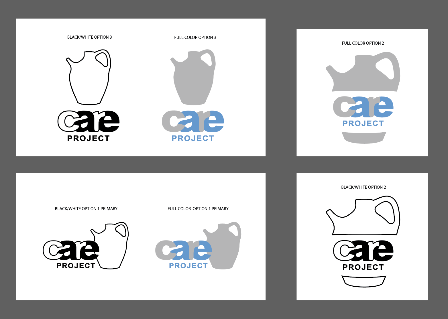
Have you taken a guess? I hope so! Thanks again for your help. The Care Project is an initiative to connect churches with the community in order to harness and promote community service. My boss said that this design might be misleading as the clay jar could be seen as a food related item. I was hoping to know your thoughts!
Feel free to ask me any questions, comments, or concerns you may have
ThanksSoMuch! -
@Kruzby I like how the letters flow together. The jar reads successfully as pottery, and with the blue color my first thought was that the organization helps to provide clean drinking water to a community that uses similar jars with this unique shape. Maybe to distinguish it from a water- or wine-jug, you could put a flower in it.
I wasn't sure if you were looking for input on which option to choose. If so, I think options 1 and 3 are stronger because it is more clear that the silhouette is a jar. It took me an extra half-second to figure out option 2. Maybe it is because the words are on a flat plane whereas the jar is rounded, so it breaks up the shape. If the words were curved so that they appeared as if on a rounded surface, or if the bottom piece met up with the text more closely, that might make it read more as a unified shape.
Overall the shapes look welcoming and friendly.
studiojcd.com
she/her/hers
Insta/Twitter: @chengdesautels -
This post is deleted! -
Similar to your boss' concern, being that there is vessel for liquid, the color blue, and how there are many clean water non-profits, I thought the project was related to water. Or milk; it reminds me of the old Got Milk? campaign ads. I assume you meant for the jar to be something from the bibical era, therefore relates to the church.
If the project isn't focused on serving the community through food or clean water security, then what action do they want to play? Understanding that would help with creating a second design option.
-
@jenn Thank you for the input, it was tricky to get the letters to flow together like that! I like your advice about changing option 2 to have a stronger silhouette. I’ll probably end up changing the water jug to something that communicates community better. Thank you so much for taking the time to give me a meaningful critique! I really appreciate it!
-
@Kruzby You've done some neat work here ...I've tried logo design and it's not the easiest thing in the world! Way to go tackling this. Have you thought about using two cupped hands--put one facing down towards the words and one facing up towards the words, if that makes sense? Thanks for sharing this project with us!
Melissa Jacie Art
melissajacie@gmail.com
melissajacie.com -
@MelissaJacie Thanks for the advice, I really like that idea a lot. Originally I was trying to avoid using hands because they are a bit of a design cliché, but it it works it works right? I’ll do a sketch of it and post it in this thread! Thanks for your help
-
@willicreate good points! Thanks for your input. I’ll keep that in mind while moving forward. I’ll post the next iteration in this thread!
-
Hi, I also like the way the letters work but like some others my forst thought that this was a project to get clean water to people that need it. Cupped hands or a graphic shape that fits together like a puzzle perhaps?
-
@Kruzby hmm... My first thought was water because of the jar. I thought this was about creating drinking water for remote communities
-
@Kruzby Sure thing! Look forward to seeing your next rendition!