July Contest: Rabbit Road Race
-
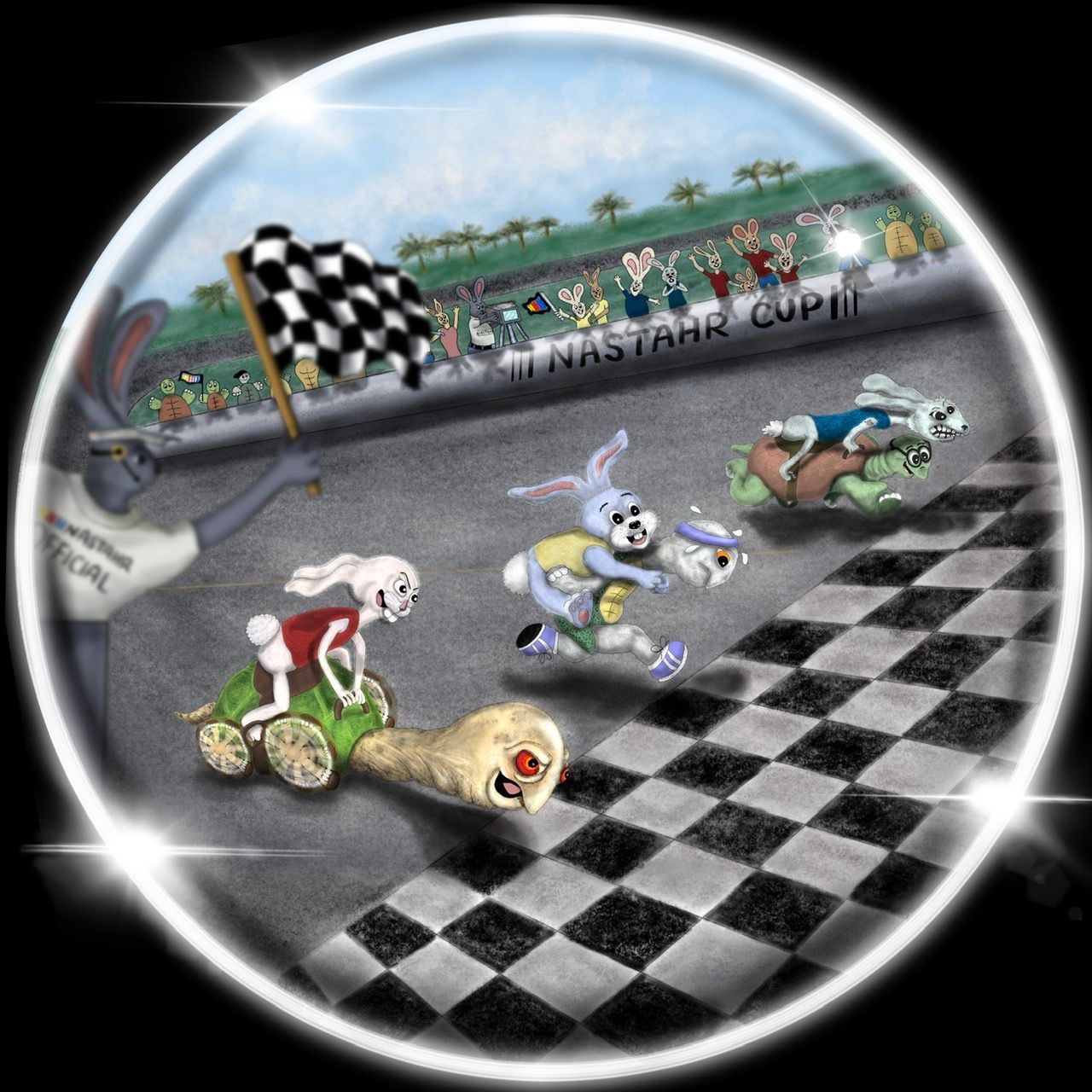
@Valerie-Light BRILLIANT!!! You really took this prompt and ran with it in a unique direction, full of AWESOME witty detail, and I love it!! Great characters, too. I remember the guys recently critiquing your website on the podcast, and I’d say this is definitely one of those standard raising “pinnacle pieces.” Of course, not all illustrations need such high detail, but you have a serious knack for it when it’s called for. Super excited to see more from you… and I want to see if I can make something just as good.
 Game on.
 -
@Sarah-VanDam WOOO Thank you for that awesome praise!
-
@Eliana-Bastidas Oh, that’s so frustrating! Glad to see your image here, though. That’ll be great if they can make an exception, but if not, come back again and compete again soon!
-
@kirsten-mcg Lol. Thank you!
-
@Sarah-VanDam Yeah, will definitely try to compete again. The good thing is that is not going to happen again

-
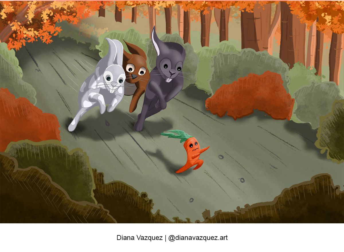
Hi Everyone, I am new to SVS, and I love the content and all the input and helpful advice I am seeing on the forum! I am a fine artist looking to ramp up my creative juices, so I am looking to learn more about visual storytelling through illustration. I joined in June, so this is my first entry into the Critique Arena! Please let me know what you think, I am open to any and all helpful advice. I’ll end with a question, can you tell from this illustration what two words I am trying convey?

-
@lucy_gow I love this Lucy
-
@aurelia love this Aurelia, super cute characters and lovely colours

-
@Valerie-Light ah no! It looks amazing though Valerie, please post a higher resolution version on here so we can see it properly! X
-
@Valerie-Light I went to your website and read the whole thing. If I were a kid, I'd want this on my wall in a heartbeat. It's fun and really well done, with appealing characters and layout. Unfortunately it would be hard to see in the Critique Arena even at higher resolution, but don't let that discourage you.
-
@LauraA Wow, thanks, Laura! That is really encouraging. I think I was really feeling uncertain about how this one would be received, but I just had so much fun letitng myself get carried away. I'm glad it's working.
@helenbrady you can see a much bigger image at http://www.valerielightillustration.com/projects-8
-
Ahhhh! First time entering critique arena! I am super impressed with the entries I have seen so far! Well done everyone!

-
My entry

-
@Valerie-Light I tried that link and it said page not found. But I did see your scenic and mural stuff. Wow! It is really cool. I am sure it is really different doing things at such a large scale. How do you transfer from the sketch to such a big "canvas" or whatever you are working on?
-
@helenbrady Ohhh thanks a lot

-
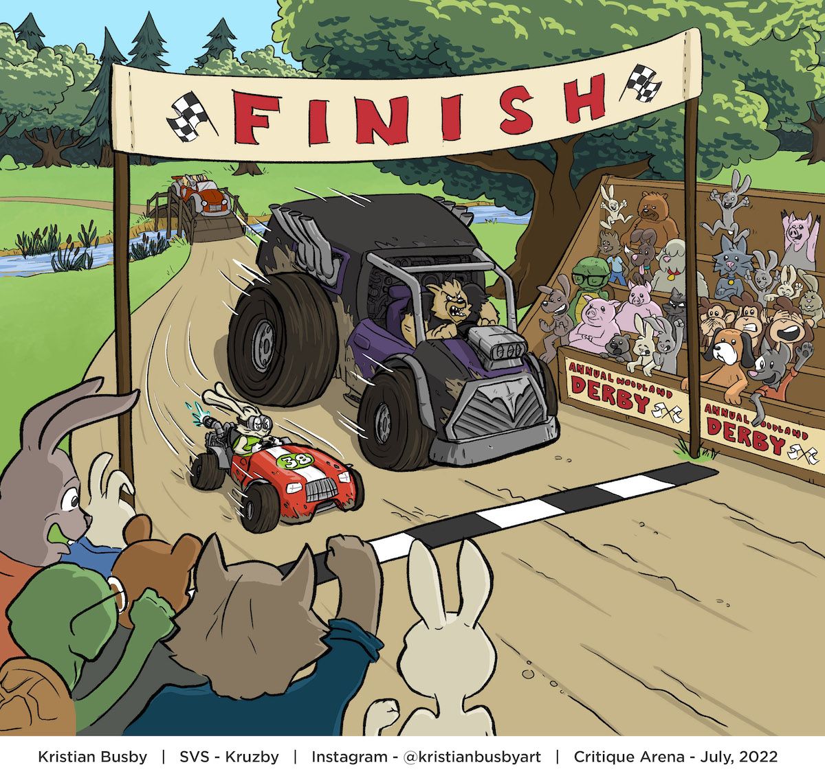
@marek-halko haha this is great! I love that you can just see the driver's eyes but there is so much expression in them!
-
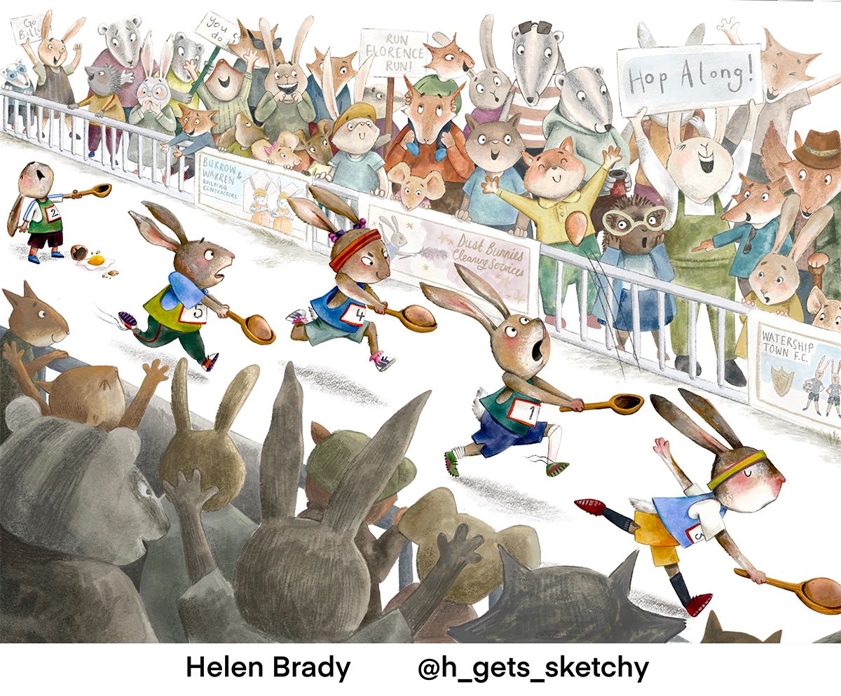
Hey everyone, I’m new to SVS, first time Critique Arena-er but long-time 3PP listener!
I’m a full time makeup artists at the moment, it’s quite tricky doodling on the side of the day job but I’m excited to do some of the SVS courses and I’m hoping they’re going to make me more focused so I can make the most of the free time I have. I did Will’s interior class the other day and loved it, loads I hadn’t considered and I’m looking forward to putting it into practise. I’m scared of environments at the moment but love doing characters, that will probably be obvious from my submission below!
I had to rush to submit it so I want to make a few tweaks to the foreground characters, the flying egg and the posters. If anyone has any other suggestions for edits please let me know! But I made the deadline and I bloody loved drawing this, it was so much fun!
I’ve just been browsing through the forums and there’s so much amazing work on here, it’s super-inspiring! Looking forward to getting to know you all!
H xx
-
@Kim-Rosenlof Whoops, link fixed! my illo work is at www.valerielightillustration.com/project-8
It is SO different working on a big scale. All your mark making is based on body movements and finding the biggest tool for the job so the brush strokes look effortless even if you're standing 60 feet away from the finished piece. One classic way that we enlarge images is by overlaying a grid on top of the reference image, and tacking down a grid made of string all over the backdrop. Then you just have to draw the detail in each 1 ft square, and make it all tie together.
-
@helenbrady Holy moley, this is amazing!!!! The detail, the composition, the complexity, the CUTENESS. This is incredible and looks like it was taken straight from a children’s book - WOW!!!!
-
@helenbrady This is funny. Cute idea and the characters are adorable!