Personal projects feedback please:|
-
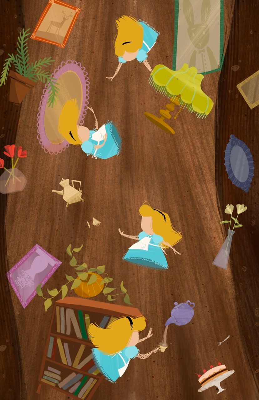
@Asyas_illos I love the balance of larger shapes with little details. And the tumbling movement.
-
@Asyas_illos Nice textures in the Alice background — the linear pattern helps with the falling effect.
I'd like to see her apron lifting up / flying away from the skirt of her dress in at least one pose (at least a corner pulling up or something). And maybe some apron strings / bow streaming behind her.
Also, Alice is tumbling, but the objects are only tilted. Could you put one of the tea cups on its side? Maybe have a slice of cake that has come loose and floating / falling above the cake where it came out of it? I miss the chair from the earlier version (but I agree with the comment about antique styles).
The overall style is adorable & I like the colors. That cake is so cute!
-
@Miriam thanks for the critique, I’ve done some work since my last visit and antiqued a few things like the lamp and teapot.
-
Working on Alice’s hair face and gesture now
-
@Asyas_illos I'm really loving the motion in this Asya! One thing I might suggest would be to play with the sizing of the objects a bit more. Right now they are all reading as sort of the same size with the exception of the lamp... I might ask yourself which of these objects is particularly important in conveying what you're trying to say at this point in the story and then perhaps size that up and draw emphasis to it with light or contrast in color.
The piece has great potential, but I do feel like the objects are making it a bit busy and I'm not really sure which one to look at first and why or which of them are important. Hope this helps! Great job with the poses of her falling and seeming confused - that reads well even without the expressions, so that's really well done!
-
@Kristen-Lango thanks for the feedback! Once I finish everything I plan on going over with lighting and shadows some things will fade back and others forward. Hopefully it will appear less busy then!
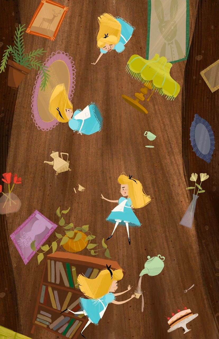
Here’s where I am at currently, just a few things left then I can start on lighting!
-
@Asyas_illos This is really great! The additional character poses really create the passage of time along with the actual passage down through the hole. And I love the rabbit wall art, little touches of the world she's entering with the world she's left.
-
@Heather-Boyd thank you! That was beautifully put
 ️
️ -
@Asyas_illos I also love how she's catching a cup of tea, that is a funny moment
-
@Asyas_illos this is adorable! I love it!
-
@Pamela-Fraley thanks!
-
So I’m currently working on another book idea
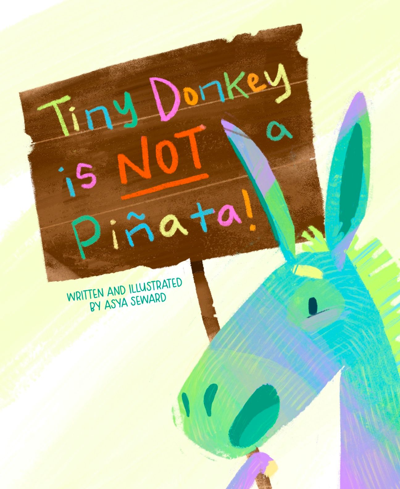
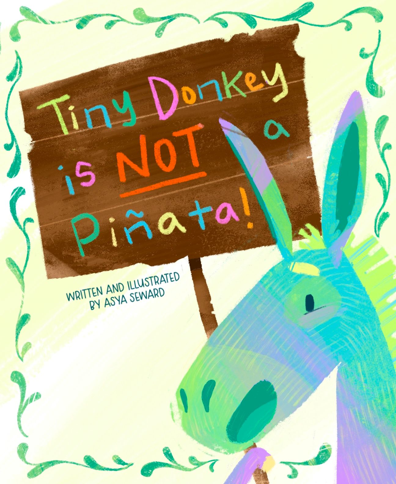
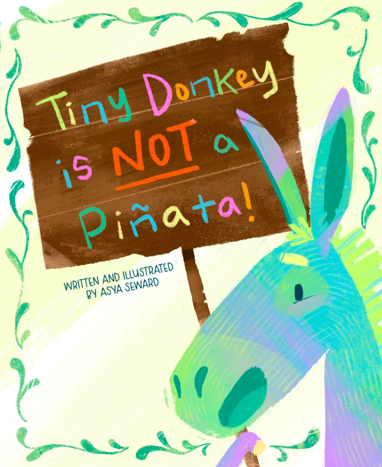
 (I know) but feel really good about it so far! I’m looking for some feedback regarding the cover, is the filigree too much? Should it be smaller/thinner? Composition working ok? Also, I wasn’t sure about the placement of my name, I know that lower left seems a bit bare. And, title is subject to change, but I think this one quite catchy. Thanks in advance!
-
@Asyas_illos Hi! Beautiful work. I love the color and texture. My suggestion is to not separate the "a" from the other words. Maybe move the ear backwards and the "a" forwards. Overall, I think this is a professional level piece and should definitely go into your portfolio.
edit: I think the vine borders look amazing. Definitely keep them.
-
@Nyrryl-Cadiz thanks nyrryl! I was wondering about that a haha.
-
@Nyrryl-Cadiz is this better?
-
@Asyas_illos what if the filigree varied in width? Or maybe it should go behind the top right corner of the sign? I like how it adds interest to the background but it does compete a little. However just making it thinner might not fit the scale of the rest of the shapes.
-
@jenn thanks I’ll probably play with it a little more and see what works.
-
I just love all of these! Little Alice, the donkey!
The cover design is very well done! I would absolutely have to pick up this book if I saw it on a shelf. You've got nice open space in the design for the eyes to rest and the colors work great. Moving the "a" was a needed and you managed to do it with compromising anything. Yay!
I would like to see if you could bring the sign in front of the border on the right side and definitely try varying the scale of the individual border elements - just for fun. Differing sizes of the swashes might look great with those yummy textures you've got going!
-
@Asyas_illos this would be such a FUN book to read! Love the colors and rendering.
Yes, I think that the design would look more balanced if your name was in the bottom left corner. (Just FYI, some books by author-illustrators say "written and illustrated by", but the vast majority just have the author-illustrator's name.)
I really like the hand lettered title. Why is the filigree added? Does it have anything to do with the story? My personal preference is the design without it; it's stronger, in my opinion, because there are already a lot of colors going on!
This will depend on your story and character, but just going on the cover, I feel a discrepancy between the title and the character's expression. The feeling I get from the title is that this is a grumpy or fed-up character that is misunderstood and keeps getting hit with sticks. But the character's expression feels happy and welcoming. So is Tiny Donkey ok with the mix-up and torture? If they're happy, why do they feel the need to clear up the misconception?
Again, LOVE the character and your rendering! Really nice design and story idea!
-
@Melissa_Bailey haha thanks for the feedback, I tried moving that darn eyebrow all over the the place to give him a bit of irritation but nothing was feeling right, it was like he was an old man and I didn’t want that. But I will play with it some some more. As for the border I only added it because it seemed a little too, bare. I like the border but I think I need to make it thinner/smaller. I will also play around with the name thanks again Melissa!