Superhero feedback needed/ help with format for clarity
-
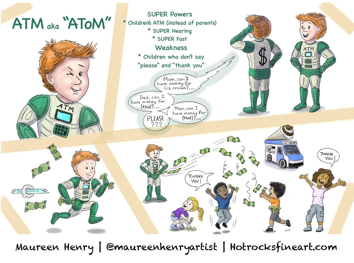
Hi everyone, what a great group we have here! I am recently new to SVS this Summer and I’m trying to transition from realistic art to childrens book illustration, and it is NOT easy as I’ve quickly realized! This month will be my second attempt at the arena, and since I have no basis for feedback from my first attempt in July, I will venture a guess that a primary issue was that it was way to hyper- realistic. So this month I am trying to change that up a bit. I would love some feedback for my superhero, please let me know what you think or your suggestions to make it better. I am learning so much from all of you and would appreciate any critiques and suggestions ! Thank you so much!
Also, how do you all get your submissions to be so clear? When I reduce my work from 3600 pixels to 1200 pixels, it gets fuzzy, and if I create an image at 1200 pixels, it’s fuzzy. I work in Procreate, so any tips with what you do would be awesome! Thanks again!

-
@Maureen-Henry-Artist hi and welcome! This is an interesting concept I wish he was real and helped adults too lol, also I like your style it reminds me of the magic school bus books I used to LOVE when I was a kid. As far as being fuzzy it’s just something we’ve all gotten used to, I think at this point. Because the size is so limited, no matter what it will always have some degree of fuzziness. This used to really bum me out when I first joined. What I do is work a few sizes up from the required dimensions so that it keeps the shape, then when I’m done copy the canvas and paste it to the proper size and it tends to be somewhat clear. But like I said it will still have a bit of fuzziness especially if you try too zoom in.
Example: if I’m going to do the 1200x1200, I will work in 4000x4000 this gives you a same square shape that transfers easy to the 1200x1200. If I want to do say a 1200x1000 I would double it to maintain shape so 2400x2000 then transfer to the 1200x1000 for finished work. I hope that helps you!
-
@Asyas_illos thank you Asya that is quite a compliment about my style! I hadn’t heard of the series (I grew up about 10 years before that series) but after looking it up, I see what you mean. Actually, my favorite illustrator whom I’ve always admired, Mordicai Gerstein, had a similar style to that illustrator Bruce Degen, so I very much appreciate you saying that!
 And that makes sense about the size change for submissions. Like you said it bugs me about the fuzzy details but I’ll just have to get used to it. I love your work and thanks so much for your feedback!
 -
@Asyas_illos This is helpful and you answered a dilemma I was contending with !!!!
-
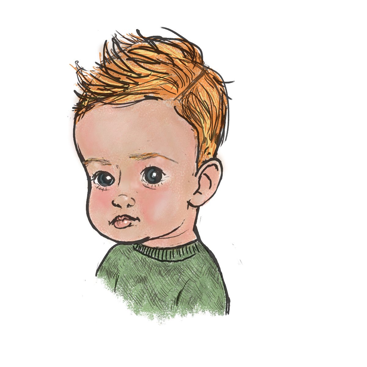
@Maureen-Henry-Artist Maureen you already have emotion and perspective going and yes I hear you about moving from hyper-realistic into the children's illustration genre. From what I see you are transitioning well! I love Steven Silver's approach to character design and it's helped me in finding the "T" in quick sketching, so I don't spend a ton of time creating the exact likeness of a child rather I'm capturing the essence. Still WIP with that. Welcome to SVS! This is my sketch attempt at a little boy...

-
@ArtistErin glad you found it helpful! @Maureen-Henry-Artist you’re welcome! And glad I could help
-
@ArtistErin thank you and this little boy sketch looks great! I’ll ckeck out Steven Silvers method, thanks for the tip!
-
@Maureen-Henry-Artist This is a great idea! The pictures are looking great.
-
@Frogpunzel thank you so much! I appreciate your feedback

-
I too am a portrait artist focusing on photorealism trying to transition into cute illustrations while also trying to find my illustrative voice. It's really hard when you're so well practiced in getting in even the smallest details, and letting that all go to tell a story with as much minimalism as possible.
I really like your character sheet, though I think I would let go of the division strip, I find them a bit distracting to my eye, and they don't contribute to who he is. I would also consider less children playing. They'd be great in the story as an actual illustration, but for a character sheet I think it's too many extras.
-
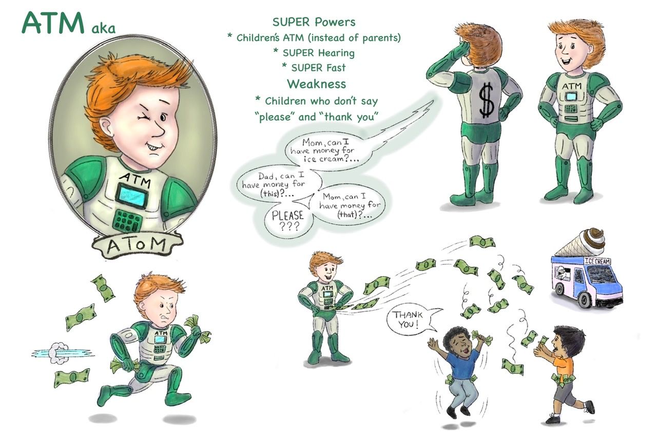
@AngelinaKizz You nailed it on the head when you said about being used to painting all the details! I am very detail-oriented, it’s hard for me to adjust to saying things visually in less. I love your suggestion about taking away the division strip, though at first I really liked it for color opposition to the green and how it sequenced the scenes. But after changing it up to your suggestions, I like the final result even better! I took out one child and the mom, since both aren’t really needed for the character, so it looks less busy now with the changes. I thought of the money-like frame, which I think adds to the appeal of the layout and design. What do you think of the changes, do you think it looks better? Thank you, I really appreciate any and all advice! Here is the update….

-
@Maureen-Henry-Artist I think this is much better! Huge improvements in clarity and less distractions! Great work!
-
@AngelinaKizz Awesome, thank you so much! And I just checked out your website. Your work is incredible! And even more amazing is your recovery and determination to do your art with your non-dominant hand! Very inspiring! I really like your illustration style too!
-
@Maureen-Henry-Artist awe thankyou! It’s been a challenging road to be on, but I try to focus on the good things that have come my way since the injury. My left is pretty comfortable now, even though the tendency is there to want to put that pencil into my right. But, like everything else in life, you work with what you’ve got.