Critiques for Portfolio Pieces
-
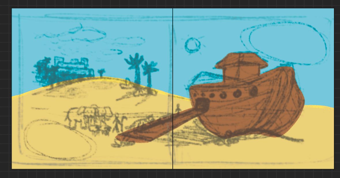
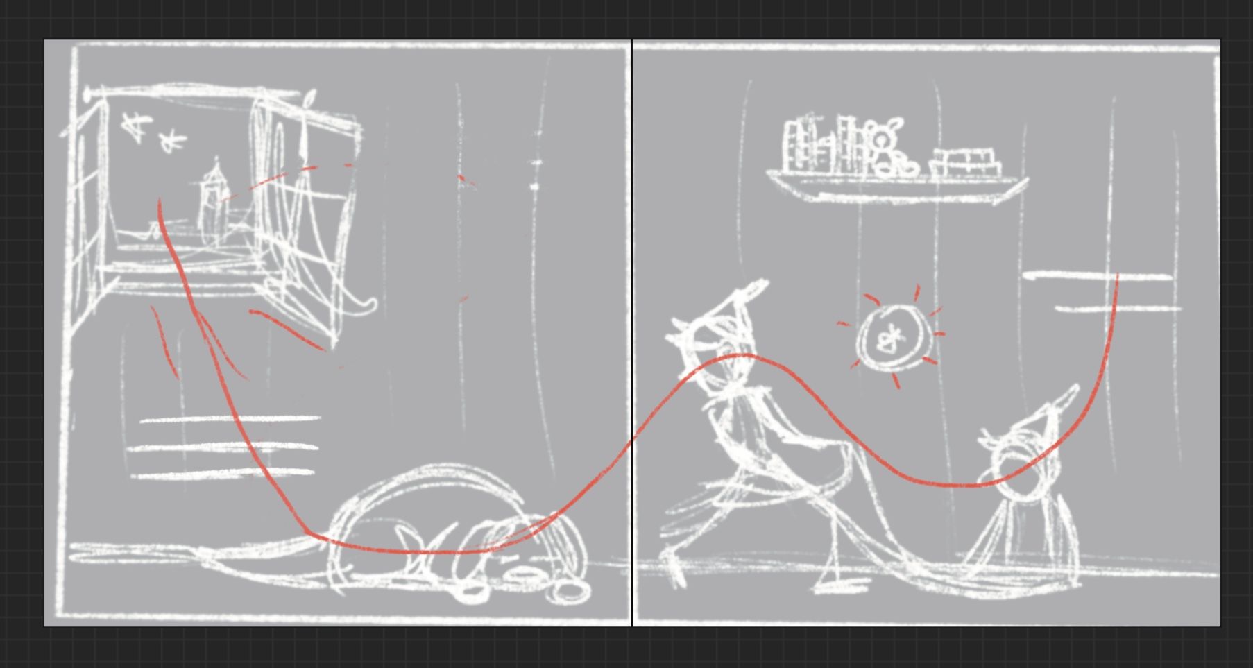
The Noah’s Arc 2 page spread is still in an early stage, but for both of these pictures I’m wondering what I should do for colors because I wasn’t confident in making a color palette like last time. I’m open to suggestions.
-
@kayleenartlover howdy!
Liking the preliminary color palette with the Noah's ark illo -- but it's a little difficult to read at the moment. You may want to adjust the composition because it looks like quite a few important elements may fall into the gutter. Could you play with perspective or size more? Perhaps make the ark bigger (we don't have to see all of it to know it's an ark), with part of it cropped out so that the focus will be on the door and the animals going inside? Or make the ark smaller (more in the distance) and the animals in the foreground in a line going towards the gangplank. Might be a more interesting composition -- will also help give you a focal point.
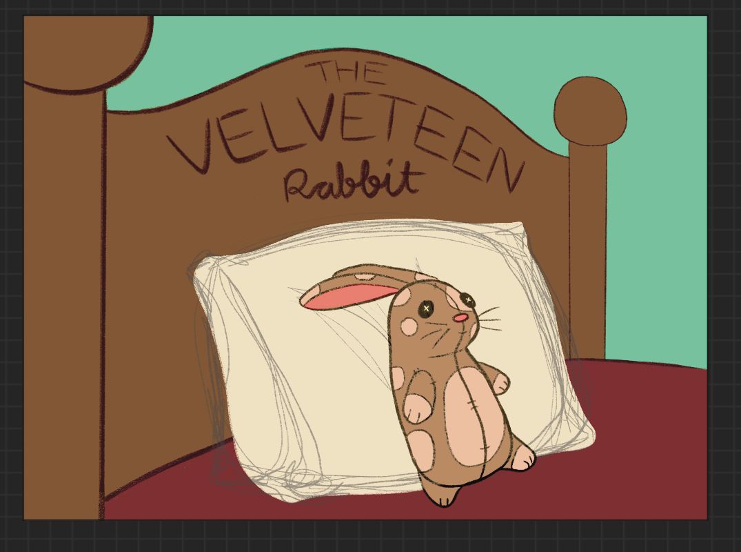
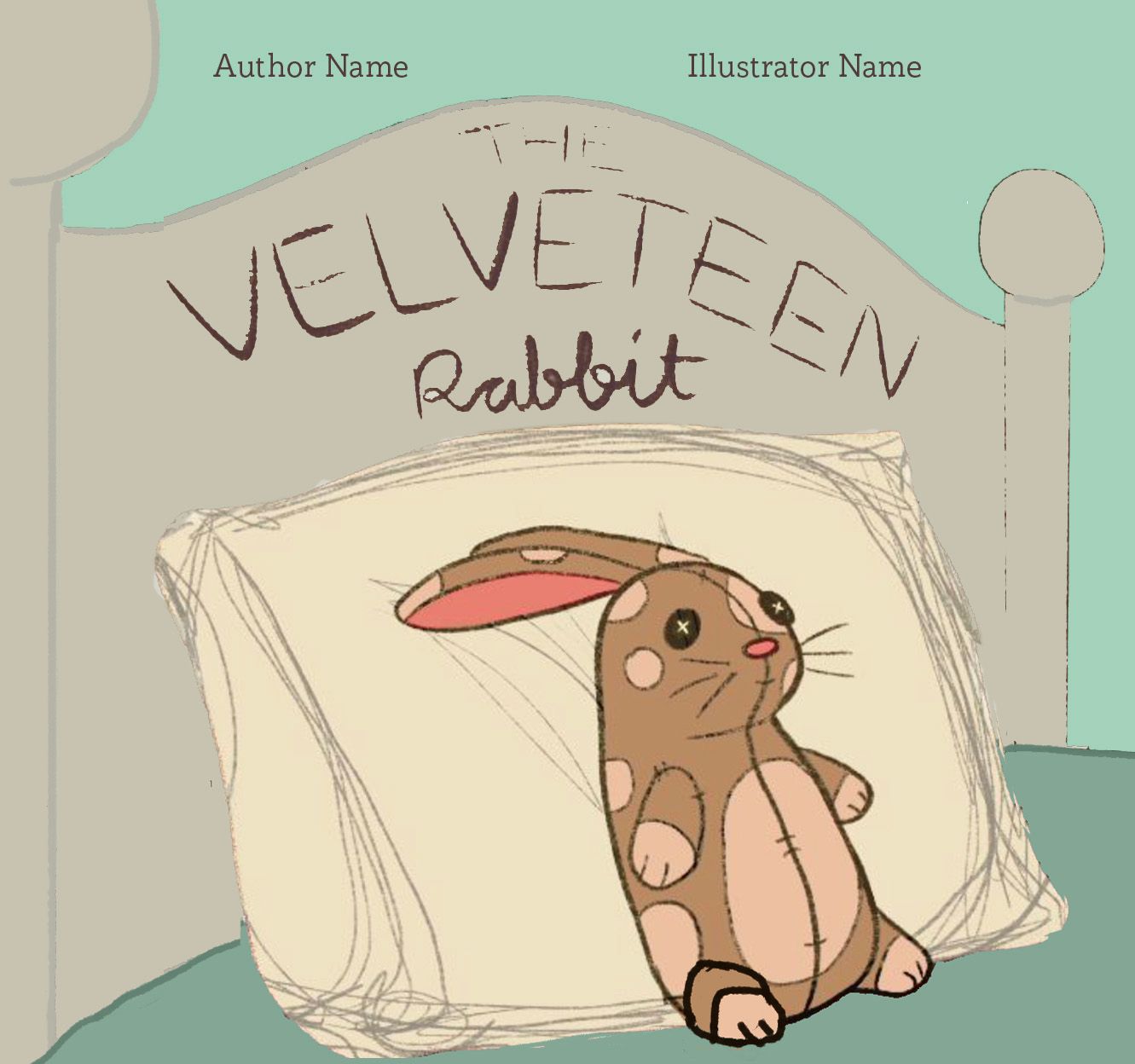
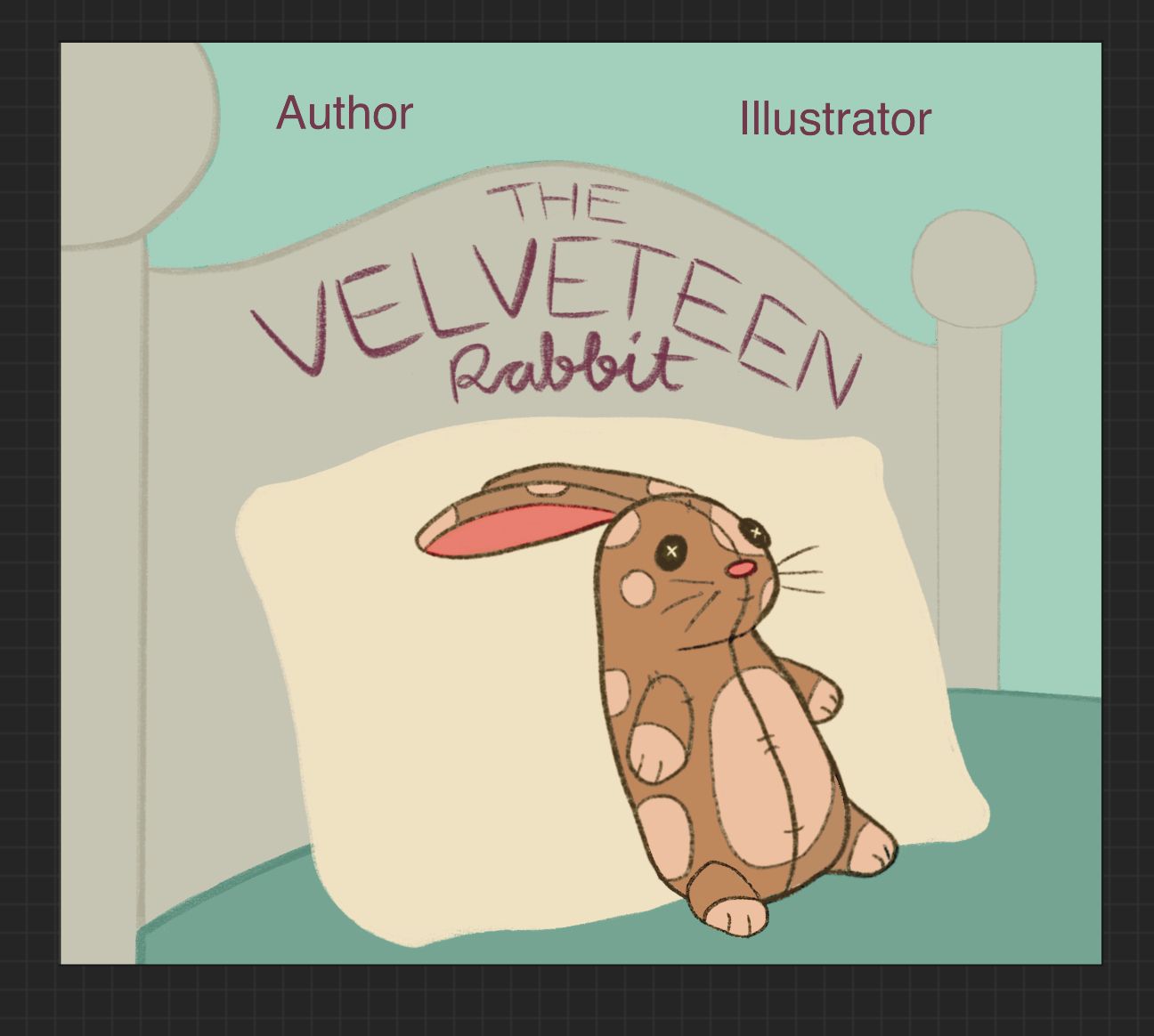
For the Velveteen Rabbit illo -- is this intended to be a cover illustration? If so, where is the space for the author's and illustrator's names? For me, right now the bed is dominating the composition. It's the heaviest element, and the darkest. The velveteen rabbit is adorable and it's good that you put him against a light pillow because he is mostly midtones. I love the green background -- what if you played with the values, lightening up the bed and perhaps making it more cool tones to help the warmer hued velveteen rabbit stand out? Could the rabbit be a little bigger while still leaving room for title and bylines? What if the bedposts weren't as thick, or not even there at all? Could the composition be cropped or resized to make the rabbit the star? The simple composition does work, I think, but the elements could be adjusted to be more readable and make the rabbit the focal point.
Hope you don't mind, I took a screenshot of the Velveteen Rabbit illo and did a quick draw over for a visual of what those adjustments might look like. Just as an example -- there are so many different ways you could approach this sweet composition.
You've got such cute characters! Looking forward to seeing where you go with these pieces.
-
-
Started on another piece, a two page spread of Peter Pan. I’m excited about this one so far.
-
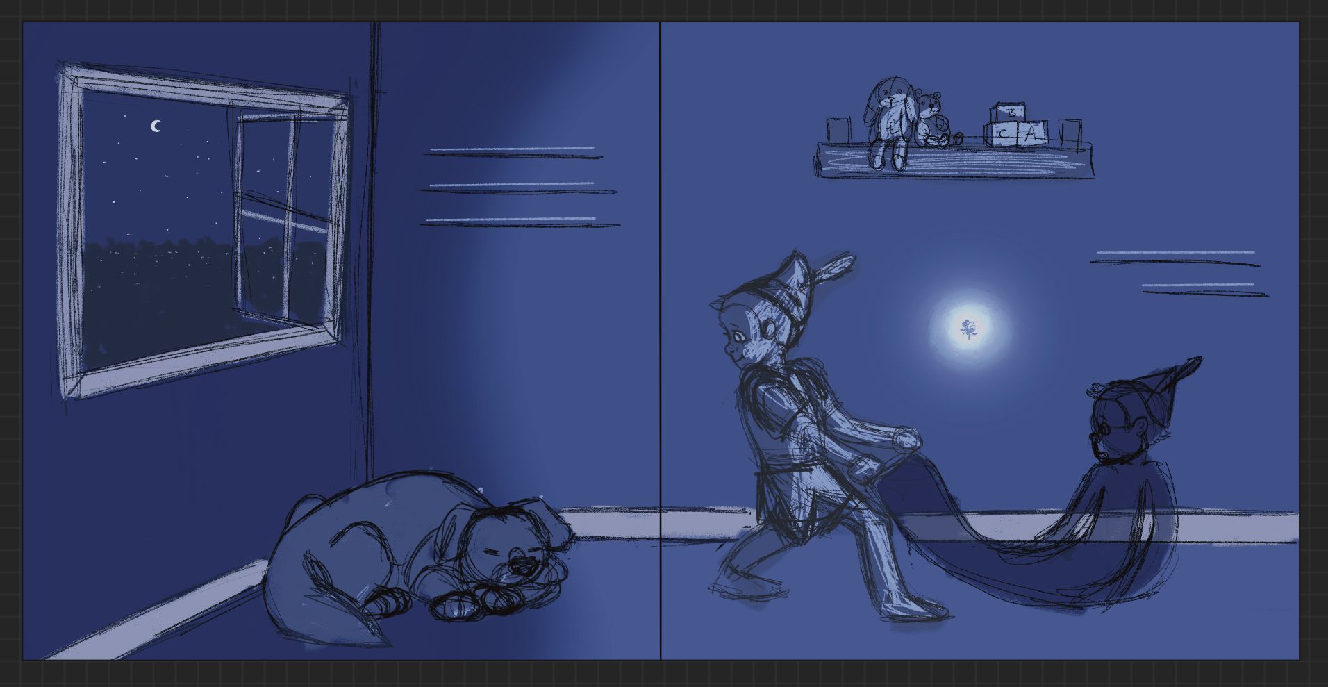
Update on Peter Pan pages -
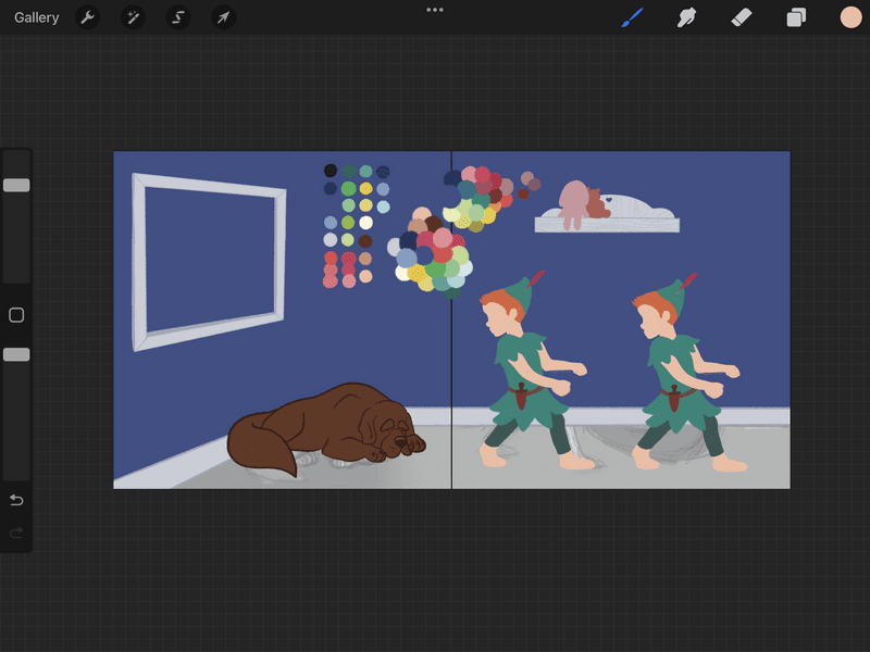
I need a second opinion on my Peter Pan drawing. I will be adding facial features and outlining later, but right now I’m trying to make sure the head shape makes sense. I couldn’t get a good reference photo for this pose so what do you guys think makes more sense for his head shape especially the forehead/nose relationship for him to be a kid?
-
I still don’t know what to do about the Peter Pan drawing. I can’t tell which head looks better. I need some help.
-
@kayleenartlover I think once you add the features it will look ok it’s hard to tell right now
-
@Asyas_illos I just can’t tell which one has better proportions with the forehead/nose/chin proportions
-
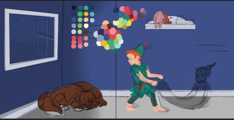
This is with the original rough sketch on top -
@kayleenartlover oh I see it now I like the first one or the one on the left.
-
@kayleenartlover I’d go with the left one. His head looks rounder and more childlike