Last 10% feedback
-
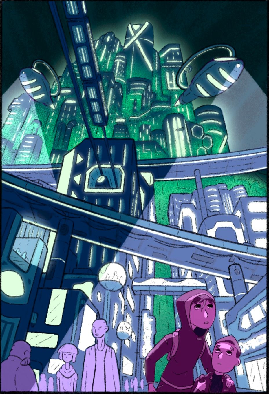
Howdy! I’m at the point where I can’t quite decide if I’m done with this piece.
Is there anything confusing to you?
What could be add or subtracted to improve it?
Do the main characters in the lower right stand out enough?
Does this work as a book cover?I most certainly did not plan the title placement when making this piece so I’m still working on that bit and just hoping it works out alright.

-
I think I would put a few more shadows in. I think that the ones in front are the lead in the story, maybe the ships are looking for them, and as it currently is I find more focus on the couple in the background as they’re brighter. I put some shadows on them, to take some attention away. I also put a very minor multiply layer over a few spots on the buildings that I felt would have had some shadows on them.
As for the title, I think you would need to zoom out a bit and extend your city view outward to leave enough room at the top for a title. I don’t think it would fit over your image, as the image is rather busy. If you don’t want to zoom out, I would consider a darker walkway that could add even more depth to the image and have the title over the walk way
Just some thoughts.
-
@AngelinaKizz all great suggestions, thanks!
-
I haven’t wanted to touch this one it’s beyond my skill level lol I think it looks great! Agree with @AngelinaKizz about the folk in the background standing out though.
-
@Griffin-McPherson This really is amazing! You're perspective and the way the buildings are rendered feel great. I do feel like I want to see just a little more on the figures in the foreground. Maybe some of the colors from above reflected on them? Or maybe just slightly more defined lifework? They somehow feel separate and less finished than the rest of the piece. But overall great work!
Instagram: https://www.instagram.com/kirsten.mcgonigal.art/
Portfolio Site: www.kirstenmcgonigalart.com -
@Asyas_illos I don’t think that means you’re unable to Give feedback though! Skills are multidirectional not linear I think. One artist could be skilled at character design while another is skilled at environments. We all have skills in different areas and that’s what makes getting feedback from different perspectives so helpful!
-
@kirsten-mcg I think you’re right, they stand out but in a way that feels like they’re kind of just pasted on. I need to find a way to make them stand out but still feel connected to the environment. Thanks!
-
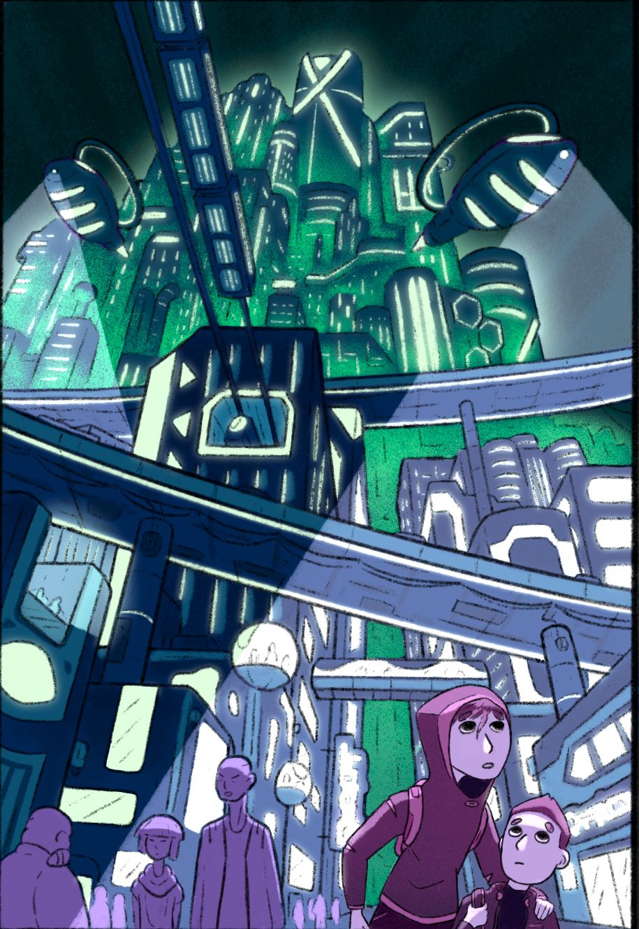
Update: darkened the buildings a bit, darkened the background characters, brightened the main characters, made them a bit more blue and beefed up their linework
How is it looking?
-
@Griffin-McPherson looks great!
-
@Griffin-McPherson This looks really cool! Great perspective work and awesome rendering on the buildings!
-
Hi Griffin,
you have bulit up great but very complexe scene. You can play here with light and atmospheric perspective to make your characters stand out more and keep your values simplier. Look up some reference photos from movies with similiar thematic (Blade Runner for instance uses a lot of atmosphere to hide details and create clear silhouletes. I made a fast scrible over your complex drawing to see what i mean.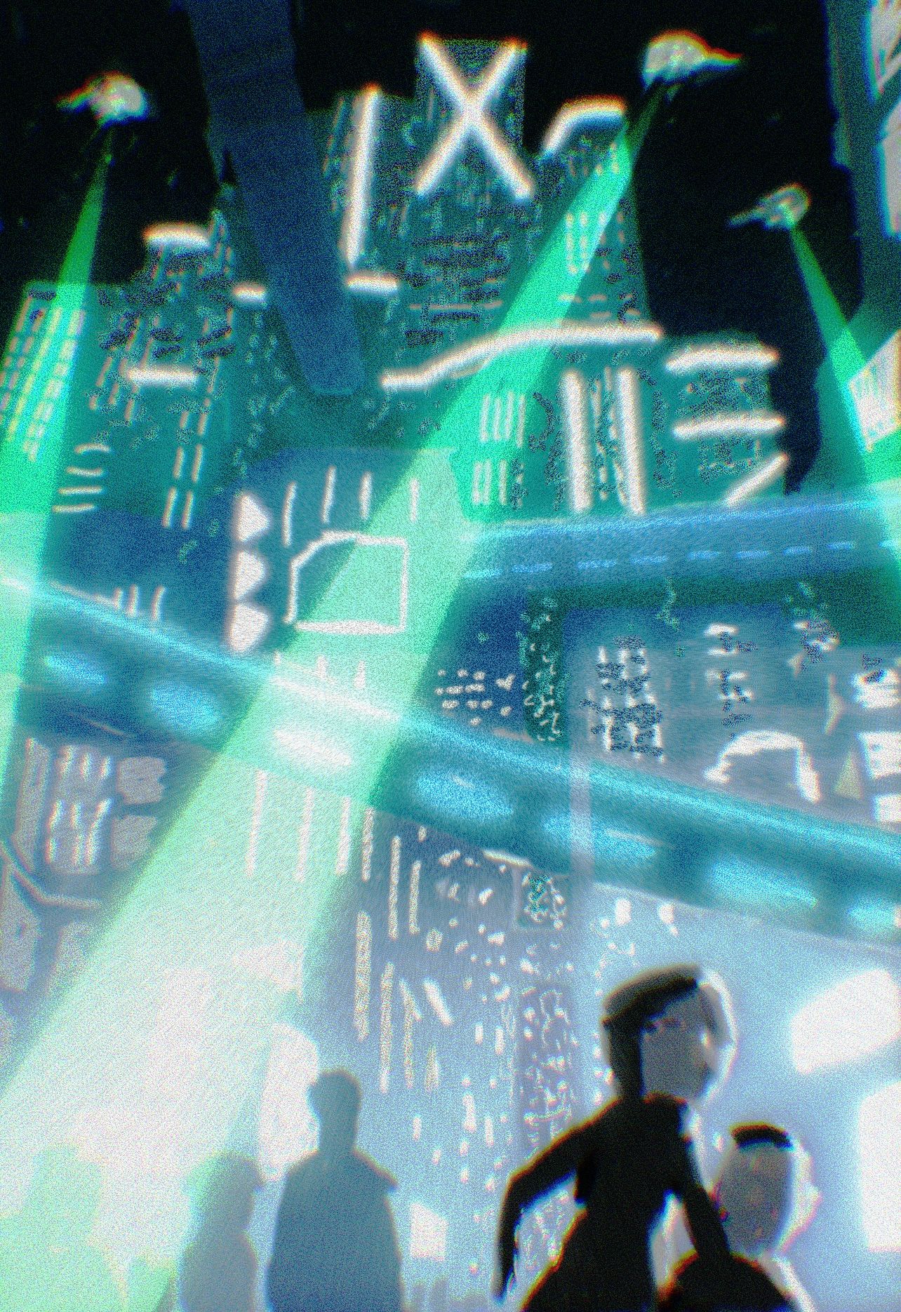
-
@marek-halko thanks for the feedback! Funny you mention blade runner because it was a big part of my mood board for this one. Do you find all of the details distracting? I do want it to feel dense and chaotic like I’m imagining this city is but I want just enough attention on the main characters so that they’re not lost on the image too much.
-
@Griffin-McPherson your improvements work too. I was trying to imagine how characters outside the light beam would compare to characters slightly in the beam or directly in the beam. Marek’s draw-over gives it even more of a Blade Runner vibe for sure. When I first saw your image I thought of a splash page in a graphic novel or comic, but seems cool for a cover too.
-
I think this looks great! I love the 3-point perspective and your attention to detail. I think your line work is what is making it feel a little disjointed. Your lines for the buildings are thick and soft like pencil or paint. Your lines for your main characters are crisp but thinner. I think you need to make them thicker and in the same style (or at least closer to it). Then the characters would feel more grounded in the environment. You also have a ton of details in the environment but your characters are less so. Maybe add some more texture? Value contrast on them alone? As is, I thought the story was reading as just a beautiful environment rather than two kiddos running from the ships. I love it, though. I look forward to see the final piece.
-
@Griffin-McPherson i think the characters get a bit lost (they have strong color contrast but lack value contrast). If you like to keep the scene very busy and want the characters to really stand out, just redesigning background behind the characters (placing them with very light background) might do the trick. Overall the scene works nice as it is!
-
@Griffin-McPherson going to address one of your questions: Does this work as a book cover?
In its current layout, it's not the best composition for a book cover. Here are a few reasons why:
-
Readability. As @marek-halko pointed out, value and contrast have a huge bearing on readability. A book cover should be clear when viewed up close (holding the book) and zoomed out (for example, as a thumbnail image on Amazon or on a book shelf on the other side of the book store). The more readable a cover is, the more likely it is to catch attention, and the more successful it will be.
-
It's busy. As a book designer, I would question where is the best place to put the title -- it's going to obscure a good portion of all that city detail. So part of the illustration will be lost. Also, having a busy scene with a lot of contrast behind a title will make it difficult to read; it won't stand out. And where will the author & illustrator names go?
-
The characters. Making the characters a different color than the background is great; it helps them stand out. But placing them so far down on the page visually gives them less importance than the city, which dominates the composition. On a book cover, a reader will connect more with a character than an environment, if both are present on that cover. A reader will also want to get a sense of who these characters are and what their story is about. You've done a great job of making these characters look apprehensive and/or overwhelmed by the city, but what are they looking at? What are they scared of? That part of the storytelling isn't clear for me.
If you want to use this illustration as a book cover, this book designer's recommendation is:
-
Simplify and reduce the contrast in the background.
-
Give the characters greater prominence. Increase their size and move them up a bit from the bottom of the composition.
-
Design the cover so that there is space for a title and bylines that won't obscure important parts of the illustration.
Here is a quick example of cover design with a side by side comparison of this illustration as-is, and with some of those suggestions implemented:
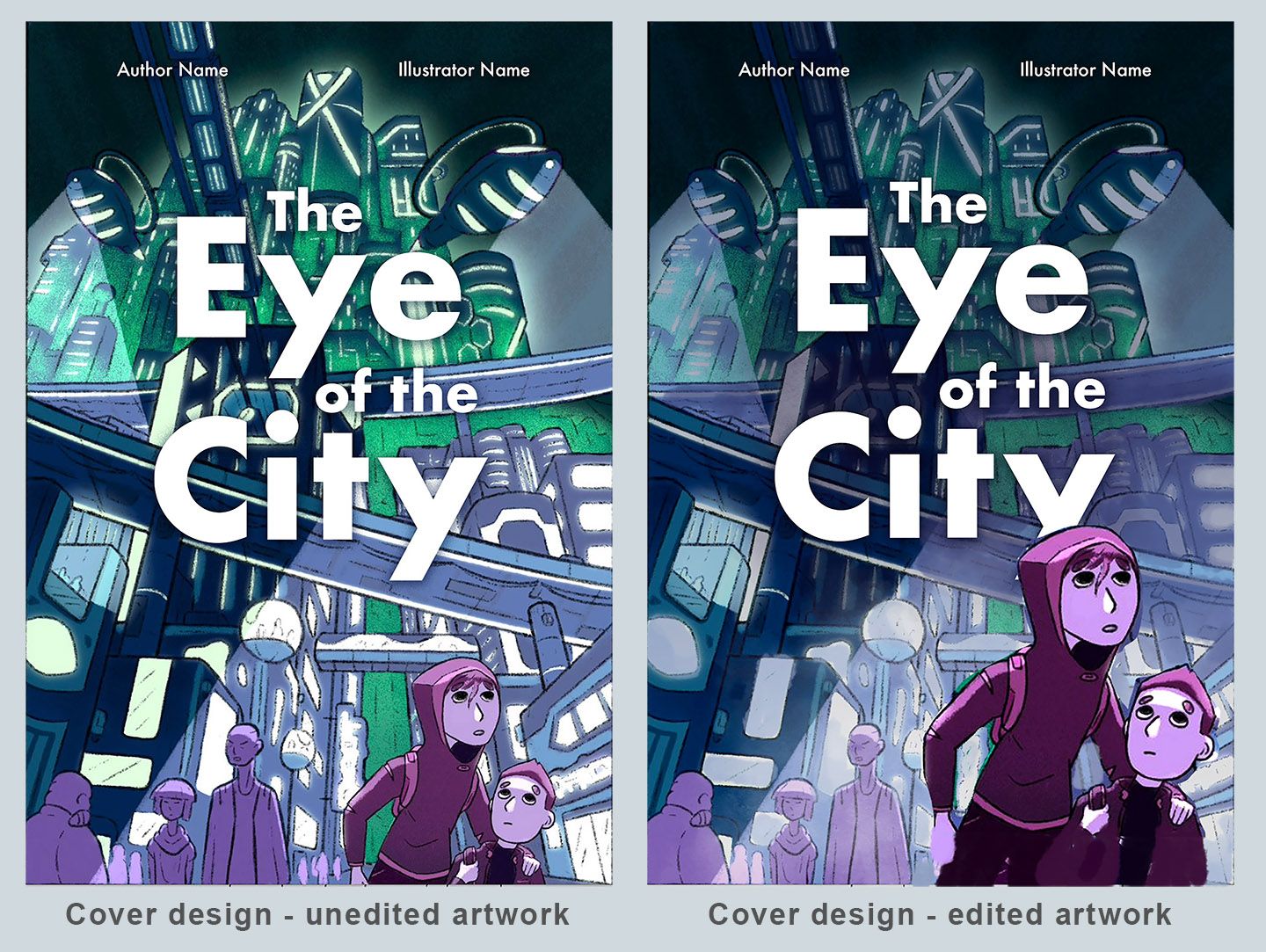
(Hope you don't mind that I took a screenshot for this example. This isn't the best cover design, and probably not the best font choice -- just a visual of one way this illustration could be adjusted for cover design.)
illustrator - author - smiley person
mbaileyart.com
instagram.com/mbaileyart/ -
-
@Melissa_Bailey thanks for all of this feedback! I agree with all of these points haha. I was pretty passive about this being a book cover at the start. If I wanted to make this really work as a cover I would have to make so many changes that I think I might as well make a totally new piece that’s designed with the text in mind from the start.
-
@Griffin-McPherson absolutely! You're so welcome. It's best to start cover design with the text, as that is often an element that can be moved around but can't change.
There are elements here that could make a great cover, but you're right: it would be best to redesign an entirely new cover illustration.