Society of Visual Storytelling

    SVSLearn Forums

    • Register
    • Login
    • Search
    • Recent
    • Tags
    • Popular
    • Users
    • Groups
    • Search

    Help with character colors

    Questions & Comments
    color colorscheme characterdesign
    5
    11
    1162
    Loading More Posts
    • Oldest to Newest
    • Newest to Oldest
    • Most Votes
    Reply
    • Reply as topic
    Log in to reply
    This topic has been deleted. Only users with topic management privileges can see it.
    • Griffin McPherson
      Griffin McPherson last edited by

      Colors and values are often where I get hung up. I know that picking two colors for a character design is usually a good way to start but I struggle to balance everything and get jumbled up when I start adding accent colors. I was initially going for a west coast beach vibe with lots of pastel blues and oranges.

      What approaches would you suggest that lead to a clean, readable design?03B50261-D48E-41E3-977B-DF865C192E23.jpeg

      Asyas_illos ? KevinTreaccar ArtMelC 4 Replies Last reply Reply Quote 1
      • Asyas_illos
        Asyas_illos @Griffin McPherson last edited by Asyas_illos

        @Griffin-McPherson this looks really clean and crisp like all your work. Generally when choose color I go a little crazy. I will pick like 5 base colors and then from those, I will still choose a lighter and darker variation and accent colors!…so I end up with like 20 colors lol probably not the best approach but it’s what works for me.
        Great illustration by the way love the character and colors.

        Asyasewardillos@gmail.com
        www.Instagram.com/asyas_illos/
        https://asyasewardillos.wixsite.com/mysite

        Griffin McPherson 1 Reply Last reply Reply Quote 0
        • Griffin McPherson
          Griffin McPherson @Asyas_illos last edited by

          @Asyas_illos FIVE colors? What a terrifying thought, though maybe I should give it a shot anyways haha. Thanks for the feedback!

          Asyas_illos 1 Reply Last reply Reply Quote 0
          • Asyas_illos
            Asyas_illos @Griffin McPherson last edited by

            @Griffin-McPherson I really love color lol and I break it constantly 28F9DAEB-0929-4042-9D6C-793133F2908A.jpeg

            Asyasewardillos@gmail.com
            www.Instagram.com/asyas_illos/
            https://asyasewardillos.wixsite.com/mysite

            1 Reply Last reply Reply Quote 1
            • ?
              A Former User @Griffin McPherson last edited by

              This post is deleted!
              1 Reply Last reply Reply Quote 1
              • KevinTreaccar
                KevinTreaccar @Griffin McPherson last edited by KevinTreaccar

                @Griffin-McPherson Maybe my process will help. I try to mimic Will’s process in the 10-step dragon video.

                I probably do this wrong, but would love to hear so if I am. Like you, color is what I’m least confident about – and I know I have a lot of areas for growth.

                I always start with toning black and white:

                7FEFD836-D479-4D98-A122-7A0925F9DFC4.jpeg

                BC4EFD6C-D7EC-4BAC-9448-F4CA4609E6B5.jpeg

                Then I’ll find a theme I like on Adobe.color.com, find an image I like and steal the main colors, or find a color I like and explore the compliment options on Adobe.color.com.

                06D8C08B-FDDB-4954-9F2F-BCD8B0CC2E8D.jpeg

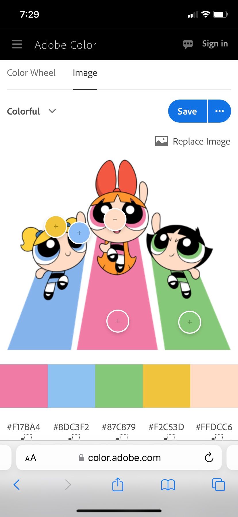
                Then I add 3-5 colors and get:

                F3B0DDA9-6CBA-4CA3-AD6C-7D899A68BF6E.jpeg

                053B8DDC-E1C1-49DA-A172-BD35A0E480BE.jpeg

                My colors never stand out like Asyas’s, though.

                kevintreaccar.com
                instagram.com/kevintreaccar

                1 Reply Last reply Reply Quote 1
                • ArtMelC
                  ArtMelC @Griffin McPherson last edited by

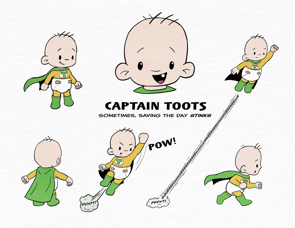
                  @Griffin-McPherson For me I think about what kind of environments the character will be in. If he will be in jungles and among trees, I will pick orange and warm colours to ensure he stands out. If he will be in an environment with lots of browns, I may pick a cool colour to help him stand out.

                  www.instagram.com/art.melc.illo/
                  www.artmelc.com
                  I write weekly on mondayblues.substack.com

                  1 Reply Last reply Reply Quote 1
                  • Griffin McPherson
                    Griffin McPherson last edited by

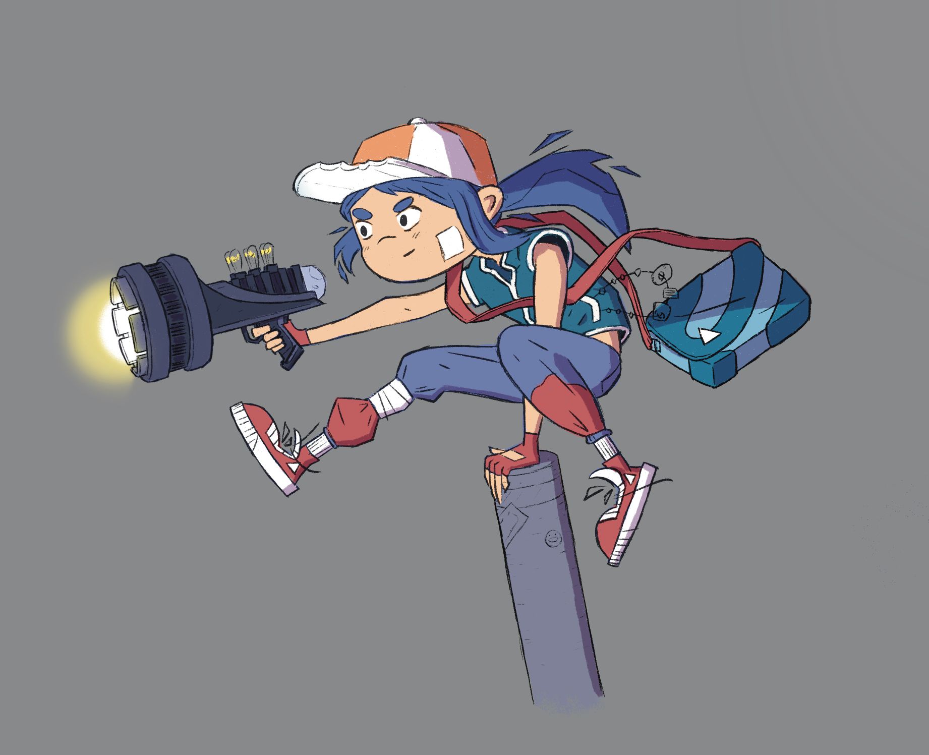
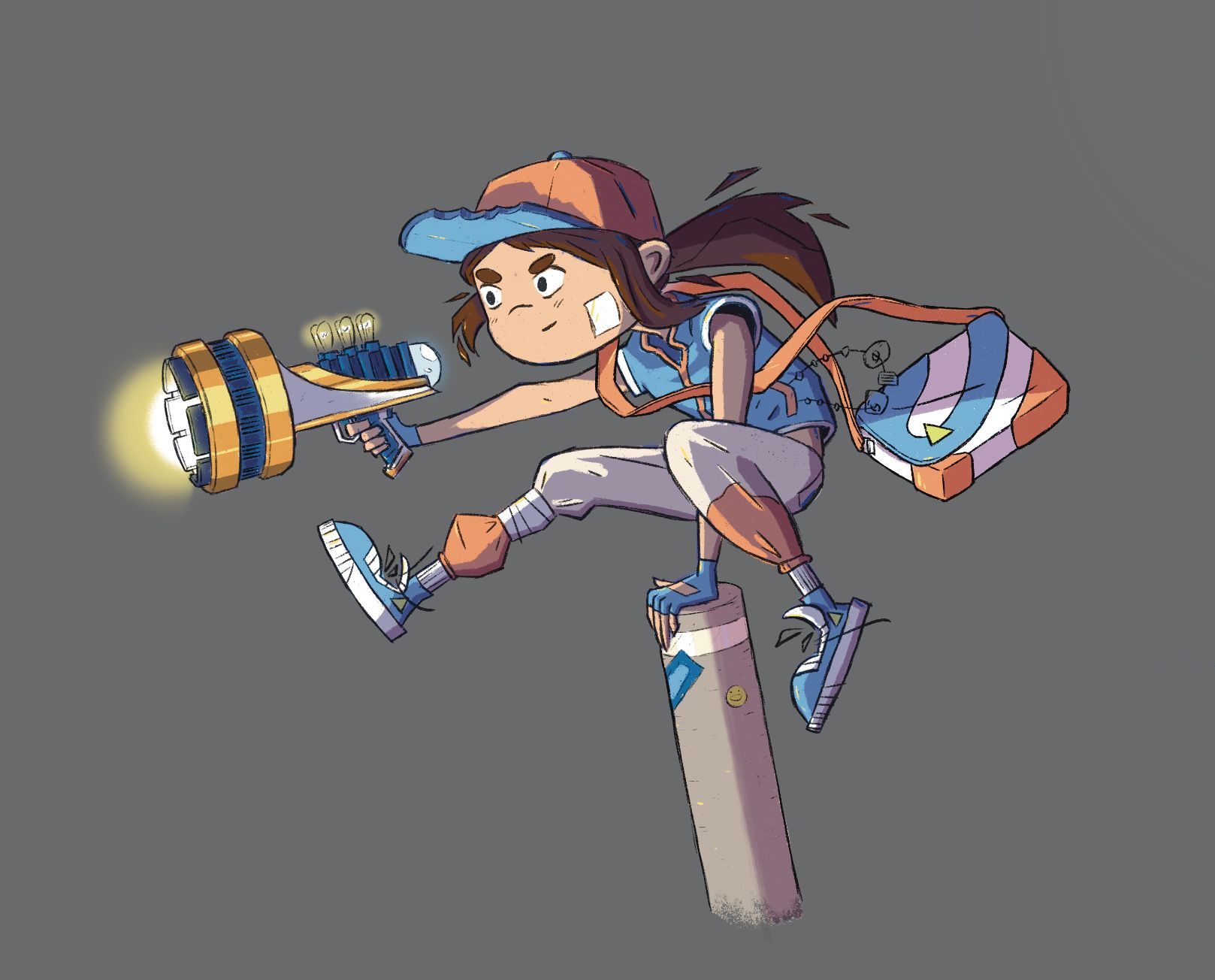
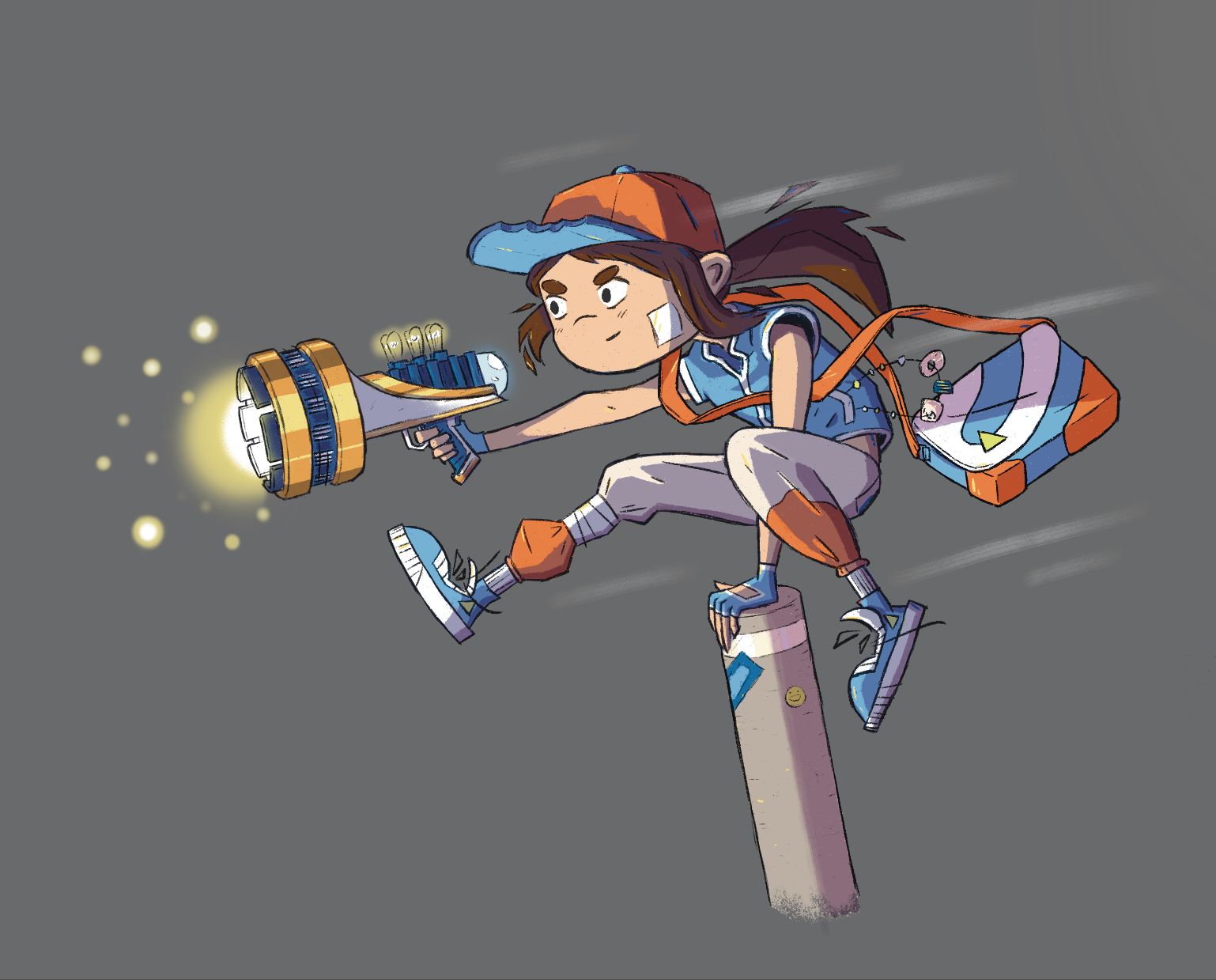
                    Update: here’s where I’m at now. Really tried to restrict myself to just orange and blue and I’m liking it better but still have some bits I’m working out. Not sure I like the white on the bag, I also think the strap for the pag might need to be darker. I can’t decide if I like the colors on the gun or not, I think it;s mainly the dark blue parts that feel weird to me and I’m struggling to figure out what the solutions there is.
                    Is the gold on the gun working? I’ve never really had to make a shiny metal surface so I want to make sure that’s reading well. Additionally, does the shiny gold fit in with the rest of the character at all? I haven’t been able to decide if it looks out of place or not. I want it to stand out but not in a disjointed way.

                    Let me know watcha think! Thank you all for the feedback!70DE570E-5172-461B-B987-6BA13E7B52BA.jpeg

                    1 Reply Last reply Reply Quote 0
                    • Griffin McPherson
                      Griffin McPherson last edited by

                      Update: alright I think I’m about done here unless I get any more feedback. The only things I’m wondering about now are the orbs around the gun and the dash streaks around the character, do you think they’re too much?AAB36A1D-4430-49B5-BA32-B09CBA7C245C.jpeg

                      KevinTreaccar 1 Reply Last reply Reply Quote 3
                      • KevinTreaccar
                        KevinTreaccar @Griffin McPherson last edited by

                        @Griffin-McPherson I think the added saturation to the orange here is definitely working better than the image before.

                        kevintreaccar.com
                        instagram.com/kevintreaccar

                        Griffin McPherson 1 Reply Last reply Reply Quote 1
                        • Griffin McPherson
                          Griffin McPherson @KevinTreaccar last edited by

                          @KevinTreaccar yeah it helped a lot. I tend to gravitate towards low saturation colors but higher saturation always ends up working better.

                          1 Reply Last reply Reply Quote 1
                          • First post
                            Last post