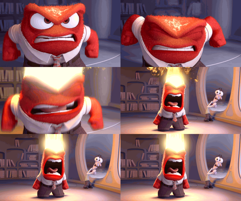
My Glowing WIP (wow, that sounds vein, but GLOW is the topic, so cut me some slack, please)
-
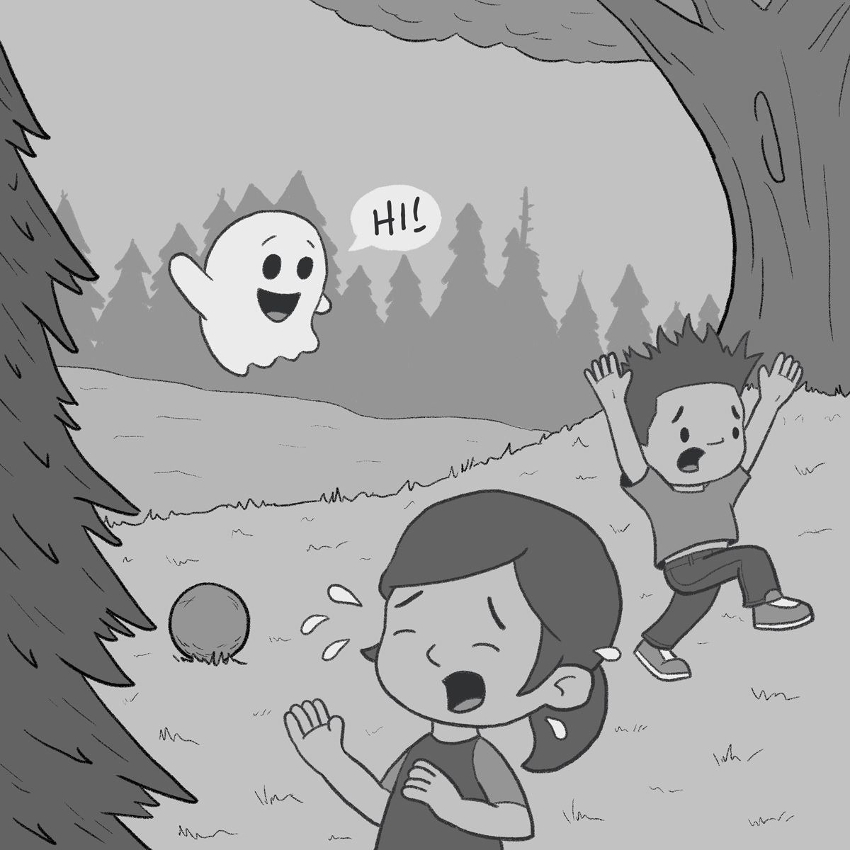
@KevinTreaccar story is very clear to me. The ghost wants to play but he scared the kids. I'm only wondering what the dotted egg thing is next to the girl? Can't wait to see how it turns out when finished.
-
This post is deleted! -
@Chantal-Goetheer @Stephanie-H Correct! [fist pump gif]
And the dotted circle is a two-second soccer ball.

-
@KevinTreaccar it looked like a cookie to me

-
@Asyas_illos Sorry if that made you hungry.
-
Story is clear. I am just thinking, if you want to maximize the glow of the ghost, the strip of bushes behind it will need to have a much darker value. But it will look really odd to have a really dark strip right in the middle of the image like that, you risk accidentally cutting off the image into 3 separate sections. Maybe try a full forest of trees so you can extend the dark area all the way to the top?
-
@ArtMelC Like the two-second soccer ball, that was a two-second tree line to show the dark backdrop (since I’m not using library for it). I think we’re having the same thought – or at least close to it for bringing the ghost out more. Though, I’ll confirm it. Thanks!
-
Line art down and a first value pass.
-
@KevinTreaccar hi! looking great! My one suggestion is to lean the boy forward more. right now he looks like's just marching instead of running.
-
@Nyrryl-Cadiz Can do. Thanks for pointing that out!
-
@KevinTreaccar This is looking great! Would suggest making the ghost somewhat transparent instead of opaque. Maybe move him up a bit so the top of the tree line is visible through his body?
-
@susanhowarth-art I like the thought and I'll keep it in mind as I keep going forward. Right now, at least, it's just not working with my treeline as I get rid of trees to create that. Feels more like a tangent. Might be able texture through later, though. Thanks!
-
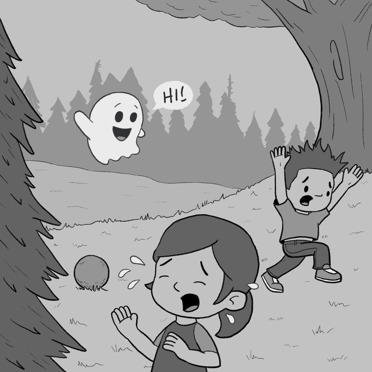
Tweaks per feedback. Thank you!
-
@KevinTreaccar she’s crying because she dropped her cookie


-
-
@KevinTreaccar ok I’m sorry it’s a soccerball!
-
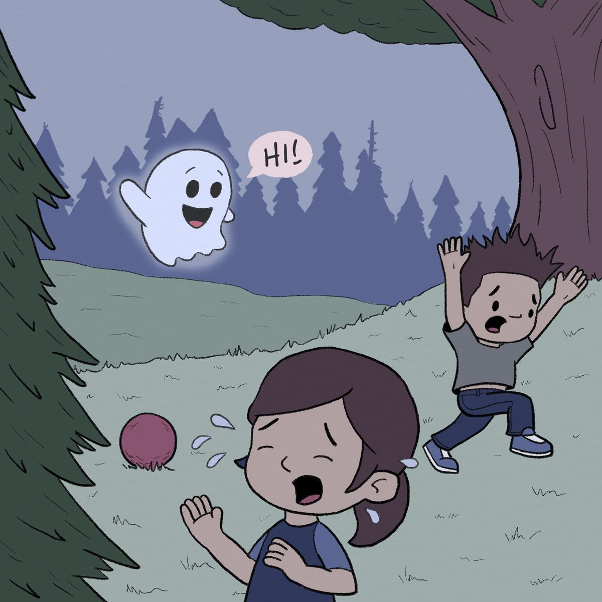
And a first pass at color.
-
Added 10% gray throughout the entire background. Which do you prefer – left or right version?
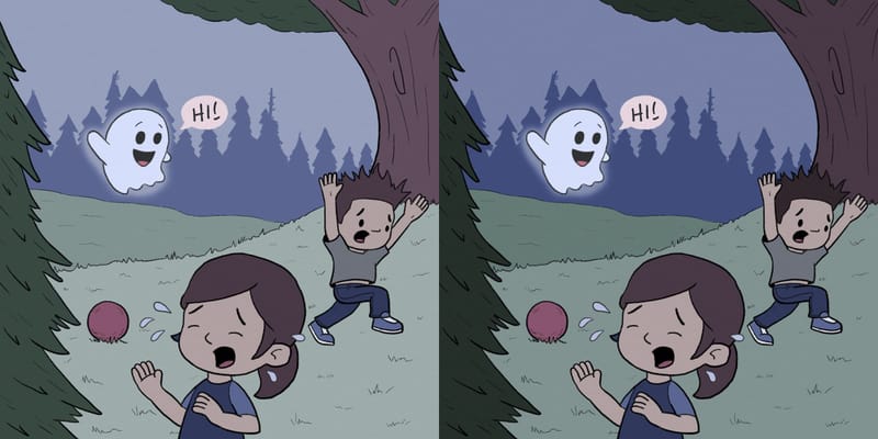
Thanks
-
@KevinTreaccar I prefer the one on the left. The treeline looks more hazy / far away, which I like.
-
@susanhowarth-art Hazy. I like that thought. Thanks.
