Society of Visual Storytelling

    SVSLearn Forums

    • Register
    • Login
    • Search
    • Recent
    • Tags
    • Popular
    • Users
    • Groups
    • Search

    SVS Virtual Studio FEBRUARY 2023

    Artwork
    44
    169
    18510
    Loading More Posts
    • Oldest to Newest
    • Newest to Oldest
    • Most Votes
    Reply
    • Reply as topic
    Log in to reply
    This topic has been deleted. Only users with topic management privileges can see it.
    • ajillustrates
      ajillustrates last edited by

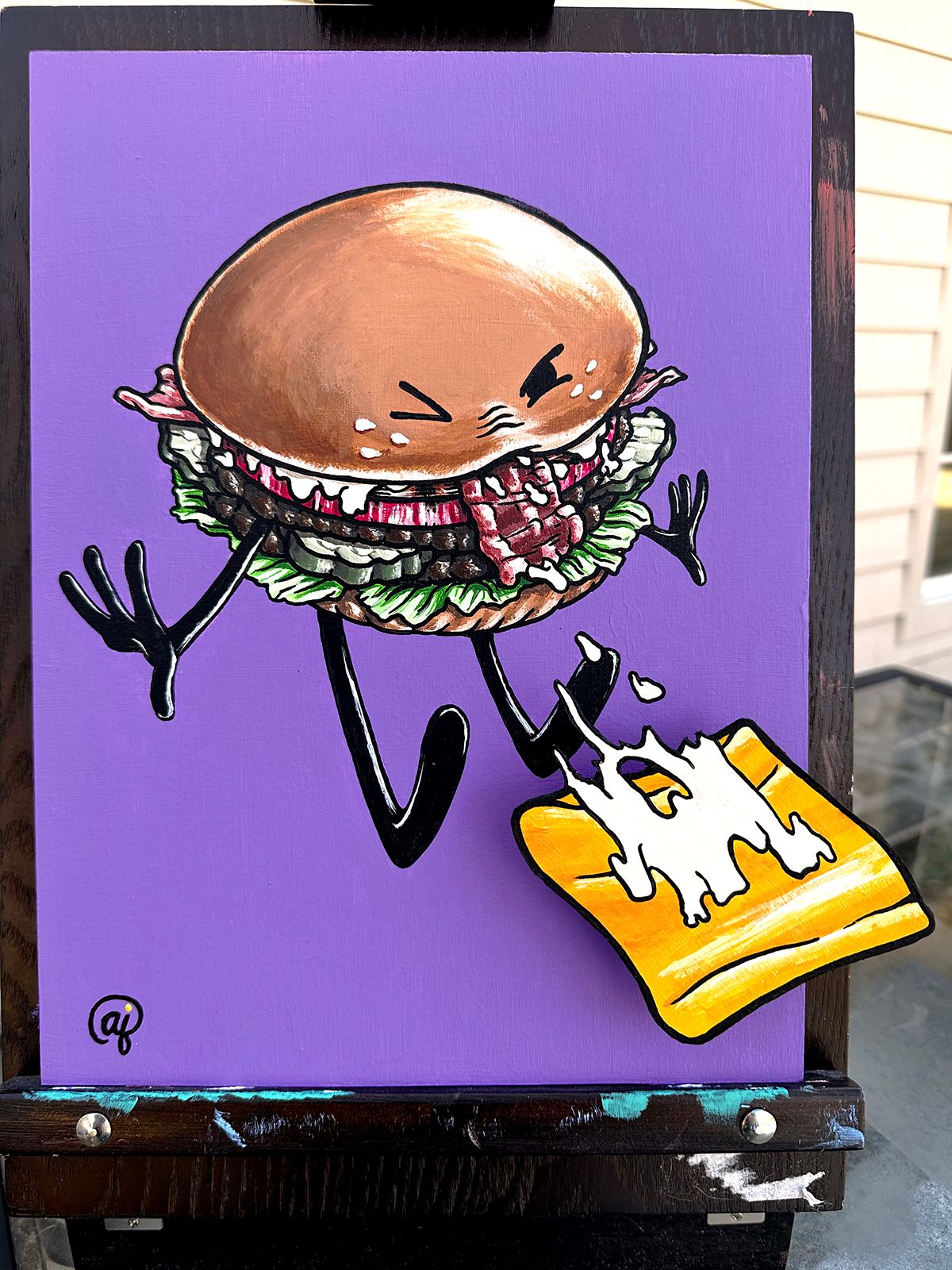
      But I did have just enough free time to contribute a painting to my favorite local gallery's annual fundraiser.

      hold the cheese_svs.jpg
      hold the cheese_gallery view.jpg

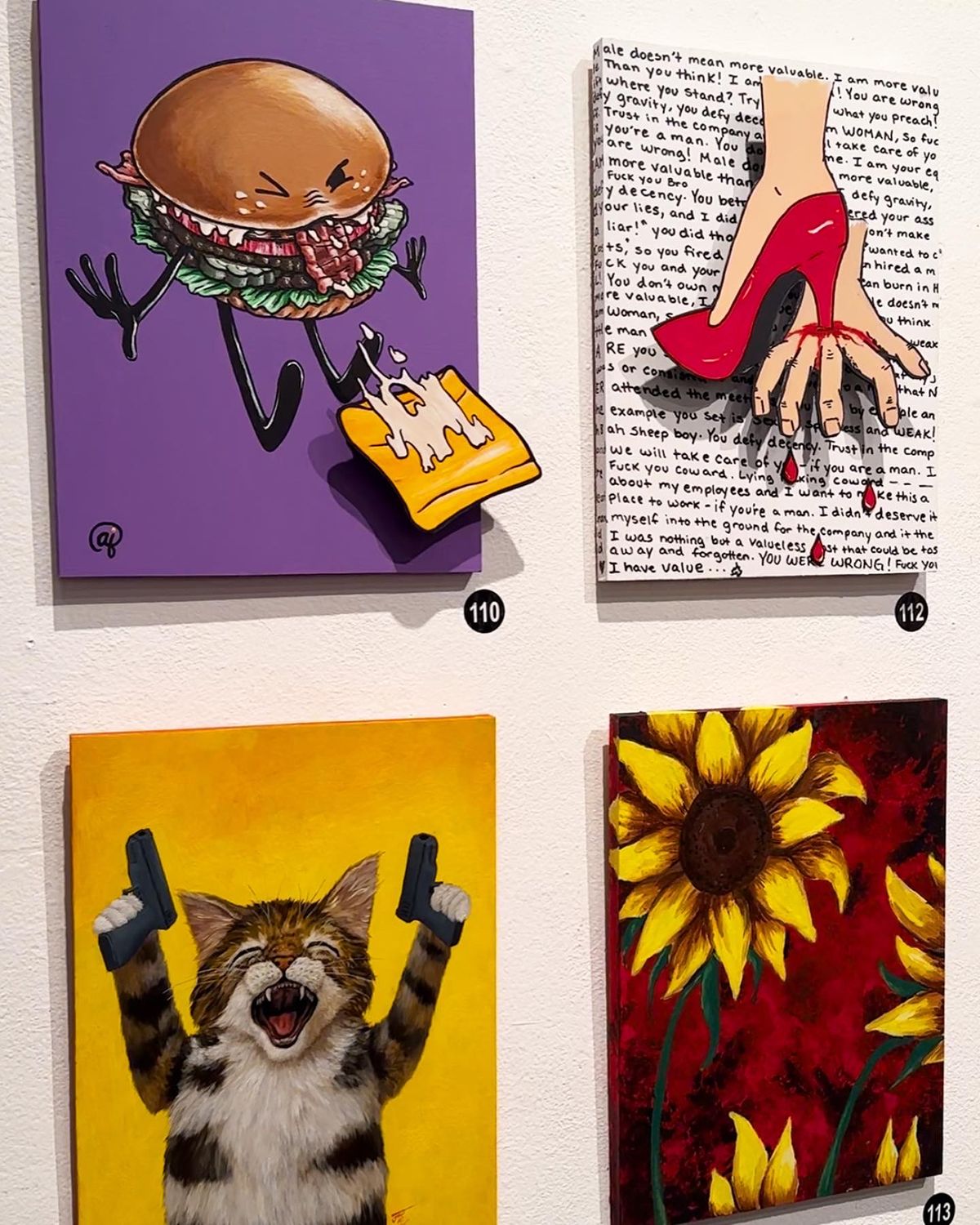
      Extra fun fact: my wife painted the two on the right side of the gallery shot (unfortunately, I don't know the artist who specializes in depicting cats at war)!

      https://ajillustrates.com
      https://www.instagram.com/aj.illustrates/

      1 Reply Last reply Reply Quote 2
      • Kristen Lango
        Kristen Lango last edited by

        20230225_204005.jpg
        Last day of February already! Time flies

        https://www.kristenlango.com/
        https://www.instagram.com/kristendraws/

        1 Reply Last reply Reply Quote 1
        • Mia Clarke
          Mia Clarke @ArtistErin last edited by

          @ArtistErin Thank you, Erin! ☺️

          www.miaclarkeart.com
          https://www.instagram.com/miaclarkeart/

          1 Reply Last reply Reply Quote 1
          • Jean Watson
            Jean Watson @Mia Clarke last edited by Jean Watson

            @Mia-Clarke This is terrific! LOVE the characters. Query about the typesetting of the 'recipe'. Did you deliberately want the letters to be tangled up together? There's a distinct chance you did. If so, ignore this next bit! If not, I'd experiment with adding a tiny bit more space between lines and even between some letters. e.g. second last line has 'it's' but the apostrophe looks like an errant comma between a and knob so you might want to bring it down a bit. Second para, 2nd and 3rd lines parsley and of are entangled. These are just some examples.

            Mia Clarke 1 Reply Last reply Reply Quote 1
            • Mia Clarke
              Mia Clarke @Jean Watson last edited by

              @Jean-Watson To be honest, I was close to throwing my ipad out the window when typesetting this. I love procreate, but it's clearly not a text tool (or maybe I'm just doing it wrong...). 😅 Thank you for the pointers, I'll definetely fix the text, and especially that apostrophe. 🙏🫶

              www.miaclarkeart.com
              https://www.instagram.com/miaclarkeart/

              Jean Watson 1 Reply Last reply Reply Quote 1
              • Geoffrey Mégardon
                Geoffrey Mégardon @Mimi Simon last edited by

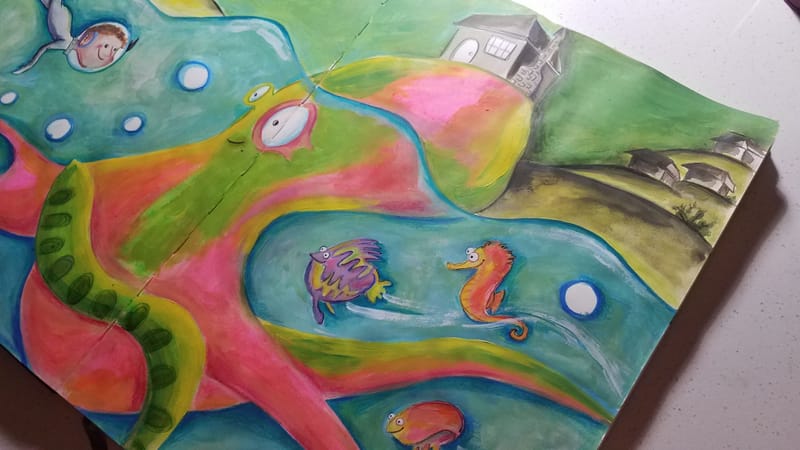
                @Mimi-Simon I really like your style 🙂 the crayon coloring, the mix of 2D and 3D, it is just great!

                Find me on Instagram: https://www.instagram.com/nodragem/
                Portfolio: https://www.nodragemillustration.com

                1 Reply Last reply Reply Quote 1
                • Jean Watson
                  Jean Watson @Mia Clarke last edited by Jean Watson

                  @Mia-Clarke I'm sure it can be done! I'm only familiar with Adobe - with that it would be using the character panel to adjust the leading between lines, kerning - space between characters - plus baseline shift for the apostrophe. Wonder if procreate has something similar?

                  1 Reply Last reply Reply Quote 1
                  • Larue
                    Larue @Asyas_illos last edited by

                    @Asyas_illos Ha! Love it!

                    1 Reply Last reply Reply Quote 0
                    • ArtistErin
                      ArtistErin last edited by

                      Sandcastle3NEW.jpg

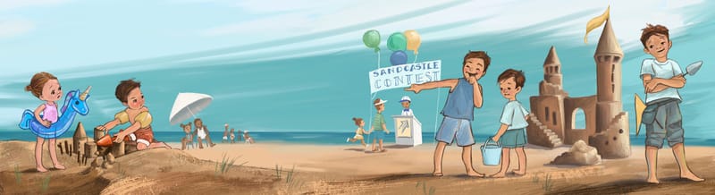
                      WIP Sandcastle contest... Hoping this story makes sense and if I need to adjust anything? Making pieces for portfolio. This was reviewed in the Creative Lab with Aram Kim in the "Creating Picture Books That Soar" intensive in the SCWBI conference last weekend. Aram suggested I add in more color as in a beach scene. I am not sure how to do that without it becoming too busy! Any thoughts?

                      Erin Richardson
                      instagram.com/erinrichardsondesigns21
                      www.erinrichardsondesigns.com

                      1 Reply Last reply Reply Quote 2
                      • First post
                        Last post