SVS Virtual Studio FEBRUARY 2023
-
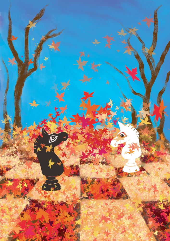
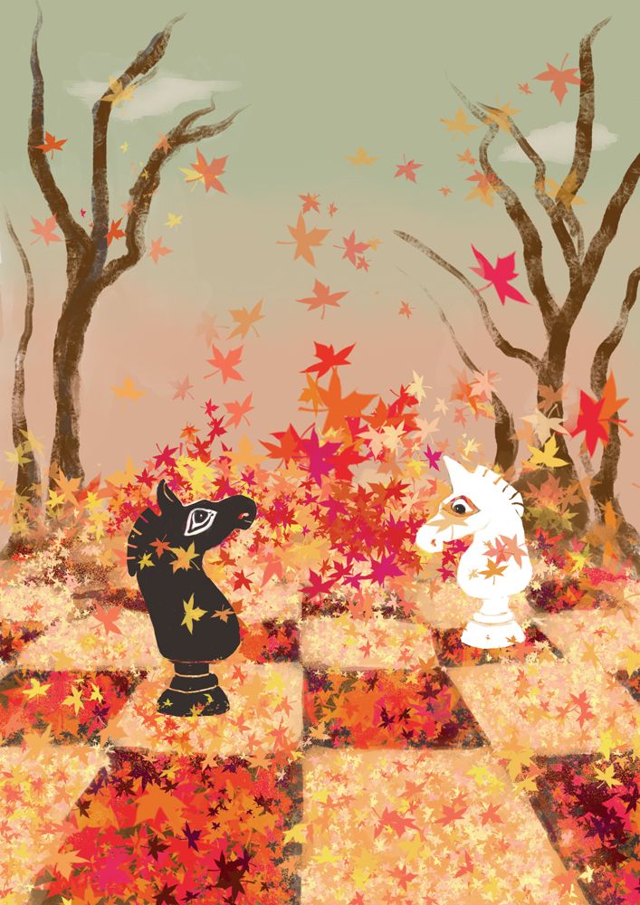
Busy working on four chess 'certificates' for a client who runs a chess business for schools - to give out at tournaments. I'm loving it but really flying by the seat of my pants because I really didn't expect to get any illustration work this year. It was all meant to be study. So scary but fun!
Client fortunately loves what I've sent her so far. I've used Photoshop brushes for the leaves but honestly still getting used to Photoshop and it's taking ages as it is!
I was basically given free rein but each stream from participation to high distinction gets its own colour (this one is orange/red - doesn't have to be the only colour) and has a power progression (in terms of the value of the pieces in chess). I've made them all playful landscapes with chessboards. Feedback welcome. I thought the blue sky was a bit extreme so have changed it.
-
@kirsten-mcg aw thanks Kirsten! Yes that's definitely what I'm going for with this second go of it

-
@kirsten-mcg This is so well done! I love how you treated the hair with that touch of red/orange to give warmth to really place the children inside the room.
-
@Melissa_Bailey thanks so much Melissa! Yeah I'm trying to push myself to not resort to using full saturation and splashing bright vivid color on the page all the time ('tis my tendency
 ) I'm starting to feel like I'm assaulting people's eyes hahaha
 -
@Melissa_Bailey I can't remember if I already replied to your "Once Upon a Nighttime" cover, but it is so beautiful! It's tender and sweet and has such delicacy to it with that little mouse holding his acorn. I honestly couldn't dream of a better children's book cover than this.
-
@Kristen-Lango oh wow, thanks so much! I hope that this little cover is effective in selling the dummy.
-
-
-
This post is deleted! -
@Mewie Thank you! I love these books too.
 And I'm so happy to hear that you find Edmond's expression intriguing! That's what I was going for. Plus, grumpy faces are just fun to draw lol.
 -
@Kristen-Lango Thank you!
-
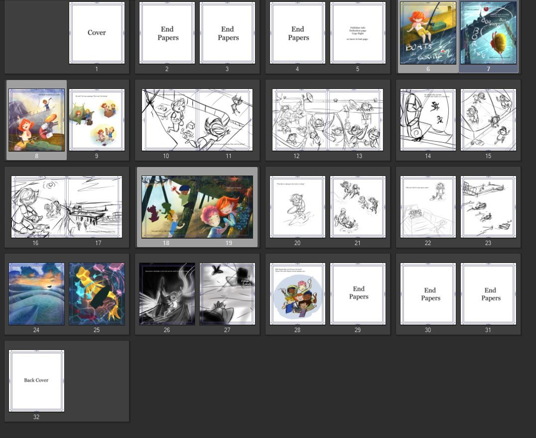
Working on 'Boats are Boring'.
-
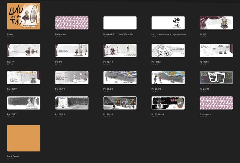
Slowly illustrating a personal project, Lulu and the Tutu, written by my Lighting Designer colleague in the theatre department where we work together. Hoping to have it finished for printing for family and friends in time for Christmas 2023. Very long way to go, but It's getting there.
-
@von_Nimmermehr Beautiful! I love that pose of the character sitting and looking off. Somehow it just feels really cozy and warm to me.
-
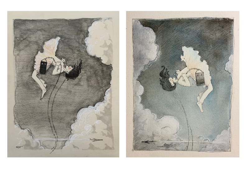
I think I need to wrestle with traditional media a little more now and again. Which version, right or left, do you like better?
-
@kylebeaudette LOL Love this

-
@Sarah-VanDam I Love this so much!! Such great movement and line. I think the second one is better, the direction of the flow of gesture makes better sense reading it from left to right, and the blue hue in the background makes the image pop. Beautiful work

-
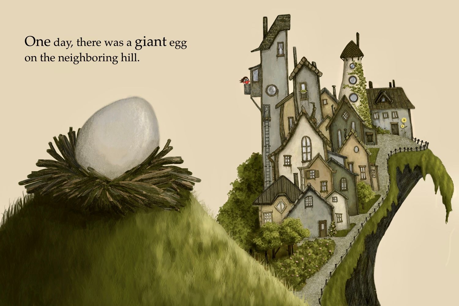
This took me forever, but I really enjoyed doing it. It's the opening spread for a dummy I'm working on.
-
@Sarah-VanDam Love these - so whimsical and beautiful too. The second one (right) for me. Combo of the colouring and composition makes it more eye-catching, for me at any rate!
-
@Sarah-VanDam wow this is great! I love it. I also like the one on the right the most.