• Recent
  • Tags
  • Popular
  • Users
  • Groups
  • Search
  • Register
  • Login
Society of Visual Storytelling

SVSLearn Forums

  • Register
  • Login
  • Search
  • Recent
  • Tags
  • Popular
  • Users
  • Groups
  • Search

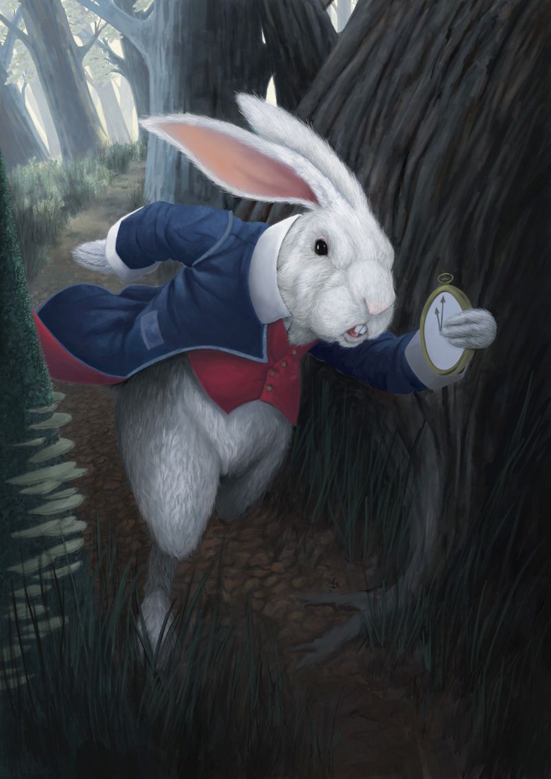
Advice please: The rabbit image has finally made progress :D

Artwork
8
23
948
Loading More Posts
  • Oldest to Newest
  • Newest to Oldest
  • Most Votes
Reply
  • Reply as topic
Log in to reply
This topic has been deleted. Only users with topic management privileges can see it.
  • randarrington
    randarrington last edited by 14 Feb 2023, 00:45

    Just looking for some feedback before I actually paint this thing.

    rabbit adjusted.jpg

    Instagram: https://www.instagram.com/randarrington/
    Tumblr: https://www.tumblr.com/blog/themightyrand
    Art Station: https://www.artstation.com/myartstation/projects
    LinkedIn: https://www.linkedin.com/in/rand-randy-arrington-8470905/

    kayleenartlover Mia Clarke Jeremy Ross 3 Replies Last reply 14 Feb 2023, 22:20 Reply Quote 2
    • kayleenartlover
      kayleenartlover @randarrington last edited by 14 Feb 2023, 02:10

      @randarrington This might just be my lack of understanding rabbit anatomy, but the way he's holding the pocket watch seems off. He should be able to hold it comfortably to get a good grip on it while hurrying. It might be that the watch is too big, or that his wrist looks uncomfortable, or something that I'm just not seeing. Other than that, everything looks great!

      1 Reply Last reply Reply Quote 1
      • Mia Clarke
        Mia Clarke @randarrington last edited by 14 Feb 2023, 06:29

        @randarrington Is this an ai generated image you’re working from, or is this a wip?

        www.miaclarkeart.com
        https://www.instagram.com/miaclarkeart/

        randarrington 1 Reply Last reply 14 Feb 2023, 11:18 Reply Quote 1
        • Geoffrey Mégardon
          Geoffrey Mégardon last edited by Geoffrey Mégardon 14 Feb 2023, 08:03 14 Feb 2023, 08:02

          What do you mean by “before I actually paint this thing”? We need to know what is your next step so we don’t feedback on what you haven’t done yet 🙂

          Find me on Instagram: https://www.instagram.com/nodragem/
          Portfolio: https://www.nodragemillustration.com

          randarrington 1 Reply Last reply 14 Feb 2023, 11:40 Reply Quote 1
          • randarrington
            randarrington @Mia Clarke last edited by 14 Feb 2023, 11:18

            @Mia-Clarke WIP. All done by me. Why?

            Instagram: https://www.instagram.com/randarrington/
            Tumblr: https://www.tumblr.com/blog/themightyrand
            Art Station: https://www.artstation.com/myartstation/projects
            LinkedIn: https://www.linkedin.com/in/rand-randy-arrington-8470905/

            Mia Clarke 1 Reply Last reply 14 Feb 2023, 11:56 Reply Quote 0
            • randarrington
              randarrington @Geoffrey Mégardon last edited by 14 Feb 2023, 11:40

              @Geoffrey-Mégardon So I really don't paint very often....sooo due to that fact and my crippling imposter syndrome, I've done a dry run digitally. I did this on a single layer in Procreate just to try and wrap my head around doing it traditionally and the approach I need to take.

              Next step will be moving the drawing to a substrate and then deciding on the medium. I'm thinking casein or gouache but I've not really decided as of yet.

              Please feel free to give me feedback on anything. By the time I've played with an image this long....I really start to hate it and I stop having a good perspective on it. I may not make the suggested changes (depends on what they are) but I'm curious to hear everyone thoughts about it.

              Thanks for having a look and again, any feedback is helpful!!!!

              Instagram: https://www.instagram.com/randarrington/
              Tumblr: https://www.tumblr.com/blog/themightyrand
              Art Station: https://www.artstation.com/myartstation/projects
              LinkedIn: https://www.linkedin.com/in/rand-randy-arrington-8470905/

              1 Reply Last reply Reply Quote 1
              • Mia Clarke
                Mia Clarke @randarrington last edited by 14 Feb 2023, 11:56

                @randarrington I just needed to know what phase you’re in, and what kind of feedback you wanted. If it had been an ai generated image then the stage you’d be in would be very different from if you had painted it yourself…

                I think your image works, your lighting is good, and it’s super moody. The rabbit looks a little bit scary and off-putting with all the definition of its face, but given the eerie vibe you’ve got that’s really a good thing.

                The two things I’d look closer at before moving to paint would be the angle of the rabbit (he looks a tad too tilted to me) and the pocket watch (which looks too big and has a strange angle to it). With the watch, I don’t think we need to see the face of it in order to have it read as a watch, which might solve some of the issues.

                It’ll be interesting to see you take this to traditional. What medium will you be using?

                www.miaclarkeart.com
                https://www.instagram.com/miaclarkeart/

                randarrington 1 Reply Last reply 14 Feb 2023, 12:40 Reply Quote 1
                • randarrington
                  randarrington @Mia Clarke last edited by randarrington 14 Feb 2023, 12:45 14 Feb 2023, 12:40

                  @Mia-Clarke THANK YOU SO MUCH!!!! I love hearing peoples thoughts.

                  I'm still debating on the medium. I'm leaning toward casein...but I've never painted with it sooooo I may chicken out 😃

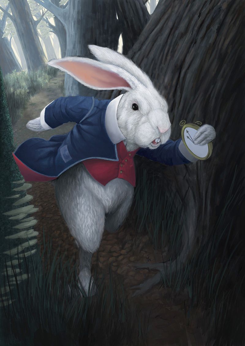
                  I did a quick fix on the suggestions so far. I rotated the wrist of the rabbit with the watch and the rabbits angle.

                  rabbit WORKING_1.jpg

                  Instagram: https://www.instagram.com/randarrington/
                  Tumblr: https://www.tumblr.com/blog/themightyrand
                  Art Station: https://www.artstation.com/myartstation/projects
                  LinkedIn: https://www.linkedin.com/in/rand-randy-arrington-8470905/

                  Chantal Goetheer 1 Reply Last reply 14 Feb 2023, 19:04 Reply Quote 1
                  • Chantal Goetheer
                    Chantal Goetheer @randarrington last edited by 14 Feb 2023, 19:04

                    @randarrington it looks great! Especially when it's just one layer in procreate. Only the watch is still off to me though. Now you ve tilted the wrist it looks more natural. But it's not a way he would be holding the watch to check it for the time. Try the pose in a mirror and decide if you want to have the Rabbit hold the watch just as you would carry a book or any other item or if the watch need to be held to check it constantly for the time as if you're hurrying to the bus. And you could always consider a watch on a chain around the neck. Looking forward to see the traditional version develop!

                    randarrington 1 Reply Last reply 14 Feb 2023, 19:30 Reply Quote 2
                    • randarrington
                      randarrington @Chantal Goetheer last edited by 14 Feb 2023, 19:30

                      @Chantal-Goetheer Well I didn't intend to have him checking the watch really but just running with it in his hand...maybe I should put a cover on the watch to reduce the possibility of anyone having that idea...

                      How do you feel about the rabbits rotation to a more vertical stance. This was actually the original pose that I'd created and someone on here thought it should be rotated forward to create a more dynamic feel....which one do you prefer?

                      Thank you for your input!!!!!

                      Instagram: https://www.instagram.com/randarrington/
                      Tumblr: https://www.tumblr.com/blog/themightyrand
                      Art Station: https://www.artstation.com/myartstation/projects
                      LinkedIn: https://www.linkedin.com/in/rand-randy-arrington-8470905/

                      Mia Clarke AngelinaKizz Chantal Goetheer 3 Replies Last reply 14 Feb 2023, 20:31 Reply Quote 2
                      • Mia Clarke
                        Mia Clarke @randarrington last edited by 14 Feb 2023, 20:19

                        @randarrington when seeing the straightened up bunny I must say I was wrong, your original tilt was better.

                        www.miaclarkeart.com
                        https://www.instagram.com/miaclarkeart/

                        randarrington 1 Reply Last reply 14 Feb 2023, 21:11 Reply Quote 1
                        • AngelinaKizz
                          AngelinaKizz @randarrington last edited by 14 Feb 2023, 20:22

                          @randarrington I actually think the first pose has more urgency to it, it’s more dynamic. The watch looks better in the second variation, however the hand still looks rather unnatural. The fingers look to be disconnected from the wrist to see that much turn backwards. In foreshortening the forward hand should also be larger than the back hand. In a natural run that arm coming forward, will also bent and moving upwards. The arm also naturally come out mor centered to the body. It’s not a huge adjustment, but I think it’ll help. If you take the hands off of the watch then maybe adding the chain that’s typical of a pocket watch trailing behind as he runs will help add more readability and push the movement even more.

                          www.evarartistry.com
                          www.Instagram.com/evarartistry/

                          randarrington 1 Reply Last reply 14 Feb 2023, 21:10 Reply Quote 1
                          • Chantal Goetheer
                            Chantal Goetheer @randarrington last edited by 14 Feb 2023, 20:31

                            @randarrington the first one looks more dynamic.

                            randarrington 1 Reply Last reply 14 Feb 2023, 21:10 Reply Quote 1
                            • randarrington
                              randarrington @AngelinaKizz last edited by 14 Feb 2023, 21:10

                              @AngelinaKizz Thank you for your advice. The original drawing did have the watch chain and it does add a great deal of movement. I'll add that back into the final. I think I do need to emphasis the hand (holding the watch) and its anatomy more clearly. I'm not sure if the fingers breaking in perspective is being read. I think that's due to the fir....but I can play with that.

                              Thank you very much!!!!

                              Instagram: https://www.instagram.com/randarrington/
                              Tumblr: https://www.tumblr.com/blog/themightyrand
                              Art Station: https://www.artstation.com/myartstation/projects
                              LinkedIn: https://www.linkedin.com/in/rand-randy-arrington-8470905/

                              1 Reply Last reply Reply Quote 1
                              • randarrington
                                randarrington @Chantal Goetheer last edited by 14 Feb 2023, 21:10

                                @Chantal-Goetheer I agree. 😃

                                Thank you very much!!!!!!!

                                Instagram: https://www.instagram.com/randarrington/
                                Tumblr: https://www.tumblr.com/blog/themightyrand
                                Art Station: https://www.artstation.com/myartstation/projects
                                LinkedIn: https://www.linkedin.com/in/rand-randy-arrington-8470905/

                                1 Reply Last reply Reply Quote 0
                                • randarrington
                                  randarrington @Mia Clarke last edited by 14 Feb 2023, 21:11

                                  @Mia-Clarke I think so too...but it was certainly worth checking. I did have the rabbit in more of a vertical position originally but you never know. simple to check it 😃

                                  Thank you for you help!!!!

                                  Instagram: https://www.instagram.com/randarrington/
                                  Tumblr: https://www.tumblr.com/blog/themightyrand
                                  Art Station: https://www.artstation.com/myartstation/projects
                                  LinkedIn: https://www.linkedin.com/in/rand-randy-arrington-8470905/

                                  1 Reply Last reply Reply Quote 1
                                  • randarrington
                                    randarrington last edited by 14 Feb 2023, 21:16

                                    Can I ask how everyone feels about the color? Is it lean too much toward the grey tones toward the background and then goes dark too quickly? How dies the ridges in the tree directly behind the rabbit read? I almost thing it'd be better to use larger shapes not the ridged bark look. That would create other large shapes in the design. That's one of my fears actually is that I've not payed attention to the large shapes in my zeal to get into the drawing and the detail. How about the contrast? I'm trying together the rabbit to be the focus. Does that work here?

                                    Thanks again everyone!!!! I really appreciate your thoughts

                                    Instagram: https://www.instagram.com/randarrington/
                                    Tumblr: https://www.tumblr.com/blog/themightyrand
                                    Art Station: https://www.artstation.com/myartstation/projects
                                    LinkedIn: https://www.linkedin.com/in/rand-randy-arrington-8470905/

                                    Chantal Goetheer 1 Reply Last reply 14 Feb 2023, 22:03 Reply Quote 0
                                    • willicreate
                                      willicreate last edited by willicreate 14 Feb 2023, 21:53 14 Feb 2023, 21:39

                                      @randarrington If you cover the face of the watch it may reduce the viewer's ability to recognize the object as a pocket watch; especially for the younger audience.

                                      I wouldn’t be too concerned with people interpreting the image differently than your intention. While I agree about the issue of how the paw is holding the watch, I do like the initial hand position. The rabbit looks as though it is presenting the watch to me, directly communicating, "Get out of the way! Look at the time. I'm late. I'm late."

                                      The posture as it currently stands is great.

                                      The environment looks convienently spaced around the rabbit, oppose to the character navigating the landscape. For example, the tree behind the rabbit is bending at a 30 degree, but no roots sticking out of the ground or growing on the path and not chopped to create the path. The root underneath the rabbit bends safely away from tripping it. The grass undisturbed. I think the composition would benefit if both the character and the environment reacted to one another.

                                      Shouldn't the coat end be behing the left tree trunk?

                                      As for the colors, I did think there were too much blacks. Have you considered subsitute black with color to simulate color casts and tints. Something like a N.C. Wyeth illustration. However, one can argue the 'real world' are greys and blacks and Wonderland is in technicolor.

                                      I'm not sure what to say about the ridges. It depends on your style. Do you want to go for a realistic, photographic look or more impressionist? Your question made me think of the illustrator Chris Buzelli. He's very detail oriented, but not a hyper-realist. Take a look at his execution.

                                      I do like the quality of the digital piece. It'll be an awesome painting.

                                      randarrington 1 Reply Last reply 14 Feb 2023, 22:26 Reply Quote 1
                                      • Chantal Goetheer
                                        Chantal Goetheer @randarrington last edited by 14 Feb 2023, 22:03

                                        @randarrington personally I like the ridges. It still feels like a big tree to me, and the ridges just give it texture and make it more like a tree. It also fits how the rabbit is textured. The white of his head certainly catches attention first. The dark blue of the coat, especially the arm holding the watch, fades a bit into the tree. Maybe making the tree, what it alrea What @willicreate says about the interaction with the environment and the colour is a good point.

                                        randarrington 1 Reply Last reply 14 Feb 2023, 22:29 Reply Quote 1
                                        • Jeremy Ross
                                          Jeremy Ross @randarrington last edited by 14 Feb 2023, 22:20

                                          Hi @randarrington, I think it’s great. I would go ahead and paint it!

                                          https://www.instagram.com/jeremyrayross
                                          https://www.jeremyrayross.com/
                                          https://twitter.com/jeremyrayross
                                          https://jeremyrayross.substack.com/

                                          randarrington 1 Reply Last reply 14 Feb 2023, 22:30 Reply Quote 1
                                          1 out of 23
                                          • First post
                                            1/23
                                            Last post