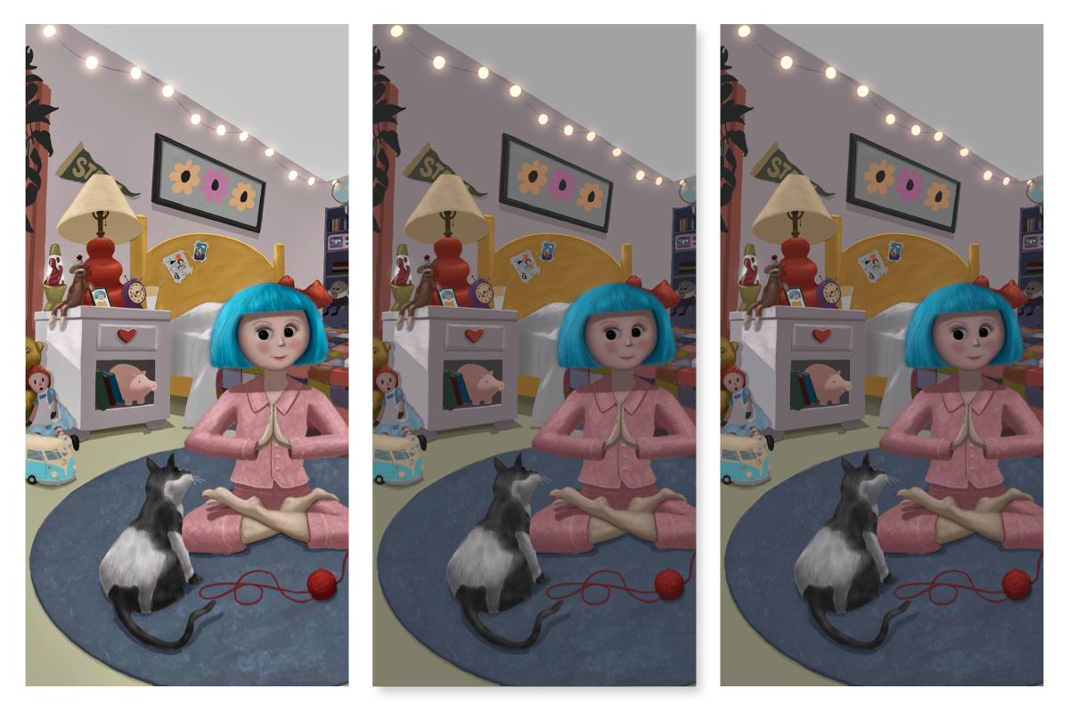
Procreate Exported Images Very Dark
-
@Coreyartus omg, thank you for this! I had no idea!

-
@Coreyartus Wow thank you for this helpful insight. I don't have an iPad or Procreate yet it was helpful to understand the RGB/CMYK Photoshop connection. I just bought Rebelle 6 Pro, becoming familiar with the tools and figuring how to set my canvas. Do you know anything about this application?
-
@AnumC Thanks! Will give that a try.
-
@Coreyartus Thanks for the great information. My problem is not with the printing, at the moment, but with simply exporting of the image to jpeg, png, pdf, etc. I should note, I did not have this problem a couple of years ago on the same iPad, same settings. I've tried to simulate it here. The first image I have brightened after export to approximately what it looked like in Procreate. The second two are jpg and tiff as they were exported. The other formats look the same - pdf, png, and even psd - as the last two.
Thanks again, for your help.

-
@KimberScott You might download another art app to your iPad and save the images using it to see if it's specific to Procreate or your iPad in general.
Also, you might check to see if you have activated True Tone or Nightshift on your iPad. Sometimes those force visual adjustments on the screen that aren't accurate in your image... If all the formats are turning out the same way regardless of app, it might be a setting on your iPad that's screwing things up for you...
I, too, have a Macbook Pro, and you can actually change the color profile in your System Settings under "Displays". You might set your color profile to the same as your iPad, which is Display P3 if I recall correctly... Mine own is currently on Color LCD...
If those things don't work, I'm not sure what the issue might be... I'm so sorry.
-
@Coreyartus Thanks! Will try all of that. I do have True Tone turned on on my iPad. Will turn that off first and go from there. I appreciate your help!
-
@ArtMelC The brightness level was the problem. Thank goodness. Such a simple fix. I started working at 50% brightness and that did the trick.
 Thanks!
 -
*Different color profiles in Procreate serve specific purposes, particularly in the context of digital printing.
The P3 color profile, which is the default for Apple products, emphasizes robust reds, yellows, and oranges. It was initially developed for digital movies to enhance their appearance on Apple devices. Conversely, AdobeRGB, another proprietary color profile, focuses on vivid blues and greens.
In Procreate, the CMYK profile is not a true CMYK representation but rather an emulation created by Savage Interactive. It functions as an RGB profile that removes specific hues and tones that are likely unprintable. Although it is labeled as CMYK, when a CMYK image saved in Procreate is opened in Photoshop, it opens as an RGB file. Savage Interactive is aware of this issue but cannot currently resolve it without significantly increasing the app's size. Hence, it is advisable to utilize the sRGB IEC61966-2.1 profile in Procreate, as it is the established international standard for light-based color on electronic devices. Subsequently, the file can be adjusted and converted to CMYK in Photoshop for digital printing purposes.
It's worth noting that when directly printing sRGB files, they may appear darker compared to CMYK files without adjustments. Moreover, on the iPad, images may seem brighter due to Apple's advanced display technology and specific color profile, which is designed to showcase richer and brighter colors than most monitors or prints can reproduce. To compensate, it is necessary to increase the brightness of images by approximately 10% or more before printing. Additionally, it's important to recognize that when viewed on non-Apple monitors or phones, images might appear less vibrant, darker, and lacking the same visual impact, regardless of screen brightness settings.*
-
@Coreyartus Oh really?! So would RGB be best option or do we need to find a way to turn it into CMYK on another program?
-
It's definitely because of the maximum brightness of your iPad. You think the color you picked is light, but it's actually really dark and only appears light because your iPad be shining like a lighthouse! I had the same problem and lowered the brightness of my screen. BOOM, fixed! My eyes also get less tired now, win-win!