Help me choose thumbnail composition
-
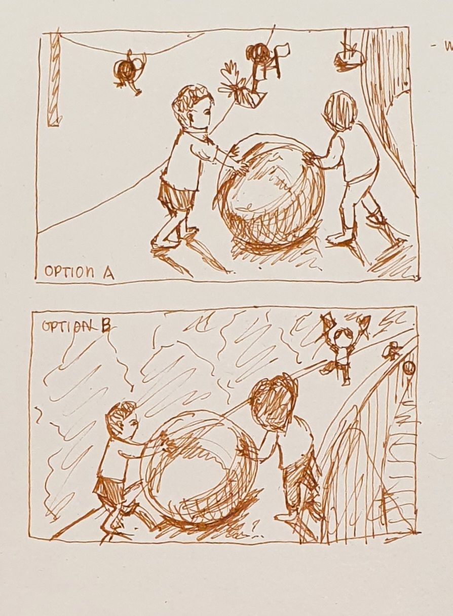
It's a standalone image of 2 kids pushing a big ball uphill while a third kid shows the way forward. I want to also make it more interesting by showing the difficulties that lie ahead (e.g. someone dropping the ball?) Without making them too prominent.
www.instagram.com/art.melc.illo/
www.artmelc.com
I write weekly on mondayblues.substack.com -
@ArtMelC Hello!
Option B has more of a left to right movement, and gives more of a feeling that the road is long. However, I'm not sure either shows how up-hill the road is (though I'm sure the mountains/rocks will be clearer at a later stage). Perhaps you could try a point of view from the children's knee-level of something like that?
The child on the right looks as though they only have one hand on the ball and looks too comfortable/finding it easy. Maybe they can be further behind the ball, pushing with both hands to make it look like more of a struggle? That is unless the ball is really light - for some reason I was thinking it was a big stone ball! (Getting confused with greek myths...)
-
@Robyn-Hepburn thank you! Yes, I'll add the rocky cliff texture. The ball is probably more gym ball than a rock hahaha. I see what you mean about the kid on the right. I'll tweak it
-
@ArtMelC B is the better option, but I suggest removing the character with the flags. I like how you show the ball dropping in the distance, and if you create a clear goal somewhere beyond that, it should be obvious to the viewer/reader what the characters in the foreground are trying to do. I would also move them more to the left to create a bit more left to right movement like @ArtMelC suggests.