Nov 2023 - Prompt WIP (HTFYA)
-
@Jason-Crowley Thanks! Yeah, you're right it would be at night. I must have subconsciously avoided doing that because night scenes are harder for me
 I'll do some experimenting to see if I can make it work. Thanks for the heads up mate.
 -
@Larue Yeah I think you're right, it might help the image pop more. If I make it a night scene I guess the moonlight could also work in the same way. Thank you for the advice!
-
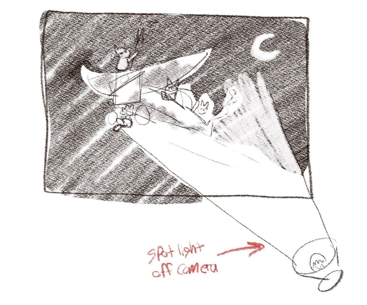
@MarcRobinson You know what would be pretty cool, is if you did it at night, BUT instead of the plane being silhouetted by the moon (which you might risk losing sight of the cats faces and the details of the plane). You have the plane "lit up" by a spotlight coming from below. (my very bad sketch below for reference)

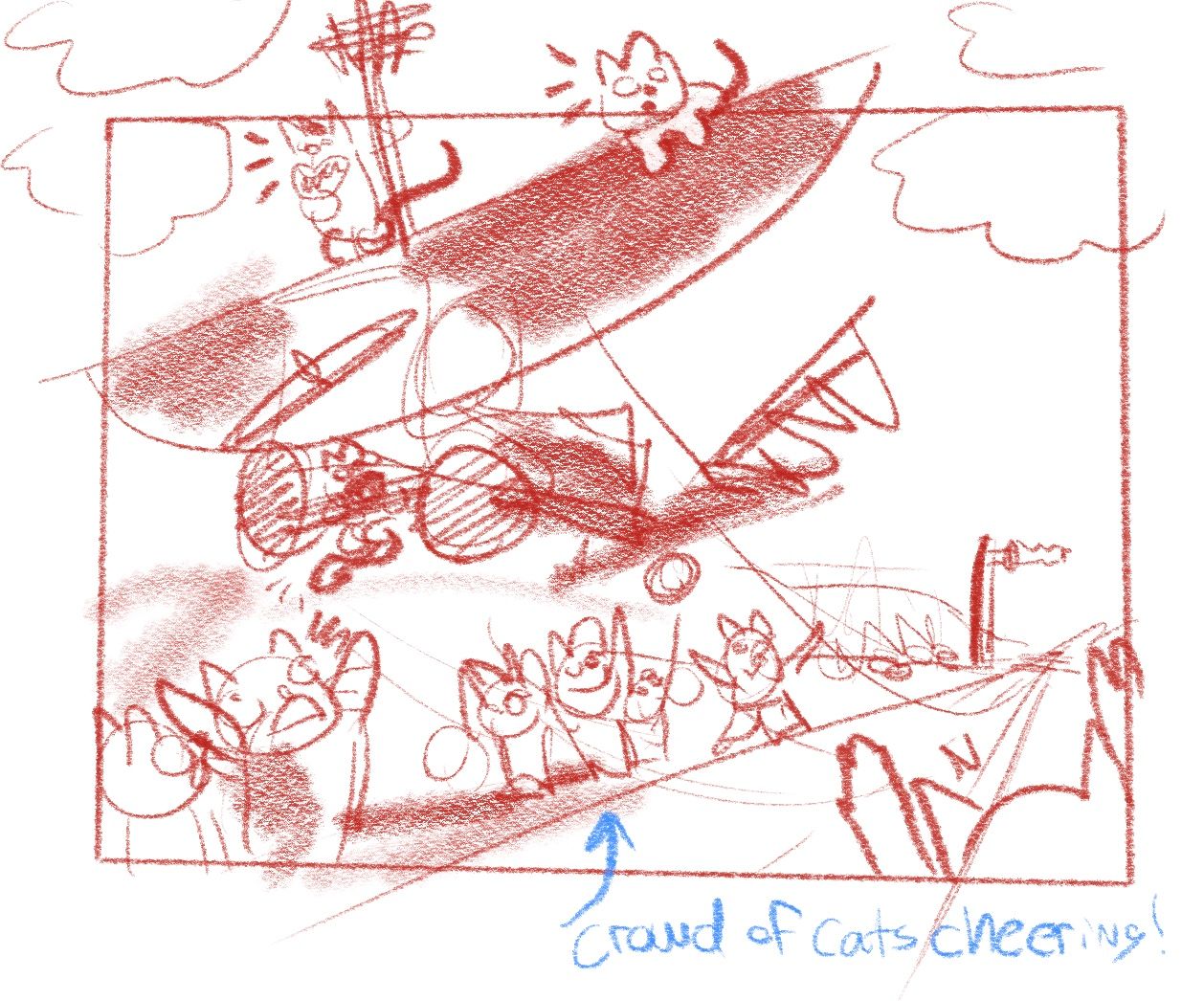
However, when I saw your piece it looked like they're simply engineer cats, that are test flying their newly made machine, so you could have them just taking off a dirt runway, and you can keep them in the sun light.

You can steel this idea if you want, but those are my thoughts.
-
@alexw Cheers mate, those are really great ideas. I ended up going for the spotlight idea because I liked the interesting light options. Your thumbnail sketches are really dynamic and interesting, I appreciate it massively.
-

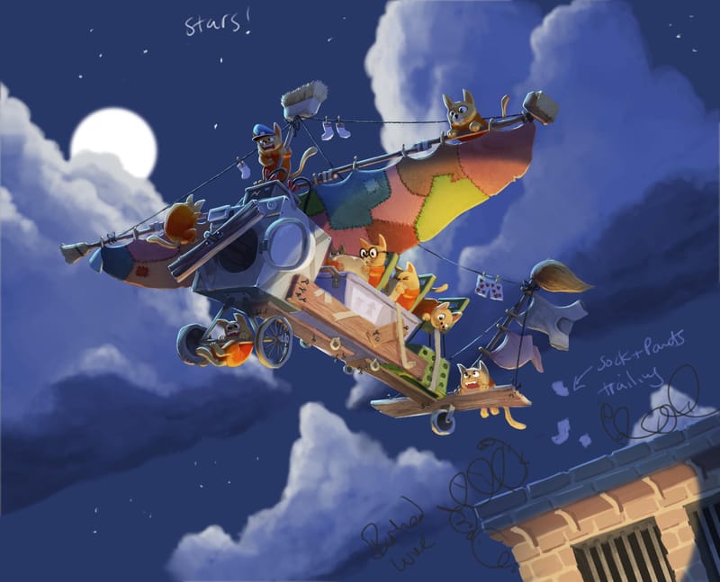
This is where I've ended up so far. With the extremely helpful advice from you guys. There is a lot of tweaking and editing to do, but I'm super pleased with the way it ended up going.
-
@MarcRobinson
This is fantastic!
I was eyeballing it for a long time before I could find something to suggest: it feels like the main cat is that captain-like one with the hat, right? Yet the spotlight draws the eye to the three passengers. You could perhaps widen the spotlight, or just brighten and saturate all the cats somehow?
And one very minor thing: is that back passenger looking at the one clinging to the tail? His pupils aren't quite trained on him (he looks a wee bit squint).
I'm looking forward to seeing the final image! -
@MarcRobinson This looks SO GOOD! Now that it's in color the whole piece is so interesting to look at! KUTGW!!! (Keep up the good work!)
-
@Robyn-Hepburn Cheers Robyn those are all really good and valid points. I'm going to have to go round and tweak those little bits. I might remove the captain hat from the one on the top to avoid it being confusing, as it's not really important. This was originally going to be a daytime scene, so I find it really interesting how so many things need to be changed now it's a night scene with the main light below! Thanks for pointing out the issues, I appreciate it.
-
@alexw Cheers mate, and thanks for the "night scene" tip off!!!
-
@MarcRobinson You are very welcome, good sir!
-
Fantastic,far exceeded my expectations! Great multiple light sources.
-
@Larue thank you!