Feedback on Composition, John Space v. Caterpillar
-
@Geoffrey-Mégardon I like the one where he overlaps. It makes my eye draw back to the monster behind him and go back and forth between them. The others make me feel like looking off the page more.
-
@Geoffrey-Mégardon Oh okay, how about this then?
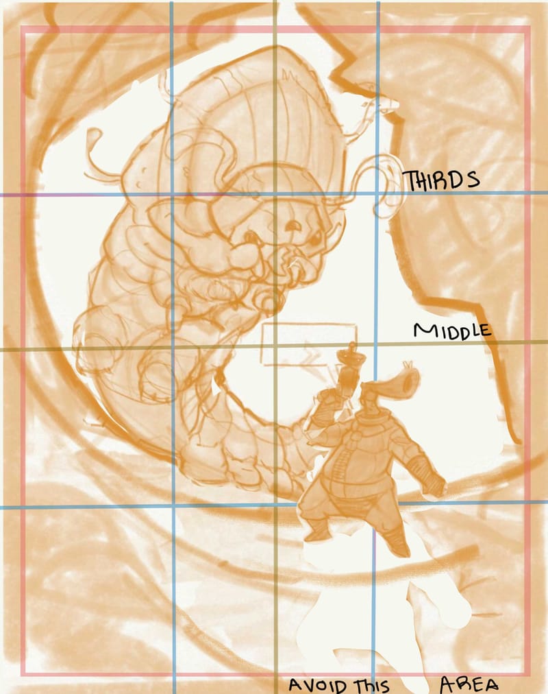
I should have been more clear too. Im worried your spaceman is too close to the edge in all of them, and while i like the overlap one the best, you lose the silhouette of your cool gun. Im sure there is a way to solve the composition with the spaceman more centralized while preserving the small big contrast and the negative space around important bits (gun, hair, face, focus). A big reason i think john space should be more centralized is because i assume the story is about john space, the space man, being in danger, and not the caterpillar named john space finding lunch… i hope that makes sense…
edit oh you’re saying he is supposed to be moving off the panel? Its not a poster? Its a comic panel? Well the gesture he is in feels like he is just standing, if he is supposed to be moving, you might want to change the gesture….
-
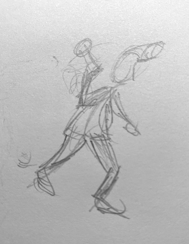
@Geoffrey-Mégardon like @R-Fey-Realme suggested, John's pose needs to change to have it be more obvious he is moving to the right. As he is now, he looks as if he is hiding behind a wall, preparing for a surprise attack. Perhaps shifting his weight to his front leg like in this very rough sketch.
-
@Geoffrey-Mégardon after reading the following posts I can agree that 3 looks best. You can still make him a tad smaller, bringin their feet in but keeping his head in place
-
Thank you all for your feedback!
that is very useful to see so many different ways of experiencing the composition. Such a puzzle!@R-Fey-Realme yes that's to be seen as a comic page. Although John Space is the hero, on this page, the "danger" appearing behind him is the main subject. That's why I am willing to put John Space on the periphery. I like how you've changed the forearm/gun angle btw
") it improves the flow, I will try to integrate that change. I also think that you are right about the silouette of the gun. I don't want the reader to miss the information that his gun is ready.
it improves the flow, I will try to integrate that change. I also think that you are right about the silouette of the gun. I don't want the reader to miss the information that his gun is ready.@tom-barrett If I had to describe John Space's action with words, it would be: walking cautiously downhill inside a cave, his left hand reaching for some support, or moving some grass out of the way. I have some sort of an Indiana Jones pose in mind (replace the gun with a torch). I will try to improve that aspect.
@MerryMary I like that this composition is making your eyes go back and forth between the two! however, as @R-Fey-Realme mentioned, it might be important to keep the silouhette of the gun readable.
@makekong thanks supporting Image 3
 I needed it!
So I think I am going to render image 3 with John on a separate layer group for now. Like that I can progress and I will still be able to move and scale John Space around at the end!
Thank you so much for your help and ideas
I think it helps a lot to speak about the whys for me to gain confidence.Find me on Instagram: https://www.instagram.com/nodragem/
Portfolio: https://www.nodragemillustration.com -
Trying out some lighting options, which I believe can totally change the composition.
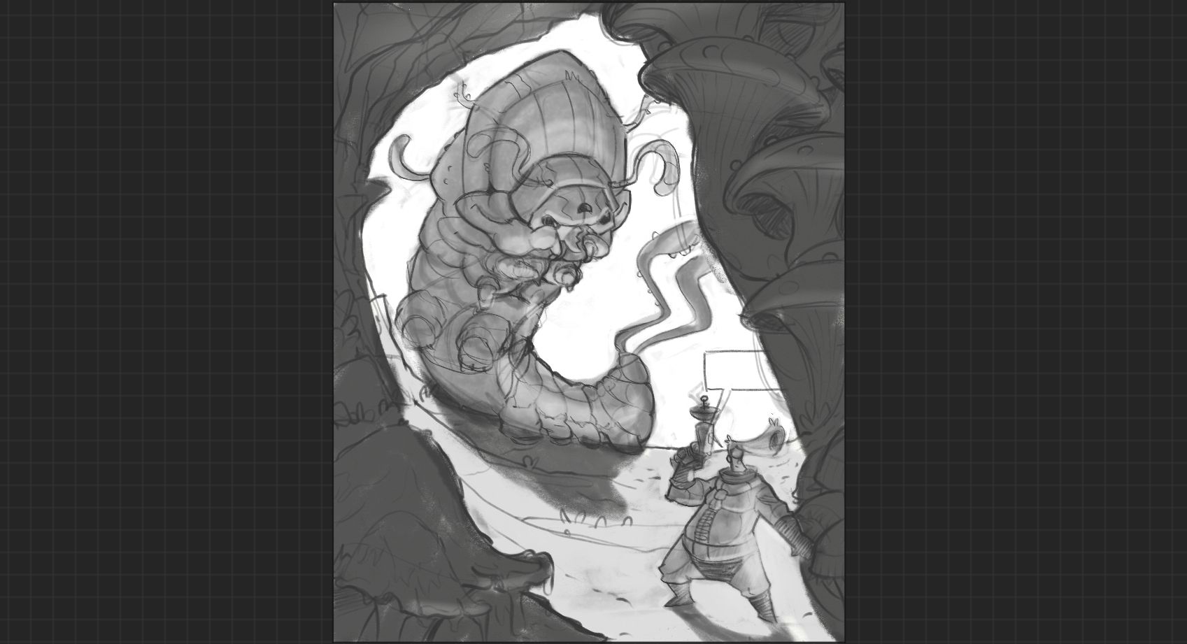
But I have no idea what to do in terms of colors!Otherwise, I have done the inking for John and the Caterpillar, now I have to do what is the hardest part for me: the environment!! Drawing rock and mushrooms is not that easy
I hope to be done by the end of the weekend!
-
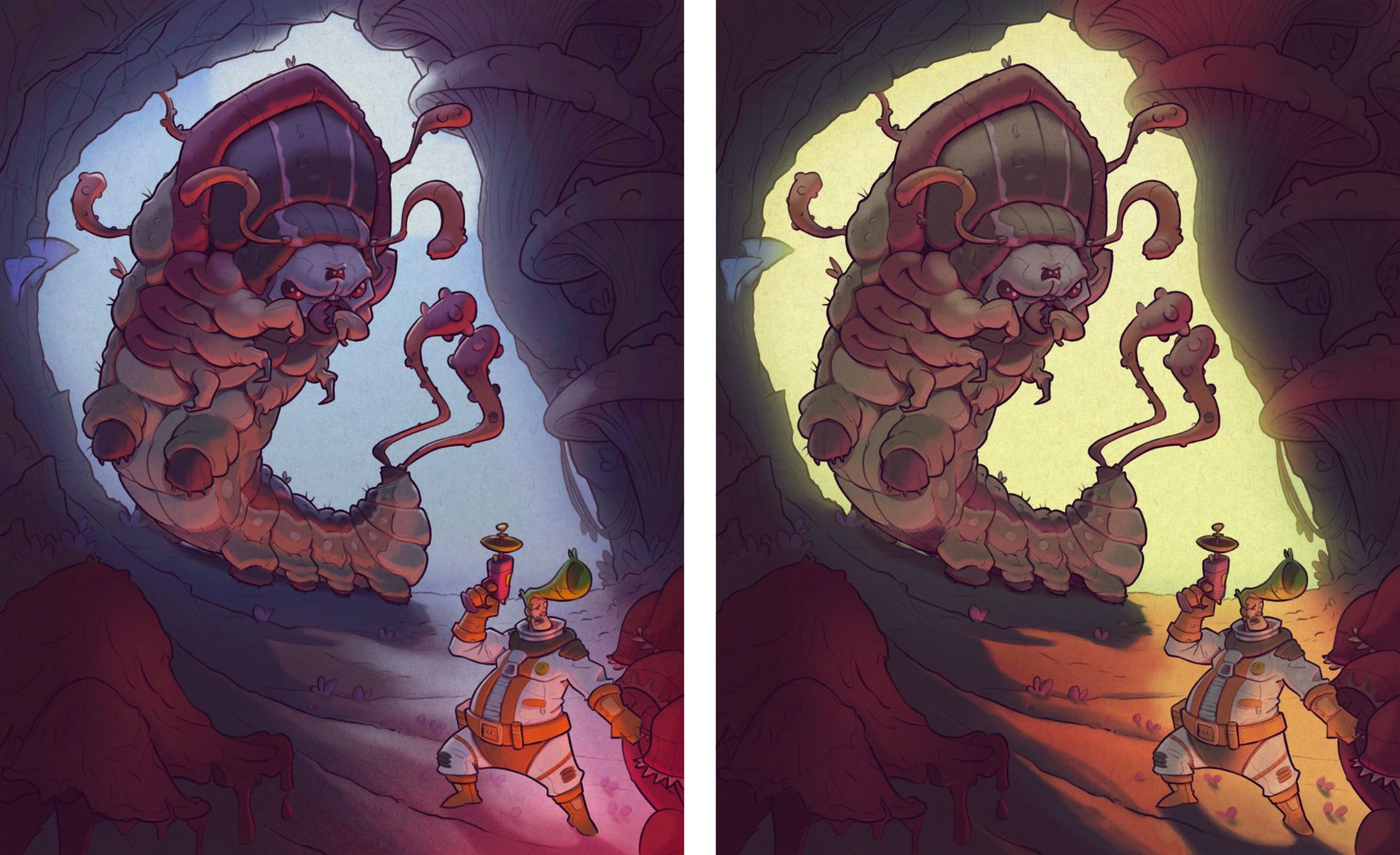
I posted my struggle with composition a few weeks ago; now I am posting the "possibily" final image after struggling with colors and lights!
I really wanted the green and orange image to work, but I struggled so much with choosing the colors and intensity of lights, I am not even sure it works still. So then I made the blue/night version.
Which one do you prefer? is there anything that seems to not work? what could be improved in terms of color and light? Any feedback welcome!
Find me on Instagram: https://www.instagram.com/nodragem/
Portfolio: https://www.nodragemillustration.com -
This post is deleted! -
@Geoffrey-Mégardon The red in the first composition makes it look a lot more ominous and dangerous. I like that one the best.
-
@ChloeGreenbergArt So I did a little "survey" on instagram, and it seems that most people prefer the night scene
So I will be using it!
Thank you for your feedback! I should be publishing the final page today.