WIP insect ladies: February HTFYA follow-up
-
Huge thank you to Will and Lee for the marathon critique they pulled off!
@Lee-White and @Will-Terry
Serious kudos, guys!
Amazing! You managed to give something to everyone.I was so happy and excited to get a critique on the very first HTFYA piece I submitted!
Especially because I'm a new student, short and sweet was a-okay with me:
That said, the feedback was the exact OPPPOSITE of what I expected.
I like my characters' poses but I can see issues with the rest of it.
However Lee said the characters' poses are confusing but the values and color are good.So to my fellow SVS students, would anyone like to comment? I would appreciate your thoughts!
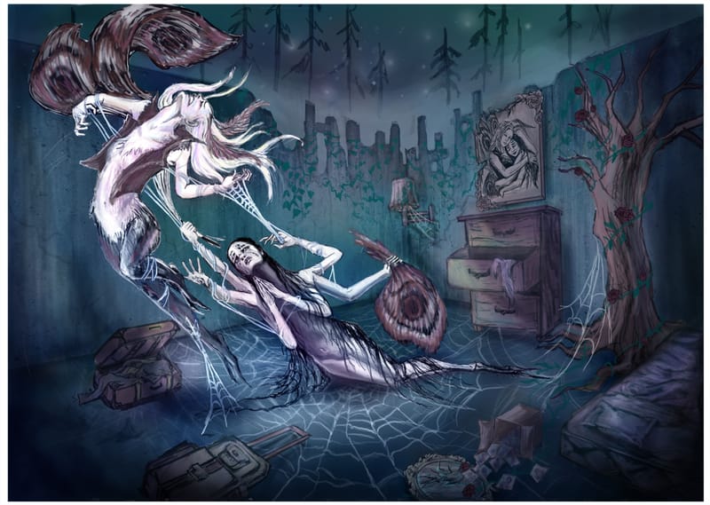
Here's how the story is supposed to read:
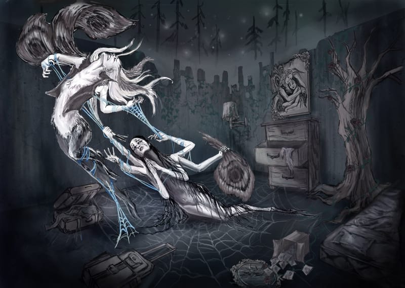
Spider lady is trying to prevent Moth lady from leaving.
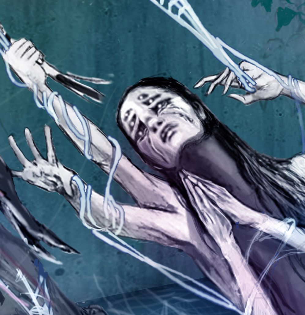
Spider lady's 6 arms each represent a conflicting emotion: pulling off Moth's wings (anger) while pleading "don't go" (sadness).They are stuck together with webs but Spider lady is also trapped by her own web.
The stuff on the floor is a bed, suitcases, a broken mirror and a box of photos.Style inspiration is Chiara Bautista, who has this approach of fantasy symbolism to convey an emotional visual language.
Fellow SVS rabbits, please comment on the following:
Many thanks!-
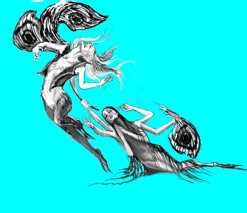
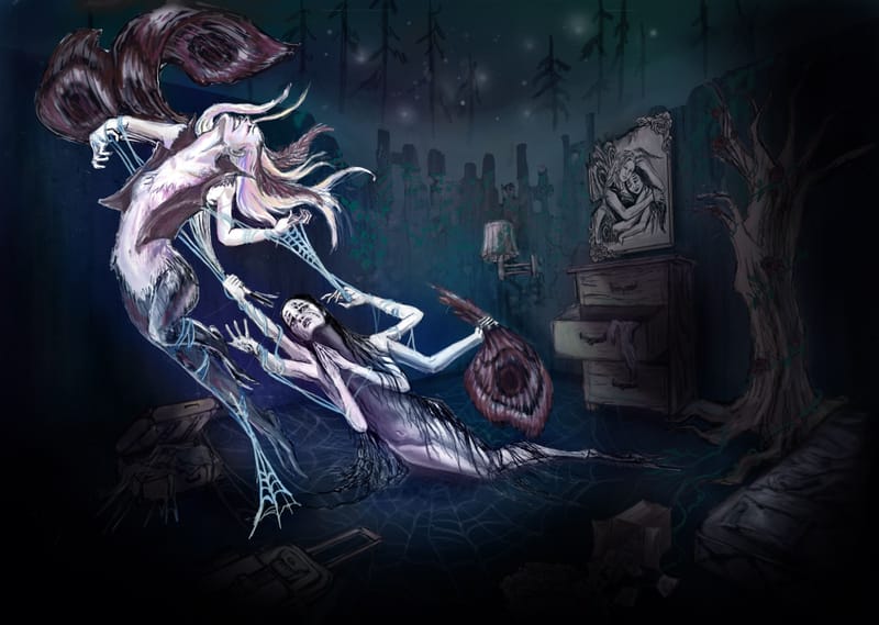
Can you tell what is happening in the first one (original color version of the picture)?
-
Are the shapes more clear without the webs connecting the characters?
-
Would the piece be better if I could somehow crop in?
-
Would limiting/desaturating the colors help with clarity?
-
Should the background values be darker?
-
Other suggestions?
-
-
@reberlik hey!
-
yeah it is a lot easier to see what is happening there, but it still takes a minute sitting with the picture to put together all the pieces (the clues are very spread out)
-
I think the webs are important, they make the gesture work, they make the spider lady work (cant really see her four eyes at first, but the web immediately says spider), and they are most important for the trapping.
-
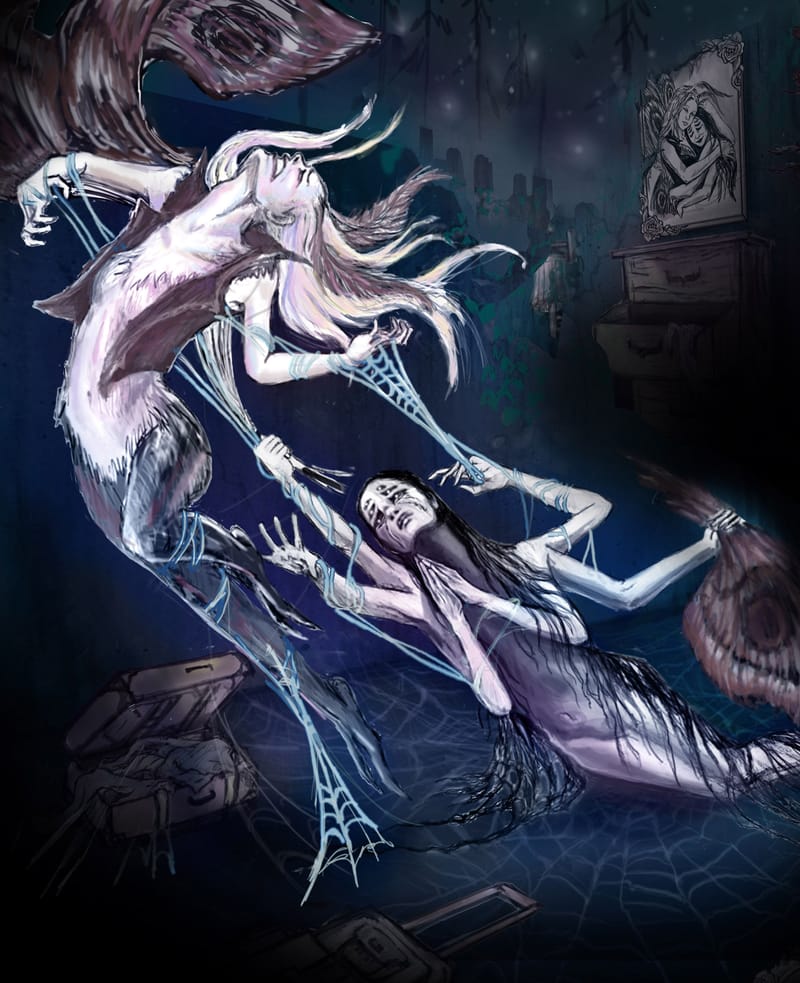
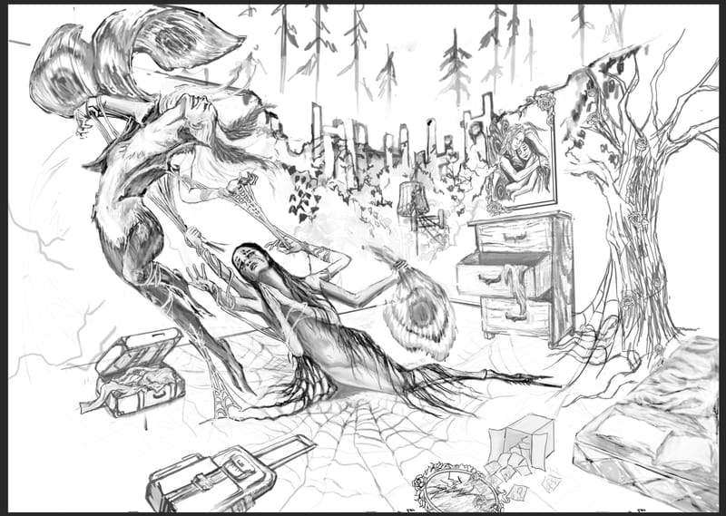
I dont think cropping it how it is right now would help, if you could consolidate everything into a more vertical format (think magazine full page) so you could see the couple portrait and the suitcases more at the same time that coud make a faster read (still looking at the top rendering version)
-
I think in the top one it works pretty well (contrast and saturation wise and color wise) Its still a bit of an unconventional story (it wont be instantly readable because you arent using the instantly recognizable male-female relationship) so Its okay if it takes a few moments to put together. I really think just putting it into a vertical format so the clues are closer together would do most of it.
-
no, i don't think so.
its a very dramatic piece and it all makes sense pretty well to me (figures and design and structural drawing) the portrait is the biggest clue, i didn't see the suitcases till way later so the torn-up dresser was confusing. the moth wings didn't really read but since the spider lady reads I didn't really question it. idk the wings just dont really read as moth wings or her moth wings for me, although they do help with the drama and movement
Blog: mamatheartist.blogspot.com
Coloring page newsletter: https://bit.ly/Color-in -
-
Hi @reberlik!
I like how much you have thought about this image! I can tell you have put a ton of work into it. I'm new here, so I was wondering if you could tell me what your goal is in general with art? Are you trying to work in a specific field as an illustrator or are you looking to develop your work as a fine artist exhibiting in galleries? Knowing your direction influences the sort of advice you are going to need to move forward on your pieces.
That said I think the concept is very clear right off- this is an illustration of a relationship that isn't working anymore. There are toxic elements to this relationship. However, I think what you need is a bit of simplification. There are a ton of ideas happening here with the elements around the characters. Maybe a good exercise will be to take away some of the elements to see if the story still reads. The box with the photos and the broken mirror spilling out, for instance, is less informative than the portrait of them hugging in the background. The bed and the furniture could go as well.
What would happen if you made the portrait behind them part of an actual web- the lines being the lines of a web and the spider coming out from that and hanging onto the moth?
I think where the confusion lies in the character design is all of the things coming off of the characters. The spider reads well, in my opinion, as it has a strong silhouette. But the strands of hair next to the face of the moth are confusing as they are the same color as the character's skin. Changing the color of the hair might help clarify it a bit. Maybe having just a single web connecting the two characters might help rather than so many. I think simplification in this piece will be your friend.
The emotion in this piece is great. I understood it at a glance. The mood is perfect for this sort of story and the characters have great gesture and strong facial expression. I think stripping elements away to the most essential and then slowly adding them back in might be the key. I hope that is helpful!
-
@R-Fey-Realme
Wow! Thank you R. Fey for the in-depth and thoughtful critique!
You're totally correct and everything you articulated was something I felt was wrong but couldn't quite put my finger on.
I'm eager to redraw the background in a vertical format with all of your awesome suggestions!Good notes about the moth wing design. I'll see what I can do there.
You're also right about the story not immediately reading, probably because the background elements were tacked on after drawing the characters.
Here, feeling trapped is a duality between desperation for independence and the pain of loneliness.
Each character represents one side of my feelings on this topic, and that's why they're both female.
I'm trying to make narrative images that express deeply personal emotions in a symbolic way, like Chiara Bautista does in her work.It's most important that the poses are clear and reading well.
The background is a secondary element that was mostly added for me to practice storytelling.That said, I'm a bit unsure how to maintain the feeling of sparse emptiness/loneliness in the room if I start pushing the background elements closer together, but let's see how it turns out.
Thank you again, R. Fey for the amazing critique. You've got a great eye and everything you said made a lot of sense!
-
@reberlik that is a very real and very complicated relationship/message to show. Those internal battles are something everyone has experience with. It is coming off like a romantic relationship right now…. My only thought on how to clarify it as an internal struggle could be to make the two characters very obviously the same, except that one is a moth (white) and one is a spider (black). You can use a sort of pattern in the design of both (inverted on the spider) ill see if i can find other examples of art showing an internal struggle.
")