Critique request: girl and horseshoe crab
-
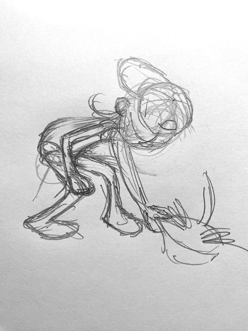
@jenn Hi, Jenn. I like both sketches, bot the first one gives to me the feeling of dynamic and just make me want to join the child playing on the beach. It is really nice!
-
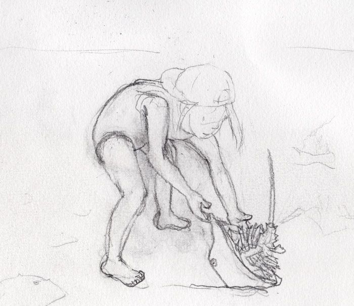
@Dima-Eichhorn thanks! I think I will go with that pose and enhance it with more story elements.
-
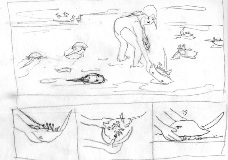
I know, I'm so slow... but here's the next iteration. Originally I was planning to do a single panel watercolor or acrylic painting but now I have this sequence that demonstrates how to flip a horseshoe crab. So I am still trying to figure out the format and medium. Suggestions are welcome.
-
Love the sequence! Something you could try medium wise is pen and/or marker. I personally like to make everything grayscale to help my planning on composition and depth, then if I like it, I add a color overlay of some kind. (example: I do a detailed ink drawing with crosshatching and then I'll do minimal watercolor to make it pop.)
-
@H-Moon thank you for the suggestions, they help me to visualize what to do next. I'm finding that is one of the biggest challenges.

-
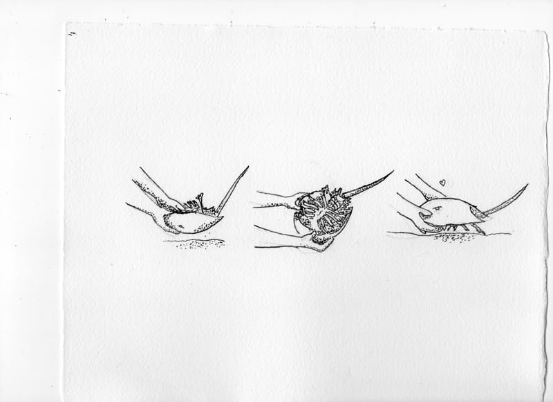
Here's an inked version of the 3-panel part. I tried to ink the top panel and totally messed it up. I started stippling and just couldn't stop. Then it looked really bad so I am going to start that part over. Do folks think the panels should have frames drawn around them like the pencil sketch? Or is it clear enough that this is a step-by-step?
-
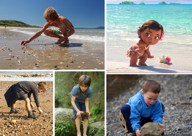
@jenn I am a bit late to this conversation, but looking at your sketches, the pose of the girl is unnatural for what she is trying to do. If you think about picking something up off the ground, especially something heavy, your body will be facing that object, not turned away from it with you reaching to the side. And especially for a child picking up a horseshoe crab, she most likely would be using both hands. I have included some photos I found online of kids picking up objects off the ground for reference.
I like the ink drawings, and they work well without frames, though the stippling on the girls' arms looks odd. Maybe add some heavier stippling closer to the line work so it looks more like a shadow and not a rash.
-
@jenn I like the pose in the first one but the girl in the second one stands out more with the light background. So if you go with the second one I would suggest you make her eyes look down at what her hands are doing, but the first one might look better just with a strong difference between foreground and background with the value/color.
-
@tom-barrett thank you so much for taking the time to provide feedback and also to search up relevant images. They are all very helpful and I will work on adjusting the pose. I think my problem was that I was complicating the pose too much. Also thanks for the tip on the stippling. Those darn pens are so... permanent.
")
-
@kayleenartlover thank you very much for the feedback. I agree with the reasoning. I think that I can achieve some contrast on the first pose if I can make the right lighting choices.
-
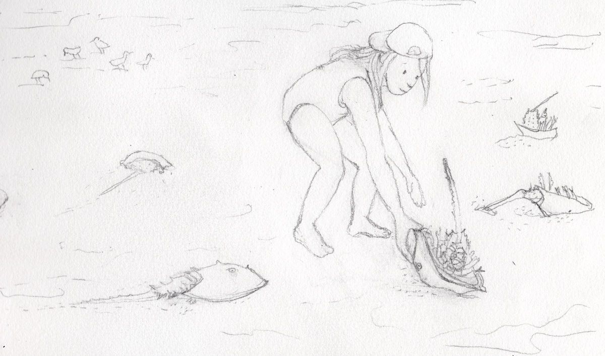
Here's a revision of the scene with the girl, eliminating the twisted pose, thanks to very helpful feedback from @tom-barrett.
-
@jenn the new pose is much better, but I think you could push it even further. Since she is reaching out in front to pick up the heavy crab, her legs would be a little offset to help balance the weight of her forward leaning body. Also, with you having her use her right arm in this pose to grab the animal, it cuts through some of her body, creating an odd silhouette. Below is a very rough sketch of a pose that would work better in this instance.
-
@tom-barrett thank you for taking time to do this sketch, I can see what you are saying and I am in agreement. And I am also noticing that I am being too precious with my drawing, which is why I thought I could get away with avoiding too much change to the pose. First step is admitting I have a problem, right?
 I will push ahead, in the pursuit of stronger art!
 -
@jenn Hi Jenn! Yes, I do think the composition is working. I like the poses too. I prefer the second one. I'm excited to see how this piece will turn out.
Portfolio: nyrrylcadiz.com
Instagram: https://www.instagram.com/nyrryl_cadiz/
YouTube: https://www.youtube.com/channel/UCbJCF1Im8ZO7hpGWTKOJMuA -
@Nyrryl-Cadiz thank you! I'm glad that you think the composition works, and thanks for expressing your preference.
-
Thank you @tom-barrett for the push to improve the pose. I think it is getting there now. Now that it is on paper, I can see how the angle is more natural-looking and the pose is clearer.
studiojcd.com
she/her/hers
Insta/Twitter: @chengdesautels -
@jenn this latest sketch is looking much better
 what are you planning on doing for the final? Watercolor or gouache for example?
 -
@kayleenartlover thank you so much. I am planning to do watercolor first and see how it goes.
-
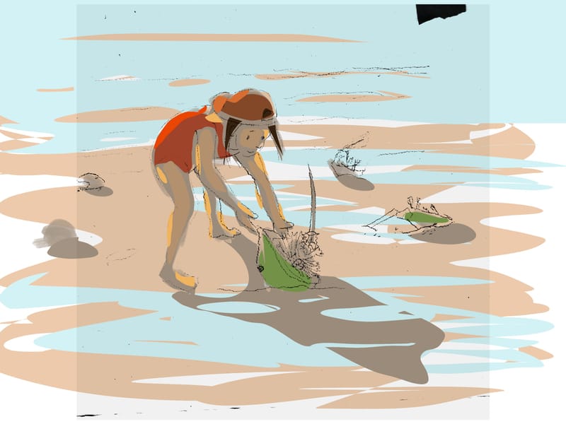
I've scanned it to try some color ideas. This is the first one. I'm thinking the composition is going to change. My original sketch was longer horizontally with more crabs and birds to the left, but I might crop it in closer, and enlarge the whole thing. The green color is sort of a placeholder because they are not that brightly colored. I plan to make time to try another version later this weekend. Feedback is welcome, especially because I am pretty sure I have a color vision deficiency.
studiojcd.com
she/her/hers
Insta/Twitter: @chengdesautels -
@jenn when deciding on colors for everything, sometimes I like to make them all into little blobs of colors next to each other to see what looks good together harmoniously and then use whatever colors stand out the most for coloring the focal point. The more saturated and the more warm it will come forward. Also sometimes I get inspired by other paintings of the same subject and use similar colors. Hope that helps!