Jack Leapt: Lets share our inspiration and WIPs!!
-
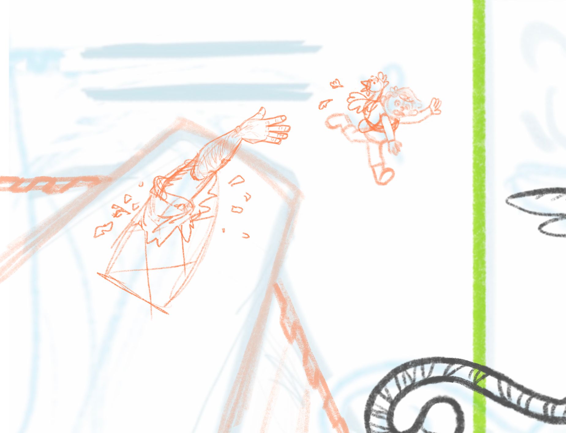
Is the giant a dumb idea? Does it work? Would love to know what y’all think…
-
@kayleenartlover i think its better without the giant personally
-
@R-Fey-Realme does it need anything instead of the giant? Should I keep whatever Jack is stealing with him? I drew a bird but it could be gold coins or the singing harp or something. Should it just be jack empty handed like before? I'm open to ideas.
-
@kayleenartlover if your story is rooted in jack n the bean stalk it would be important to have him stealing something, do you know why your jack is jumping and why there is a tiger griffin to save him? It could just be an escape, he doesn't have to leave with something. The perspective angle is low enough that you dont need to include anyone looking over the edge, and the whole story moment can be that jack jumped, and is falling, but the griffin might catch him. His pose looks a lot better now btw, great job! Since you refined the griffin its center of mass has changed and id recommend you move it a bit to the left so the two pages feel more cohesive, less split. Its perfectly fine to have on of its hind legs crossing the gutter
-
Hello fellow SVS friends,
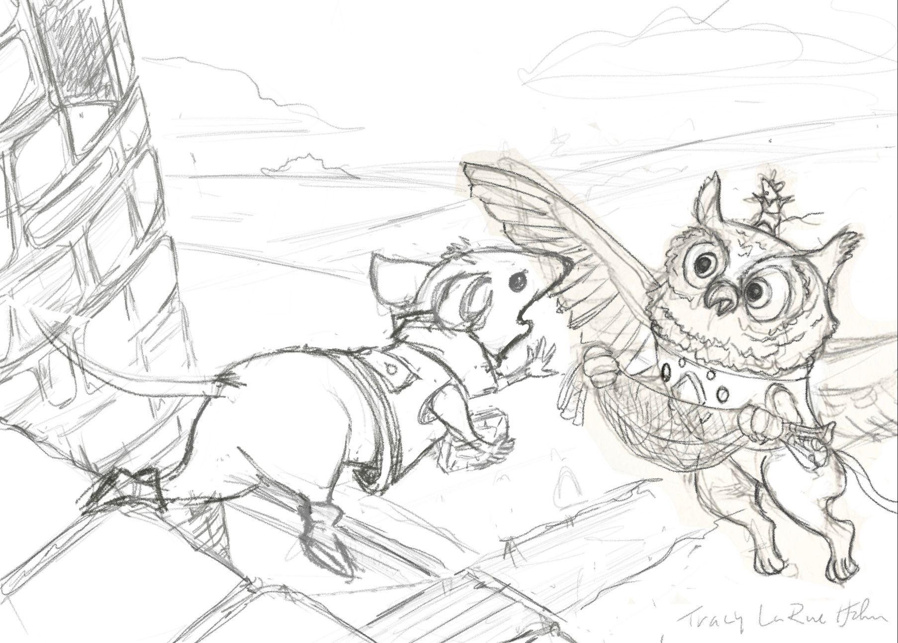
So this is where I’m at after several attempts of getting the point of view and perspective right. Backstory in readers digest form: (If you’re old enough to understand that reference) precious stone is stolen from Gryphons chest plate, he is friended by these two mice determined to retrieve it from the castle to return it to it’s rightful owner. Thoughts, suggestions appreciated.:) I know his left arm is at a tangent to his collar, I’ll fix.
-
@kayleenartlover
I think the giant is a good idea but I think it would be more effective if the “window” was an open turret and the giant is reaching out to him but he’s just out of reach, the giants face could show his anger and frustration! -
@Katt
Hi! I can definitely see the action and that your jack is tumbling to his death but I don’t see the story behind it? What is the purpose of the broom and bucket? Was he cleaning and fell out of the castle? The bird looks like it’s falling out of control as well, perhaps if his wings were out to the sides showing some control? Check some reference photos of birds in that position. His claws also look really sharp, perhaps rounding them a bit so they don’t look so scary? Also the cliff behind him would most likely be lighter at the top and darker as it goes down creating a good point of contrast. Right now, if you squint, Jack’s clothes blend right into the cliff, if you give him an accent color he’ll pop more. Hope this doesn’t sound too harsh, just trying to better your story! -
@R-Fey-Realme
Cute image, good show of movement but from prior critiques I think without your words, story isn’t clear. I know as kids we used our toys to create “environments” to play in so maybe, the table could have a pretend “scene” on it using figures/plush etc. or even another child in costume like in cosplay or perhaps jack is wearing a “costume “ to help present the story? -
@Larue the kitchen stuff is mentioned in the story above (from the march prompt, the kitchen where he works falls off the cliff, for a middle grade book), i was just trying to keep consistent with that story. As I'm writing this I think I might add some stones falling too...Yea, the clothes, dark brown or black are consistent with the character, maybe i will make the cliff lighter for that... not sure how to get around that and sabotage the character/story.
Thanks for the feedback
-
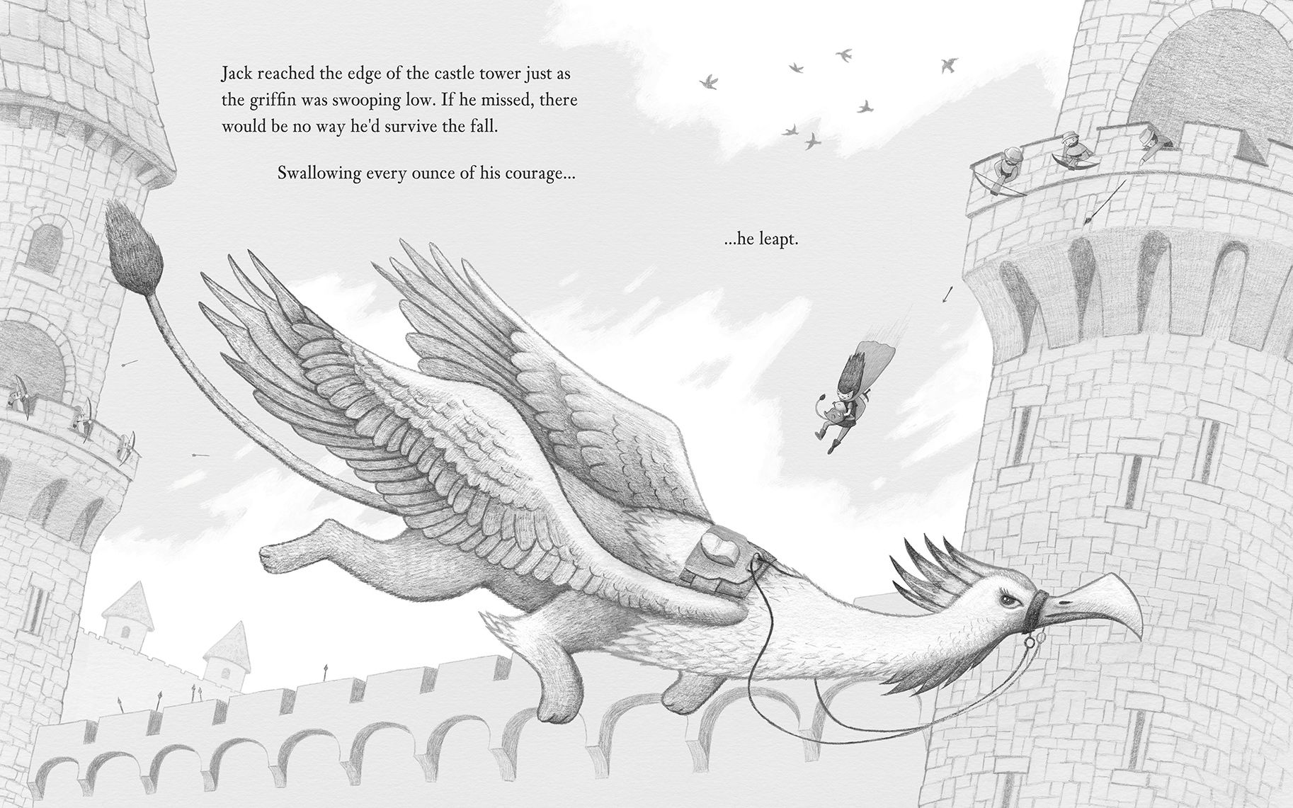
Here's the pencil render before I change it to multiply and paint colour underneath. It's mostly pencil on paper and about 20% digital pencil. I think I'm going to do digital pencil going forward as it's so much faster, my hands are super shaky when working traditionally.
-
@Jason-Crowley
Beautiful work, lovely detail. Looking forward to you’re finished piece. -
-
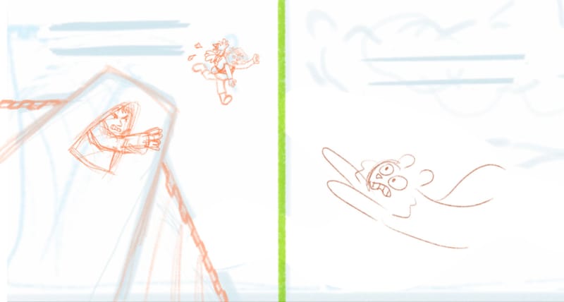
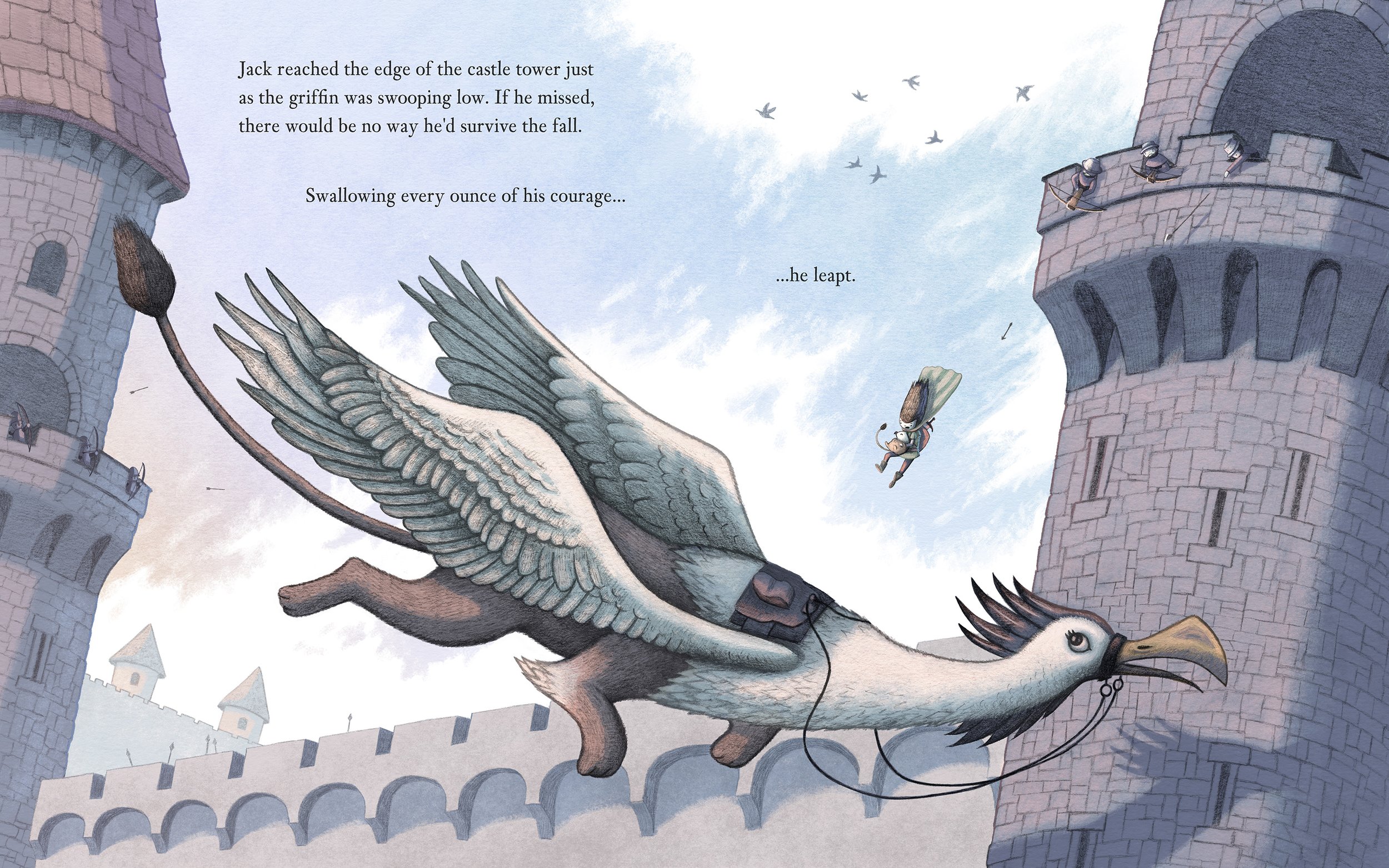
Here's my finished piece. I think the composition works pretty well as a double page spread with a gutter down the middle, reading left to right. Having said that, I wish I spent more time in the thumbnail phase to experiment with lots of different ideas, as I went with this layout too quickly. But, being this close to the deadline I didn't feel I could really experiment with castle or griffin design, as they were all new to me. I almost put this prompt in the too-hard basket but I'm glad I gave it a try.
I do feel a little bit closer to nailing down my process and 'style', which in this case is drawing (digitally and traditionally) and colouring separately. So I plan to keep experimenting there. The next prompt sounds right up my alley, and I won't have text to contend with text on a page

-
PS: If you're concerned about resolution and compression when uploading to this forum I've figured out these two things:
When uploading:
Use a max-width of 1826px (1074 * .85 = 912.9 * 2) and it will render crisp in the forum post. Anything over this size will apply a lot of compression (blurriness and artifacts) to the image in the post itself. Clicking on the image should show the original uncompressed version of the image.When linking an image:
If you want a larger size then use the Image Link option, and host the image on your own website. It doesn't seem to over compress it using this option. -
Do any of these poses for the griffin work? Should the body/wings be a different gesture position? It was flying low, then is suddenly changing directions to try to catch Jack above.
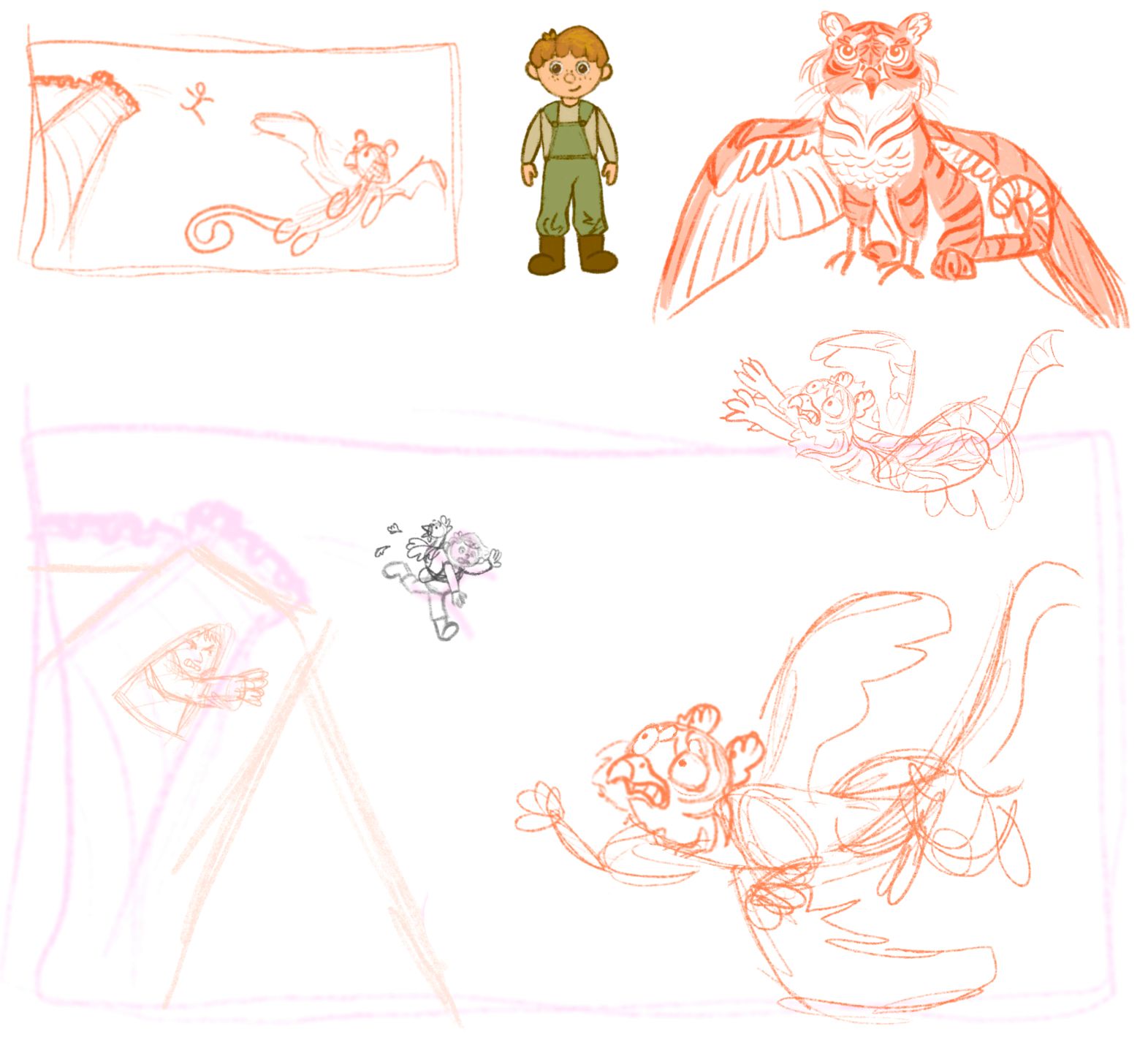
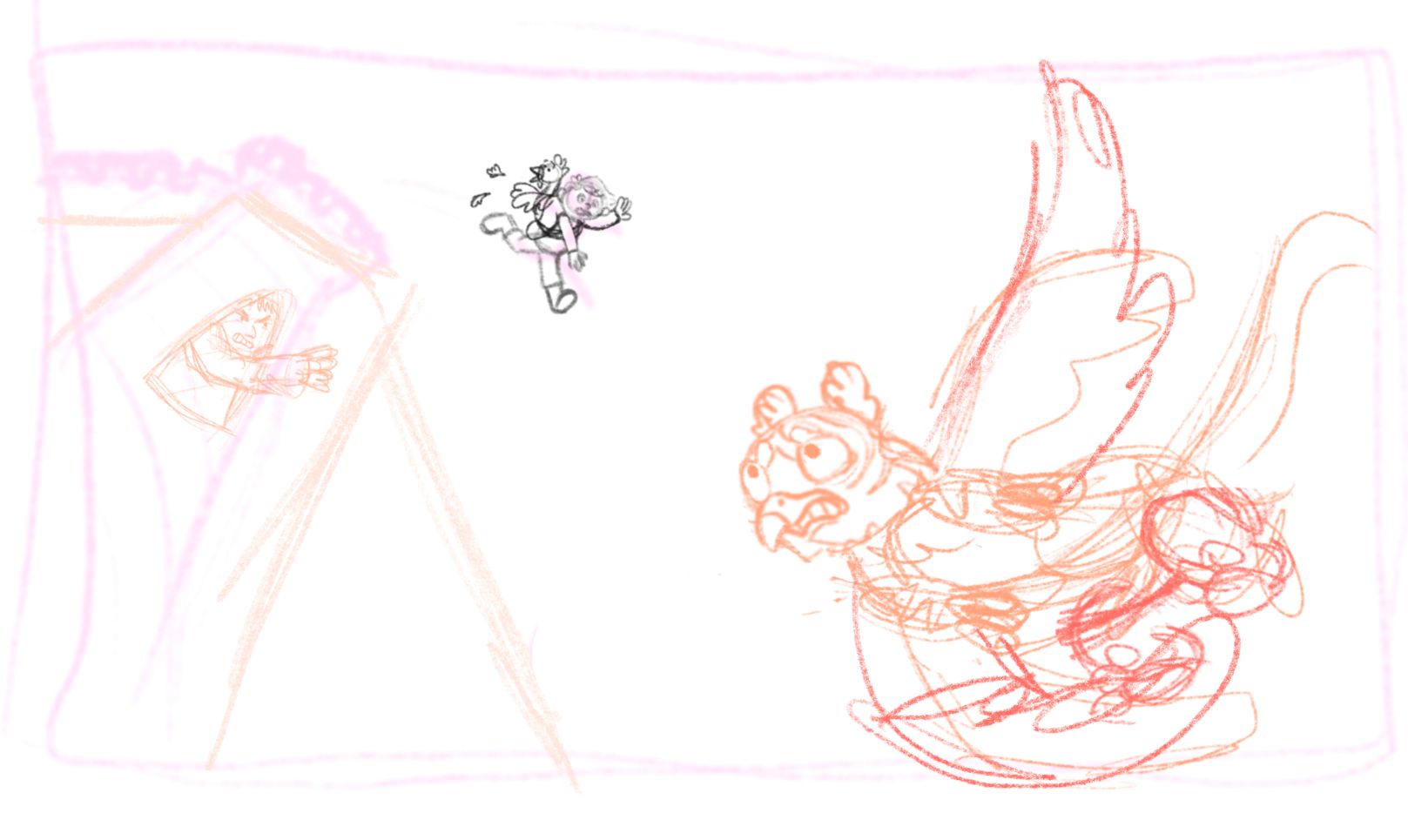
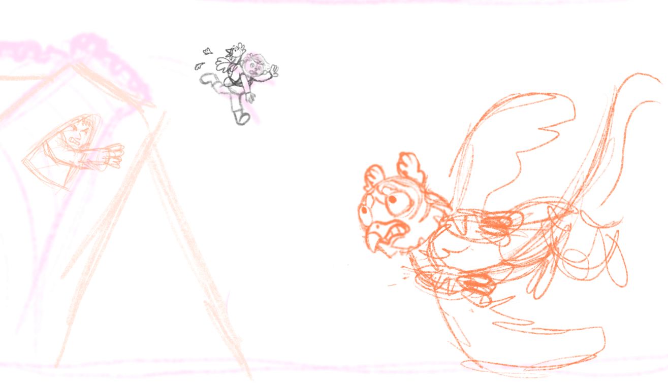
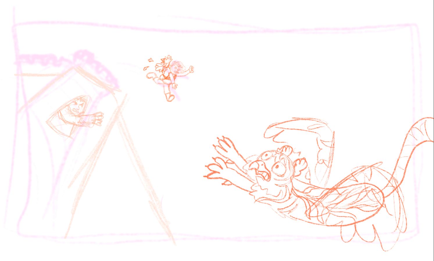
(The sketches ended up out of the order I drew them in)
-
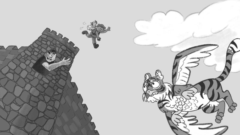
-
I'm trying to get this finished today, even if I don't get to polish it much I had fun with the idea and with getting back to the SVS prompts after a long pause

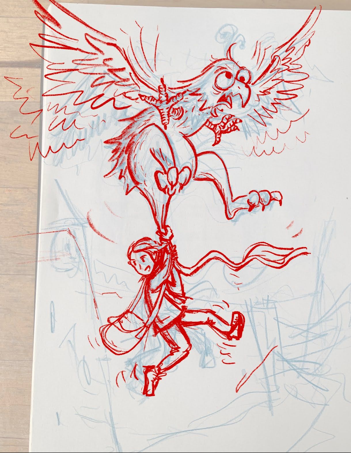 .
.I am not shure what my inspiration is at this point, I have gone back to some old Donald Duck comics I loved in my childhood and I think some of the expressions and gestures from that type of images comes through. For the background I plan to use a bit of local roumanian castle architecture.
-
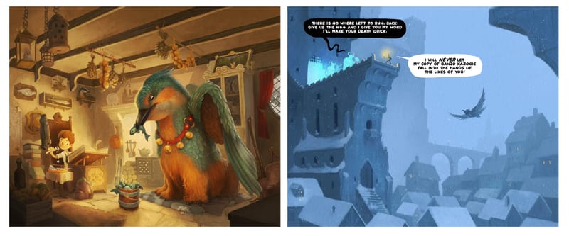
I tried to design this months image to complement the previous one I did. I liked the idea of inverting the colour temperature for the newest illustration by keeping the majority of the image super cold blue.