Feedback on double page spread
-
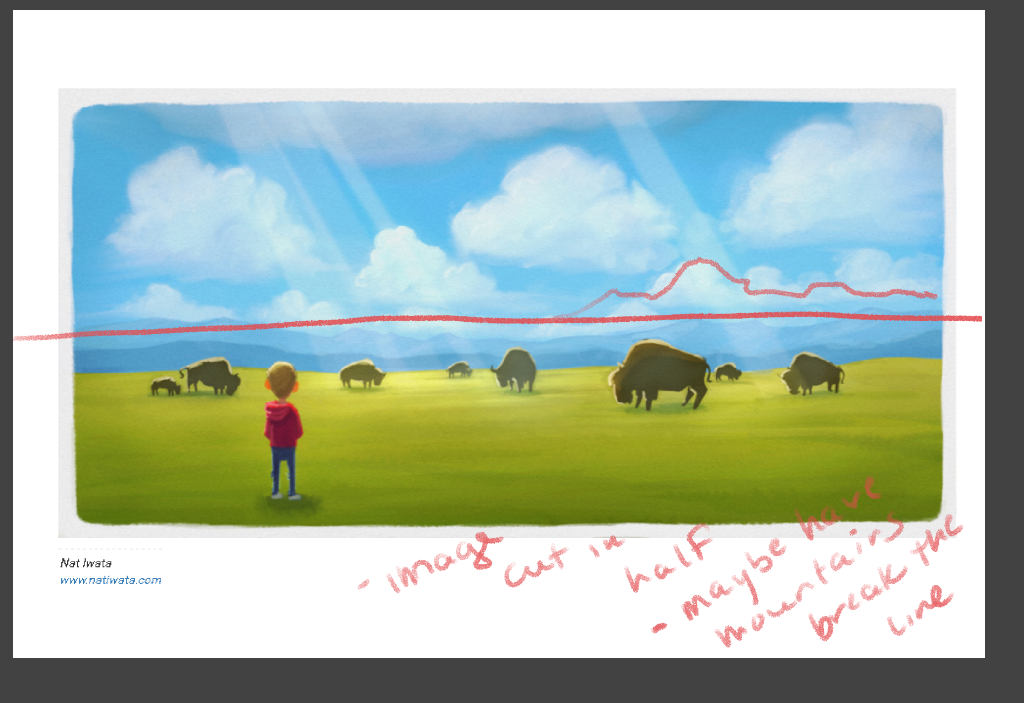
Hey everyone, working out an idea to go along with a book text, would love feedback on this double page spread. Composition, lighting, etc....
Nat Iwata
www.iwataillustration.com -
Your paintings are beautiful
") where do you picture placing the text? Is it something that parents will read for their children, or something children should read themselves?
where do you picture placing the text? Is it something that parents will read for their children, or something children should read themselves? -
@Camomilla thanks! Text will be in white in the lower right hands corner where all the green is...
-
It's hard to give critiques when you don't know the story, or what feeling your trying to convey in your image. Your image looks very good, but I can't tell if it will work or not. I've made a few children's books (I work as a graphic designer), and storytelling through imagery is very diverse. You can have books where images tell everything, and books where images merely support what's written. My favourites are the books where it all comes together and completes each other
-
Awesome stuff! The palette is really appealing, and the image feels really airy and open (sorry for my lacking vocabulary, I'm Swedish ;P)
Maybe one thing to try could be some overlapping of shapes? That's at least something that I struggle with and try to do myself, and i find that it often leads to a lot of depth in the image. Now the Bisons and the clouds are all separate objects on the background, but I think if one would look at a reference image similar to this a lot of the clouds would be overlapping, and probably some of the Bisons as well.
As I said, great work, looking forward to seeing this finished!
Thanks,
Joel -
Looks like South Dakota
Beautiful feel to this piece, and i agree about some overlapping adding more depth. Lightening the sky along the mountain range will help as well, sky blue fades to almost white in far distances, but if this is traditional media, just add a few overlapped buffalo. Gosh, i really like this the more i look at it 
-
It's a beautiful concept and really nice things already - I love the hot spots of light shining down, great for focussing attention and adding depth...also the light on the boy is lovely, as are the fluffy clouds.
The things I would tweak..the first thing I thought was that the grass looked a bit flat, or lacking in texture a bit...some more 'grassiness' to the grass would be nice, it would also add to the depth if you had more longer strands near the boy and then becoming flatter further out.
The other thing I'm not sure whether it's intentional, is that the grassy horizon isn't flat, it undulates but not sure if it's meant to....to my eye it might be nicer if the grassy horizon was a flat line, with the jagged blue hills rising behind in contrast. (all personal opinion though!)
But it is looking lovely already and will be great to see how you finish it off!
-
Love!!! My only thought was value, because I am working on that now, have you checked it in black and white and pushed the values? Otherwise amazing!
-
@natiwata Looks really good Nat. You chose some strong colors and I think it works very well. The boy stands out great. I have two thoughts. I like your use of atmospheric perspective on the bison but I think you can push it more with a few easy fixes.
First, the bison in the very back has the same strength as the bison in the mid-ground. I would lighten that one more to push it further into the background.
Second is the bison in the foreground, I feel like you're losing out by not giving very much detail on that guy. The closer to the viewer (us) the less the shadows muddy out. You don't need to give too much since he is pushed into the mid-ground but something to show us how majestic these guys really are.
Last, small thing, not really important but when you convert to blk/wht the boy's ears get lost. A very simple thin lighter line around the ears will help separate them from the background.Great work, I am really enjoying your progress. :^D=
-
Really nice work, Nat.
All great advice. My small suggestion is below to keep the composition from being cut in half at the middle maybe rise the mountains on one side a bit more. Hope that helps! Great job
-
Nice image, a few things have already been suggested, my thought is have you checked to make sure you won't lose anything, or at least anything important, in the 'gutter'? Just a quick glance and the bison in the center might get lost.
Without the text or story context it's hard to see what's going on other then the obvious. But it does make me wonder abut the story.
-
My thoughts without knowing the storyline: Move the background up to be the top third, increase the size/height of the mountains in one area, leave the boy just where he is. I think this would emphasize his smallness in the immensity of it all. This would also allow the text to not overpower the green area.
-
I like it, seems to me like a nice calm scene.
-
The illustration is lovely, but it is hard to tell if it works without knowing the text. It is a very peaceful, calm, static image. Does that fit the story? If yes, then it works. Without knowing the text, I long for some action. If it fits the story, I would try and create more tension...at the very least a Bison acknowledging the boy is there by looking up. Right now it is a calm landscape with a random boy standing there.
I also think placing the text in the bottom right corner won't work very well. I feel that would make the bottom half of the image even more heavy. So far all the color and interest is in the bottom half of the page. If you put the text there, the top half will be ignored completely.
Hope that helps! You have a great color and style! -
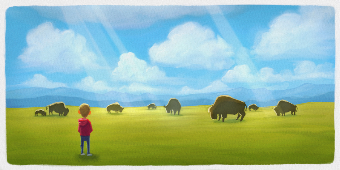
Thanks everyone for all the feedback! I'm incorporating some of the changes and will post again later tonight. As far as the context of the story, the basic idea of this scene is just to convey the idea of a 'wide place' with a beautiful scene. It's my book, so I'm not as concerned with matching the text to the picture as I would be when illustrating someone else's work.
I'm did notice the bison in the middle of the page, moved him over, lightened the sky towards the horizon a bit, extended some of the clouds and bison to overlap, and I think I'll actually add more sky than less since I want the sky to look really big and open. Thanks!
Nat Iwata
www.iwataillustration.com -
@natiwata Hey Nat - really nice - great feel to the image - i just wanted to try lowering the sun - the only thing i was feeling was that the atmosphere was not conducive to making those rays..... i could be wrong - but i think it is when the rays of the sun are low and traveling through more atmosphere - that is when those rays seem to happen i think - mostly cut and pastes with some erasing - i know the piece is not about the rays.... and this is a minor and possibly incorrect point but just wanted to share the thought:)
-
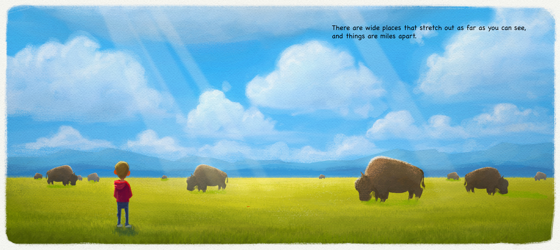
Update I did a few days ago and forgot to post. Did a lot to try and polish this and incorporate some suggested changes.
Nat Iwata
www.iwataillustration.com -
Looks really good:) Nice work>
-
Yeah! This looks great! I like the extra details that you added, the grass blade up front and the buffalo fur. You did a good job balancing the subtly of detail while not making it too punchy. This looks like a portfolio ready piece. :^D=
-
Thank you @BradAYoo and @evilrobot !!!