Society of Visual Storytelling

    SVSLearn Forums

    • Register
    • Login
    • Search
    • Recent
    • Tags
    • Popular
    • Users
    • Groups
    • Search

    Feedback on double page spread

    General Discussion
    16
    28
    13749
    Loading More Posts
    • Oldest to Newest
    • Newest to Oldest
    • Most Votes
    Reply
    • Reply as topic
    Log in to reply
    This topic has been deleted. Only users with topic management privileges can see it.
    • Charlie Eve Ryan
      Charlie Eve Ryan Pro SVS OG last edited by

      Really nice work, Nat.

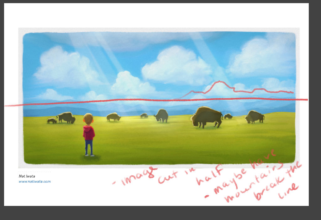
      All great advice. My small suggestion is below to keep the composition from being cut in half at the middle maybe rise the mountains on one side a bit more. Hope that helps! Great job

      upload-704d47d4-c536-46ba-8114-a0c7e8154e3c

      Happy Creating
      www.charlieeveryan.com

      1 Reply Last reply Reply Quote 0
      • Rich Chabot
        Rich Chabot last edited by

        Nice image, a few things have already been suggested, my thought is have you checked to make sure you won't lose anything, or at least anything important, in the 'gutter'? Just a quick glance and the bison in the center might get lost.

        Without the text or story context it's hard to see what's going on other then the obvious. But it does make me wonder abut the story.

        1 Reply Last reply Reply Quote 0
        • Russ Van Dine
          Russ Van Dine last edited by

          My thoughts without knowing the storyline: Move the background up to be the top third, increase the size/height of the mountains in one area, leave the boy just where he is. I think this would emphasize his smallness in the immensity of it all. This would also allow the text to not overpower the green area.

          1 Reply Last reply Reply Quote 0
          • Jiří Kůs
            Jiří Kůs last edited by

            I like it, seems to me like a nice calm scene.

            Follow me on
            https://www.instagram.com/yiri_kus/
            http://yirikus.tumblr.com/
            https://www.facebook.com/yirikus/

            1 Reply Last reply Reply Quote 0
            • Joy Heyer
              Joy Heyer last edited by

              The illustration is lovely, but it is hard to tell if it works without knowing the text. It is a very peaceful, calm, static image. Does that fit the story? If yes, then it works. Without knowing the text, I long for some action. If it fits the story, I would try and create more tension...at the very least a Bison acknowledging the boy is there by looking up. Right now it is a calm landscape with a random boy standing there.
              I also think placing the text in the bottom right corner won't work very well. I feel that would make the bottom half of the image even more heavy. So far all the color and interest is in the bottom half of the page. If you put the text there, the top half will be ignored completely.
              Hope that helps! You have a great color and style!

              Twitter: @Joy_Illustrated
              Instagram: joy_illustrated
              Website: joyheyer.com

              1 Reply Last reply Reply Quote 0
              • natiwata
                natiwata SVS OG last edited by

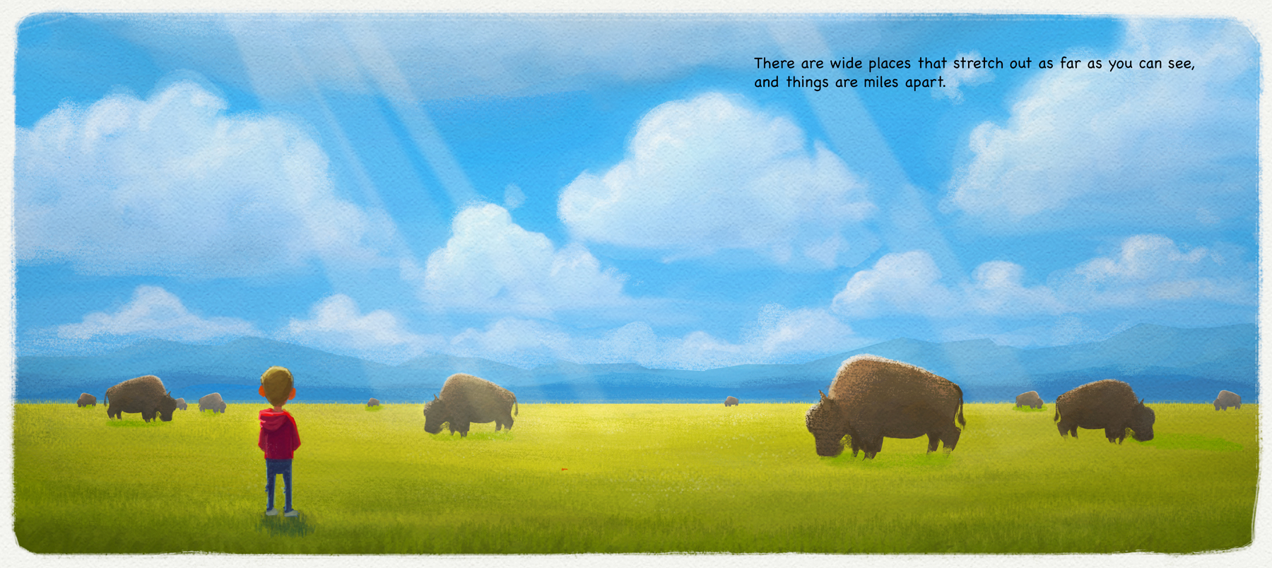
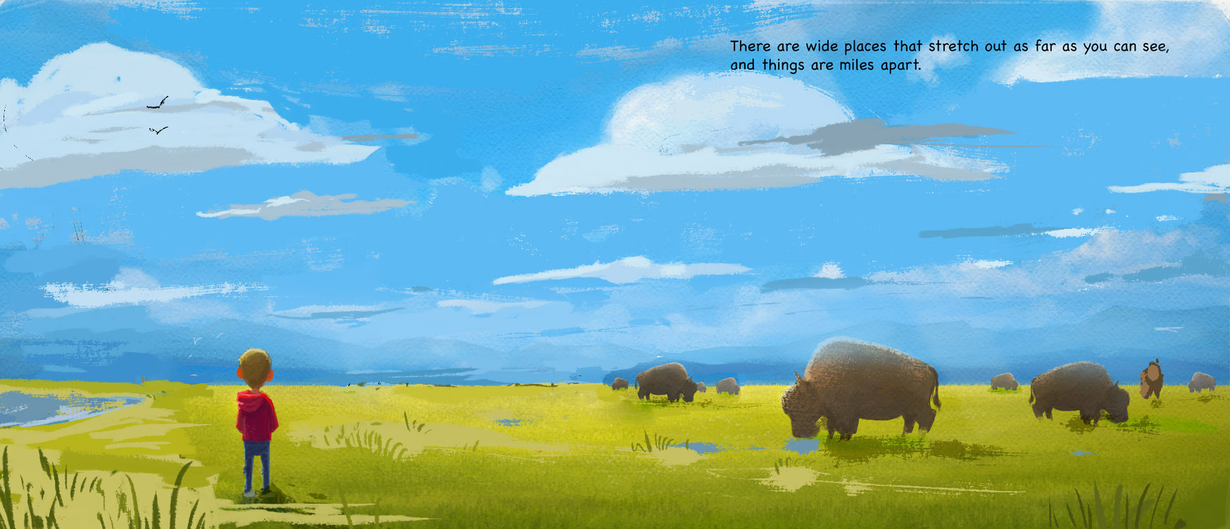
                Thanks everyone for all the feedback! I'm incorporating some of the changes and will post again later tonight. As far as the context of the story, the basic idea of this scene is just to convey the idea of a 'wide place' with a beautiful scene. It's my book, so I'm not as concerned with matching the text to the picture as I would be when illustrating someone else's work.

                I'm did notice the bison in the middle of the page, moved him over, lightened the sky towards the horizon a bit, extended some of the clouds and bison to overlap, and I think I'll actually add more sky than less since I want the sky to look really big and open. Thanks!

                Nat Iwata
                www.iwataillustration.com

                Kevin Longueil 1 Reply Last reply Reply Quote 3
                • Kevin Longueil
                  Kevin Longueil SVS OG @natiwata last edited by

                  @natiwata Hey Nat - really nice - great feel to the image - i just wanted to try lowering the sun - the only thing i was feeling was that the atmosphere was not conducive to making those rays..... i could be wrong - but i think it is when the rays of the sun are low and traveling through more atmosphere - that is when those rays seem to happen i think - mostly cut and pastes with some erasing - i know the piece is not about the rays.... and this is a minor and possibly incorrect point but just wanted to share the thought:)godrays.jpeg

                  Portfolio: kevinlongueil.com
                  https://www.instagram.com/kevinlongueil/

                  1 Reply Last reply Reply Quote 1
                  • natiwata
                    natiwata SVS OG last edited by

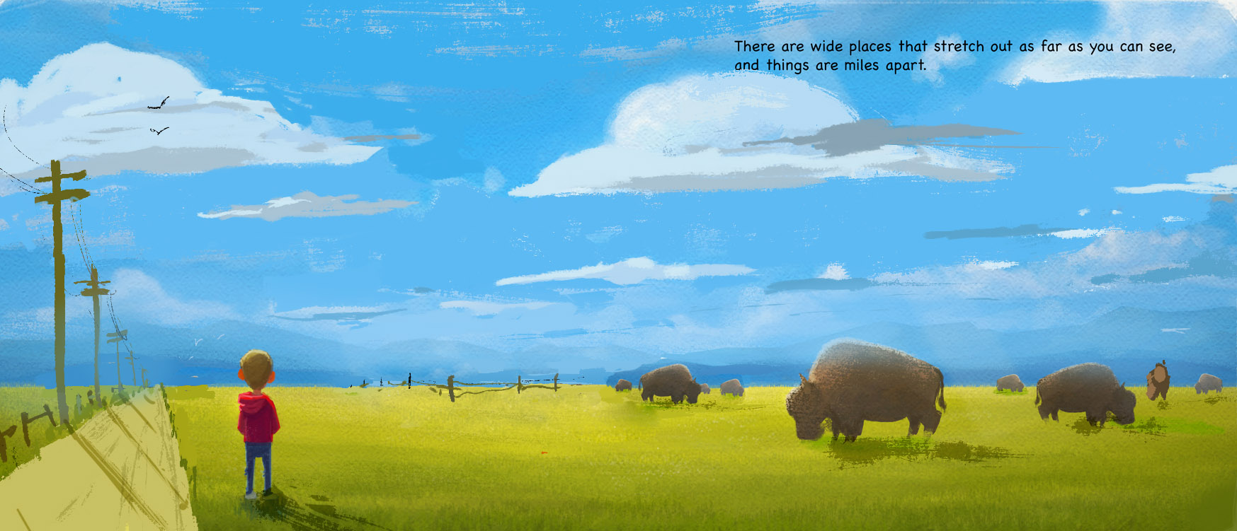
                    Update I did a few days ago and forgot to post. Did a lot to try and polish this and incorporate some suggested changes.

                    HiddenPlaces_Wide_DoublePage.jpg

                    Nat Iwata
                    www.iwataillustration.com

                    Kevin Longueil 1 Reply Last reply Reply Quote 9
                    • evilrobot
                      evilrobot SVS OG last edited by

                      Looks really good:) Nice work>

                      http://www.palacioillustration.com/

                      https://www.scbwi.org/illustrator-gallery/illustrator-detail/?illustrator_id=84142

                      https://www.pinterest.com/evilrobot2/pins/

                      https://twitter.com/MyEvilRobot

                      1 Reply Last reply Reply Quote 1
                      • BradAYoo
                        BradAYoo last edited by

                        Yeah! This looks great! I like the extra details that you added, the grass blade up front and the buffalo fur. You did a good job balancing the subtly of detail while not making it too punchy. This looks like a portfolio ready piece. :^D=

                        http://geobrd.com - https://www.instagram.com/geobrd/ - https://twitter.com/bradayoo

                        1 Reply Last reply Reply Quote 1
                        • natiwata
                          natiwata SVS OG last edited by

                          Thank you @BradAYoo and @evilrobot !!!

                          Nat Iwata
                          www.iwataillustration.com

                          1 Reply Last reply Reply Quote 0
                          • lmrush
                            lmrush Pro SVS OG last edited by

                            It is awesome, love it

                            Lisa Rush
                            www.lisarushgallery.com
                            www.facebook.com/ArtbyLisaRush/
                            www.instagram.com/lisarush11/

                            1 Reply Last reply Reply Quote 0
                            • Kevin Longueil
                              Kevin Longueil SVS OG @natiwata last edited by

                              @natiwata This looks great Nat - i think you might be done so i hope i am not annoying you with this feedback - i really liked the original and all of the changes you've made too - but something on this new version that really jumps out at me is that the Bison look like they are the same animal cut and pasted at different distances - small head tilts and two tail shapes but otherwise the same - the variations of poses on the previous paintings looked more natural to me -

                              Portfolio: kevinlongueil.com
                              https://www.instagram.com/kevinlongueil/

                              natiwata 1 Reply Last reply Reply Quote 1
                              • NoWayMe
                                NoWayMe last edited by

                                This looks great, as always!

                                noemiegionetlandry.squarespace.com
                                noemie_illustration on Instagram

                                1 Reply Last reply Reply Quote 0
                                • lmrush
                                  lmrush Pro SVS OG last edited by

                                  This is why I love this school, we post, others see things we don't and we can only grow from it

                                  Lisa Rush
                                  www.lisarushgallery.com
                                  www.facebook.com/ArtbyLisaRush/
                                  www.instagram.com/lisarush11/

                                  1 Reply Last reply Reply Quote 0
                                  • Lee White
                                    Lee White SVS Team SVS Instructor Pro SVS OG last edited by Lee White

                                    Really nice! With this subject matter, I would consider using some perspective. Maybe spread out the clouds and layer them a bit. Group the buffalo together. This will give you more compositional elements and design options. 1460397749340-hiddenplaces_wide_doublepage.jpg

                                    SVS Faculty Instructor
                                    www.leewhiteillustration.com

                                    1 Reply Last reply Reply Quote 1
                                    • natiwata
                                      natiwata SVS OG @Kevin Longueil last edited by

                                      @Kevin-Longueil Thanks Kevin, and yeah I totally cut and pasted then slightly modified the bison! I meant to go back and add a few more variations and some at different angles but haven't yet, good call.

                                      @Imrush @NoWayMe Thanks for the comments, it's great to grow and see things improve with everyone's help.

                                      @Lee-White - Thanks for the suggestions, I do see that some of the elements of the composition may be too evenly spaced. Part of this illustration in the larger book idea is that this is a remote place, in the wilderness, so I'm wondering what I can use instead of man made things like roads, poles or fences out on the pains? Maybe make the clouds more sweeping toward the camera...or variation in the grass? Hmm...

                                      Nat Iwata
                                      www.iwataillustration.com

                                      1 Reply Last reply Reply Quote 0
                                      • Lee White
                                        Lee White SVS Team SVS Instructor Pro SVS OG last edited by

                                        sure, those ideas should work. Just think of overlapping things and varying the shapes and spacing as things go back. Here's another option with maybe some puddles and a body of water...1460568122293-1460397749340-hiddenplaces_wide_doublepage.jpg

                                        SVS Faculty Instructor
                                        www.leewhiteillustration.com

                                        natiwata 1 Reply Last reply Reply Quote 0
                                        • natiwata
                                          natiwata SVS OG @Lee White last edited by

                                          @Lee-White Thank you for the feedback, lightning fast! Water, accentuating foreground grass, birds I really like these ideas, and they make the image less boring but keep it serene.

                                          Nat Iwata
                                          www.iwataillustration.com

                                          1 Reply Last reply Reply Quote 0
                                          • First post
                                            Last post