Society of Visual Storytelling

    SVSLearn Forums

    • Register
    • Login
    • Search
    • Recent
    • Tags
    • Popular
    • Users
    • Groups
    • Search

    Feedback on double page spread

    General Discussion
    16
    28
    13749
    Loading More Posts
    • Oldest to Newest
    • Newest to Oldest
    • Most Votes
    Reply
    • Reply as topic
    Log in to reply
    This topic has been deleted. Only users with topic management privileges can see it.
    • Kevin Longueil
      Kevin Longueil SVS OG @natiwata last edited by

      @natiwata Hey Nat - really nice - great feel to the image - i just wanted to try lowering the sun - the only thing i was feeling was that the atmosphere was not conducive to making those rays..... i could be wrong - but i think it is when the rays of the sun are low and traveling through more atmosphere - that is when those rays seem to happen i think - mostly cut and pastes with some erasing - i know the piece is not about the rays.... and this is a minor and possibly incorrect point but just wanted to share the thought:)godrays.jpeg

      Portfolio: kevinlongueil.com
      https://www.instagram.com/kevinlongueil/

      1 Reply Last reply Reply Quote 1
      • natiwata
        natiwata SVS OG last edited by

        Update I did a few days ago and forgot to post. Did a lot to try and polish this and incorporate some suggested changes.

        HiddenPlaces_Wide_DoublePage.jpg

        Nat Iwata
        www.iwataillustration.com

        Kevin Longueil 1 Reply Last reply Reply Quote 9
        • evilrobot
          evilrobot SVS OG last edited by

          Looks really good:) Nice work>

          http://www.palacioillustration.com/

          https://www.scbwi.org/illustrator-gallery/illustrator-detail/?illustrator_id=84142

          https://www.pinterest.com/evilrobot2/pins/

          https://twitter.com/MyEvilRobot

          1 Reply Last reply Reply Quote 1
          • BradAYoo
            BradAYoo last edited by

            Yeah! This looks great! I like the extra details that you added, the grass blade up front and the buffalo fur. You did a good job balancing the subtly of detail while not making it too punchy. This looks like a portfolio ready piece. :^D=

            http://geobrd.com - https://www.instagram.com/geobrd/ - https://twitter.com/bradayoo

            1 Reply Last reply Reply Quote 1
            • natiwata
              natiwata SVS OG last edited by

              Thank you @BradAYoo and @evilrobot !!!

              Nat Iwata
              www.iwataillustration.com

              1 Reply Last reply Reply Quote 0
              • lmrush
                lmrush Pro SVS OG last edited by

                It is awesome, love it

                Lisa Rush
                www.lisarushgallery.com
                www.facebook.com/ArtbyLisaRush/
                www.instagram.com/lisarush11/

                1 Reply Last reply Reply Quote 0
                • Kevin Longueil
                  Kevin Longueil SVS OG @natiwata last edited by

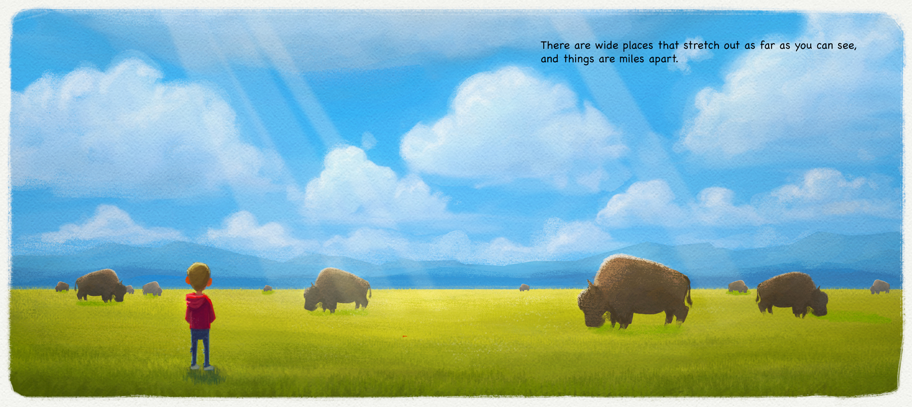
                  @natiwata This looks great Nat - i think you might be done so i hope i am not annoying you with this feedback - i really liked the original and all of the changes you've made too - but something on this new version that really jumps out at me is that the Bison look like they are the same animal cut and pasted at different distances - small head tilts and two tail shapes but otherwise the same - the variations of poses on the previous paintings looked more natural to me -

                  Portfolio: kevinlongueil.com
                  https://www.instagram.com/kevinlongueil/

                  natiwata 1 Reply Last reply Reply Quote 1
                  • NoWayMe
                    NoWayMe last edited by

                    This looks great, as always!

                    noemiegionetlandry.squarespace.com
                    noemie_illustration on Instagram

                    1 Reply Last reply Reply Quote 0
                    • lmrush
                      lmrush Pro SVS OG last edited by

                      This is why I love this school, we post, others see things we don't and we can only grow from it

                      Lisa Rush
                      www.lisarushgallery.com
                      www.facebook.com/ArtbyLisaRush/
                      www.instagram.com/lisarush11/

                      1 Reply Last reply Reply Quote 0
                      • Lee White
                        Lee White SVS Team SVS Instructor Pro SVS OG last edited by Lee White

                        Really nice! With this subject matter, I would consider using some perspective. Maybe spread out the clouds and layer them a bit. Group the buffalo together. This will give you more compositional elements and design options. 1460397749340-hiddenplaces_wide_doublepage.jpg

                        SVS Faculty Instructor
                        www.leewhiteillustration.com

                        1 Reply Last reply Reply Quote 1
                        • natiwata
                          natiwata SVS OG @Kevin Longueil last edited by

                          @Kevin-Longueil Thanks Kevin, and yeah I totally cut and pasted then slightly modified the bison! I meant to go back and add a few more variations and some at different angles but haven't yet, good call.

                          @Imrush @NoWayMe Thanks for the comments, it's great to grow and see things improve with everyone's help.

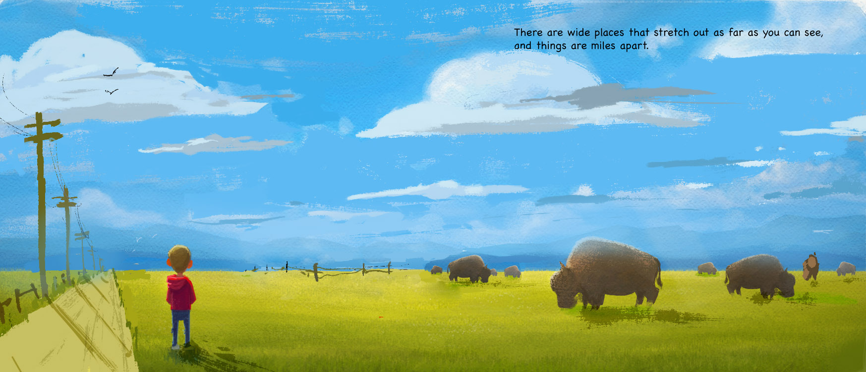
                          @Lee-White - Thanks for the suggestions, I do see that some of the elements of the composition may be too evenly spaced. Part of this illustration in the larger book idea is that this is a remote place, in the wilderness, so I'm wondering what I can use instead of man made things like roads, poles or fences out on the pains? Maybe make the clouds more sweeping toward the camera...or variation in the grass? Hmm...

                          Nat Iwata
                          www.iwataillustration.com

                          1 Reply Last reply Reply Quote 0
                          • Lee White
                            Lee White SVS Team SVS Instructor Pro SVS OG last edited by

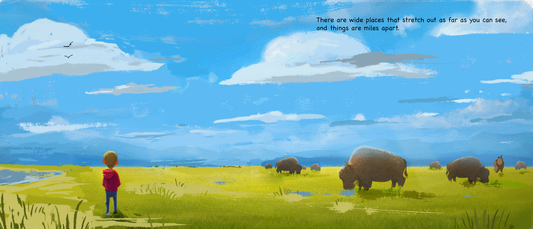
                            sure, those ideas should work. Just think of overlapping things and varying the shapes and spacing as things go back. Here's another option with maybe some puddles and a body of water...1460568122293-1460397749340-hiddenplaces_wide_doublepage.jpg

                            SVS Faculty Instructor
                            www.leewhiteillustration.com

                            natiwata 1 Reply Last reply Reply Quote 0
                            • natiwata
                              natiwata SVS OG @Lee White last edited by

                              @Lee-White Thank you for the feedback, lightning fast! Water, accentuating foreground grass, birds I really like these ideas, and they make the image less boring but keep it serene.

                              Nat Iwata
                              www.iwataillustration.com

                              1 Reply Last reply Reply Quote 0
                              • First post
                                Last post